The Nanette Cameron Digital Archive is an online archive of newsletters produced by Nanette Cameron between c.1990 → c.2018.

We become artists by creating a beautiful home in which to live, even if we do not actively make some work of art. Just as a beautiful object gives pleasure to the viewer, a beautiful home will give joy and pleasure to ourselves, our families and the friends who visit us.
1990
Term 1

Term 2

Term 3

Dear Guild Members
With so little time between the autumn and winter newsletters, there is really little to add, especially in this deflated economy. However, there does seem to be a glimmer of light appearing and positive thinking on all our parts can only help. It was interesting to read in this year’s New Zealand Architectural Awards that “buildings delivered to tight budgets in a difficult economic climate” were in premium. Definite emphasis in the judging, was put on value for expenditure , still of aesthetically high standard but without relying on expensive construction or luxurious materials. I would like Guild visits for this year to reflect this and show innovation and imagination rather than high cost. There is today, a much greater appreciation of the beauty of textiles and a much deeper realisation that fabric design is an art. I believe, if the budget is restricted, as it is for most of us, to use a lovely fabric in a less amount, to treat it in a similar way as a painting or sculpture. But then we must use it in a dominant position so that it appears precious. I am, as you all know, a great lover of the art of textile design and production. It has always been a sorrow to me that we, as New Zealanders, do not understand the richness and cultural heritage inherent in textiles. Maybe because there have been no textiles manufactured here until recently. There are very beautiful and skilled Maori weavings but they have not been given the recognition they deserve in New Zealand. In all other older countries, textiles have an important place in the history of the people and their cultures. Museums and art galleries show their textile collections with pride and they are an essential part to understanding the country, its history and culture.
In Europe today, many textile manufacturers are re-instating and re-using old weaving looms and printing techniques, such as block printing and hand silk-screening. The art of the technique of Chine, simpler but similar to the Eastern Ikat, that almost spiritual combination of resist-dyeing and handweaving has been revived. Ikats are appreciated by connoisseurs the world over. They may be more expensive as they are more time-consuming to produce but gives the fabrics an intangible yet intrinsic quality as well as beauty. Use them sparingly as you would a fine jewel and appreciate the quality they add to your room or interior. Older richer fabrics such as damasks and cotton velvets and prints such as Toile de Jouy are again in demand, along with decorative braids and cords. While considering textiles, we certainly can be very proud of the beautiful woven wool upholstery fabrics produced here, many for the overseas market. Many of our worsted woollen upholstery clothes are in world class. For good looks, for long-term retention of their appearance, for wearability and durability, it is hard to find a material that performs better than a good quality worsted wool upholstery. As is stated in the places to visit, the newly redesigned Exchange Tavern is a highlight of design in Auckland. Architect Noel Lane, working with artist Gavin Chilcott, created this new interior. The design and the use of materials and finishes is outstanding. The Medusa Bar is moody, poetic, darkly romantic in its atmosphere. To enjoy a drink by the glowing fire sitting on the comfortable furniture, covered in a deep rich blue worsted woollen damask produced by Atelier, here in New Zealand is a pleasure I hope you will all indulge in and then maybe have a meal in the restaurant.
Nanette
Dear Guild Members
Facing the end of the first year of the new decade, can we see a clear direction ahead or are we in a transition period waiting for the year 2000? One thing is certain, the world will have to conserve more and consume less if there is to be any sort of world in the future. At Designers Weekend held recently, the debate was “Will Design in New Zealand be dead by the year 2000?”. For the affirmative, the team, among other reasonings, explored the theory that in the Middle Ages men worked harmoniously together, with a faith in God inspiring them to achieve the great Gothic cathedrals. The next age was the Age of the Craftsman, then with the Industrial Revolution and the advent of the machine, which required definite direction, the Twentieth Century developed as the Age of the Designer. Design dominated, it became a cult word — designer furniture, designer jeans, designer sunglasses, telephones. The designer relied on even more consumption. The team who eloquently explored this theory, see the next century as a development of a new concept that will replace design based on a care for the world’s fast fading resources. But maybe design won’t be replaced but change its direction?
While we are discussing change, the new Wool Board Colours for 1991 have been released and are called “El Dorado”, inspired from Spain and the Spanish architect Antonio Gaudi. The colours show a subtle shift rather than a change from the vibrant 1990’s “Hothouse” Collection. Yellow is still the base colour but orange has become stronger and texture is more important. New techniques with machines are giving greater versatility to tufted carpets and there is a more creative intermingling of colour combined with more decorative effects. The brilliance of Gaudi’s mosaics are a strong influence in carpets and wool upholstery fabrics.
Spain is emerging as a country whose designs may challenge those of that Mecca of design — Italy. Barcelona will be a brilliant city to visit in 1992 with the Olympic Games and the World expo there — as well as all of Gaudi’s architecture. I do hope everyone will visit Artiture this year — it is at the Museum from Saturday 22nd September until Sunday 7th October. Two years ago the guild sponsored Artiture — Furniture as Art. Always it is a stimulating and thought-provoking exhibition. Included in it this year, are designs for the Intarsio Collection planned to show the beauty and versatility of the new Italian wood veneers, marketed by Quality Woods here in New Zealand. Pete Bossley, Ron Cox, John Hughes, Noel Lane, Stephane Rondel, Paula Ryan and Marilyn Sainty were invited to participate and create a piece of furniture to display the veneers — the result is outstanding.
The tour to Japan in May, planned by Penny Vernon and her sister Nina, who has lived In Japan and speaks Japanese, was a great success. I have always had a love affair with the old culture of Japan and I knew I would appreciate that aspect deeply, but as well there is the best of the world’s modern architecture and design; I guess the Japanese are the only country with the money for this! Penny and Nina are planning a trip next year so seriously think about it. As well as Japan I went to Greece this year and by coincidence visited the two cultures that have achieved the greatest heights in man-made objects, ancient Greece and Japan. I really appreciated that statement, which I quote in the first year class notes. However the purpose of my visit to Greece was for a family reunion planned by my sister who lives in England. All seven of us were together on the Island of Skiarthos — quite an event and not I guess without its share of family dynamics! I loved Greece — the beauty of the whitewashed houses on the island, tumbling down the steep hills towards the clear blue sea, doors and shutters painted in vivid sapphire, turquoise, indigo or emerald. A very happy summer — take care of our land, our water, our beaches.
Nanette
Dear Guild Members
We cannot pretend this year is destined to be an easy one with the bitter facts of the country’s economy to face. We must not be pessimistic, on the other hand, we cannot be falsely optimistic but to be positive is important. Hopefully with the slower economy, more care and thought will be put into all our decisions and designs. Any new buildings and interiors will be more beautiful with greater concern for the occupants and more care for the environment and we will be less ruthless in destroying our worthwhile old buildings.
Colours will remain rich and vibrant — I am sure we need this uplift for our spirits. In the last decade, we cossetted ourselves with soft pastels. This decade we must face the world with courage. Each year there is a subtle shift in colour forecast but it is only at the end of a decade we see a positive change. If there is any other strong influence, it will come from ethnic sources, from countries such as Sri Lanka, Bali, Kenya, Peru. The very artistically-produced Australian magazine “Interior Architecture” in their latest issue, has a wool supplement which shows rich designs in woollen carpets, upholstery, fabrics and rugs influenced from ethnic Maori, Australian Aborigine and New Guinea art. I do think this magazine is one everyone should consider subscribing to. It is a visual delight, maybe occasionally a little obtuse for the sake of art, eloquently written and is becoming an international success. Last year it had a wonderful supplement on Barcelona and Gaudi. The next issue is dedicated to New Zealand, so it is one every Guild member should get.
As you know, a couple of years ago, I stressed how hard floors were to become the dominant decorative surface in either home or commercial interiors. Today one has just to visit shops and restaurants in Auckland to see how this is true. Hard floors are definitely being treated as an art form and the designs and combinations of materials are limited only by the creative limitations of the designer. The magazine “Home and Building”, in their latest issue, has an article called “Mixed Media”. showing imaginatively-treated hard floors in New Zealand. Polished concrete has emerged as an important floor with a wide range of treatment possible, from colouring the concrete, paint finishing, burnishing or inserting with marble, tiles, timer, even special memorabilia. To be successful, the concrete must be very well laid — an art in itself — if it is to be the final floor.
I do hope all Guild members will become positively involved in our fundraising scheme for the next few years, to raise money to help a very talented student who is studying Interior Design at Carrington, but who is having financial difficulties. It is not only the $2000 fee but material costs for the course and living costs. I, as you all know, feel we are a group of talented, intelligent, hopefully caring women and should do more than just flit like butterflies through house visits. But I also see it as a way of groups getting together and enjoying the communication and interaction as well as achieving something worthwhile. The fundraising doesn’t have to be major — if everyone does a little it will be accumulative. Maybe if different groups had simple lunches or potluck dinners for instance. When we supported the South Auckland Hospice a few years ago, there was a terrific response. All those who were at the A.G.M. of the Guild and heard the graduating student, Jacqui Wright, speak were very impressed with the calibre of her work and the charm of her personality. Jacky won the trip to study overseas presented by Corporate Design Associates. I am confident she has an important future. If we can help a student with similar ability, it will be really a worthwhile achievement for design in the future.
Let us all be positive this year.
Nanette
1991
Term 1

Dear Guild Members
It is interesting that Dr. Alessi of the great company of Alessi in Italy places so much importance on Design. In his view “there are two distinct approaches to design today. One practised by big industry is to view design purely as an aid to profitability and marketing. The car industry is a good example of this attitude and now, as a result, cars worldwide all look the same: boring! The other consists of a limited number of industries that want to see the growth of the cultural and aesthetic sensibility of the people … companies that want to see design as something higher — as art and poetry. I welcome transgression from the “rules”. To fight against the rules, any kind of rules, be it technological. marketing or aesthetic, is not only acceptable but is even hoped for.” he states. In the past decade, Alessi has instigated projects with Americans Robert Venturi, Michael Graves and Frank Gehry, with Frenchman Philippe Starck, a Japanese architect Arata Isozaki, with Italians Aldo Rossi and Ettore Sotass.
For all those who have visited Susan Cohn in Melbourne in her minimal, exciting warehouse and seen her jewellery and other art works, will be delighted to know that Alessi is producing a bowl designed by her. We did not visit her last year as she was in Italy to meet Dr. Alessi to begin plans for the production of her bowl. It is to be launched this year. But all students will know her jewellery — I wear her earrings frequently, too frequently many classes think. The earrings are immortalised in the cartoon a second year class last year commissioned as a gift for me!
As I have stated in a previous newsletter, Spain will be a brilliant country to visit next year, even with the crowds. Spain is rapidly rising as a centre of design. The cities of Barcelona, Seville and Madrid are in the process of a great revitalisation. Madrid is the cultural capital for Europe in 1992. Barcelona, in Catalonia, the province that spawned Antonio Gaudi, Pablo Picasso, Juan Gris and Salvador Dali, has a wealth of the work of the great architect Gaudi. Seville is the centre for World Expo 92. What New Zealand has planned for the New Zealand Pavilion will be a source of pride to us.
The most innovative former director of the Dowse Gallery in Wellington, James Mack, is the curator and designer of New Zealand’s Craft Exhibition. This is to be held in a 14th century monastery and it will become the Royal Pavilion at Expo and it is here our ceramics will be displayed. The building has prior claims to fame; it was here that Columbus retreated while he thought about how to sail against the wind. Remember, he also had to convince sailors that the world was round and they wouldn’t fall “off the edge”. Thirteen New Zealand best potters and one glass artist will be exhibiting, the whole display having a common theme showing what New Zealand looks like and to remind people that great ocean voyages were happening at this end of the world too. Just recently I was part of on art tour to Northland and visited Richard Parker, the potter, near Kaeo. Hearing him talking about the concepts of Expo and what he was in the process of creating was inspirational and mode me appreciate the talent here in New Zealand. The trip was inspired by the programme on Sunday Arts. On the same Sunday was featured the unique development in Merivale in Christchurch designed by architect Peter Beavan. The living complexes were planned around a shallow pond with an old brick church and new pub integrated. We need more of this innovative, lateral-thinking planning. Remember as Dr. Alessi says “Good Objects Make People Better”.
Nanette
1992
Term 1

Term 2

Term 3

Dear Guild Members
I am back exhilarated and revitalised after my trip to Spain, that vibrant and colourful country which in the last year has become highly design-conscious, particularly Barcelona, and seemingly more efficient with less ‘manana’. Spanish design in furniture and fabric is beginning to rival Italy but with its own particular style — the furniture with a touch of eccentricity, maybe the influence of Gaudi. The success of the Olympic Games in Barcelona and the International Expo in Seville are evidence of this. We all appreciated the brilliance of the Games through television and that wonderful sight of the divers against the city of Barcelona and Gaudi’s Sagrada Familia spires.
Barcelona I loved intensely, along with Robert Hughes who has just written a new book on Barcelona. We stayed in a little hotel in the very old Gothic quarter, the bedroom had its own charming wrought iron balcony looking down on the old Gothic church and square and was just a short walk to the Ramblas. This famous street with its double narrow vehicle space on two sides and wide walking central tree-shaded pavement in the centre, is unique to Barcelona. You cannot but enjoy strolling up the Ramblas at any time but to do so after siesta until late in the evening is to feel richly part of life. As well as the old historical aspect of Spain, there is a wealth of Spanish Art Nouveau dominated of course by Gaudi’s eccentric and exotic architecture.
Alongside this, Barcelona has commissioned some of the world’s greatest architects to design buildings in the last several years. Arata Isozaki of Japan has designed one of the sports stadia, the Palau de Sant Jordi, for the games at Montjuic. Its large roof, assembled on the ground, was hydraulically raised into position. Ricardo Bofill, a contemporary Spanish architect, designed the massive Institute of Sport, a combination of Palladium and Post-Modern styles. Frank Gehry has designed a building but I couldn’t trace it. Gae Aulenti, an Italian and one of the very few women architects of international standing, is responsible for redesigning the great palace, the Palau Nacional, to become the Museum of Catalan Art. It has a rich collection of Catalan art but is only partly completed. Gae Aulenti did the interior for the Musee d’Orsay in Paris, a romantic Art Nouveau building formerly a railway station. As with the elaborate and ornate Palau, Gae Aulenti has used a simple modern concept for the interior with beautiful proportions and use of materials and as women, we can be very proud of her.
The 1929 Barcelona pavilion, rebuilt exactly as Mies van der Rohe had designed it, was as simple, calm and beautiful as I had imagined from photographs. In the Pompidou Arts Centre in Paris, I had seen the flame holder designed by Phillippe Starck for the Winter Olympics and I am certain from the appearance, that he designed the one for the Barcelona Olympics but I couldn’t confirm it. We used Eurorail in Spain but it has its ups and downs. We booked and paid for first class in New Zealand but discovered the train to Granada had only second and third class and the trip took 13 hours! The train did all sorts of turns and twists, it nearly got close to Madrid at one point. The other aspect is that it is very difficult to find out if there is a restaurant car on the train. One thing was sure, if we had a meal first there would be one, if we didn’t and looked forward to a meal on the train, there would be nothing. Certainly on the 13 hour trip to Granada there was no buffet car and all the local Spanish on board had delectable and endless packages of food. On a French overnight train, we looked forward to dining on the train but no service. Our dinner was a can of beer each and a shared packet of sweet biscuits. But one does get a wonderful impression of the countryside and small towns travelling by train. The golden fields of sunflowers and the hillsides covered in neat grove after grove of olive trees will be an indelible memory.
August, I appreciate, was not the month to travel in Europe but teachers have little option. The hour and a half queue to get into the Alhambra Gardens in Granada, and the masses of people, did not spoil the interest and beauty of the Moorish Palace and famous gardens. The Sultans, who lived there originally, certainly had life made for them — a Sultana to produce an heir, a bevy of beautiful concubines to entice him. The concubines danced around a tiled pool and fountain, musicians, who were blind or blinded so they could not see the concubines, playing softly. The woman favoured for the day was thrown a golden fruit. The Sultan enjoyed her favours for the day, also luxuriating in a sophisticated Turkish bath and massage.
Seville, a romantic city, is of course, hosting the World expo. This is thought to be the last Expo on this scale, and one can only give full marks to the planners and designers. The whole setting is beautiful across the river, approached by new light and elegant bridges. Tent-like sails protect some areas, other lanes covered with wide pergolas, supporting thick creepers, shade other walkways. Water and fountains are everywhere as well as areas where a moist mist is sprayed.
Even though the N.Z. pavilion is very low budget compared to the great ones of Spain, Italy and France, one certainly be proud of it. In fact we had the best tapas in Spain in the N.Z. pavilion. They served mussels in several ways, smoked salmon, lamb kebabs, small lamb steaks and other delicacies, beautifully, on a silver platter with fine Montana wines. The French bread was delicious. It is made in N.Z, then frozen with a newly developed process, which evidently has great export potential. Anyone can come into the N.Z. pavilion and have the tapas and it is very popular with people from all countries.
To work at the pavilion, it is essential to speak Spanish — there are a team of 120 there. How they will cope after this exciting six months returning to N.Z. I don’t know, especially the young ones. It seemed an amazing juxtaposition on the evening of our first day at Expo was the launching of a new book written by Professor Margaret Flint, head of the History Department at Auckland University — the book was on Christopher Columbus!
As well as an amazing experience of architecture, design and technology, Expo was also a feast of art. For example, in the cooly elegant white pavilion of Spain, there was an exhibition of the greatest Spanish artists, carefully selected from all over the world. The Picasso and the Salvador Dali came from the Museum of Modern Art in New York, the El Greco and the Goya from the Prado Museum in Madrid. The French pavilion was brilliant as was the large Italian pavilion designed jointly by Gae Aulenti and Pierluigi Spadolini Spain as well as developing the theme of Discovery, starting with scale models of Leonardo da Vinci’s inventions including his flying machine and finishing with the sleekest of today’s transport vehicles, there were paintings and sculpture by all the important Italian artists. There was certainly a strong cultural emphasis in many pavilions especially the Japanese pavilion. I quote “The architecture of a country with supreme confidence in its future and of a man who wields an absolute mastery of his materials. Tadao Ando’s transcendental command of timber and concrete has produced a pavilion of pure enlightenment, that bridges the shore of the traditional Japan to the shore of the modem era.”
Finally, in a simple and beautifully restored monastery on the island set behind walled herb gardens and orchards, there was the most brilliantly displayed exhibition I have seen. It was “Art and Culture around 1492” from the main cultures; Europe, the Islamic world, the Far East and Pre-Columbian America as well as Byzantine and African. Any very small previous objects were displayed in glass cases and set on a bed of gleaming black mica chips and lit by the tiniest halogen lights buried in the mica, all in a semi-darkened atmosphere.
I can only say to finish, that next year will be a great year to visit Spain, the crowds and costs will be less but the magic will still be there.
Interior Design Tour to Australia 1992
Melbourne – Canberra – Sydney
Last year the tour was completely filled with second year students, so no Guild members were able to participate. This year there will be space for some Guild members.
As it has been every year in the past, it is a very comprehensive design tour, visiting private houses, galleries, design stores, new hotels or anything of design interest. Everyone can visit Australia for shopping but this is a unique opportunity to visit design situations, to meet architects and design personalities never possible as an individual. A very important part of the tour is definitely the companionship, the rapport and the fun that develops in the group.
We have five days in Melbourne, staying at the “Park on Exhibition” in the city. These are apartments with kitchen facilities and are very pleasant. In Canberra we stay at the Hyatt Hotel. This comparatively new hotel, extended from an old 1930s one, was designed by leading Australian architect Darryl Jackson, who has kept the elegant Deco style. We are able to stay there at a very discounted price as we book very early and because we are there for the weekend. Canberra, as the centre of Government, is mainly occupied during the week. There is a wonderful gym-pool complex and bicycles are for hire to cycle around the flat Lake Burley Griffin on Sunday morning.
In Sydney, for the five days there, we are based at the Park Apartments in Oxford Street. As in Melbourne, these have full apartment facilities.
Melbourne is a very beautiful, elegant city and is certainly the centre for Australian design, with great restaurants. In Melbourne, we have one day in Mt Macedon, where all the beautiful gardens are. We have a coach for the day visiting gardens and homes — always a very special day.
Canberra for those who haven’t been there, is a planned, calm city with wide tree-lined streets and all the overseas embassies. We visit at least two embassy residences. The new House of Parliament is a brilliant building, the national Art Gallery very rich and the new Science and Technology Institute most interesting. These are all in within walking distance of the hotel.
We go out of Canberra by coach to see the real Australian countryside, visiting the very beautiful old station Lanyon. In Sydney you get an extra dose of adrenalin and find the exciting pace of Sydney, as well as all the new developments very stimulating. For several years we have visited some innovatively-designed beach houses at Palm Beach. Friday 16th is a gala night for the group and always great fun.
Dear Guild Members
Welcome to 1992, a year that, I hope, will bring a slow rebirth to the economy and to the feeling of optimism among New Zealanders.
This year too, will bring a change in the Interior Design Guild for Sylvia Sanford, who has been the co-ordinator for the last three years, is stepping down. In fact, she generously did an extra year in the role, meant to be only a two year term. Everyone, I know, has appreciated Sylvia’s vital and enthusiastic direction in all the Guild planning and events for the last three years. She is not deserting the Guild but will remain on the committee. We are very lucky to have Brenda Higgins as the new co-ordinator and I know she will have everyone’s support and be very successful. Two other committee members who play key roles are Dianne Barron who produces the very attractive and professional newsletter and Elaine Smales, the secretary-treasurer.
To get a ‘kick-start’ for this year, I went down to Wellington for a few days to see an exhibition at the Wellington City Gallery called “Home Made Homes”. This exhibition looked at what our homes meant to us, the concept, the architecture, what goes into our homes and the two styles of architecture, Modern and Post-Modern and also included the feminists’ feelings towards the home. It would have been a great exhibition for Guild sponsorship.
Although this exhibition was very stimulating, the aspect of my visit to Wellington that really excited me was the development of the new Civic square, which incorporates the brilliant new Public Library designed by Ian Athfield. This square brings all the public buildings together making a heart to the city, linking the main retail area to the square, the public buildings and to the proposed Harbour Development and in the future to the new National Museum of New Zealand.
Ian Athfield, the conceptual architect for the square, has successfully united a group of disparate buildings round the perimeter. This he has achieved with water, a continuous shallow and sensuously shaped pool that seems to embrace all the buildings. The beautifully proportioned and restored Old Town Hall looks down on the square, its main entrance opposite the Michael Fowler Centre. As well, the shortly to be opened “Capital Discovery Place” — a children’s hands-on science centre designed by Ian Athfield with Rewi Thompson, is completely underground with two pyramids giving glass viewing windows. The elegant old library will become the new City Art Gallery, also part of the square. The long waving glass wall of the back of the library faces into the piazza, the space is just d delight to be in.
I must comment on the library as a building, the concept, the total design, the way it works, the art incorporated, the ambience, to use a hackneyed expression, all make it a great building. Claire Athfield was the designer for the interior along with Ian and artists were commissioned for the reception desks, clocks and other enriching aspects. The wonderful “Bird” Gates designed by Para Matchitt for the Guild-sponsored Gate, Doors and Lintel Exhibition in 1989, have finally found a suitable home leading to the New Zealand section of the library. Also, Aucklander Carin Wilson of De De Ce and Artiture involvement designed the chairs; both the desk chairs and the individual reading chairs. These are made of kauri laminated plywood rounded into an enfolding shape with blackwood detailing. The symbolic concept of the chairs is that it was a very early custom for young Maori men, who came to the sacred house of learning, to take off their clothes and be wrapped in a cloak before they were taught by the old tohunga. So the chair holds the student in comfort (wrapped in a cloak) while he/she assimilates knowledge in the house of learning. The chairs were all made by De De Ce furniture factory in Parnell.
To walk around Wellington is to experience a city. What can we say of Auckland? Do we get blown around the wind-besieged Downtown Square, struggle up the dreary length of Queen Street or look at the paddock of Aotea Square with the ugly lump of the Aotea Centre as its focus? Maybe we shake our heads and go to Parnell or a too salubrious suburban shopping centre. Perhaps we should all go to Wellington, be inspired, and try and get more people, especially women, who care about their city, on to the Council in the next election. Not wanting to be completely negative about Auckland, we can be proud of the new High Court and new Children’s Hospital, but neither seem to be part of the city. The Children’s Hospital is lively, happy with almost a fairytale quality that completely transforms how a child feels about what has been in the past, a frightening experience. The flooring is an art and the children’s section a joy. Congratulations to Lesley Land, a Carrington Interior Design graduate, now a mother of a young child. She was responsible for the complete interior. Her husband, Geoff Land of Stephenson Turner, was the main architect for the building.
Unfortunately the Children’s Hospital, now it is in operation, cannot be visited by a group but everyone should walk into the atrium and public area. The atrium is reminiscent of a colourful imaginary fairytale village.
Finally I do hope all the Guild will get behind our 1992 fund-raising project which is to finance a talented Interior Design student at Carrington through their course. I feel this is a very worthwhile and ideal project for the Interior Design Guild. As we see from Lesley Land’s success with the Children’s Hospital, it can only benefit us all. It would be great if the different years and groups had lunches or other imaginative functions to help raise the money. Everybody contributing a little will quickly accumulate a valuable amount.
Warmest Wishes
Nanette
1993
Term 1

Term 2

Term 3

Dear Guild Members
Welcome to 1993, a year we are all optimistic about. In the design field, interior designers are again finding themselves in demand, carpet companies are facing an upsurge in business and textile importers’ order books are filling. Let us hope the buoyancy is here to stay, we must all think confidently — it is contagious.
The Fifties Exhibition at the Auckland City Art Gallery was certainly nostalgic for me, I was working in that centre of design, revolving round Vulcan Lane, in the mid and late fifties. Names such as Brenner Associates, John Crichton, Hurdleys along with great fashion boutiques, John Greer Shoes run by John Greer himself, made Vulcan Lane a lively Mecca for the design-conscious.
The exhibition brought back to me just how revolutionary the architecture and design was then. Of course the aftermath of a war creates a design impetus, similar to that which spawned the Bauhaus in Germany in 1919. The style of home design changed radically from buildings with separate rooms, long passages and limited window area into houses with open planning and walls of glass embracing the garden, bringing the interior and exterior together.
The Group Architects philosophy was to design a light, open, natural house that was affordable to the average person and using native timbers. As with many new movements, they were criticised for looking like “cowsheds” in their simplicity. Certainly the inspiration would have initially come from the great Frank Lloyd Wright’s Usonian style of house, but New Zealand adapted its own definite style, that related to New Zealand’s climate, landscape and way of life.
The Harbour Bridge opened, very significant to North Shore dwellers. The Fifties also saw the opening of a true restaurant. Beforehand, there was nothing between the typical hotel meal and a fish and pie cafe. The Gourmet in Shortland Street was a trailblazer. Using artists to help create an interior with a completely new atmosphere and serving “gourmet” food, a new and enticing style of dining was available to Aucklanders.
Having despaired of Auckland city ever feeling any design impetus, especially towards developing a city centre, I was cheered by observations that one street back from Queen Street, a revitalisation was occurring. I walked slowly down Lorne and High Streets to Vulcan Lane. Here the width of the street and the scale of the buildings feels comfortable to people. Starting at Wellesley Street, a new shoe shop, Georgia-D, has happy yellow walls and a charming touch of whimsy. Further down in a small building with a delightful façade, Tessuti and Alba share the space. Very lovely home accessories on one side and exquisitely served lunches on the other. Both are light with simply designed interiors, beautiful proportioned fittings in pale wood. A talented Italian woman, Chiara Corbelletto, who qualified as an architect in Italy but works as a sculptress here, is the designer of both and a part-owner of Alba.
High Street is also transforming and new and interestingly designed clothes boutiques and coffee shops are appearing all the way down to Vulcan Lane. The lane itself has a festive mood with two coffee shops spilling out on to the pavement, a new coffee shop in the lovely old corner building, Norfolk House, looks down on the lane. Maybe Vulcan Lane will once again become a vital pivot to the city.
Still on the subject of design in Auckland, the old Nestles factory in St Georges Bay Road in Parnell has opened under its new name, Axis. It is another “tour de force” by architect Andrew Patterson. It could be del j scribed as brutal, minimal industrial in style. All these would be correct but it far exceeds these basic definitions of style. Across the open central atrium, a strong, black industrial metal bridge is a focal point but also a practical solution to a very sloping site.
A most successful restaurant, Cibo (pronounced Chiba), is on the ground level and it opens out to the atrium with its pool of moving water. All the spaces have been let, although there is no retail business at Axis. On the top level are apartments, really worth a visit from a total design point of view, even if that style or situation for living is not your ideal. They have open viewing in the weekend I believe.
Andrew Patterson was scheduled to talk to the Guild and classes last year, but that had to be cancelled. He is scheduled to talk to us in the winter term, so everyone should have an intelligent look at the building. That should be no hardship — Ciba is the “in” restaurant to dine in at present. I should mention Women’s Suffragette Celebrations in 1993 — the message still is to be more assertive without being aggressive. We still have not reached true equality. Good news on this front, for the new National Museum in Wellington, which is under final design planning at present, has had Cheryll Sotheran chosen as Chief Executive.
In a couple of weekends, a group from one of last year’s classes is going down to Napier for the Art Deco weekend, complete with made or hired Deco gear. I will report on this in the next newsletter.
Nanette
Dear Guild Members,
With a new metal and synthetic hip joint I am prepared to face the second forecasted wet winter. Today a hip replacement is a very skilled, sophisticated and highly successful operation. For six weeks I have to be careful but after that I can walk, run or whatever. I know I won’t be jogging again, as I believe that is what caused it, jogging on hard pavements for years.
In the last autumn newsletter I stated a group of us from one of last year’s classes were going down to Napier for the. Art Deco Weekend and that I would report on it afterwards. It was a tremendous success, from the interest and historic point of view and great fun. Also the mix of people that came — a group from California and Canada, several Australians, young architects, lovely retired couples from all comers of New Zealand.
Our group departed at differing times by car, our chauffeur deciding on a 6.00am start on the Friday morning. After breakfasting on the way — delicious home-made venison pies somewhere out of Taupo, we had time for a couple of antique shop visits and a wine tasting at the Esk Vineyards. Unfortunately half way through the Esk Valley heavy rain started and didn’t stop until Sunday morning but it in no way spoilt the weekend. We dropped our gear at our hotel on the Napier waterfront and enjoyed a delectable lunch at “The Bay” restaurant right on the beach. No doubt sunshine would have enhanced the situation but we appreciated the empty white beach and rolling waves.
Then to the new headquarters of the Art Deco Society in the centre of Napier. The Society has become such a force in Napier that the Council supports and the former director of the Napier Art Gallery/Museum has become the official director of the Napier Art Deco Society. Robert McDougall welcomed us, we saw a short film and headed off with umbrellas up, for a guided walk through Napier’s city centre. Our guide was excellent, with a great command of English and a wealth of knowledge and fortunately a full, clean voice. We went inside several buildings including one that was now a Backpackers Lodging. As the weather was so miserable it was full of a really international groups and couples hopefully appreciating their Deco environment. We finished at the Society headquarters again for coffee and two more films.
Back to the motel for a dry up and a drink before the official opening at the Napier Museum. Some of the group had changed into Deco gear. After a few short lively speeches and drinks the Art Deco dealers opened their stalls inside the Museum. Dealers from all over New Zealand, including Gary Langsford, had fascinating displays of furniture, china and accessories for sale — very tempting — it was such an elegant period the best of it. Dinner at a new restaurant on the pier followed.
Saturday morning we started with a “snap crackle and pop” breakfast in one of the Deco cafes. Regretfully, due to change of management the snap was completely missing and we barely made our bus for the days tour. Each bus had an eloquent guide and we indulged in a fascinating day through Napier, Hastings and Havelock North. We visited Louis Hay houses, Chapman-Taylor houses and William Gummer houses along with other historic buildings, stopping for a delicious lunch at the old MacDonalds Winery. Despite the rain we all enjoyed, mid-afternoon, a large cone of the famous Hastings home-made fruit ice cream. A highlight for me was to see Tauroa again. This is a unique house designed by architect William Gummer who must be one of New Zealand’s really great architects. Designed in 1916 it has a very Deco extension but with a strong Arts and Crafts tradition on the interior. It is a house that inspired the photographer, Robin Morrison to produce a book on. In the introduction “There is a house in New Zealand I fell in love with” and that is how I feel about Tauroa.
In the evening we all attired ourselves in Twenties clothing and felt great, it is such a flattering period for style. We all looked “Tres elegante et chic”. After drinks in a local pub there was a progressive dinner in several restaurants in the city. It was fun, groups of Deco decked out people passing each other against the Deco period backdrops of the shops and hotels, as we moved from restaurant to restaurant. The finale of the evening was a Jazz Big Band Ball.
The whole programme for the weekend is very wide and you select the events you wish to go to.
Sunday, we left the Deco behind and visited vineyards. By now the sun was shining and everything was gleaming. The Te Mata Winery designed by architect Ian Athfield has a Deco inspiration but is no replica. In its setting of luxuriant acres of vines it is very lovely and on the opposite side of the road is John Bucks home also designed by Ian Athfield. We detoured to the summit of Te Mata Peak — marvellous view of the countryside and resisted the invitation of the hang gliders to do a dusk descent! After several false turns, we finally arrived at the Sacred Hills Vineyard set high up in the hills and sat in the sunshine on the rustic benches and ate a simple but delectable home-baked lunch set out on wooden planked tables. It is an idyllic setting and it was with great reluctance we dragged ourselves away to depart for Auckland, laden of course with local wines. The essence of going on this weekend is to decide BEFORE Christmas because the weekend is mid-February, and if the planning is left later, with Christmas and holidays it ends up too late. The organisers for our group had it settled mid-December.
I must encourage groups of you to think seriously about next year. At no other time in the year can you see the private houses and many of the buildings but as well as that it is such a “fun” weekend especially if you enter into the spirit of it all. Deco gear is easy to hire and generally most attractive, or you could trim something you have, as some of our group successfully did. The men, too, enjoy the clothes and look most handsome in the white flannels and striped jackets.
It was interesting to read a few days ago, in a report from the world’s most important furniture fair, the Salone del Mobie in Milan, Italy, that it was for the first time a very quiet, conservative event, with little of the design extravagance of past years. Furniture is generally simpler and being made less expensively, furniture that will sell. New Zealand architects are also saying clients are mainly building conservative homes and requesting designs with a strength and a quality that will be enduring.
What does this say? Heading into the mid-nineties and towards the 21st century we seem to be wanting to consolidate after all the frantic pace of change and development of this century. What are your thoughts?
Have fun in Napier 1994.
Nanette
Dear Guild Members,
Whether we are prepared to accept it or not, a definite influence of the fifties is pervading design, especially in furniture design. Tricia Guild’s latest settees, chairs and ottomans have the fifties peg legs. A report from the Frankfurt Fair states that the fifties and sixties style was definitely evident, as it was at the influential 1993 Salon de ***** in Milan. Bespoke, at this year’s Artex, showed a small occasional chair very much inspired by, but not a copy of, the fifties. I was impressed with it. A style we grew to hate, we may learn to love again. It was interesting that the Resene Award for domestic architecture went to a home designed by Pete Bossley of Jasmax and he stated there was an influence from the fifties on its design.
I do think ‘Open Home’ on television is a programme to watch. Certainly there are some low points but its coverage of architecturally designed houses of quality from all over New Zealand is generally very good, for instance the home by Pete Bossley. Nearly everyone has a video today and I think it is advisable to video Open Home even if you are watching it. To see it a second or third time is valuable. It is impossible to absorb all the detail the first time and with a video you can ‘pause’ and look at a room or a setting to absorb all the finer points.
Over the years with the house visits and in Open Home we have seen little work of women architects. I appreciate they hold a lower profile than their male counterparts and are mostly involved in domestic architecture, where they bring a sensitivity and a very human liveable quality to their designs. On our most recent house visit to Debbie Waalken’s home, I was very impressed with the architectural ability of Wendy Shacklock. Her planning for the renovation of an old bungalow into a happy home for a family of five, her feeling for space, proportion and detail is commendable.
The Guild-sponsored exhibition at the Fisher Gallery will be a highlight of the year. This annual exhibition is planned in some way to make a crossover, a bridge between art and interior design. We have had many innovative and successful exhibitions including ‘Folding Image’ in which artists painted folding screens for the home. Another was a ‘letterbox’ one, in which artists and. architects designed and made letterboxes.
This year the exhibition is called ‘Dinner Service’. When Crown Lynn closed, Christine Harris, the owner of Studio Ceramics, bought the simple, well-designed moulds for their domestic ware and now in her pottery is using them to produce her hand-painted, colourful and lovely tableware. For this year’s exhibition, artists have been painting or creating transfer designs on a dinner plate set and other items such as cups, saucers, jugs and teapots under the technical supervision of Christine so all the china will be highly practical as well as most individual.
These will all be for sale.
The mood of the nineties is for more individuality and personality in our homes. Just as we are not buying suites of furniture, we are not using complete dinner sets so much. It seems rather boring to serve every course on exactly the same china throughout a dinner party.
Lately it has been disappointing the number of Guild members that come to an opening or even visit the exhibitions. This year we hope to make it a Gala Event and really want the Guild to support the opening and publicise the exhibition among family and friends. The opening will be, we hope, a colourful occasion so mark September 16th at 6.00pm on your calendar and put on some lively gear and celebrate the opening.
Very excitingly, I am off to New York and Chicago, those two great cities, in August. With all the years I have lived, I have never visited the U.S.A. so I will be enthralled with everything, the cities, the architecture, the art, the people. I am also going to Frank Lloyd Wright’s ‘Falling Waters’ at Bear Run in Connecticut. This famous house is considered by many to be the most beautiful house in the world. In New York we will stay a few nights at Philippe Starck’s Paramount Hotel — an old hotel that Starck, that master of design, has redesigned so that it is now a small eloquently innovative but not too expensive hotel. I hope to have a meal or a drink at Royalton, which is in a different cost bracket.
So the prospect of this, visiting buildings by two of my most admired creative genii is quite overwhelming. I guess you will have to face hearing about it in the next newsletter. I will see you all, I hope, at the “Dinner Service’ opening.
Nanette
1994
Term 1

Term 2

Term 3

Dear Guild Members,
Welcome to 1994 and a year I hope will continue the buoyancy that last year ended with. I am sure we will continue to enjoy living with the more vibrant colours we have been using, although there seems to be a feeling towards the earth colours and a returning appreciation of brown, green and creams.
Last year was memorable for me as I visited the USA for the first time and saw the work of my great design heroes, in actuality and not reproduced. My first impression was initially “synthetic”, on the beds a sheet of foam, like an ironing board undercover, on toast and rolls butter that was white and whipped and very synthetic. Also an immense number of overweight people always eating and drinking.
One day in a city does not allow for an accurate judgement but Los Angeles appeared very much in the grip of a depression — empty buildings and lots everywhere, with notices on endless buildings to say for rent or lease on office space as well as apartments. This contrasted with the opulence of Beverley Hills with its palatial homes, all behind the severest security. A competition between Spielberg, a new mansion on the highest hilltop with one hundred bedrooms and seventy five bathrooms, outdone by the CNN magnate who has one hundred bathrooms in his nearly completed house. One wonders who will use so many ablution rooms.
The brilliant design of O’Hare airport was a significant introduction to Chicago. Moving along the escalator-type walkway, led on each side, by walls decorated like a vastly extended colour wheel moving through all the shades and tints of each colour, really beautiful, while overhead a mobile neon sculpture of changing colours, both cleverly designed to create a feeling of pleasant movement, through this vast airport.
Chicago, which calls itself the premier city of American architecture, is for anyone the least bit interested in architecture. The city is geared to architecture with interestingly conducted architectural walking tours and architectural boat tour along the rivers. One is able to get a different and more distant view of the buildings from the river to that at street level and successfully supplements the walking and bus tours. To understand the differing architectural styles and to see the work of the great architects of this century, Chicago is the city. From the buildings of Burnham late last century to Louis Sullivan’s powerfully rhythmical buildings early in the century through the Art Deco style to Modern and Post Modern, is to comprehend the progression of architectural styles, involving architects too numerous to mention.
And it is, of course, the city where Frank Lloyd Wright did all his early domestic architecture. It takes a day in Oak park, and a delightful day, to appreciate the talents of Wright. One has to be inside a building he has designed to really understand his amazing feeling for space and detail. To start a self-guided walking tour, with an audio cassette of the area, along the streets lined with tall spreading trees, their shade a pleasure in the hot sun of August. One wonders when one walks through an American suburb or small town, why New Zealanders, the minute they have a house, fence it all in. The appearance of American residential streets with the lawns and gardens flowing into one another is so much more attractive. Fortunately Wright’s houses are not hidden behind high walls. The house Wright built for himself, his wife Catherine and his eventual six children is fascinating, designed before he developed his Prairie style. Even if the children’s bedrooms were small, he designed the most imaginative and creative playroom for them, scaled to their size and including a wonderful tiered balcony for their performances. I remember, as also one of a large family, the numerous plays and acts we subjected our parents and their friends to. I guess, regretfully, television has ousted all these activities with today’s children. The studio which is separate but attached to the house in a brilliant design with the most satisfying proportions and beautiful detail. At the house, the Gingko Tree Bookshop has books and gift items and the F.L.W. Visitors Centre is most friendly and helpful with tour information, videos, books etc. The Robie House, one of Wright’s most famous Prairie houses, is in the University campus and perhaps the best to appreciate his spatial genius.
We really loved Chicago, for more than its architecture, its setting along the lake, its atmosphere and vitality, the art galleries, restaurants, we dined at Oprah Winfrey’s exotic and eclectic: “The Eccentric”. The elegant shopping of Oak Street was purely for looking as far as I was concerned. Armani’s new styles, “the dressed down” look one would have to know it was an Armani to justify its cost. I changed my original distaste for crushed chenille velvet, which is big news in fashion for the winter. It is interesting that it features in Timney Fowler’s furnishing collection.
Falling Waters, Frank Lloyd Wright’s masterpiece at Bear Run in Pennsylvania was our next stop. It is not so easy to get to as it is an hour and half drive from Pittsburgh and there is no public transport, one has to hire a car or limousine. Both cost about the same so we settled for the latter and no navigational hazards. We arrived the evening before in Pittsburgh and had a whole day at Falling Waters. On the way there, through the Pennsylvanian countryside, I could not help but feel a little apprehensive having for years admired Falling Waters and had it as a goal to see, would it live up to my high expectations?
Certainly it did and far beyond. It is breathtakingly beautiful, daringly engineered, cantilevered over the waterfall. The planning for the public is so sensitively achieved, no vehicles intrude on the house, they are completely hidden by trees. A simply designed centre has information office, book and gift shop, restaurant using deep green and natural timber, also not visible from the house. Only a small group walk up and visit the house at one time, so no feeling for the house and its spaces are spoilt. The Kauffman’s were the perfect clients for Wright, as not only did they give him freedom in his design of their holiday house, the furniture they chose, (apart from what Wright built in or designed), their choice of fabric and art works were perfect, enhancing the architectural beauty. The house is so well maintained and the simple flowers inside so fresh, One feels the Kauffmans have just gone out for a bush walk. I could go on and on talking about Falling Waters, built in 1936, but looking as if it may have been built in the nineties, such is the magic of it. My companion, a more pragmatic engineer, was equally impressed.
New York, New York beckoned. We were booked to stay at Philippe Starck’s Paramount Hotel. Having heard that the rooms were very small I had a nagging concern that my tall friend may find the rooms a little claustrophobic and disregard Starck’s innovative design for the cramped spaces. This was in fact the case. It is a very old hotel and with very solid walls so bathrooms had to be fitted into existing bedrooms. Starck is always inventive and his designs for bedheads unfailingly original. A large gilt picture frame formed the bedhead infilled with a black textured fabric, or in the suites a tapestry of an old master. Crisp white linen changed daily was on the beds.
There is no colour used in the whole hotel with the exception of a theme of single fresh red roses used on the foyer walls and in the public toilets, even in the sculptural chrome rubbish cum toilet holder container. Starck puts great importance on public toilets and this was no exception, sculptural fittings, the room sparkling like a cache of diamonds. The foyer was inspired by the great 1920s French liner the Normandie and was always full of trendy people, the staff both men and women were young and beautiful dressed in loose black dinner suits with white T-shirts. The hotel had a very imaginative and colourful children’s play and media room, although for the five days we were there we did not see a child!
For anyone visiting New York, a visit and a tour of the Paramount should be included and also of its more expensive sister hotel, also designed by Starck, the Royalton. This was rebuilt and is more spacious and uses a brilliant rich blue as its main colour with rather erotically designed furniture.
I won’t dwell on New York but if I did need a confirmation of the elegance of the Art Deco period it would be the great buildings of New York, their tall spires and refined luxurious foyers. As my trip was somewhat of a Frank Lloyd Wright pilgrimage I must mention the newly restored and extended Guggenheim Museum. I spent one day of my precious five days in New York there. As well as the wonderful permanent collection, and the changing main exhibition, there is an excellent audio cassette architectural tour of the original building and the sympathetically designed extension. It is a not-to-be-forgotten experience to stand in the superb space of Wright’s original building with the dramatic skylight presiding over the elegantly curved spiralling ramps.
Fifth Avenue, Central Park, Soho and ?????, the grand Metropolitan Museum, the Museum of Modern Art, the contrasting architecture, along with the always slight tension existing between security and a feeling of apprehension on the streets and subways of New York are all facets of that great city. A gentle tour of New Hampshire and Vermont in a hired car, was a gentle wind-down. Salem, that town of ancient witch hunts with a stay for bed and breakfast in one of the oldest houses was our farewell to America.
Again, all the warmest wishes for 1994.
Nanette
Dear Guild Members,
The last few newsletters have been devoted to design outside our country. This winter newsletter I want to celebrate New Zealand design especially if it has an indigenous quality.
I can still vividly recollect the impact of my first visit to the Kermadec Restaurant on the Quayside. I had heard it was a successful new restaurant and as you all know, I am an enthusiast for good new design. I was literally bowled over by the concept, the completeness, the design, the art — it was a total sensory experience beyond dining.
Noel Lane, who was the architect, had the confidence of the management and from the initial planning included artists and craftsmen in the design, not added as a pastiche, as so often happens with architectural design here. The theme, to extol our place in the Pacific, perhaps to take a visionary voyage through the Pacific, starts at the spiral shell staircase subtly suggesting sea and astrology. In the brasserie, the more casual of the restaurants, the Pacific mood is relaxed and joyous with a wide balcony with retractable transparent covers. Large flax mats, woven by Niuean women, are suspended sail-like under the ceiling, beside floating tapa-inspired cloths painted by Polynesian artist John Pule, and lashed as outriggers are.
As one moves from space to space, one could fantasise that one is on a sea voyage. A sand and shell walkway leads to the Trench Bar, where the atmosphere is deep and mysterious; one could be under the depth of the ocean. Artist Elizabeth Thomson has sculptured exotic deep sea fish in bronze, their fins highlighted with small fibre optic lights that change from one rich colour to another.
Two main restaurants are separated by a long narrow corridor, the floor of which is covered by a brilliantly coloured and patterned thick Dilona rug designed by Gavin Chilcott and Ralph Paine. On one side against the sloping wall, a row of strong wood columns with beautiful detail were the work of artist Robert Jahnke. These lead into the restaurant and meet the natural wooden floors on which sea images have been painted by artists Gavin Chilcott and Ralph Paine, as has the reflective ceiling.
The smaller dining room has a series of floating oval discs in a theme of the charting of the Pacific by artist Keggy Carew while in the small bar between the bars, Keggy Carew has painted pillars and walls in delicately detailed symbols of sea life, which are reflected again in long mirrors behind the bar.
Lighting throughout has been carefully planned to create mood and atmosphere and to highlight art and detail. Standard floor lights in the main restaurant, designed by Noel Lane, throw light on to the ceiling but cast a gentle flattering light on diners. Even the staff costumes have been specially designed. Marti Samuels, who first qualified as an architect but moved to fashion design graduating from the Wellington Polytechnic School of Fashion Design, last year won the Benson and Hedges Supreme Award. His designs for Kermadec have been described as fresh and lyrical but practical and comfortable.
Two beautiful Japanese tatami rooms for private functions will open in late June. These will incorporate water, bamboo, gardens with glasswork by artist Stephen Canning.
Even the flowers, simple strong arrangements, stand in no ordinary container but in Anne Robinson’s beautiful cast glass vessels.
As you have all been through my classes you will recognise one of my maxims “Always visit the toilet”. You may miss a great design use of material, maybe a view if you don’t. The Kermadec toilets are not to be missed; handbasins are crafted by Paul Mason.
After all this you will ask — what about the food; isn’t that what Kermadec is all about? It certainly is seafood at its freshest and most delectable, but to quote from a connoisseur of food and design “the memory of the Kermadec experience lingers longer than the taste of the meal”.
Those who went to the panel talk by Shelley Wilson of the Wool board, Barry Dyer of Vision Wallcoverings, Linda Rysenbry of Mokum Textiles and interior designer Jacqui Wright, who all talked on Colour Directions for 1994, found it very informative and interesting. Without previous contact all gave much the same message, that we are in the “Natural nineties”. White has been replaced by ivory, natural linen, cream as neutrals. Brown, as in fashion, we are appreciating again, but highlighted with terracottas, bright oranges, corals to reds, golds, colours that are definitely yellow-based.
Textures are definitely becoming important, softer, more nubbly, with more surface dimension.
There is a growing consciousness and care for the environment and ecological concern, which reflects on to our homes. Interiors are less formal, more liveable, warmer, less pretentious.
The eighties rushed past at high speed and with crazy ambition. In the nineties we want a more satisfying lifestyle but we would add a little fantasy or adventure. One of the speakers amusingly likened it to the number of women driving four wheel drive vehicles to drop their children at school and kindergarten and not for any safari — this creates a sense of adventure as does the prevalence of wearing jodhpurs in the city, far removed from any horse, adds a touch of fantasy to life. We too frequently neglect this aspect in our interiors. The power of colour was reinforced when it was stated that 60% of all decision making on purchases depends on colour.
A very welcome addition to the magazine range is the advent of N.Z. House and Garden in early May. It aims to not just discuss interesting architectural houses but to look at the people who live in them as an integral part of the atmosphere of the home. Gardens, design, art and craft and a fascinating cooking section are all included as well as a short look at people featuring on the cultural scene. If the first issue is indicative the magazine should be very successful.
I hope we will get a good response to Babette Hayes’ “Room Magic”. Last year on our Australian Interior Design Tour, Babette spoke to the group at a breakfast seminar we had. Everyone was impressed with her concepts and what she had to say. I am sure the weekend will be a richly rewarding experience.
Let’s hope we do have a wet winter this year so our gardens will survive. We must treat water as a precious commodity.
Nanette
Dear Guild Members,
To give a new forecast of style and colour in each newsletter is obviously impossible. Movements or trends in Interior Design have a slow graph. Each year there is a subtle shift, which at the end of a decade is obvious. But the influence at present, and this is slowly escalating, is for a natural effect both in colour and texture, for friendly, warm interiors without the “wanting to impress” syndrome of previously. The essence of decorating is to achieve a personal home that is environmentally caring, planned to last and based on a sense of re-valuing and a feeling for our roots.
Having watched the very beautifully and lyrically produced video made for the 1994 Salone del Mobile Furniture Fair in Milano, it reinforces what I have stated. I will quote from the video and give a precis:
Re-wonder
wide space, meditative place — blue atmosphere, transparent light from light to deep blue — dream forms, natural materials light volumes, wide light
Re-exist
tender age, tender home — purity, with memory, white, pastels, softness, cool forms
Re-joy
as in the blossoms energy where colours are singing — flowers’ colours, spring air, lifeful sun
Re-discover
other love — exotic suggestions to discover different interpretations other emotions, different interpretations of colours, forms, state of mind Re-value looking for home values to bring to light
Re-flect
wise age, wise home — serenity, nature colour, a sense of security reflecting our roots — to light upon, a wide, wise space — where to feel good
Re-search
essential home, essential age into the form, material + form = less colour + light = — form
Re-be
sky colours, water colours — looking for the new age, undefined atmospheres looking for the new age, ambient transparency
Re-grow
whites, the message of whites — purity, simplicity, essence — compact forms, as the egg, a glass of milk
Re-create
the playful colours — the playful toys as the first creative energy — colourful, enjoyment of the playful object, childhood atmosphere where energy is all cool….hot….colours
Re-mix
the men’s age in the home where differences live in love together, exotic atmosphere, nomadic solutions for the object, mixing colours and patterns, faraway, cooking everywhere, with everything for every-
body
Re-naissance
everlasting colours as autumn fruits — inside our age, inside our home our family history in the objects — full of experience, old of time — finding the harmony, the fullness of love
Re-dig
material colours — as stones, as oxidised metal, as roots, as bread — digging the material as into the form
Re-generate
no true colours for everything — looking for another use among forms regenerate our minds, our life, our home, our soul to prepare our future meal
I do feel this sums up the approach of the mid-nineties.
I did say in the last newsletter that we should be appreciative of what is happening in design in New Zealand rather than always looking overseas for inspiration. I also think, as Auckland’s or city dwellers, we tend to overlook, or not consider, what is being achieved in smaller and more isolated communities. Recently I went with Penny Vernon to Gisborne for a few days and we were both surprised with the creative talent that is flourishing there.
We were especially impressed with two people, who had both lived and worked overseas for some time but have come to Gisborne to live.
Mark Perry was one and he is designing and making very original furniture, expertly made and with a touch of whimsy. His furniture is as much an art as it is a craft. The old villa he and his American wife live in was a delight.
The other, Patricia Girling Butcher, now married to a Tolaga Bay farmer, is producing very beautiful 100% cashmere jerseys. In the farming recession she saw all the cashmere goats with their fine fibre and she decided to research the potential.
There were several hurdles, a major one that it is not possible to have cashmere spun in New Zealand, it has to go to Scotland. This she has to do, but it is knitted here in New Zealand. Cashmere is a high quality fibre and Trish has designed her packaging and marketing to equate in standard. The packaging is beautiful. The name is Tolaga Bay and she has used a significant symbol, originally designed for Tolaga Bay but never used. Having heard Brian Richards speak about marketing, I appreciated the value of her approach. Brian is the man behind the marketing of Cloudy Bay Wines, the QuikStik company, the Cervena Label and the Kermadec Restaurant to mention a few. He feels strongly that you have to market a product, an image, a feeling of place, an undefinable quality that cannot be specifically measured in dollars but that adds great value to the product and its success. This is what Tolaga Bay Cashmere has achieved.
There are many places in New Zealand to be explored and enjoyed and often a group can open doors to homes and people that one or two cannot. I would like to encourage more groups to visit different areas in New Zealand maybe from one year. It takes a couple of enthusiasts to start the planning and investigate places, costs, travel etc. I would be delighted to assist any group with ideas. I hope some more groups are going to Napier for the Art Deco weekend in 1995. Last year’s gang had a great time, full of interest, loads of laughs and fun. After all, Art Deco design, delightful vineyards plus the elegant Art Deco gear one wears for the special occasions, what a combination for a weekend. But it is important to make plans before Christmas. January is usually lost and as the weekend is mid-February, all the well planned and fascinating events get booked out as do the motels if one leaves it too late. The address to write to for the Art Deco weekend programme is: Art Deco, Desco Centre, 163 Tennyson Street, Napier. A happy summer, rain or shine.
Nanette
1995
Term 1

Term 2

Term 3

Dear Guild Members,
Most of us are approaching 1995 with a feeling of confidence and optimism. Although we welcomed all last year’s winter and spring rains to ease the water shortage, the sunshine of the last two months has given us a golden introduction to this new year. I think of the artist Renoir’s statement “The magic of the sun transmutes the palm trees into gold, the water seems full of diamonds and men become kings from the East.”
This summer message “Cover Up” may not have got through to teenagers, who still seem out to soak up the sun, but the small fry are adding to the gaiety of the beaches, wearing their brilliantly coloured and well-designed “wetsuit-look” gear, which covers them from neck to knee. The joy engendered from these swiftly moving colourful little figures, reminding us of tropical birds or butterflies, makes us appreciate the potency of colour in our lives. Our suburban streets, often prosaic in character, are lifted with the children’s bright bicycle helmets and lollipop-striped bicycles. Children wearing and using these vibrant colours must surely grow up with less timidity in their choice of colour as adults.
A lovely concept — the reverse of colour — I discovered in a cookery book. On a hot summer’s evening, throw a “Moonlight” dinner or supper. Invite all guests to wear white and serve all white or pale food using only white flowers and candles. Perhaps one could finish with one note of vivid colour!
As to the influences in design and colour in 1995 I have mentioned before there is no yearly or seasonal change as in fashion, just a slow evolution, although they frequently share an underlying theme such as the renewed enjoyment of the “naturals”.
The next strong influence will be on Texture but with more sophistication than in the seventies, a coarsely textured wall paper for instance may have the gleam of metallic thread subtly incorporated into it. The Pacific will be another definite influence along with a renewed appreciation of ethnic Pacific artefacts.
I have enjoyed reading a recently published book “Chic Simple Home”. It gives much the same message as the 1994 Milan Furniture gave. This I recounted in the last Guild Newsletter. In the introduction the book states it is a primer for living well and sensibly in 1990s. The desire for a quality of life that is defined not by the accumulation of things, but rather by a paring down to the best essentials — with a commitment to home, community and environment. In a world of limited natural resources, Chic Simple enables readers to bring value and style into their lives with economy and simplicity. Recycle (paint it, move it, cover it) instead of replace. The book challenges us to re-think, re-use and re-experience the living space we call home. They quote “I had three choices in my house — one for solitude, two for friendship, three for society” Henry David Thoreau. “The more you know, the less you need.” Australian aboriginal saying and from Andre Putman “Style is to see beauty in modest things”.
Last year I had the interesting experience of-being one of the judges for the Great Marquee at the Ellerslie Flower Show. There were three of us: Maggie Barry, who is, of course, well known for her TV garden shows and European garden tours, and Dr Keith Hammett. a plant breeder and noted horticulturist, then myself to represent the design aspect. Design was regretfully lacking in many exhibits, too few exhibitors had one definite concept that they carried right through, some tried to do too much, the common problem of not knowing when to stop.
Hopefully, the appreciation of good design will filter through. It was also interesting to be there with Maggie Barry and her small retinue of assistants, someone to touch-up her make-up and her beautiful red hair. She had, of course, to carry through the afternoon and into the evening celebrity cocktail party, fronting the TV programme on the Flower Show. She certainly is an eloquent, confident and vital person.
This year we are introducing a Stage III Course and the response has been most rewarding. To take over two Stage I classes I am pleased to have Sharon Graham and I know she will be inspiring and successful. Stage III will be an extension of the first two years, but without the pressure of project work and presenting folios. I am sure that what many miss on the completion of the second year is the regular contact with design and the immediate knowledge of what is happening on the design scene, which the classes give and it brings a new challenge to me personally.
Nanette
Dear Guild Members,
Regretfully I did not go to Designex, the major interior Design Exhibition held each year in Australia at the end of April. Previously it has been held in Melbourne, but this year it was in Sydney and in future it will alternate between the two cities. I have however spoken to several people who did, and the feeling was positive that it was very worthwhile especially if one attended the Seminars. All I spoke to would like to go next year. I hope more Guild members may consider going — maybe make up a group.
The first and lasting impression was light, bright and inviting — the venue was Darling Harbour in one of the new buildings designed for Seminars and shows, and of course on the harbours edge. The space for the exhibition was geometric and allowed for cohesive and organised display, giving contributors the opportunity to create visually appealing displays. The background was a yellow ochre, a warm colour that was universally adaptable. Comparisons, as is stated, are odious, and we have to appreciate the differences in population between Australia and New Zealand but Auckland has no venue that is not grey and dark. Also both our two only venues, the very dreary showgrounds with a jumble of shed-like building and another shed on the waterfront, where Artex is held, a series of cold levels, are disjointed. One is never sure that everything has been viewed. To go to an exhibition in Auckland is an arduous experience rather than a pleasure.
In Designex there was an aisle of room settings created by designers. The standard was very high and the settings took the commercialisation away and gave viewers the opportunity to see new concepts in interiors. One that seemed to have great appeal was called “Out of Africa into Asia” by Meryl Hare. The title suggests the style, relying considerably on subtle texture harmonising. One viewer described the overall mood as basically classic, but able to take a wild card thrown in.
New Zealand could be proud of its many contributors and their displays, Cavalier Bremworth, Feltex, Atelier, Mokum, Unique, E.C.C., Fisher & Paykel etc. A new company Imagica, who are screen-printing curtain and upholstery fabrics had a colourful stand. Their original designs, some designed by artists such as Kate Wells and Pamela Wolfe, have a much bigger market in Australia, we New Zealanders are perhaps a little too conservative to fully appreciate them as yet.
One of the exciting events of Designex for New Zealanders was the announcement that Atelier had won the Woolmark Golden Threads Award, presented by the International Wool secretariat, for their as described “adventurous mix-and-match” Palazzo range. The combination of Victoria Smith’s creative ideas with the highly developed technical skills available at the New Zealand looms, have produced beautiful woollen fabrics. It is often felt by home owners that woollen upholstery fabrics belong only in commercial interiors. I, personally, have always been an advocator of worsted woollen as a great fabric for any upholstery. Worsted wools’ quality of beauty, lustre, its special tactile character, its ability to be cleaned, its durability and its special quality of growing old gracefully have made it an exceptional cloth.
Atelier have already many very successful woollen upholstery fabrics and recently produced a range of delightful checks and stripes. These new Palazzo wools are sophisticated and involve intricate combinations of patterns. There are upholstery worsted woollens, machine washable wools which could be used for loose covers, which are becoming more popular, and a curtaining wool. Launched at Designex they have yet to be introduced to the New Zealand market. Look out for the Palazzo Bange when this happens — they are beautiful.
The Seminar speakers were excellent and added weight and value to Designex. Among them were talented designer George Freedman whose title was “Coloured Environment — inside and out”, famed architect Harry Seidler on “Aesthetics in Our Time”, Architect and designer from Queensland Graham Bligh “Opposite Sides of the Same Coin” the relationship of architect and designer. All of them I would have been extremely interested to hear but being a lover of Textiles I deeply regret that I did not hear Asha Sarabhai who has been titled “Saviour of India’s Soul” her textiles and clothes have captivated people as diverse as Japanese fashion designer Issey Miyake, Indian conductor Zubin Mehta and American artist and sculptor Frank Stella. She has a shop in London called Egg and spends five months a year there and the remainder in Ahmedabad where she has a workshop employing about 250 people who work in a leafy compound, producing exquisitely simple clothes and homeware to her designs. Penny Vernon said her talk was inspirational.
A feature too of the Seminars was the eloquent and well researched introduction by top design writers. Former New Zealander, Davina Jackson, (whom participants in the Interior Design tour to Australia, have met and visited) who is a leading writer for Vogue Living and editor of Architecture Australia was one of these designers. Davina often writes about architecture and design that is “on the cutting edge”.
New Zealand exhibitions do not extend to key speakers. The Home and Building Design Lunch does give us the opportunity to hear an overseas speaker but many of us would rather have a lecture without the trappings of lunch. One of the suggestions at the Design Guild Cocktail Party A.G.M. was to accumulate excess funds and for the Guild to bring an overseas designer here. This could well be looked at for next year.
An inspiration for dedication to a goal, expertise in design and technology combined with team spirit was the message from the exciting victory of Black Magic. Certainly all of New Zealand was gripped with euphoria. Let us hope the principles that brought success to Black Magic will guide Aucklanders in their development of the city and the waterfront. Wellington Christchurch and Dunedin have all achieved city hearts and Wellington a waterfront orientated heart. Auckland has always been fragmented and divided. Hopefully now it might unite and plan cohesively. I attended a talk a couple of years ago by Logan Brewer of Commonwealth and Seville fame. He talked about the need for an inspired overall visionary to weld all the disparate bodies together to achieve a city and waterfront we can be both proud of and enjoy. Maybe he could do it. Brian Richards, who is the inspiration behind the successful Brandy, Cloudy Bay Wines, Cervena, Kermadec Restaurant and others, stresses the importance of an image, a vision behind any successful endeavour, something extra, maybe spiritual, that cannot be measured in money terms. Perhaps he would be the one to lead a team. I am not decrying the important role that architects, city planners and artists have, as they all combined in Wellington, but we must have one “visionary head” that can hold city councils, mayors, port authorities and business interests together. Let us hope for Auckland’s sake that with the impetus of the cup we will achieve a city waterfront of beauty and pleasure.
Nanette.
I want to correct an error in the last newsletter I quoted from Henry David Thoreau. It should have read “l had three chairs in my house — one for solitude, two for friendship, three for society.” As it read previously it did not make sense
Dear Guild Members,
Having read of Turkey as the cradle of European cultures and of the sense of romance the country evokes, it was a feeling of great excitement that pervaded me, as we flew into Istanbul, the former legendary Constantinople. The tiredness of a flight of twenty-six hours dissipated as we landed. Driving from the airport, passing ruins of old brick walls that once fortified the city, the Bosphorus Sea blue below us, passing through narrow twisted streets, my anticipation mounted. We stopped at an old wooden Ottoman house, now converted into a small hotel, in the Sultanahmet area, the really old area of Istanbul. Our room had polished floors and rugs, or carpets, as the Turks proudly call them, one so thick, but now evenly worn, it made an ideal plane to use a travel iron! We had drinks on a tenace looking down on the busy Bosphorus Harbour with its multitude of shipping, gleaming huge cruise ships, large container ships, small fishing boats, yachts. Our first Turkish meal, aubergines stuffed with onions, rice and spices followed by kebabed lamb and a delicious salad with bread. Turkish bread is crisp, somewhat like French bread but the loaf is fatter and shaped. It accompanies every meal. Finally sweet melon and grapes on a rich Turkish dessert. Turkish wine is mostly not great but palatable.
Walking out from the hotel and down the narrow cobbled pavements we passed a shop selling carpets, a little further along a butcher with carcasses hanging, a small shop like a corner dairy, handy for the bottles of water one cannot drink tap water in Turkey, another carpet shop. You have to get used to the ‘hard-soft’ sell of the Turkish men as you pass their shops particularly the carpet dealers. They try and entice you in to look and drink the inevitable glass of apple tea, which we did enjoy. Once inside you cannot escape easily. It is better to have a pleasant word or a joke as you go past unless you are a serious buyer.
It was an early start on our first full day, with our guide, Tunch, a University graduate, skilled in History, Italian and English and a most interesting young man. It was a worthwhile investment — we got to every place quickly and his wealth of knowledge made the tour so much richer. I would advise anyone visiting Istanbul to organise a guide. A guide book helps, but is not nearly as successful, you learn so much more than even the best guide book tells you. It is difficult to read and look whereas a Greek, with knowledge and love, informs you as you gaze and wonder.
Names, when you haven’t been to a city do not mean much but the Basilica of St Sophia, an old Byzantine Basilica, converted to a Mosque, was an important first visit. It was here the great Sultan Mehmet II in 1453 after he had defeated Constantinople, prostrated himself and prayed, before he gave his soldiers the usual rewards of victory, three days of looting and licensed mayhem. However he was an enlightened leader and encouraged people of all nationalities to live together. He began the Ottoman that lasted until the early part of this century.
A building of great beauty and harmony, a landmark for Istanbul, is what is now called the Blue Mosque, not because its exterior is blue, but because of the very lovely blue tiles used in the interior. It has six elegant and delicately beautiful minarets, whereas most mosques have one. The story goes it has six minarets because the Sultan who commissioned it, requested the minaret, to be in gold. The architect knew that it couldn’t be afforded but said yes. The word for six and gold sound very similar! When it was finished the Sultan was delighted. It is breathtakingly beautiful with its six slender minarets, both outside and inside, whether in daytime or floodlit at night. On one of our evenings there was a sound and light performance by a top orchestra, a beautiful voice (English the night we went)telling the story of the mosque and changing lights moving over it. It will remain an indelible memory for me.
The minarets have a balcony where the muezzin, or priest, makes the call to prayer, often a loud speaker is used today. This happens five times a day. At first we found it a little disconcerting especially the 5am call but gradually it became part of the rhythm of Turkey and we felt we would miss it.
Where we were staying we could walk to all these places, Topaki Palace, the home of the Ottoman Sultans for 400 years, is situated on a headland, now with vast, but once vaster gardens. In the elaborate Harem the Sultan lived with his powerful mother, who ruled the harem, his four wives and children and his concubines. A series of rooms and courtyards guarded by black eunuch formed the harem, from which the women could not leave. Certainly a Sultans world! In another area of the palace is one of the largest diamonds in the world and an enormous emerald, which were gifts to the Sultan.
Another colourful visit was to the Spice or Egyptian Bazaar, where among the varied piles of spices, the ones we were constantly enticed to buy were the aphrodisiacs — they appeared to the best sellers!
After several days in Istanbul, a city I grew to love, we left for Gallipoli. It was quite emotional to see where English Generals had sent New Zealand, Australian and their own soldiers, to land in World War l. It couldn’t have been more ill-chosen, a mix-up by the English commanders. To be there one realises again the utter futility and waste of war.
In Istanbul we had seen a number of little boys running around dressed in long white trousers shift and cape, the cape decorated in gold. We learned they were about to be circumcised, this is an important ceremony. In Gallipoli we saw the ritual. A dinner or banquet is held and an elaborate bed is set up, this one on an open terrace, the bed and high headboard covered in deep blue satin and surrounded with flowers. When the meal is over the boy, or in this case the two boys, place their cloaks on the end of the bed, the first boy goes inside with his father. Twenty minutes later he returns wearing only his long white shirt, everyone claps and his father puts him gently on the bed, The women attend him lovingly, the many relatives and friends giving him the present of a coin. It was quite a public occasion, an important one for Muslims, and an interesting tradition for us to observe — a true rite of passage.
Ephesus was a major visit, firstly an Amazon city, then a Greek and finally a Boman city, built in B.C. A city of beauty and culture, Ephesus had the most important library of the Roman Empire. Now partly rebuilt by Austrian archaeologists it is a double walled building, to preserve the books and scrolls but with a space between wide enough for a person to walk. This is connected to an underground passage, which led to the brothel, an accepted part of the city. The story true or false, is that men, at times, told their wives they were going to the library but diverted down the passage! There was also a Roman latrine, where the men sat in a row on smooth marble seats and conversed. In the centre, a fountain splashing to keep the air fresh.
The main attraction is the high and wonderful old theatre, its worn stone seats, warm with the sun remarkably comfortable. One could just imagine the great tragic dramas that were performed there centuries ago in B.C. They do use the theatre today for special musical events. To see it floodlit at night on such an occasion must be a magical experience.
In Pergamum, an interesting old town, there was an Acropolis and the remains of a Greek Healing Sanctuary. The therapy was relaxation, drinking and bathing in the sacred waters, mud baths, drama therapy in the theatre, and most important of all the psycho-suggestion. In a sanctuary reached by a tunnel, they were talked to by the priests as they slept, told they would be healed, curative rituals recited. The advanced thinking of the ancient Greeks and Romans never ceases to amaze one.
A few days in Bodrum, a rest for our minds teeming with historical detail, a chance to wander round, relax, have a swim.
The sea water is very clear but the beaches are rather pebbly, and of course there are no tides on the Aegean Sea so one can swim comfortably at any time.
Cappadocia was another memorable visit, an extraordinary lunar landscape, its cones created by nature. Early troglodytes, prehistoric hairy people, more like monkeys than men, first lived in these sandstone caves, climbing up the rock face with hands and feet. Here people actually lived until the 1950s. There are many Christian chapels formed in the caves and decorated with rich frescoes. In another area, are the Underground Cities built into the sandstone. The early Christians built these amazing cities when they were trying to bring Christianity to Turkey but meeting with opposition. They formed great granite doors they could hide from their enemies behind. No one quite knows how they achieved it all. These were complete cities, with small churches, pathways, storehouses, living spaces. A thing that amused us were the number of rooms for making wine — no doubt they needed it.
However Turkey inspires one with its richness of history it has a long way to go as far as women’s rights are concerned, especially in country areas. The chasm between their woman Prime Minister, a former Turkish University Professor of Economics, who has studied at Harvard, and a country woman is immense. In every village there are groups and lines of men sitting, talking, while the women carry loads on their backs. Along the road tractors, driven by men, take women and girls to the fields to pick the sunflowers, cotton, potatoes and corn, their clothes in this hot climate are long and cumbersome, although often colourful, Scarves always cover their heads. Regretfully it is also the women who want to keep the old traditions. For New Zealand women, although we have not yet gained full equality, it is a flaw in an otherwise fascinating country and still a comparatively inexpensive one to visit. As well as that, Turkish people are so friendly that one feels quite safe there, in no way worried about danger or theft.
If one leaves the beaten track a very simple life style can be found in small villages. Beyond Konya, on the vast wheat plains, now golden brown with the stubble, are groups of villages made of mud brick, their colour merging and part of the landscape. In one village we visited there were touches of turquoise and blue on doors and windows. It was extremely simple, no electricity and water from a few communal taps beside large troughs presumably for washing. I bought a small bag made by one of the women, our guide was delightful with the children who were excited to see us.
Houses in some of the old areas of the towns, tumble down the hillside, some picked out in a favourite combination of yellow ochre and cobalt blue, just the right balance.
There is so much I haven’t been able to write — maybe you will think I have written too much. Turkey is without doubt a country to savour and delight in.
Nanette
1996
Term 2

Dear Guild Members
We all wish to keep up with leading overseas designs and I am sure we appreciate that the Guild helps us achieve this. Everyone who went to the Interior Design Lunch will have heard Trish McKay talk on the design trends she saw at the Salon del Mobile Italiano in Milano this April. Italy has been the great Mecca for design since the Renaissance and today every year designers, furniture makers and lighting experts travel to Milano for inspiration. The fair always has a theme on a philosophical basis.
Trish was very eloquent in conveying her interpretation and I am sure those that were at the lunch will enjoy to recap and those who were not able to go will be most interested to read about them. Two years ago I gave you the 1994 concept which was based on these themes — re-flect, re-discover, re-value, re-create, re-mix. I think these concepts still subtly underlie this year’s theme.
The 1996 philosophy stated that there are eight trends.
1. The ‘twins’ furniture. Previously men were engaged in certain types of activities and tasks and women in others; today they are both part of a shared life project. Couples are a nucleus with a separate identity. Couples choice turn to twin products, a double bed can be personalised, one side higher, one side lower, differently equipped sofas or chaise longue, kitchen tops that can be positioned at different heights according to the person using it.
2. The ‘upgrading’ furniture. No more throwaway but consideration of the upgrading trend, that is the search for products which maybe cannot fulfil one’s desire in the very short term but can be developed and completed in the long term. Flexibility, multitasking and modularity thought through. The ‘puzzle’ view of life replaces the ‘throwaway’. No longer are you looking for the brief reward. Extensible and flexible products will be more and more important.
3. The ‘adrenaline’ furniture. The world is rotating faster and faster; communications take place in real-time, people are being pushed towards extreme experiences. The adrenaline sensation is introduced into daily life and in furnishings the trend is clearly visible in small pieces of furniture, lamps and fittings aimed to attract one’s emotions and perceptions. Bright and fluorescent colours, overlapping materials and innovative shapes, lighting playing a very important role, a major sense stimulator because it can create a high impact atmosphere.
4. The furniture for on-line spaces. The presence of new technologies in our homes is getting stronger and stronger. Personal computers, multitasking consoles, set-top boxes, printers and multimedia platforms will more and more affect home space and lifestyle. The home is approaching a completely new phase — we spend more and more time at home sitting in front of a computer. Living spaces will be affected by this trend. The Ulysses of the modern times is represented in the internet — the wandering and timeless navigators travelling on the internet. Living spaces, in particular the house, will be affected by these trends which must combine technology, comfort and enjoyment in everyday life.
5. The furniture of the sixth sense makes much more use of all the senses and pays attention to the balance between emotions and the mind. The mind listens to the body and the body follows the mind in a circular dynamic. Extremely tactile surfaces, significant visual, olfactory and sensory contents. Lighting products play a centre role because they are able to change the domestic environment and create a different atmosphere. We want to establish deep relationships with our everyday life, use our sixth sense, which we might define as a feeling.
6. The pedagogical furniture. The great changes our society are experiencing makes It difficult for people to understand the meaning of such changes and what the new scenario implies. Today a lot of people turn out to be ‘children’ in front of the great changes. The green movement has contributed to emphasise the need for strengthening our bonds with nature. We want high quality stout products, which are compatible with the natural and cultural environment surrounding them. Old and period furniture that is able to supply memory, imagination, history and material culture, keeping a remembrance of our past along with the new technology.
7. The politically correct furniture. This furniture considers original diversity, the differences that special characteristics such as sex, race, age, culture, religion and an appreciation of the needs of ethnic minorities, handicapped and elderly people create. Fair and democratic products characterised by a well-balanced quality/price ratio, which speak about their style, their functions and their performance in a clear way.
8. The protective furniture. This trend is rather hard to define or analyse. The house represents the protective place par excellence since it has encouraged the ‘cocoon’ attitude, the private environment considered as a cocoon. Domestic space and furniture will have to guarantee protection, safety and reliability, apart from style and design. Future house furnishings must ensure product life and resistance to fire, climate and time so that the home is a protective place.
General impressions that Trish gained I will summarise. She did feel we are behind in furniture design and our appreciation of the immense potential of lighting. Fabrics we have as soon as anywhere else in the world and as wide a selection. Trish’s impression of furniture influences was that a smooth, clean, defined line, a strong emphasis on simplicity. There was no sign of ‘shabby chic’ or wrinkles. This came home to me because I had stated in my classes that there were two direct styles for this year, the simple well designed furniture and shabby chic. I must reconsider. It is not that Italy is ‘God’ but always its influences reinforce strongly, maybe one or two years later here. Trish said that a great deal of the furniture was loose covered but with clever cutting and the use of Velcro and perhaps a zip at the back it achieved a perfect fit. There was no sign of piping whereas NZ is piping mad! Top stitching and some saddle stitching (double stitching) or no visible stitching, giving a smooth line.
No valances, no ties, no bows. Tapered legs, often metal, a homage to the fifties, keep a light mood and feeling of space, very little furniture sitting solidly on the floor. Other influences, lightness, furniture often floating on walls, furniture with glass some milk glass, wire look bases, wheels on furniture for mobility, modular seating strong. Beds also were on legs and had adjustable upholstered backs often with a suspended ledge at the foot.
The colours that were featured were lime green, often translated to an acid apple green, orange and a mix of orange and red together whereas here and in Australia it is lime green, orange and hot pink. A completely opposite scheme that particularly appealed to Trish was a background of white with a subtle mixture of greys and beiges as the soft accents.
If one wanted to talk about the gods or gurus of furniture design at Milano 1996 Ron Arrid ousted Philippe Starck for first place and the Australian Marc Newson, who has lived in France for the past several years, featured strongly. Fornasetti, whose surrealistic individual furniture is much sought after as well as his furnishing fabrics and fashion items, has ventured into the lighting field and we in New Zealand will be able to see and purchase Fornasetti lights and lamps at one of New Zealand’s leading lighting companies shortly. We could savour that surrealistic eye lit up in our living rooms ! Ingo Maurer showed tiny lights on wires with birds wings along with other lights that as he states express emotion.
Designex in Sydney was of course much lower key and less influential than Milano but the special aspect of it are the invited overseas speakers. For me the highlight was to hear Arnold Chan from England, a lighting expert who has his own lighting company, Isometric. His talk with slides was like a magic carpet ride, looking at all the greatest buildings of the world, commercial, hotels, boutiques and private homes. He has lit all Starck’s buildings including the latest Hotel Delarno In Miami. It was such a brilliant talk I had to go a second time. More and more one realises the power that lighting plays in both our interiors and exteriors. We certainly have placed greater importance on lighting in the last years but still could be much more imaginative in how we plan it. Give your home at least one shot of ‘adrenaline’ lighting this winter.
Nanette
1997
Term 1

Term 2

Term 3

Deeply concerned with the ‘juggernaut’ of Britomart, another ill-conceived building that is far too large and is not going to solve Auckland’s transport problems, largely a gross monument to the Mayor and his band of following councillors and which Is sure to end costing the ratepayers large amounts. Another Aotea and ARA blunder. This made me consider did Auckland have any buildings we can be proud of?
one that definitely is a building of beauty is the Auckland Railway Station, the architect William Gummer. When it was built in the late twenties, railway stations were very important focal and social buildings in a city. Trains were the main method of travel on land. And of course train travel in Europe has regained appeal and new railway stations such as the one in Barcelona are again designed by top architects.
Everyone should visit the Auckland Railway Station to see what a superb building it is and could become again. It is a beautifully proportioned and detailed building and should be walked through, not just driven past. If one mentally removes things such as the kiosk in the foyer, the crude addons and uses one’s imagination, it can be appreciated. When it was built it had elegant dining and breakfast rooms, bath facilities, a barber shop. Today the vast glass-roofed concourse is still there.
Anyone who went to the Don Giovanni Ball there will know how brilliantly it worked for a glamorous event. The formal gardens designed by Gummer have unfortunately been reduced but the main sweeping drive, palm tree lined, is still grand. Once tramcars delivered and collected travellers to and from the city and suburbs. In 1931, Gummer won the Architectural Gold Medal for this building.
Last year there were two quite different and important houses designed by Gummer on the market and so could be viewed. One in Remuera was very much in the arts and crafts style, the other, the house he designed and built for himself, ‘Stoneways’ in Mountain Road, reflecting a Deco influence, with its reinforced concrete frame and plastered brick cavity infill walls.
The composition showed a definite influence from Frank Lloyd Wright with a strong fireplace in the living room, in the heart of the house, the room opening on to a spacious well-proportioned loggia, formerly open to the sky but now mostly enclosed. Pergola and trellis protect it. Interestingly, a servery for drinks divides the living room from the dining room and a food servery the dining room from the kitchen, designed in the time of servants.
Not all the renovations have added to the charm of the house. Originally open balconies extended the bedrooms on the first floor, the largest one now glassed in. The flat roof is accessible from the top landing giving extensive views over the city and harbour. Regretfully, subdivisions have removed much of the carefully planned gardens. Gummer was always concerned with the relationship of the house and garden.
Another beautiful construction Gummer designed is the Wintergarden in the Domain, the very lovely proportions and elegance of the glasshouses and the long slim pool framed by pergolas is probably the most favoured situation for wedding photographs in Auckland.
He also designed the main gates to the Domain in Park Road, commissioning R.O. Grosse to do the statue which surmounts one of the massive gate posts. The nude bronze male discus thrower, designed to be symbolic of health and physical fitness but “whose unquestionable virility covered neither by fig leaf nor discreetly placed arm” caused great controversy. There were petitions to the City Council in 1936, 1937 and again in 1942 but nothing was done. The other gate post has a carved stone swan surmounting it!
Other buildings he designed were the old National Gallery and Dominion Museum in Wellington with the Carillon and Hall of Memories commemorating the New Zealanders who died in the war and the Dunedin War Memorial for which he won the competition. In Christchurch, Gummer designed the Cashel Street Bridge over the Avon. In Auckland he designed the Remuera, Grey Lynn and Albany libraries, the Dilworth Building on the corner of Queen and Customs Streets. This building is much admired still today. In his original plan, the building was to have had a mirror image on the opposite side of Queen Street creating a true gateway to Auckland city.
Gummer is known for three houses in Havelock North, one Turoa, which the former renowned photographer Robin Morrison captured in a book he called ‘Images of a House’. He stated in his introduction “In the North Island of New Zealand is a house I fell in love with. I kept returning to the house to photograph the atmosphere of its rooms and gardens, roofs, corners and detail.
Built of reinforced concrete, brick and jarrah wood the materials give a great sense of solidity and yet the house does not seem ponderous or overwhelming in any way. I hope that people interested in the power of shape, and light and space to move the imagination will enjoy this book.”
Turoa is included in the Country House Tour during the Art Deco Weekend held each February in Napier. Those who see it are impressed, not only with its beauty but how innovative a design it was for 1916.
Another important project for Gummer was the first restoration of the Treaty House at Waitangi in the 1930s, very carefully researched and carried out. William Gummer was born in Auckland but did not attend secondary school as his father thought he would waste his time playing sport and considered architecture to be too ‘sissy’ as a career. William however did an apprenticeship with W.A. Holden from 1900-1907 then went overseas, studying architecture at the Royal Academy in London, from which he graduated in 1910.
He travelled extensively in Great Britain, France and Italy, mostly by bicycle, drawing pencil sketches and painting watercolours of all the famous buildings, taking detailed measurements and absorbing the proportions of the structure.
All his buildings show a remarkable feeling for proportion, this principle considered to be the divine principle. He also took photographs on a bully tripod mounted camera and using glass plates, carrying them around Europe on his bicycle.
Later in England, Gummer worked with the celebrated architect Edwin Lutyens, famous for his country houses. Lutyens was completely aloof from the Modern Movement, he was a traditionalist and part of the Arts and Crafts Movement.
From England he moved to Chicago, where the innovative Chicago School flourished and had a strong influence on his later work, then he returned to New Zealand.
During the war he was in Egypt and stayed ort after the war to help with the mopping up. This gave him the opportunity to study the architecture and art of the country. He was impressed with the vivid colour of Egyptian decoration. He also acquired a collection of genuine artifacts, as these were available then. He later donated many to the Auckland Museum.
He was strongly influenced by the spaces and colours of Egypt. His own house in Mountain Road he painted a salmon pink, a direct result of his time in Egypt. Now it is white. I do hope someone who loves it and wants to keep its unique character will purchase this house. It was on the market again early in 1997.
I also hope that some day a really good book will be published on Gummer, he is one of New Zealand’s greatest architects.
Talking of beauty and talent, many of the Guild who have been to Melbourne on the Australian Interior Design Tour, will be saddened to know that Kevin O’Neill, who has been so generous to the group, opening his lovely garden and home at Mt Macedon to us for so many years, died early in January of cancer. It will be a gap in our Melbourne itinerary. Not only was he a gifted florist and a brilliant designer but he had such a warm personality everyone responded to him. One of my great memories will be the year we walked round the garden in the rain and cold, then were invited into his home, a fire in each fireplace, burning candles scenting the air, Kevin supplying Mt Macedon wine for us to have with our lunch. Then we all packed into his panelled study to see videos of some of the great occasions he had done the design for. He did the total concept of wedding or party. That a year we saw a video of Kerry Packer’s daughter’s wedding in England — the scale and glamour of the event beyond anything we had seen before.
We did not meet him personally last year but he still helped and arranged things for us. He touched the lives of so many people. He will be remembered with great love.
A successful 1997
Nanette
Dear Guild Members
It has been a dream of mine for years to go to the Salon del Mobile in Milano, the greatest furniture fair in the world, but it had always been held in term time. Now with the advent of the four term year, it became possible. Last year Penny Vernon, who also had an ambition to visit the fair, decided 1997 would be the year to go. She thought a group of women who were all interested in design would be ideal. One can enjoy travelling with husbands and partners, on a different and hopefully more romantic level, but not always sharing the same design appreciation. The decision was made and eight women made up the team.
After a long flight to Los Angeles followed by a six hour wait there, we boarded an Alitalia flight for Milan.
We arrived in the early evening, feeling jaded but in need of exercise. We booked into the Hotel Manin, dropped our luggage and went for a walk. The Manin is centrally placed near all the fashionable shopping. We strolled the short distance to the Via Manzoni one of “the” streets in Milan and running off it many cobbled open arcades lined with boutiques. We were overwhelmed by the beauty of the old buildings and courtyards viewed from the arcades. Each boutique we passed seemed more dramatic than the one before, amazing combinations in the hard flooring and brilliant lighting, not to mention the clothes, unfortunately all for summer.
Milan, a town many decry as very industrial, not on a lake, river or ocean, we loved. The grand and lovely buildings, many with green roof gardens, delighted us. There are no skyscrapers or high-rise buildings so there is unity in the city. There is only one tall building, the Pirelli building designed by architect Gia Ponti. This does not obtrude as it is so slim when viewed from the side, it is like an elegant sliver.
We had an amusing effort to see over it but were forcibly barred. Misunderstanding their tirades we went to the back of the building only to be turned away again. We discovered it no longer belonged to Pirelli but was now the headquarters of the Lombardy County Council, hence the strict security.
The Salon del Mobili extends over blocks of land. Old hands at the Fair, Hilary Skinner and Mike Thorburn, showed us the way the first morning. We travelled by tram. Milan has an underground system but we enjoyed the freedom and being able to see all the sights the tramcar allows — it is such a relaxing way to travel. Hilary and Mike took us in the back way, which was much quicker but we missed the imposing main entrance for our first impression.
That first morning was difficult, trying to work out which of the vast number of pavilions we wished to visit. Many of them have very elaborate ornate furniture — everything isn’t elegant and modern! After we had sorted it out which took a couple of hours we felt relieved. Bev Smaill was great. I am sure I couldn’t have coped without her.
There is not a major change from year to year, except for 1981 when Memphis was launched. I can just imagine the excitement and then the shock when it was viewed! There is usually only a subtle shift, a refining, from year to year. Those who heard Tricia McKay speak last year would see similar influences to this year. The lines of furniture are elegant, clean, simple. Legs are finer, all furniture is on legs and off the floor, the beds as well. Texture was strong, even if colour was used, and not much colour this year. The sharp limes and oranges of last year were muted and softened.
Nearly all the furniture had removeable covers. You could not call them ‘loose’, they fitted so impeccably with the clever use of Velcro and zips. No ‘shabby chic’, no frills, bows, no piping, simple seams or saddle stitching but the detail was beautiful. Mies Van der Rohe once said “God is in the detail”.
Furniture was mobile and dual purpose, castors on many pieces. Philippe Starck had castors on most of his furniture, some even ‘little socks’ above the castors Darker values of timber are definitely emerging and there was a great use of the lightness and semi-transparency of sandblasted or etched glass. Wardrobes were big news, most major companies producing them. Clothes are treasured. When people move apartments, they usually take their kitchen wardrobes and hard floors with them. As the majority do not own their apartments and do not have mortgages, baches or boats, furniture and clothes are very important to them. A company would have a standard wardrobe design but the doors would be varied, fine corrugated aluminium, milk glass, sandblasted glass, timber or coloured panels.
For the week of the Fair, all the furniture companies that have showrooms in Milan open them to Fair visitors and offer hospitality, espresso coffee in the morning, a glass of wine in the late afternoon. Some throw amazing parties. We were lucky enough to go to the Driade celebration by courtesy of Hilary Skinner. She represents the company in Australasia. It was a truly memorable evening. They always commission an architect to do the ‘stage set’ for the party and all the designers of note attend. The party extends to the large courtyard behind, which is lined with apartments and they pay for all the tenants to go out to dine for the evening! Paris, that city of beauty and romance, never disappoints. Everyone knows about the lovely old architecture but largely due to Mitterand’s foresight there is brilliant modern architecture as well.
Most of the new buildings are the result of design competitions open to the world’s architects so all are not designed by French men or women. We were very impressed with La Defense area. The incredible building that looks like an elegant arch or a gutted cube which symbolically ‘closes’ the line of sight yet allows one to look beyond is in reality an office building. It faces the ‘historic axis of Paris’ and is the third triumphal arch on the Louvre-Champs-Elysees, including the Arc de Triomphe. It was the result of a competition won by the Norwegian architect, Johan Otto von Spreckelsen. President Mitterand said it was one of the few, if not the only, competition result that met with universal approval by the French public. Next to it is another very beautiful building designed by Japanese architect Kish Kurokawa.
Three days in Los Angeles was not nearly long enough, there is so much in the architecture and design there including the newly opened Mondrian Hotel designed by that guru of design Philippe Starck. It never ceases to amaze me at the fertility of his ideas and how he can always come up with a new concept, often turning our accepted ideas completely around or upside down.
About ten years ago we tried to take a tour to L.A. but it didn’t eventuate. However having appreciated how much there is to see there, Bev Smail I and I are planning a tour to LA for April 1998. We feel it could be a really interesting and rich trip, maybe take in San Francisco. It would not be instead of, but as well as Australia. Give it serious consideration.
Nanette
Dear Guild Members
In this newsletter I will return to Milan and Paris and talk about two artists, who impinged on our April visit and are both now dead, but who have left legacies behind them, Piero Fornasetti and Claude Monet. I first heard of and met the visionary designs of Piero Fornasetti through Gary Langsford when he had his unique studio gallery for Art Nouveau, Art Deco and other interesting designs including Fornasetti’s. Gary had a magnificent writing desk and a cabinet that both looked more like a classical building than a piece of furniture. He also had a brilliantly surreal screen as well as several chairs. Unfortunately they are all so detailed and complicated to produce they are expensive. I coveted a chair and Gary said get it and pay it off. Regretfully I didn’t. If I had I would own a Fornasetti chair and have suffered no pain.
With the demise of Gary’s salon due to heavy commitments with the Gow Langsford Aft Gallery, Fornasetti disappeared from the Auckland scene. But recently there has been a revival of interest and it is again available here, with a greater product range. At the Milan Furniture Fair, Fornasetti had a memorable stand and on the elegant Via Manzoni in Milan there is a boutique, which none of us could resist.
Piero Fornasetti was born in Milan in 1913 and he felt compelled to draw from a very young age. Winning a place at the prestigious Brera Art School in Milan, he was quickly expelled because he would not conform. Throughout his life he went independently in the direction he believed in, always tenacious and indomitable. The world he opened up was one of exotic, erotic imagery with a sensual, surreal quality but always intelligent.
His output was immense and included screens, furniture fabric, ceramics, lamps, accessories and clothing, all decorated in his inimitable style. The designs are unique “He makes objects speak” said Gio Ponti a renowned architect and long-time collaborator. He frequently used Ponti’s furniture for his decorative techniques. Inspiration for his designs are classical architecture obelisks, towers, columns, books and bookcases, cards which he could transform into a card village on a screen, musical instruments, hot air balloons. One of his most recognised images is that of a classically beautiful face of a woman, the eyes always dominant. In some images the eyes only are featured and their beautiful dark, sensual eyes seem to penetrate ones very psyche.
His furniture is time “trompe l’Oeil” or “trick of the eye” creating an elegant classical building out of a desk or a cabinet. The designs are so detailed and graphic, created in some special and secret method known only to the company, endless hours of work in the fine details, each one a masterpiece. His chairs are often column inspired in their shape and ornamentation, Doric and Corinthic columns, some feature the sun with an enigmatic face in the centre surrounded by golden rays. This sun motif is used on many items including his elegant packaging.
Fornasetti has designed fabric for furnishing, fabric for bed linen, fabric for clothing, scarves, ties, waistcoats, sheets all embellished with his unique motifs. A duvet covered with his “Face” design would be a real focal point in a bedroom. Two pillowcases in his gold “Sun” design could lift a white bed set but cover the whole bed and the bed gloves with life. An “Eyes” teapot could add flair to a plain white tea set. A tie, always for a man is such an important choice, as so often it is his only way of expressing himself. A Fornasetti tie and, or, a waistcoat could make sure that he is never overlooked. A lamp, especially the “Eye” motif, lit at night adds that extra sensory quality to a room. Fornasetti didn’t neglect what he termed the humble arena of decorative accessories, he produced umbrella stands, trays, coffee and tea pots, cups and saucers, ashtrays, waste bins, believing such objects essential to the proper enjoyment of daily life.
Before we left for Milan we had heard there was a Fornasetti villa, that was now a Museum on the shore of the beautiful Lake Como, where many Milanese people have a summer residence. However we discovered it was a family home, not a museum. When we met the most charming, handsome, impeccably groomed son of Piero Fornasetti, Barnaba Fornasetti wearing of course an elegant waistcoat and introduced ourselves, he invited us to the Villa Monastero on the Thursday after the Fair finished. Sadly we would be in Paris by then and couldn’t change our plans. The Villa is evidently a remarkable memorial to Piero, completely decorated by him and with some of his early works. Hopefully we may have the opportunity sometime in the future. I do hope so.
Because New Zealand is small there is no one place to obtain all his designs but they are spread around several specialised outlets. At the end of the newsletter I will state where they are.
Paris we visited the home and famous garden of artist Claude Monet. I know many of you will have been there and I am sure felt as we did that maybe it might disappoint. Its beauty is beyond all that has been said about it. To walk through it, the garden took on another dimension of beauty and an appreciation of its careful planning into formal and informal areas.
Some areas have formally balanced paths and beds with massed flowers blooming according to the seasons. Monet wanted a dazzling palette of colours and in some he has used a riot of rich colours, in others they are carefully co-ordinated into related shades, soft and deep blues, purple and lavender. One lonely area was defined by espaliered apples, a cherry tree in full blossom holding court inside. Metal archways rhythmically frame some of the paths, creating an arcade of roses. We were there in the early spring, which was a delightful season to see the garden and missed the largest crowds. However I would live to see it again in the late summer when, to Monet’s express wishes, vibrantly coloured nasturtiums are allowed to spread right across the wide pathway to the house.
To achieve his water gardens Monet had to purchase some extra land separated by a little railroad. After a great many complicated administration dealings (even in 1893) he was finally able to have the pools dug. They are today as romantic and lonely as his paintings convey. The new foliage of maples and the scarlets of azaleas are reflected in the pools, lavender wisteria trails across the Japanese bridge, the spring lime green of the willows dip into the dark blue green water, even the old punt is there. Claude Monet used to say of himself “l am good for nothing except painting and gardening.”
Even today the house seems remarkably full of life. The renowned yellow dining room in its various shades of yellow, is so conducive to conversation and the enjoyment of long lunches. Once an old barn that Monet incorporated, the kitchen successfully mixes cobalt blue and turquoise with the glow of copper. A fascinating collection of Japanese engravings cover the walls. It is said that Monet created the taste for things Japanese, which had great influence on other artists of the era. We were short of time so took a half day tour, but if one could, to take the train to Giverny, a picnic lunch, a bottle of wine and spend a day in the garden and charming village would be ideal.
I do hope there will be a strong response to the Guild sponsored Exhibition opening at the Fisher Gallery on Thursday evening 25th September at 7.30 pm. The exhibition is of Dilona rugs designed by artists so should have appeal for all members. We do want to make the opening an “Occasion”.
Nanette
1998
Term 1

Term 2

Term 3
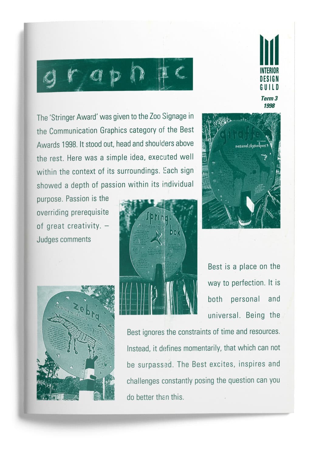
Dear Guild Members
Another year closer to the Millennium and you may wonder what are the predictions for design and colour going into the year 2000. The time just prior to a new century can be somewhat of a limbo. I listened to an influential woman from America, Hayson Hanan, who is a highly paid consultant to corporate companies. She predicts influences and movements for the future. Her feeling about colour was that blue would be strong allied to silver. Philippe Stark sees silver as representing creative acceleration.
At Designex last year the Colour Consultant, Jean Clements, who works internationally and for Wools of New Zealand prophesised blue as important in the year 2000, blue implying security and responsibility and we hope peace. For this year Jean felt the colours would be darker but with an overall emphasis on black and white. Brown would continue to be evident in rich and warm shades and true dark shades. For patterns in carpet and wool upholstery there was a strong influence from the extrovert Art Deco Age period and from the pioneering abstract artist Vasily Kandinsky, generally regarded as the father of abstract painting. He explored the interaction of lines with banks of colour to create dynamic rhythms with colour. And of course he was a teacher at the famous Bauhaus School in Germany at the end of the First World War. Jean stated that research has shown 60% of the acceptance or rejection of a product relates to its colour. She stressed again the importance of texture.
For Christmas, this year, I went to Australia. Of course I go to Australia each year with the Interior Design Tour and usually to Designex. This was a holiday, and to an area, I had not visited before, on the coast between Sydney and Melbourne, an area very different to other parts of Australia. I love the red heart of Australia and the sparse lightness of the Australian bush, but this coast line once had massive native cedar rain forest, which were denuded for export, as were our kauri forests. The countryside is more lush and settled by English farmers or landowners it has many exotic trees and green fields. The beaches are numerous and varied, a mixture of surf and gentle waters and mostly not over crowded.
I have two sisters who live in different small towns, one owns a boutique bookshop and other is a librarian and historian for the Australian Navy based at Jervis Bay. It is an historic old complex of buildings crusted round the Bay. The water is so clear, a brilliant turquoise near the shore, changing to deep lapis lazuli further out. In the treed grounds and on the naval base golf course, kangaroos bound about freely, not worried at all by humans. Colourful birds call raucously from the treetops. Australian and New Zealand birds are so different. New Zealand Natives are generally darkly or quietly plumaged and sing musically, whereas their Australian counterparts are brilliantly coloured, much larger and call raucously to each other. I guess we could liken the two nations to their birdlife.
Coming from a large family and now with numerous younger generations added, Christmas dinner has always been rather crowed and chaotic. This year it was a late leisurely lunch that drifted into the evening, on a shaded balcony among tree tops, uninvited guests being colourful birds that with their glorious colours added a true festive note.
One of the highlights of my stay there was a visit to Bundanon, the property that the greatest living Australian artist Arthur Boyd gifted to the nation. I have loved his paintings ever since I first saw them on an early trip to Australia. The mixture of beauty and whimsy in his work, sometimes a little surreal and always with a subtle message, struck a chord for me. One of the series he painted, that had particular appeal, were his depictions of the half-caste being married off. The half-caste, as happened in so many countries in earlier times, particularly India under the English Raj, despised by both races.
The house, he donated, set in acres of land near the Shoal Haven River is very simple Early Georgian in style but with Australian verandahs shading the sun from the upper level balcony and making a deep terrace on the ground floor. It stands among tall and spreading trees in a grassy field that slopes down to a small lake. Behind are vine covered courtyards. Interestingly, as with a lot of early Australian homes in the country, the kitchen was across the courtyard and still is — a fire precaution in times past.
The house is comfortable and lived in and visitors are invited to sit down and enjoy the atmosphere and the art. For not only does it have Arthur Boyd’s work but is a repository for work by all his talented family, including sculptors, potters, writers, musicians, architects — a family of amazing skills. The contents as well as the house have been left to the nation.
Regretfully Arthur Boyd was in Melbourne, so we did not see him. When he is home he always pops round a doorway and says hello. He is in his eighties, a short man with round apply cheeks and a delightful smile and a quick wit. In his studio, which was reached through a wisteria covered walkway, you really felt his presence, half-finished canvas on easels, tubes of paint, palettes squiggled with oils.
Arthur Boyd has donated the land, the house and all the arts, both his and his families to the Australian people. It took some years before the gift was accepted and it might not have been if Paul Keating had not been Prime Minister. He negotiated a million dollar grant so it could continue into the future. Now at certain times it is open to visitors, has special art functions held their and is also a centre for “Artists in Residence” although they live on the adjoining property once owned by Sir Sydney Nolon, a great friend of Boyds. There are plans, and the model was on display, of a new arts building on some of the land and the great architect Glen Murcutt has designed this. Glen Murcutt won the equivalent of the Nobel Prize for World Architecture. The new centre has all the lightness and beauty typical of Murcutt’s designs.
Talking of Glen Murcutt on last year’s Interior Design Tour we visited a lyrically beautiful work of Glen Murcutt. It was an addition to an historically restored Victorian House, or rather Mansion. It sounds utterly incongruous but he achieved a harmonious combination. Its deeply curved roof soars over a glass fronted facade, looking over olene trees to a valley and hills. The whole front can open up lifting its glass to the sky electronically controlled. Inside it is elegant, beautiful, restrained, the interior done with the help of Frank Gull who people on earlier trips met and realised how talented he is. He has used the green greys of the trees and floated them inside.
The whole visit was a total experience and very special. As well as the charming owner, we were met by the butler and given morning tea in the Victorian Reception Room, silver service and friendly maids in black with embroidered white aprons. After tea and coffee we sat down, and the owner talked about the history of the old house and her decision to keep the Victorian part as historical and for entertaining but build an addition they could live in as a family. She told us of her research to find the right architect. Firstly she asked I.M. Pei the Chinese/American architect of great note, but he had to say “No” as he had just been asked to do the new entrance and foyers for the Louvre Gallery in Paris, the crystal caves. She is delighted with Murcutt’s solution.
Then we were personally escorted through both houses and the gardens. I really should not say both houses, for they are unbelievingly united aesthetically as well as practically. It certainly was one of the most memorable of our now twenty years of Interior Design Tour visits.
Returning to Blue for the year 2000, an exhibition of Yves Klein was on, in Sydney in 1998 while I was there, and Klein, a French artist, paints largely in blue, a deep brilliant blue and to celebrate his work, which was exhibited at the Contemporary Gallery across from the Opera House, for the Sydney Festival opening they bathed the Opera House in blue light — an ethereal experience.
Nanette
Dear Guild Members
After a visit to Wellington earlier this year for the opening of the Wellington Arts Festival, once again the contrast between Auckland and Wellington, as cities to experience and enjoy, makes one feel desolate for Auckland. There are probably many reasons for this. Auckland has too many divisions — Manukau, West Auckland, North Shore etc as well as Auckland City, to achieve cohesive planning. Others say our warm climate and great boating harbour take precedence over the city — not that as yet the city expands to the harbour. There is no waterfront to enjoy as in Wellington. We have had Mayors and Councils more interested in building monuments, Aotea Centre — an ugly “bun” in the city, Britomart a large scale disaster about to happen — or is it? No caring for the city’s soul.
Earlier this year the classes revisited a studio/ apartment close to the city that the Interior Design Guild visited four years ago. In 1994 the new innovatively designed bathroom, had a spa bath just installed, but not able to be used because of Auckland’s water shortage. This year the spectacular view from the deck of the city and sky tower was completely dimmed because of the inner city power crisis!
Auckland has no centre, no heart — there is no public attractive space. Aotea Square is unloved except by skateboarders, Downtown Square is cold, deserted and windblown, the approach to the city from the Eastern Suburbs is a strip of petrol stations, McDonald’s and K.F.C. Buildings are being demolished, as they were earlier, before final resort consent is achieved. Regretfully, the Stables, an historic area behind Symonds Street and a haven for artists is to be sold not rejuvenated. We still have the gaping holes from demolishing historic Browns Mill and the beautiful corner building on Chancery Street — both now car parks.
This year the Council Elections are to be held. It is an opportunity for change. The role of the Mayor, or Mayors is pivotal but there is need for a supportive council. The priority considerations for Auckland are traffic, sewerage and water but we have to recognise the cultural significance of the city — take Bilboa and the new Guggenheim Museum designed by Frank Gehry and what it has done for that city.
I do hope Guild members, who make up a group of hopefully influential intelligent women will take an interest and go and hear all the candidates speak and get behind whoever they believe is going to be best for Auckland — not just let our chance for change slide past and then complain afterwards. This is such a general fault of New Zealanders.
The experience of the Festival was a rich one. A group of us stayed at the Museum Hotel de Wheels opposite Te Papa Museum. There were varying opinions among the group but generally we felt Te Papa was great. Each day we were in Wellington we were there for some part of the day and It did begin to feel like home, even to having a friendly money machine in the entry. We really appreciated how Te Papa appealed to so many people, who do not ordinarily visit museums and how happy and relaxed they were, as well as to the museum educated person. To make Wellington a holiday destination is something everyone should consider, especially today with the low N.Z. Dollar.
At the end of April another group of us went to Sydney to see Designex. Again, this year, with poor planning, Designex coincided with the Home-ideas-Artex show in Auckland. It is a much more sophisticated version of the New Zealand show and alternates between Melbourne and Sydney. This year I appreciate the Designers Pavilion lifted the standard of Auckland’s show and that the displays by the designers were challenging.
Last year on our annual Australian Interior Design Tour we met a very talented young architect/designer, Scott Weston, who had won a commission to redesign an old terrace house into a Boutique Hotel. The project was half way through when we saw it, but hearing Scott talk and seeing a model made us decide we would like to stay there. It had only just opened before Designex so we felt quite like design pioneers.
We loved it, each time we returned we got a real “buzz” Irom the design of the Medusa. It was an old villa in Darlinghurst Road in the centre of the restaurant area. Painted a rich red with deep blue railings it stood out in the busy street. While we were there a Sasanqua Camellia in full bloom had petals the colour of the walls falling on the ground.
The planning of the rooms and the use of colour was so creative, the bathroom and the minimum kitchen facilities were within a cube within the elegant old rooms, with their fireplace and ornate plaster ceiling. The foyer with a brilliant pure red carpet had clear pale pink walls with “wait for it” flower rosettes under the paint — enchanting, a sculptural fabric chandelier poised overhead.
Just verified, it has been organised that Scott will come over to New Zealand at the end of July and talk about his concepts for design. This will be a gala occasion with Scott Weston giving a presentation, choreographed to music, of his work. Scott has an extremely outgoing, witty personality. I am sure all the Guild will come and delight in it.
Designex itself was valuable although a great disappointment was the cancellation of the Keynote speaker Dr Alessi, head of that great Italian company Alessi and also that of an important Spanish architect. It is the Seminars given by important overseas and Australian architects and designers, which to me are the highlight of Designex. However other interesting speakers helped to compensate.
We were particularly impressed with one stand at Designex, the Abet Laminati stand for its originality and wit. When we learnt it was done by Scott Weston and had won the “Best Designed Stand Award” we were quite elated. Scott also won the second best stand as well — so you can realise his talent.
We visited two great new restaurants the M.G. Restaurant where among innovative design you can have a delectable meal and buy an M.G. sports car at the same time! Andrew Pair, of Melbourne, was the designer and he is a talented young man, who has been very good to us on the Australian tours. The design is challenging, the toilets an experience, almost a factory or assembly mood but glamorous and scintillating at the same time. The other was the Boathouse in Glebe. It is an old boathouse with water on three sides and murals on the walls, painted by that talented whimsical and witty New Zealand artist, Jenny Dalzeil. And the food was good — owned and run by the Bayswater Brassiere team, an old established restaurant in Kings Cross. Two of the group came back from Sydney with a “plastic fantastic” from an interesting store West Eight in Woolloomooloo. Multi-functioned it can be a stool, a chair, a light or a table base. As was commented by Anna Miles “It doesn’t take a genius to conceive great designs but if you’re a great designer with an ingenious ability to come up with extraordinary ideas anything is possible”. It was designed by that darling of English design Tom Dixon.
This maverick designer now has an important role as designer — director for Conran’s Habitat. Dixon was here in Auckland recently as keynote speaker at the “Persuasive Object” Conference, and despite having flown direct from the Milan Fair and looking a little jaded he was challenging to listen to. One of his other designs you may be familiar with is his slinky S-Chair which Tricia Guild frequently displays in her books.
Winter is a time to enjoy visits to Galleries and a catch up with “Culture”. An absolute must is Anne Robinson’s glass “Casting Light” Exhibition at the new gallery.
Nanette
Dear Guild Members
The thought that this is the last newsletter for 1998 is quite frightening — the speed with which this year has passed! One more year before the millennium. Just recently the Best Design Awards were presented with a gala dinner at newly refurbished Town Hall. There was little publicity, unfortunately, in the newspapers or television. What impressed me in the Best Award Book was the definition of Best “Best is a place on the way to perfection. It is both personal and universal. Being the Best ignores the constraints of time and resources. Instead, it defines momentarily, that which can not be surpassed. The Best excites, inspires and challenges constantly, posing the question can you do better than this?” I think we could all remember this when we approach any project.
In the Interior Design Section judged by Architects Richard Priest and Clark Gascoigne and Interior Designers Neville Parker of Inscape Design and Clare Athfield. I am sure Brenda would be too modest to announce her son-in-law Malcolm Taylor of Site Architecture won the Interior Design Section with the interior of her and Eddies boat “Tenei Ra” (Maori for “this day or this sun”). It was a beautifully presented entry and the boat interior which featured in Home and Building April/May 1998 was superb. In the citation it said “the winner displayed a wonderful balance of function and aesthetics, with exemplary attention to detail”. Having been fortunate enough to sail on the boat I would completely agree, especially the workings and the appearance of the “galley” and “heads” both of which require minute planning. Of course Malcolm, with all his talent had a perfect client! As was stated “if you want to strive for great results you must fly with the eagles, not work with turkeys”. In the beginning the designer of the hull, who was really still in the eighties as far as boat interiors and material use go, was very sceptical of Malcolm’s ideas but became completely converted by the end of the project.
The product Section was won by Fisher and Paykel with their new “Dishdrawer” dishwasher. The second year students are studying kitchens at the moment and asking anyone who has installed one the answer certainly is that they are very pleased with the versatility of it and its high performance, as well as its sleek good looks and styling. It comes in a white finish and in a stainless steel, and it can be integrated with other cabinetry. The company have taken a world patent on it and see it as a product with wide demand — I do hope it proves to be so.
A place I have always enjoyed, and frequently taken my children when they were young, and more latterly children of my friends as I do not have any grandchildren, is the Zoo. Recently with the new open areas for elephants and monkeys and other African animals, so that now they can be comparatively free, the large and lovely bird atrium or netted bird pavilion, where one walks slowly among the native birds, with only a fine netting between you and them, the Zoo has become a delight. It was always beautifully set in its gully shaded by mature trees and punctured with pools and lakes. So it was great to see that Peter Haythornthwaite had won the Best of Graphic Design for the “Pridelands Signage” such an imaginative and creative approach, as the judges said “Each sign showed a depth of passion within its individual purpose. Passion is the over-siding prerequisite of great creativity”. The signs are witty too.
Mike Thorburn of ECC won a well-deserved award for Design-Led Business.
The heading ECC Lighting — Design’s Beacon. Mike has always supported design and designers, he has used the best architects and designers to fit out his showrooms, he has always considered brochures and advertising important design exercises, not to mention his windows that people travel specially to see when there is a change. He has commissioned artist, Tracey Collins, to do them and they are indeed a work of art and challenging. even some a little outrageous. For any design occasion he is always willing to have his showroom the base for one of his legendary parties. And in the last two years he has expanded beyond lighting and added very well designed Italian furniture. But ECC is best known for its range of beautiful designer light fittings many carrying names of great designers such as Philippe Starck, Richard Sapper, Fornasetti, Ingo Maurer, Michel de Lucchi and others. Mike has been great to the classes over the years and I know he appreciates their patronage too.
A company I had not personally heard of, Sandeli, won an award for Graphic Brand Development. Sandeli are a new company who produce gourmet deli-fresh sandwiches handmade with natural foods and packaged most beautifully in all paper recyclable wrapping. After I heard of them I rushed to Greenlane for my lunch and was impressed. As well as takeaway sandwiches and other food — nothing cooked, one can sit down and have coffee and a sandwich in a simply but attractively designed room with today’s newspapers hung up to read. They have just opened a new Sandeli on the corner of Customs and Albert Sts in the City. But full marks Jor a new company appreciating the importance of design.
The whole promotion of the awards, the Best book that was produced, the Award Dinner and evening, everyone felt were of a very high standard.
Bill Balston interviewed the two companies behind the Best Promotion, Design Works and Maxim Group. I am sure many of you have been enjoying BackChat on television with Bill Ralston. I think it was, as it has finished for 1998, a most interesting one and a half hours viewing. It covered politics, topical matters, the arts and architecture with Bill’s laconic and witty yet intelligent and discerning interviews. It was particularly good to include architecture, an often neglected aspect of the arts. I do hope it returns next year. Anyone who appreciated it should write in and say so.
Having mentioned the new dish drawer I will briefly return to the kitchen. There has been a definite move away from integrating appliances and giving the kitchen a bland wardrobe appearance. Appliances are so well designed we are pleased to show them. Also we want the kitchen to express that it is about a joy, we hope, in the preparation, cooking, serving and eating of food. Appliances are now pieces of furniture to be proud of, range hoods no longer slip out from under cupboards, they are proclaiming themselves almost as pieces of sculpture. Stoves are standing on legs, refrigerators can have curved fronts reminiscent of the sixties Retro style and can come in brilliant colours as well as stainless steel. Stainless steel in appliances is not here as a passing fashion but as a style to stay. The beauty of stainless steel is that it fits into a kitchen with any colour or a timber finish, whereas white appliances really only work with a white kitchen — in other kitchens they stand out and there is very little demand for black. Stainless steel is timeless, strong and long lasting as well as good looking. Maybe it takes a little polishing to keep it gleaming but on vertical surfaces is simpler than horizontal.
Another material that has become a feature on kitchen vertical surfaces is glass. The 1998 Kitchen of the Year had special clear toughened glass with a baked paint finish behind it. The result was stunning and easy maintenance. Glass is becoming big news in bathrooms for vanity units and basins in sculptural shapes. Pilkingtons also have a Decorpane Design Range with interesting effects.
City council elections are looming close I do hope everyone will vote and not be apathetic, go to a few meetings to hear different points of view. Some of us were at a breakfast meeting a few weeks ago and felt very heartened when three vital and strong women appeared together, Christine Fletcher for Mayor, lawyer Victoria Carter f or Council and architect Amanda Reynolds for Council. My hope for the end of the year and into the millennium is that we have an Auckland City Council with a new face and a new care for the city.
Nanette
1999
Term 1

Term 2

Term 3

Dear Guild Members
1999 — A special year and I guess we should all feel privileged to see the advent of a new millennium, regardless of arguments when it actually occurs. The emotion of the change from 1999 to 2000 Is the important timing. We are hoping all the Guild will make it a highlight year. Obviously actually seeing the New Year in, is a family or close friend occasion, but we want the whole of this year to be met with enthusiasm from members as great things are planned.
As you know I am always eager to exhort the achievements of women and this time it is to countrywomen. After Christmas a small group of us headed for Martinborough, an area of New Zealand known for its wine and music festivals. But this was not our goal, it was to do the Tora Walk, a three day walk over farmland close to the Wairarapa’s rugged coastline. Farming in many parts of New Zealand has become marginal and Martinborough, great for grape-growing, can be difficult for cattle and sheep. An innovative farmer’s wife conceived the scheme, with two other women and it would make use of their old shearers quarters. They hoped the walk would bring in some needed cash f low. Initially the husbands were supportive but a little doubtful. Now they have seen how successful it is they are definitely involved.
Having heard good reports of the walk beforehand it greatly exceeded my expectations and I can recommend it as long as you are prepared to share sleeping quarters. No problem we found. The walk is very civilised, you only carry what you need for the day, your lunch, water bottles etc., the rest is taken by truck to the next nights stay, along with your wine, which is put in the refrigerator to chill for dinner.
We started in the early evening at the first farm, depositing our gear in simple but pleasant quarters. Our hosts invited us in for a glass of Martinborough wine to meet the fellow walkers and then a barbecue. An early start on the route by 8.00am next morning with Diana giving us some history of the area for the first leg. The walk was over hilly farmland with great expansive views, a six hour walk. On one side we could see the Wind Farm, the windmills or rather wind machines looking very sculptural and elegant turning against the skyline. We were very pleased to have the Wairarapa winds to keep us cool as we trudged up steep hillsides. Our next night was in an old cottage close to the sea but set among bush. Here delicious food was prepared. All we had to do was warm it up and serve it. Many areas of the coast are too wild to swim but that beach you could bathe. However the water was so icy two strokes were all the bravest made. A walk along the beach under the silvery path of the full moon completed our day.
We followed the coastline to the next farm, the sea on one side, the hills on the other, a sea breeze to counteract the summer sun — a gentler day. Our last night, which was New Year’s Eve, was again in old shearers quarters sharing a true old bunk room. Our delightful hosts had us for dinner, a gourmet meal, in their home. No restaurant in Auckland could do better, fresh crayfish and perfectly cooked fish straight out of the sea, a New Year celebration. We had an interesting talk about the problems of farming today. The Barghs are farming Merino sheep, which are suited to the dry hilly area, but wool prices are very low. Their family had farmed there for generations but that might become a thing of the past. They had hoped the new interest of the Italians in fine quality Merino wool for fashion might add to their incomes. The success of the Tora Walk has really assisted the family’s finances. Our last day was over farmland and through bush — a commanding 360º views for those fit enough to climb to the top of the highest peak. Some of us settled for the less dramatic vista from a lower ridge. And we were back to our first stop to collect our cars and go to the old Martinborough Hotel for refreshments.
Martinborough is a charming small town and we had two delightful home stays, again impressed with the vital, interesting women we met at both homes.
While we were in the area, we drove out to Wharekauhau, the newly opened lodge near Palliser Bay, the seals and the famous romantic lighthouse of Palliser Bay. There had been a lodge there run by Bill and Annette Shaw for seventeen years but they decided it needed enlarging and redesigning. They called on designer Virginia Fisher, architect Fred von Brandenburg and landscape designer and hands on gardener, Sue Turley. Together they have achieved a “tour de force”. Modelled on the successful lines of Huka Lodge and Millbrook, the sleeping chalets are separate to the main entertaining and dining areas. The style is inspired by country manor houses of early this century and inside there is a strong Arts and Crafts influence. The house sits securely and comfortably against the backdrop of the hills, the wild and rugged coast stretching out in front. A wildlife pond is gradually being replanted and more and more birdlife keeps arriving.
Reflecting the golden beiges of the surrounding tussock grass, Virginia has keyed her colours, both inside and outside, to these. The homestead is luxurious but in no way formal and one is welcomed as part of the family, the staff daytime dress is moleskin and polo shirts.
Sue Turley was given the daunting challenge to plan and make a garden on this windblown coastline, but she has used the native cabbage trees, tussock grass and dark river pebbles to keep a natural look in front. Behind she has created a more sheltered courtyard for relaxing and dining, and more formally laid out. An early decision of Sue’s was to build an extensive herb garden — a delight to look at and great for the chef. Backed by old trees, the courtyard entices one to sit, maybe drink a glass of Martinborough wine and listen to the liquid notes of the bellbirds and tuis. Known for her ability to create interiors with atmosphere and beauty, Virginia has excelled herself here. Her eye for detail and her skill in choosing just that right accessory, often a surprise note, is evident throughout, the detailing of the brick and stone work a feature. The Grand Hall, warm and reminiscent of the hall of the early large Wairarapa homesteads, is transformed at night with candlelight.
Victoria, a member of the Shaw family and most charming took us round the Lodge and gave us a preview of the as yet unfinished Conference Room — a dramatic note after the soft dune colours of downstairs, this room is brilliantly red. Only the walls and the polished stainless steel fireplace are there, the rest of the room still a surprise. Victoria says she knows it will be memorable. Victoria also said any Guild Member, who rang beforehand, would be welcome to have a tour of Wharekauhau. I cannot finish without saying how much Brenda with her vitality, spontaneity, warmth, sense of fun and love of colour and design, has contributed to the Guild, in the years she has been president. She has been as enjoyable and easy to work with, I am sure I speak for all the Committee. The Guild has certainly grown and developed under her leadership. The good news is we won’t lose her, she will stay on the Committee and we have Janet to give a warm welcome to.
Every Millennium Wish
Nanette
Dear Guild Members
Colour! Colour! Colour! That is the theme for the second half of 1999, whether it be colour brilliant, colour rich or colour subtle allowing for texture to predominate. Aalto Country Colours are well appreciated by the Guild, for the depth and beauty of their paint colours. When one sees the numerous trials, both organic and inorganic, that go into making each colour, one realises just how this depth is achieved, and why Aalto colours mix with so many other shades and tones of colour. Joining the staff this year is Melanie Yonge, a graduate architect and a young woman who is passionate about colour. As a student of architecture, she worked part time at Aalto and on completing her degree became their Colour Advisor. Late last year she went to a Colour Conference in Norway and after that, studied Le Corbusier colours in Paris. On first hearing this I was surprised, as like many of us, I had associated Le Corbusier with plain white walls, the essence of the modern style. However, he was a great colourist and developed his own palette of colours, which he used in many of his buildings. Melanie has researched these in depth. I have seen Le Corbusier’s colour palette and was so impressed with the actual colours and his system for using them.
After Paris, Melanie went to Vienna and was involved in a Colour Symposium and Exhibition. Based on this Symposium, Melanie with Rhoda Fowler of the Fisher Gallery, is creating an exhibition on colours “Light Labyrinth”, a 1999 Guild sponsored exhibition and we do hope that this exciting pre-millennium exhibition will be strongly supported by the Guild. Colour is so vital in all our lives. As Johannes Itten, famous painter, philosopher and teacher at the Bauhaus stated “Colour is life, for a world without colour is to us dead. Only those who love colour are admitted to its beauty and eminent presence.” This exhibition will be a unique experience involving audience participation.
Also Melanie is the guest speaker at the annual Guild Mid-Winter Lunch. This is only a few days after her return from Paris and a further visit and study at the Le Corbusier Institute. She is the most charming and focused young woman and will keep you enthralled.
Going back to the beginning of the nineteenth century, the German poet and writer Goethe who also formulated colour theories stated “People of refinement have a disinclination to colours. This may be owing partly to weakness of sight, partly to the uncertainty of taste which readily takes refuge in absolute negation. Women now appear universally in white and men in black”. His observations are applicable today except that at any meeting of Western architects or designers, almost everyone is in black (women having given up white for obvious reasons). The principle of absolute negation applies to much of their output, white relieved by a little black and the colour texture of natural materials, with here and there a primary hue or two. Many people are scared to go further than this for fear of being thought of as frivolous or stale Post Modern.
However, throughout the history of architecture colour applied to buildings has been normal and not extraordinary. The ancient Greek temples were highly coloured, even though we find it difficult to accept that these now white buildings, and classic to our eyes, should be restored to their former polychromatic glory.
There appeared an appreciation of natural materials in architecture and a distrust of applied colour. Le Corbusier wanted to return colour to architecture after it had been purged by a reaction against “bourgeoise taste” in the twenties. He wanted to offer a system of standard architectural colours which were blue, in three or four values, red or pink, pale or dark green, yellows of the ochre of the earth and of course white. These, he said, could be found in the colours of buildings in all civilisations and folklore. Corbusier selected his tints from ranges commonly available from colourmen, who had been making these pigments in roughly the same way since the time of the ancients.
In the pre-war period Corbusier used colour to emphasise the nature of walls as planes, to emphasise the spatial and formed qualities of space and form. As we all appreciate, blue and its green combinations create space — distances the wall — remove its quality of solidity. Bed (and its known orange combinations) fixes the wall, affirms its exact position, its presence. Colours have their psychological effects “to blue are attached subjective sensations of softness, calm of water landscapes, sea or sky. To red are attached sensations of force, of violence. Blue acts on the body as a calmative, red as a stimulant. According to Hebrew traditions, man’s first name, Adam, stands for “red” and “living”.
After the war Le Corbusier altered his approach to colour, retaining his previous palette but adding to it, making colour symbolic or didactive as he did in his famous Rouchamp Chapel and in the Villa Savage and La Roche. Using colour and light as tools Le Corbusier guides the visitor through, articulating an architectural promenade. Depending on the time of day and the manipulation of direct and back lighting, different parts of the building are illuminated with colours of serious intensities. His designs are thought through in colour from the start. He believes there are reasons for polychromy. There has been a renewed surge of interest and appreciation of Le Corbusier talents, architect, artist, furniture designer, city planner and just latterly colour theorist. Not that Melanie, in her talk at the Mid-Winter Lunch, is concentrating only on Le Corbusier but she will show us slides of the Colour Exhibitions in Norway and Vienna, and I am confident these will inspire you all to visit the Light Labyrinth Exhibition in September.
A small group of us are visiting London, Glasgow, Amsterdam, Paris and Bilboa, a Design Tour. Melanie has been very helpful to us for our Paris leg and we plan to see Corbusier buildings and his use of colour.
I will finish with a final quote from Le Corbusier, “Colour expresses life. We can all be actors in this part.”
Nanette
Dear Guild Members
There is no doubt you will know the theme of this newsletter — Our very rich and rewarding trip to Europe in June. Masterminded by Bev Smaill, and assisted by myself and Jacqui, it was certainly a tour with a strong design and architectural thrust but also geared for fun and enjoyment. Originally eight but finally nine, we left New Zealand on a non-stop flight to London, only a few hours in Singapore. Arriving at London’s Heathrow Airport at 6.00am we collected our luggage which was meant to be light and easily managed! We caught a train to Victoria Station, luggage in tow. As we were so early we were not sure our rooms would be ready, so decided to organise our underground passes for the week. Lining up tired and rather scruffy, not an ideal time for a glamourous photograph, we entered the selftake booth one after the other and got our passes. They proved to be invaluable and we certainly got our money’s worth. We did doubt one of the group’s photographs would pass, she made such a premeditated grimace but it did.
Our accommodation was in the Nell Gwynne Hotel, wonderfully situated between the Kings Road and the South Kensington Tube Station, and inexpensive for London but not very efficiently run. London, so much to see and such a large city and an expensive one. For years I had had no desire to return but latterly it has been revitalised and become a humming centre for design and fashion. Our first morning we browsed along Kings Road, had lunch at Conran’s Blue Bird Restaurant, well the casual part of it. The main restaurant is Conran designed. It is upstairs, cool, spacious, interesting art and furniture. Some had dinner there later. A visit to the Ideal Home Show followed — as with all Home Shows some very good and some very bad, then to photographer David Bailey’s retrospective exhibition at the Barbican Art Gallery “Birth of the Cool”. For most of us it was very nostalgic, all the sixties and seventies celebrities including the Beatles. Jean Shrimpton was his star, from her early modelling days to her mature, and still beautiful, years. A full day after such a long flight. Following days saw us visit the Victoria and Albert Museum, always rich in its displays, the Conran Design Museum, on the Thames in an old building and near the Tower Bridge. Here we were lucky to coincide with the most amazing exhibition, “Light and Colour” by Danish architect and designer Verner Panton. Not expecting it, to walk into this brilliant explosion of colour, a spectacular trip through the colour spectrum, was a memorable experience. He did a great deal of designing in the sixties and his palette had all the intensity of that decade. Few designers have been as fearless, creative or provocative as Verner Panton in the interiors he created, the furniture, lighting and textiles he designed. Anyone visiting London should not miss the Design Museum.
Of course we visited the beautiful boutiques. Donna Karan, the most simple, elegant environment to show off their clothes, art forms In themselves. A sculptural limestone staircase, not curved but perfectly angled rose beside a subtle gold leaf wall with silver overtones. The designer was and he did the Louis Vuitton boutique next door. This was quite different with pale and dark timbers and on our visit, arrangements of agapanthus in vases of differently shaped cubes but only one or two heads, their stems tied and placed at different angles in the vases, hard to describe without a sketch, which I did do.
Further down Bond Street was the newly opened Ralph Lauren boutique, a large store on several levels, the basement all about sport and casual lifestyle clothes. The designer for this elegant store was Thierry Despont who also designed some of the Getty interior and Bill Gates’ new house The design was based on the great French cruise liners of the late twenties, the Normandie and the Ile de France. It was rich, timbered and balanced, a feeling of the most elegant of the Art Deco style with some modern pieces. The women’s shoe department was eclectic with very contemporary furniture. Regretfully, photographs are not allowed to be taken. Liberty’s, that famous store started in the 1870s and I remembered vividly, seemed a little claustrophobic today.
Eltham Palace was a very recently opened and not quite completed house designed in the thirties by a member of the rich Courtauld family. Stephen Courtauld was a bachelor until he was fifty when, on a mountaineering trip in Europe, he met and married on exotic Hungarian-Italian countess, who had a small snake tattooed above her ankle and a pet ring-tailed lemur, who had her own quarters.
They built the house with all the elegance of the Art Deco at its greatest. The large entry hall had black bean panelling with marquetry panels and a dramatic glass-domed ceiling. An oval rug in brown and cream had white furniture setting on it with vases by Lalique on the elegant tables against the panelling. As in true Art Deco style, the bathrooms were beautiful, one with an oval marble bath set into an alcove whose walls were covered with real gold mosaics, a statue of Aphrodite standing on the marble plinth holding the gold taps.
During the war they had to cut their servants from eleven to two and they themselves were very involved in the war effort but did not live in the house after the war. There followed a varied history and in 1995 it came under the Historic Places Trust and is being slowly and carefully restored to its former glory, evoking the elegance of the period and the truly exotic lifestyle of the owners.
Two highlights of our stay in London were a visit to Lloyds of London designed by Sir Richard Rogers in the early eighties, but one of the great buildings of the century, even if Prince Charles thinks it should have been built as an eighteenth century replica in brick and tile instead of a gleaming stainless steel multifaceted machine. The other was a visit to the penthouse apartment of a partner in the Richard Rogers practice, John Young. As you would expect from an architect In that firm, it was very High Tech and industrial but so exciting at the top of a building the firm had renovated on an interesting bend in the Thames River. It was dramatic and daring in its use of space and materials — no one in New Zealand would even be given a permit for this design with our ridiculous regulating rules. We felt very privileged to meet someone so important, talented and charming and have the opportunity to see his glittering metal apartment with a bathroom where you bathed looking down on the Thames, the stars above you.
We had an appointment at the studio of designer Ron Arad in Chalk Farm after we had lunched at the Belgo Restaurant owned by a Belgian, the interior designed by Ron Arad in his individual but hard-edged style. We were told most probably Ron Arad would not be available as he was involved with a student design exhibition but to our delight he walked in with one of his amazing caps on his head He personally signed the just recently published book on his work for those that bought one. It was exciting for us to meet this internationally famous designer In London we were aware of a strong influence in hotel and other design of a mood of simplicity, tranquillity, use of natural materials, almost a Zen-like approach and a mood that engages all the senses; smell, sound, touch, as well as sight.
Certainly the beautiful and minimal Hempel Hotel is based on these principles but also bringing in luxury. Anouska Hempel designed and operates the hotel She is already well-known for Blakes Boutique Hotel and other design projects including her own homes. The exterior belies the interior, a series of Georgian facades with an understated entrance. A small foyer is a first introduction, all white, water and a table with a composed arrangement of white moth orchids. This leads into a long, spacious Zen-like empty main foyer with a simple stone counter in the middle, a fireplace, low and horizontal, f lames moving, at each end, with a sunken seating in front. On the tables low black bowls of water. The elements of earth, air, fire and water, the stone floors bringing in the earth, were united. The relaxing horizontal line is rhythmically repeated throughout the hotel. We were taken through all the public rooms but as the hotel was completely full we could not see any bedrooms. However we were given an elegant brochure that showed us their very calm, composed rooms with sculptural bathrooms either black or white The dining room was again the essence of elegance and simplicity, a Japanese atmosphere. Those of us who dined there later all agreed it was a memorable experience, a slow enjoyment of delicious food, exquisitely served.
At the end of our afternoon visit we had afternoon tea in the library Unexpectedly the calm atmosphere was disturbed. A very young waiter dropped the tray and smashed all the service! However another tray quickly replaced it. The garden square, which is part of the hotel, is a green oasis with long, still pools and white gravel paths. On a sunny morning you can have breakfast served in the garden.
We looked at the outside of Philippe Starck’s first hotel in London. It is now completed and is a veritable light labyrinth — the whole hotel based on changing coloured light.
We dined at a variety of restaurants, some more elaborate such as the Sugar Club run by a New Zealand chef, Peter Gordon of Pacific Rim Cuisine. Famous ouaglinos — very large but completely full. One of the simpler ones we really enjoyed was the Wagamama, which is described as a genius concept in canteen-style dining. Long wooden tables which everyone shares, Japanese-style noodles served in a variety of ways, very quick, efficient service, walls wood panelling and no embellishments. Mash was another, as they state ‘hovering between cool and cliche’ and bathrooms that are an experience in black glass.
Charleston, the house where the Bloomsbury Group lived their Bohemian lifestyle before and after the First World War was the home of Vanessa and Clive Bell and Duncan Grant and a constant flow of artists and writers. They painted the walls and furniture of the charming house and used many materials from the Omega Workshop, in which they were involved in the design and printing of these fabrics They were also artists of note and their work hangs in the Tate Gallery. We took a train to Lewes, where we were met by a minibus which took us to Charleston, the house set in a rambling country garden with a small lake. Lunch at a typical English country pub then to another nearby village across the downs, where Vanessa’s sister, author Virginia Wolfe, lived in a house called Monks House. It was in her studio, in the delightful garden, she wrote most of her books. They used to walk across the downs or ride bicycles to visit each other.
Late that afternoon we f lew to Glasgow, the city of Charles Bennie Mackintosh. Glasgow some years ago was the cultural city of Europe and in 1999 it is the European city for design. The whole year is devoted to design and in the main square of Glasgow hang huge transparent banners of the world’s great designers and each month an exhibition by a different architect or designer. While we were there Mies Van Der Bohe was the exhibitor and we saw models, photographs and videos about his architecture and furniture. We had a tour, a guide and a minibus booked for a complete day to see Mackintosh’s work. I have always admired greatly Mackintosh’s architecture and furniture but until my visit to Glasgow I did not appreciate what a genius he was and how advanced in his concepts for the time. Our tour included his most famous building, the Glasgow School of Art, a school and a church. The padre of the church was an ardent admirer of Mackintosh and gave us a moving talk on the symbolism Mackintosh had used in the church based on the St Matthews parable of sowing seed, some falling on fertile ground, some falling on stoney ground etc. The church supplied us with a simple but delicious lunch and a glass of good wine. Hill House was also on out itinerary and it is a famous house, built out of Glasgow for the well-known publisher A.M. Blackie, completed by Mackintosh, including the furniture and even down to the keys and keyholes. Every fireplace Mackintosh designs is different but all are beautiful. Afternoon tea in the famous Willow Tearooms.
Margaret and Charles’ first apartment, that they designed together, has been rebuilt with exactly the same aspect In the University Art Gallery. Its stylish simplicity, mauve grey wall to wall carpet when everyone had strong patterns, white muslin curtains to let the sunlight filter in when heavy furled drapes were the usual, white walls and furniture, in 1900 were little short of revolutionary. The Lighthouse, a newly restored Mackintosh building to be used for exhibitions, was behind schedule and due to be opened by the Queen two days after our departure.
In 1901 Mackintosh, along with Margaret his talented artist wife, entered a competition run by a German design magazine to design ‘A House For An Art Lover, a wonderful opportunity with no restraints. His entry was short of some interior perspectives and he didn’t win. In fact there was no first prize awarded but Mackintosh did win some prize. The plans have been admired by scholars and Mackintosh enthusiasts over the years and a group formed to build the house.
Now almost a hundred years after it was designed it stands completed. Set in heavily treed Bellahouston Park in its own garden, the ‘House For An Art Lover’ is simple, austere, beautiful, romantic.
The music room is one of the most lovely rooms I have ever seen. Three of the group who were in the room ahead of me said if only they had a camera ready to photograph my expression of surprised wonder and delight! Perfect proportions, a long room in dazzling white with round bow windows in which delicate silk banners were hung, designed by Margaret. A white piano, ornately decorated, balances a fireplace at the other end. White and silver with mauve and touches of rose pink are the colours used and the room has several groupings of tall white chairs, formally placed at the white lacquered tables. An Art lovers Cafe lives up to the standard of the house but is contemporary in its decor.
Mackintosh was famous early in his career in Glasgow and always greatly admired in Europe but discarded by Glaswegians after the war when Glasgow departed temporarily from its art loving status.
Regretfully Mackintosh died a somewhat unhappy and embittered man. I hope he is up in Heaven and now looking down on Glasgow and appreciating how his work is the artistic focus of the city. From Glasgow we went to Amsterdam and then Bilboa. The Guggenheim Museum in Bilboa, designed by architect Frank Gehry, in the Basque region of Spain was the visit that the tour was based on. All I will say now, until a later newsletter, is that however many glowing articles and glossy photographs we had seen, this gleaming, fluid yet dynamic titanium-covered building was greater than had ever been depicted. Paris, our last city, was as magical as always.
Have a very happy blue and silver millennium celebration.
Nanette
PS: Next year if you are looking for a delightful and educational day out at the end of September, join the Going West Books and Writers steam train trip from Auckland Railway Station to Helensville. The old coaches are comfortable, the hospitality, breakfast, delicious lunch, plentiful wine, stopping at different stations for book readings, music and book launching — a totally brilliant day.
2000
Term 1

Term 2

Term 3

Dear Guild Members
Recovered from the heavy rain that welcomed in the new millennium and blocked our Auckland’s fireworks, it is a joy to wish you all the very best for the year 2000. However, I personally felt, that it was less important that Auckland was shrouded in rain than for the sun not to have risen on the Chatham Islands, that first sunrise in the world for 2000. I am going to return to 1999 and continue the saga of our visit to Europe which was too much for one newsletter.
Arriving in Amsterdam from Glasgow in the late evening, our taxi took us to a narrow cobbled street, full of young people. On the Internet we had found this hotel with many rooms designed and painted by artists: Admittedly the hotel was quite near the infamous Red Light District of Amsterdam and maybe the street looked a little “seedy” late at night and a few in the group were concerned. A spark of insecurity can spread quite quickly into a blaze. It took all of Bev’s diplomacy to settle the doubters. Anyway, there was no chance of changing hotels — there was not a spare bed in Amsterdam. Next morning in the sunlight all fears were dispelled and we all enjoyed a typical Dutch style breakfast, cheeses, salamis, absolutely delicious warm bread and excellent coffee. In fact it took some willpower to stop eating the bread, obtained fresh from the bakery opposite.
The rooms were simple, three beds in a row with a table beside them, a white sheet, a white pillow and a folded white duvet, all spotless. Large windows at one end with a table and chairs and a bathroom at the other. We had an “artists room” with walls painted in vivid elongated bands of colour and curtains screen printed to match. A fluorescent sculpture on a wall was the main, not very successful source of light, but a challenging artwork!
The charm of Amsterdam with its dark watered canals running down the centre of the roads, its Van Gogh bridges and cafes spilling onto the pavement and over the canals. Beautiful brick and carved timber warehouses, converted into elegant apartments lined many streets. Sometimes through open shutters we could admire the interiors. It is a romantic city and as author Ian McEwan states “even the shop keepers look like professors and the street cleaners like musicians”.
We caught a train to the Van Gogh Museum, the new addition to the Museum just opened. It was interestingly designed by a Japanese architect. For New Zealanders, who cannot conceive that anybody from another country could design a building let alone a Museum for them, it may seem strange but Europe has a broader outlook and many architects from other countries design major buildings. The architect was Kisho Kurokawa noted, as are so many Japanese architects, for the simplicity and serenity of their designs. “Nuances in Grey” it has been called.
The original Museums was completed in 1973 and was designed by the Dutch architect Gerrit Rietveld and two associates and has all the straight lines and cube forms they believed in. Kurokawa’s new wing has respected the cube form but is crowned with an elliptical roofline and sunken pool separating the wings.
There was some thought, that the fact that a Japanese businessman who bought Van Gogh’s “Sunflowers” for millions and donated 35 million Dutch Guilders towards the Van Gogh new wing, influenced the decision of the architect. This is incorrect as the donor gave the money with no conditions. The Museum was very crowded, a large proportion of young people. Amsterdam is full of young lovers. In the Gallery many young couples entwined, as much interested in each other as the famous paintings. Some of us visited the Rijksmuseum and explored the modern architecture of Amsterdam while another group took a canal trip to orientate themselves and enjoy the old buildings. One of the modern buildings we visited was Fenzo Piano’s Maritime Museum.
We had hoped to dine that night beside a canal, the gleaming black waters reflecting the buildings and the lights. Somehow we ended up inside with a very inferior meal — you win some and lose some! To see the Bietveld-Schroederhuis (house) built in 1924, was one of our goals. This is in Utrecht and involved a ride in one of Holland’s smooth, fast trains. A tour of the house had been booked and this is essential. Built in 1924 it is a landmark in the history of architecture, an example of the De Stijl Movement, with its strict adherence to the straight line and cube form, using only the Mondrian colours of black, white, grey and the three primaries. We were amazed at its inventiveness, its flexibility. For such a small house rooms could be converted for dual use, screens pulled or slid, spaces changed. Mrs Schroeder was amazingly ahead of her time in her appreciation of such a revolutionary style. You walk down a long road of traditional Dutch houses and at the end is the simple cubist box, abhorred by the rest of the street. Once it looked out on green parklands, now a busy motorway runs above it. But the house over rides this crass intrusion.
While we were in Utrecht we visited the Minnaertgeboun University renowned for its more than cutting edge design. A roof that in some parts is intended to leak so that when it is raining openings in the ceiling allow water to gush down to an interior pond. This is part of a heat and cooling system. A row of cubicles lined in red, rather like compartments in a train, are heated for use by students in the winter. The Educatorium of the University was designed by Bem Koolhoos, that darling architect of his avant-garde disciples, an unconventional and dynamic figure in the world of architecture. It was designed to be a rendezvous, a centre of gravity for the University students.
A huge shell-like structure of cured laminated wood with a round window at one end — a skateboarder’s dream. The floor of the generous entrance plateau is sloped to act as a podium for the students. On both buildings the cafeterias were richly symbolic one almost “funky”.
Another day some of us caught an early train to Rotterdam, which was drastically destroyed in the war and subsequently rebuilt. The Square in the middle of the city is hard to describe, it brilliantly can cover so many activities. Regretfully we were there too early to see it all in action.
One of the treasures of travel are the unexpected events one finds. In Amsterdam there was a major exhibition of Frank Lloyd Wright’s work. It was a rich exhibition, including a brilliant scale model of the Johnson Wax Building and furniture I had not seen before. From Amsterdam we flew to Bilboa, arriving as usual late in the evening. We threw our bags into our rooms at the hotel and raced down the streets to catch our first sight of this so famous building. There it was, suddenly at the end of the street, a gleaming, fluid, rhythmical mass under the night sky. Introducing it was Jeff Koons “Puppy”, a giant sized sculpture of a dog covered in growing flowering plants. They change with the season. As it was early summer it was a riot of colour. The puppy has such a benign face — it was whimsical and enchanting standing at the front of the court leading to the Museum. The scale was so great people looked like pigmies beside it.
The concept of the Guggenheim arose because Bilboa’s wealth or economy had been based on ship building and with its demise they had to look elsewhere. The far sighted burghers of Bilboa decided that a major Art Gallery would restore their economy but it had to be great. So architect Frank Gehry was chosen, this found favour with the Guggenheim Foundation and so the project went ahead. Already it has more than paid for itself with the numbers that throng to it from all over the world. Thomas Kreuss the Director kept pushing Gehry, he wanted another great building to equal or surpass the innovation of Frank Lloyd Wright’s New York Guggenheim and he certainly achieved it. So much has been said and written about Bilboa’s Guggenheim by writers and architects of much greater eloquence than l, that I hesitate to describe it. It changes with the time of day, the light and the weather. The titanium facets reflect the mood of the day. Sometimes it is gleaming gun metal grey, sometimes golden, at sunset amber, on a fine day it mirrors the blue sky and clouds.
The fish like structure relates to the seafaring history of the Basques and as one writer states “it gives the impression that at any minute it might begin to edge down river and out to sea”. Some see it as a mermaid stretched along the river, a pool in front of it reflecting its image, a wide walkway between the pool and river.
We had a guided tour of the architecture of the Museum and an introduction to the exhibitions. We spent the rest of the day there savouring both the building and the art. The two main changing exhibitions were absorbing. In Gehry’s vast main Gallery leading off the Atrium were giant rusted sensuous steel sculptures, which you could walk through, as well as around, often creating a sense of disorientation as walls seemed to come in on one and then move outwards. Never again will all there sculptures be together as they are due to go to their various sites around the world, one staying permanently in the Guggenheim.
A Retrospective Exhibition of Euardo Chillanda sculptures was the other main exhibition. He has worked in many mediums including iron, steel, wood, alabaster concrete and earth, very organic in form. A Basque artist, his work is found in many major museums around the world and in many public places. He is considered one of the greatest living Spanish artists. The remaining upstairs Galleries shows the permanent Guggenheim twentieth century collection.
Dragging ourselves away at closing time we went chasing tapas, which the Basques are noted for. We ended up in a rich Basque restaurant, where no one spoke any English, so we had to put ourselves in their hands — very successfully. On a large mirror in the room was painted a map of the world, but guess which country was missing! One of the group tried to add a cut out paper image of New Zealand but we were not too sure it would survive.
Next day some of us returned to the Guggenheim after travelling on the new Bilboa underground designed by English architect, Sir Norman Foster, a sleek architectural triumph. Its inviting entrances with transparent canapes lead you to the stations all gleam with polished cement. Just being in the Museum or walking around it we all found an emotional experience.
The shop in the Museum was great, Brenda brought, among other things, a cardboard kit of a model of the Guggenheim for her architect son-in-law. After many hours deciphering the Spanish instructions and delicately handling fine parts with tweezers he has completed it, a tour-de-force. The other half of the group caught a bus to the enchanting seaside town of San Sebastian. There on a rocky promontory is one of Chillada’s sculptures — a kinetic piece that moves in the wind.
Another flight this time our last one before the journey home. Paris our destination, that romantic and beautiful city. We stayed in a really charming small hotel on the left Bank, each room decorated differently very French, with Toiles and small scaled patterns on walls, windows and four poster beds. An iron grille and a flower box enabled us to open the French doors.
So much to enjoy in Paris, both old and new. The Pompidou Centre an early visit. It was closed mostly for renovations but had a most interesting exhibition by Robert Delaunay, husband of painter and clothes designer Sonia Delauney, both worked in the early decades of this century. They were noted for their strange but lovely colour juxtapositions.
Near the Pompidou is the recently opened Constantin Biancusi Studio. The year before the sculptor died he left the studio, its contents, sketches, tools, books and records, to the State. It was demolished shortly after his death but 20 years later this replica has been built, an evocation of Biancusi’s spirit rather than an exact replica. It was done by Benzo Piano and captures how his studio and work encroached and almost took over his living space. The Picasso Museum is in an old and elegant mansion built between 1656 and 1659 and it has had a long history of interesting occupants. When it was decided it would be the Musce Picasso a competition was held and Carlo Scarpi was selected to adapt it to a modern museum but preserving its architectural integrity. Scarpi has succeeded to combine both brilliantly his clean lines and rectangular cut outs to let light float down, for display or give a vista into another room. It is an exciting journey through the myriads of rooms which display Picasso’s many mediums, chandeliers, lanterns and candelabras, seats, chairs and tables well designed by artist Diego Giacometti, often whimsical.
Rodin’s Museum is in the 18th Century Hotel Biron, a beautiful formal house with magnificent gardens. The formal gardens with their long vistas pools and old stately trees are ideal for Rodin’s massive sculptures. Inside the rooms are rich with his work and Include some of Camille Claudel’s sculptures. She was his young lover and pupil and inspired his later work — usually without credit.
Early one morning after several tube changes we arrived on the other side of Paris to have breakfast at La Cafe aux Chaise aux Plafend. Melanie Yonge who created the Guild Sponsored Exhibition at the Fisher Gallery in 1999 “Light Labyrinth” told us we must go to it. After a walk from the tube we found it, saw the name and settled ourselves in with coffee and croissants. When we went to look for all the special features Melanie said we mustn’t miss we couldn’t find them Suddenly we realised we were in the wrong cafe — we should have been next door! So another coffee and another toilet stop. Melanie had told us not to forget to look at the holes in the toilet! I won’t say any more.
We had tea at the top of Jean Nouvel’s Arab Institute du Monda, visited Jean Nouvel’s Institute Cartier for Contemporary Art, both buildings based entirely on lightness, glass and finely woven steel. The Cartier building stands behind a glass partition, which runs along the boulevard, isolating the apparently wild garden designed by the artist Lothar Baumqarten, a surprise in the middle of the city We also visited the Bibliotheque National de France, a huge glass building with glass towers symbolising open books against the skyline of Paris. It was designed by architect Dominique Perrault and achieved with the force of Mitterrand’s ambition. On the lowest level one walks round a promenade looking down on a literal forest. The building is severe on the outside but warm and rich inside with timber, rust coloured carpet, looped sheets of rust coloured metallic mesh on some ceilings.
A memorable visit was to Par de la Villette. What was once an old livestock market and slaughterhouse has been transformed into a great urban park designed by Bernard Teshumi. A competition for this park attracted 472 entries, the runner up was Rem Koolhaas. The park Is devoted to activity rather than relaxation and encompasses all leisure sport from walking, roller bladding to team games. Spaced regularly throughout the park are 30 “follies”, cafes covered in red metal, each one related to an activity such as music to gardening via computing.
We had hoped to visit Andre Putman apartment but it was having renovations done. We did visit the Ecart showroom, which Andre Putman founded and it makes authentic Eileen Gray reproductions and Pierre Chareau and other architects furniture from the twenties and thirties We did have a delicious lunch in the Restaurant “Lo Sushi” a revolving service sushi restaurant designed by Andre. It was very hard to find the most understated entrance but elegant and simple and very popular.
We were there for Bastille Day, a holiday for the French and everything closed. It proved very difficult to get a position to see the great parade, very military for the crowds but we caught the excitement, Again the fireworks at night were a battle to see but at least they were over the heads of the masses of people. The Eiffel lower we weren’t able to see — photographs showed us it lit up The fireworks themselves were not really spectacular. We felt they must be holding off for the millennium! Le Corbusier was the mecca of this years visit to Paris. For so many architects he is the greatest twentieth century architect of all. The impeccable proportions, the simplicity, the satisfying yet poetic forms are all characteristic of his buildings, as well as the value he put on colour discriminately used. Le Corbusier said ‘Good architecture “walks” and “moves”, inside as well as outside. It is living architecture.’ We visited his own apartment in which he lived from 1934 until his death in 1965. Always a patriarch, whatever his brilliance, Corbusier had a large studio or atelier with three spaces, two separated by a large white arch. He used to paint in the mornings, in fact he sometimes regretted his success as an architect; preferring to be known as a painter. We could find little trace of his wife Yvonne. Also he failed to give Charlotte Perriand recognition for her contributions when she designed with him. A cool roof garden looked out over playing fields as did a large window in his studio. Le Corbusier had a fondness for roof gardens and included them in many of his buildings.
We also visited the Villa La Boche, built for a friend Baoul Roche to house his art collection. This house left an indelible impression on us — it certainly moved us. Le Corbusier’s mastery with light using external and internal windows to filter on direct light we really appreciated.
Another day we caught a train out to Poissy, to visit the Villa Savoye. It was designed as a sun trap, a box of light floating above a meadow, “an exercise of architectural virtuosity whose creative poetic force is underpinned by spectacular imagery: solarium, ramps, spiral staircases and strip windows. It is a sublime fusion between architecture, the dwelling and nature. Total purity”. What more can I add. except to say we appreciated here how he had used colour to define spaces, to create intimacy or a feeling of distance.
We visited La Defeuse area, it is where all the high rise commercial buildings are, very modern, many sculptural. It is crowned with the Grand Aiche which stands at the extremity of the historic axis of Paris looking down to the Arc de Triomphe Designed by Norwegian architect Johann-Otto von Sprekelsen, again the result of a competition of 424 entries. Clad in white marble it deceptively houses many square metres of office space. A must area to visit An unexpected experience was to find a major exhibition of Richard Meir’s architecture in the elegant Jeu de Paume building overlooking the Seine. It traced the panorama of Meirs constructions from 1965 to the present day. It included large photographs and a model of the Getty in Los Angeles and closed with the Church of the Year 2000 whose construction is due to be completed in Rome for the Holy Year celebration. Our last and most memorable Paris meal was lunch at the Bouillon Bacine. This is an elegant Art Nouvean restaurant which has been restored and decorated by designer Agnes Emery. It is a dream in green, glittering with art-nouvean mirrors, tiles and woodwork. The owners, Belgium chef Olivier Simon and his wife Odile, did not want an undue reverence for the past, so the restaurant has a vibrant quality to go with the historic Art Nouveau and the delicious food. Sadly we said goodbye to Paris and flew out in the late afternoon, leaving Carol behind to savour some more of Paris and to visit the famous Chapel at Bouchamp designed by Le Corbusier, many say his finest achievement.
Nanette
PS Any Guild Member wanting more details or addresses of any of the places we visited could contact Bev Smail or myself.
Dear Guild Members
This year is of special significance, the first year of 2000, I was feeling rather regretful that I was not going to the great Furniture Fair in Milan, especially as this year it was Furniture and Lighting However, on visiting several of the galleries and shops that specialise in New Zealand made furniture, my spirits soared to see what high standards of design and workmanship had been reached in furniture design here.
Since it opened I have consistently visited Eon, a gem of a studio in Kingsland. Angela Roper, a graduate of Unitec, decided on completing her degree that she wasn’t so interested in making things herself, but she had gone through Unitec with such talented designers that she would like to promote their products. She is a great communicator and enjoys people but has a discerning eye for design and she is a believer in the importance of good design. She decided to open a gallery in the up and coming area of Kingsland. Angela realised that to incorporate a cafe with very good coffee and simple but tasty food would make the gallery a much more enticing place to visit, and people would linger and discuss the works over a latte or a cappuccino. As well as the exhibition space she has an area in the gallery that sells interesting and well-designed articles, not necessarily all New Zealand designed and made.
Eon has had a variety of exhibitions including porcelain table lamps, ceramics and furniture. Her latest exhibition was titled “Ward 7” and has furniture designed by Alastair Keating. The Design Faculty at Unitec is situated in the former Carrington Hospital and the students have their individual studios in the old cell-like rooms. It was their confined space that made Alastair realise the need for economy of proportion and the necessity for flexible and good storage as well as simplicity Also the austerity of the studios influenced him. Ward 7 range is in grey vinyl piped in white vinyl or with white vinyl interiors and chromed steel tube legs with swivel castors. It is an innovative range of seating and storage pieces, simple and slightly austere, the vinyl suits the clean cut lines. I felt that, for someone who did not think vinyl would suit them, one of Ateliers beautiful new worsted wool felt upholstery fabrics would keep the smooth look but give more softness and warmth than vinyl. The Catalogue produced for the show is a superb example of graphic design.
Eon’s next exhibition will be ceramics. It is a gallery everyone should keep on their list for regular visits. Angela is always very happy to talk to visitors and explain any detail. Susanne Bridges who makes the most exquisite porcelain table lamps is another of her gifted exhibitors. Recently a small group of us combined in a wedding present and gave the couple one of these lamps — we all would have liked it for ourselves.
Many of the Guild know Apartmento, formerly in Parnell and recognised for its eclectic and diverse range of products, from Fornasetti fabrics, exotic lamps and accessories to simple ceramics and furniture. Chris Gee, the owner is a man with discerning eye for design and a talent for discovering the beautiful, the quirky and the unusual. His wife is a part owner of Askew, so they share these traits in common. However, since Apartmento moved to Anzac Avenue, it has changed direction and with his new partner, Stuart Bowman, Chris is producing a superb range of furniture designed and made by the pair. Their aim is to establish Apartmento as a showroom for simple, high quality, contemporary furniture and this they will undoubtedly do. The quality and workmanship is apparent Their Igloo range of storage units and tables is very well proportioned, restrained and elegant and can be finished in deep dark oriental “flood stains” light grain filled bleaches, or a range of contemporary colours in hard wearing acid catalysed lacquers. The very simple, handsome George Hong settee and chair are again very well proportioned with tailored lines supported by square metal legs.
Adding to their range is a dining table with a chair called Weaver. This chair is attractive, very light to move and comfortable. It is made of latticed material webbing on a timber frame. It would work with many different tables or be useful as an extra chair. Simone Crowe, who has worked with Chris Gee on projects previously, has decided to leave retail and concentrate on design. Apartmento will stock her furniture At the moment they have a set of modular open cubes which are very versatile and can be used together or separate for individual positioning. At the moment they are in a black stain but can be produced in other finishes.
Another talented young furniture designer is Mark Freeman, who uses metal and timber together or metal with strong metal mesh for tables. One table has a black lacquered top set in a square edged metal frame. The long forms that sit with it have metal frames inset with black upholstery. These can be pushed under the table when not in use to free up the room, so they are ideal when space is a priority These pieces are well made, finished and well proportioned. “Home” in The Strand, Parnell stock Mark’s furniture and interestingly Louise Dempsey, who is the owner, also brings in from America mid-century industrial furniture, some Frank Lloyd Wright pieces and some Charles Eames.
I realise I cannot only mention new designers on the scene, when there are some great established talents, such as Michael Draper Design in Ponsonby Michael is recognised for his very original and high quality furniture in timber and metal. These Michael designs and they are produced in his workshop behind the showroom. Sometimes he uses recycled timber, sometimes smart laminates. Open storage units, tables and chairs are in his range. Bespoke and Robert Terry are two other important names in the manufacture of upholstered furniture.
I mentioned earlier Ateliers new felted wool upholstery As I have stated frequently I am the greatest believer that no other fibre gives you the combination of good looks, long lasting wear and performance as worsted wool for upholstery, for both domestic and commercial purposes. New Zealand is producing a range of handsome upholster cloths we can be very proud of. The felted wool is a great addition to this range It is interesting that reports back from the Milan Fair say that wool was used intensively there for upholstery. While I am on the subject of wool I must talk about Tracey Wools who under the direction of Tracey Roas-Woods is producing the most beautiful range of merino wool mixed with possum fur products. These are so light, warm and luxurious to feel. Tracey is producing wool throws, cushion covers, blankets and what is rapidly becoming the most important fashion accessory the shawl or body wrap. Regarded as a menace, disease ridden and a disaster for New Zealand’s ecological system, the possum produces a fur, which mixed with our finest merino makes the most light and beautiful fabric.
I realise I cannot only mention new designers on the scene, when there are some great established talents, such as Michael Draper Design in Ponsonby Michael is recognised for his very original and high quality furniture in timber and metal. These Michael designs and they are produced in his workshop behind the showroom. Sometimes he uses recycled timber, sometimes smart laminates. Open storage units, tables and chairs are in his range. Bespoke and Robert Terry are two other important names in the manufacture of upholstered furniture. I mentioned earlier Ateliers new felted wool upholstery As I have stated frequently I am the becoming the most important fashion accessory the shawl or body wrap. Regarded as a menace, disease ridden and a disaster for New Zealand’s ecological system, the possum produces a fur, which mixed with our finest merino makes the most light and beautiful fabric.
Auckland is becoming a more sophisticated city and in the commercial world many exciting developments are happening. The Metropolis has set a new standard for the design of a major apartment-hotel building and the new boutique shops that are about to open are excitingly designed. Servilles, well known for their innovative hair salons, has become a partner in a new beauty therapy concept, Spa de Serville where the elegant and relaxing atmosphere and beautiful use of materials are designed by Clodagh of international fame. Stephanie Aarons is a partner of Clodagh and she is married to New Zealand born architect David Howell who designed all of Servilles Hair Salons. They live in New York. Restaurants are putting great emphasis on the design as well as the Cuisine, and following an overseas trend, started by the great man Philippe Starck, the emphasis is also on the design of the toilets. Several of Auckland’s new top restaurants show originality and flair in their toilets treatment Starck says it is a room where “even the Emperor goes alone” and he likes to include in these rooms a certain voyeurism or worldly exhibitionism. Tom Skyring is the name at the top of the list for new restaurant design. He has to his credit Euro, Ottos, Magistrates and the very latest The George in Parnell. Starck would approve of his toilets I am sure. Bolliwood in Ponsonby with the design by Malcolm Walker and colour by Penny Vernon has a rich atmosphere and a rich Indian cuisine. Theatro in Aotea Square has been rated by Cuisine as top for both decor and food. The owner who is an experienced restaurateur and has several restaurants in Wellington and Auckland, Dah Lee designed the luxurious interior. He feels very strongly how important atmosphere is.
I am sure there will be some people or places I have failed to mention but I think that Auckland can be proud of these new design developments and the great thing is that standards have been set for the future. All we need now is a truly great building and of course our traffic woes untangled.
Nanette
Dear Guild Members
So much to say this Newsletter. Following the Guild Mid-Winter Lunch and challenging talk by Hamish Keith, it is a good lead in, to inform Guild Members about the proposed new development of the Fisher Gallery and the Community and Cultural Centre. Hamish was involved from the initial concept. Over twenty-five years ago a group of Pakuranga residents, and I was one of them, wanted to form an Arts Group, in what we thought then, was a cultural desert and often called “Vim Valley”. Our intentions were to find some simple old house and operate from there. We asked Hamish Keith, who is definitely a “visionary” to give us some advice. I well remember that evening sitting in the late Iris Fisher’s lovely living room when Hamish told us we must think in a much broader frame. It was time, he said, Councils who were very good at providing Sports Centres built Community Arts and Cultural Centres, and we must approach the Manukau City Council. It shows the powers of Hamish’s personality and persuasion that we did change direction and go to the Council. After many well prepared and presented submissions by a diverse group of ages and professions we were successful and the Council agreed to fund and build a Centre.
Just over twenty-five years ago, with great festivities the Pakuranga Cultural Centre opened, the first of its kind in New Zealand. There many of the Interior Design Guild attended classes. This worked very well for many years until in the multipurpose Centre it was almost impossible to show any major exhibition. So the concept of the Fisher Gallery evolved and after many hindrances and difficulties the Fisher Gallery opened in March 1984. The Interior Design classes transferred to the Gallery and it was an ideal place for classes to be held, as it gave the students the opportunity to gain an understanding of contemporary art. A great number of the Guild Members will have attended classes at the Fisher.
The Fisher Gallery appreciates the Guild sponsoring one exhibition each year, an exhibition planned to bridge the gap between Art and Interior Design and we have had many great ones. This year it is “Door to Door” where artists have been asked to explore their interpretation of a door. I do hope this year we will get a bigger response from members and many will come to the opening Night in September.
But back to the Gallery. Hamish Keith was involved in the plans by Jasmax Architects and he was the Exhibitions Advisor for a number of years and his skilled oratory was the focus of many occasions. Today the exciting news is that the Gallery and the Community Centre are going to amalgamate and the two buildings will be physically combined with a new cafe in part of the extension. This should make the Gallery a much more appealing place for the Guild to visit as friends can meet for lunch or coffee and visit an exhibition. For classes, too, it will be a great bonus and two new purpose built studio-classrooms are in the plans. This will certainly make my life much simpler and teaching more effective.
The Gallery is very lucky with the new director — Candy Elsmore, who has been in this role for a year. She is a dynamic and vital person and has been the driving force in this amalgamation and expansion. Also Bev Smaill has been an essential factor, as has Noel Robertson, who is also on the Guild Committee. The Fisher Gallery owes an enormous debt to Bev for her work in every facet of the Gallery’s planning and operation.
In May a small group of us went over to Sydney for Designex, along with many other New Zealanders. It is of course a much more sophisticated show than any held in the Greenlane Centre and has the added bonus of overseas guest lecturers. We are, up there with product availability, but much behind with the standard of display and effectiveness of product information, but of course we are a much smaller country. Two stands are of Laminex, a major laminate producer and Space Furniture were outstanding for their minimal, spare, dramatic presentation. No longer is it considered necessary to show a complete range of a company’s products, it is better to capture the attention and imagination of the public. Laminex had an empty white floor with an attendant in white overalls but overhead a suspended symphony of shapes in a variety of shades of hot pinks and lime greens. Laminex are now offering a service where clients can design and colour their own laminates.
Space also had an empty floor, a wall of Bon Arad’s clever shelving “The Bookworm” curving all over it and holding, not books, but bottles of purified water, which they were giving out to clients. It maybe doesn’t sound spectacular but it was both brilliant and memorable. It was pleasing that Cavalier Bremworth won an award for their stand as previously they had taken a rather humdrum approach to their stand displays.
One of the best guest speakers was Ilse Crawford, who was the author of a very beautiful book “The Sensual Home”. This book was, as Ilse said, very touchy, feely, covered in a soft grey velvety texture. She founded Elle Decoration magazine and now is the designer for fashion designer Donna Karan’s Homeware range and is about to introduce another magazine called Bare — as she states — a kind of Wallpaper magazine for girls. When she spoke, she had just come back from the Great Milan Furnlture Fair and her message was “All Modern and Emotional”. She started by quoting lan Schrager, who is the force and the money behind all the Starck designed hotels such as the Paramount and the Royalton in New York, the Delarno in Miami, the Mondrian in Los Angeles, then St Martins Lane and now the newest the Sanderson, both in London. He said “We are all into health, well being and spirituality now” which for him means that these days hotels must have spas as well as bars. But it also confirms that well being is high on our list of what we consume. Ilse said this was backed up at the Salon del Mobili in Milano. “Essere Benessere” (being and well being) huge show staged at the Triennale during the Milan Fair This was dedicated to the idea of Heaven on Earth. Areas such as the psychology of colour, the sensation of water, aromas pleasant and polluting, the texture of sounds, the sense of touch.
llse said shapes have become more human centric, or offset the geometric with the soft, Curves soften technology, take the edge off modernity, making it sensual and appealing — and she says, if you have any doubts that curves are back on the agenda look at N/arc Newson’s prototype car for Ford, the reemergence of the Beatle car, the walkaway success of the Apple iMac with its seductive curves and at Chanel’s new packaging. She stressed here the importance of the emerging force of women in the market. Cars are being specifically designed to appeal to women more. She states men are more likely to buy something solely for its image and status. Women are less interested, in say a chair for example, as an agent of hierachy and power than as a medium for relatedness and physical ease. Ilse says we often relate the chair to the essence of comfort although chairs are only sat on by one third of the world’s population. In the first world the notion of a comfy chair is fixed in our minds.
Touch is the way we connect to the world around us. It is our primary interface with our surroundings. And it is not just through our hands but also through our feet (feet incidentally, if you close your eyes become our most important contact with the world) she states. At the great new Tate Gallery in London, the Swiss architect Herzog Demeurous, has used texture as a device to bring intimacy into an enormous space. For although the building, an old power station, is huge, one connection with it is the floor of raw wood, so somehow the whole feels warm and human rather than impersonal.
Throughout the building the architects take texture to another level from leaving the irregular patched brickwork intact to juxtaposing a crisp new layer of glass on top. It is also interesting to note that touch is our first sense to develop and the last to go. Ilse also said that at Milan there was a whole new take on colour. Natural tones don’t seem right on their own any more, they need a strong shot of colour * skin and vitamins. And intense saturated colours, vibrant and sophisticated they were too. Not so much primaries as pure painterly colours. There was a lot of green too, fresh bright grass green, resonant of early summer. Ilse says a bit of green in some way, shape or form is a bonus — if only integrating grass green as a colour.
Last year on our trip to Europe we found that several of the boutique hotels such as The Hempl were dedicated to this sense of calm and wellbeing, an almost spiritual quality. The Hempl foyer was simple and spacious, based on the natural elements of earth, air, fire and water. The bedrooms were calm, using contrasts of texture, all demanding to be touched. On our trip to Australia last year we visited the old hotel — the Prince of Wales in St Kilda in Melbourne which has just been completely renovated and extended. Although in public areas rich colours have been used, the bedrooms were calm oases. This feeling also prevailed in a new boutique hotel in Sydney, My Hotel, where the design was done by lain Halliday.
For his latest ho.tel, the Sanderson in London Ian Schrager gave Philippe Starck his highest concept yet: an ethical, transparent “urban spa” in which walls are replaced by glass and sheer sexy layers of curtains. A challenging project because the new hotel is situated in the fabric company’s old building, and it is protected as an historical landmark. The result is a hotel of illusion — optical illusion and poetic tricks, with an 8,000 square foot spa “you are inside a mental cloud” and a lush bamboo-filled roof garden.
I went with Bev Smaill to the 2000 Australian Architectural Conference in Sydney at the end of June. It’s title was “Crossing Thresholds”. It is great when one is teaching to get inspiration from other sources and to have one’s approach rejuvenated. There were keynote speakers from Japan, America, Germany, Holland, France and India. Shigeru Ban was such a great human as well as a great architect. He was originally known for his beautifully simple glass houses — Japanese transparency he talked about. The glass walls had no obstruction from any walls or columns. Divisions were in the form of storage units but always flexible. He became interested in the potential of paper tube construction when he had to design an exhibition of the great Finnish architect Alvar Aalto work. There was not sufficient money to use wood, which was Aalto’s trademark material, so he decided to use paper tube, which created much the effect of wood. At the end of the exhibition not wanting to waste the tubes he put them in a storage space in his studio. He thought more about their possibilities as structural elements but originally Japan’s Building Standards Law did not permit their use for permanent buildings. He started testing them and found them much stronger than he expected and they can be made in any length and width. He used them in a small library for a poet, putting reinforcing rods in their hollow centres, which were combined with reinforcing braces to comprise trestles. Wood joints were used. It was successful and beautiful.
Shigeru used paper tube houses in the refugee camps in Rwanda, where the displaced people were trying to shelter under a plastic sheet. Paper tube was easily handled, low cost and was recyclable. He later used it after the Kobe earthquake disaster and for a communal church for which as well as supplying the concept he had to supply the funds. He had Japanese architectural students helping with the project. Again, he used paper tube houses in Turkey after their disastrous earthquake, where he involved the community and the children to help with the building, families were much larger in Turkey than Japan.
Having proved the qualities of paper tube he built himself a holiday house using it. Then he was asked to design the Japanese Pavilion at the 2000 Hanover World Expo. One of the problems with Expo is that after six months the whole or nearly all the pavilions are dismantled and so a great deal of waste is created, says Shigeru. At the Hanover 2000 Expo with the theme “Humankind, Nature, Technology” his paper tube pavilion is perfect. Using recycled cardboard tubes which themselves are easily recyclable and capable of being inexpensively produced to almost any length as the primary material. He did initially have problems with the German authorities, who he said, did not like experiments, but they were finally solved. Having seen illustrations of the building it is a beautiful, curving, sinuous shape with an almost honeycomb appearance inside.
Shigeru Ban believes it is important for architects to do something for the community, referring to his work for people who have suffered the blow of natural disasters but he also would like ‘to build a monument”. The Dutch Pavilion at Expo is another challenging design. One of the architects for that was Winny Maas of Holland and he was a keynote speaker. This could not describe it in a few words. Having visited the last Expo in Seville in Spain, myself, I would certainly recommend a visit to Hanover for anyone who was contemplating it.
I wish you all for the rest of the year 2000 and into 2001 a period to develop the sensual, emotional, more animal side of your psyche and take it through to your interiors, but also remember to keep refreshing those things that increase your wellbeing and spiritual self.
Nanette
2001
Term 1

Term 2

Term 3

Dear Guild Members
We are now one year into the new century and what has been achieved? Maybe because there was so much hype over its dawning that, after all the excitement and also the great worry about the millennium computer glitch which did not eventuate, last year seemed to slip past uneventfully and very fast, rather an anticlimax. The long drawn out American election culminated in a contestable result. For the most influential country in the world to select or not select an apparent lightweight such as George W. seems incomprehensible. Each new direction his policy takes, the more worrying it becomes. His stance on abortion is going to set the clock back for women. However I guess we should keep optimistic and hope he will prove to be better than our fears.
This summer a group of us went to the South Island. This is the third summer I have done a walk and this year we did two, starting with a three day farm walk in Kaikoura, a challenging walk two days up and over farm hills with grand views, one side to a river and valleys, the other the rugged coastline, one day walking the pebbly beach with its bird and sea life, penguins and dolphins. The farm accommodation is simple, one night In an eyrie among the treetops. The meals, the evening meal shared with the farm families, is gourmet style and it is so interesting hearing about the local history and local colour from the family.
A few days rest and then we did a very beautiful Hollyford Valley walk. We did the guided walk, not the Demon walk over frightening double-wire bridges.
Swing bridges were more our style and there were numerous. The walk is one of the most lovely I have done. You walk through the most beautiful bush, beech forest at first and then podocarp, beside a flowing river, sometimes green, sometimes turquoise due to the sediment, the snow-capped mountains making a grand backdrop. The musical sound of water flowing over the pebbles interspersed with birdsong.
Nothing can compare to physically walking through bush for a rejuvenating, revitalising effect on the spirit. I love visiting great cities and seeing great architecture but that is a completely different experience.
The huts are comfortable, picturesquely set on the banks of rivers and the meals are generous and excellent. Breakfast cereal and fruit, pancakes, scrambled egg, coffee and toast. Just as well we were walking six or eight hours a day. As well as scenic, the area is very historic and our guides regaled us with the stirring stories of the early pioneers. The beauty of this area of the country is due to its rainfall so we could hardly believe our luck to have four fine days.
At the end of November, the Listener had an interesting article, written by Bruce Ansley, discussing how Sam Neill took on the Queenstown mayor, Warren Cooper, in what he calls the battle for Queenstown’s soul. This brings up the vexed question regarding the contest between developers and care for the environment. Neill says Cooper is a dinosaur, a survivor of the Muldoon era, Cooper says Neill should stick to acting. At stake, the subdivisions invading the valleys and downs of the lovely Wakatipu Basin, a clutch of developers intent on chopping the lowland into small lots and making suburbs of the mountain idyll.
Having just visited Wanaka and Queenstown, I feel very strongly that this very special scenic area of New Zealand should be treasured and protected. I appreciate that it could be considered to be an elitist approach, as Cooper says. The really critical aspect is to elect people to town and city councils, who care for the area in their custody, not with greed for more and more random subdivisions, hence more tax revenue. I was disturbed to read that in Queenstown in the 1970s, a huge 1863 stone building, one of New Zealand’s finest, the old Buckham family brewery, was a victim of vandalism and was bulldozed in a dawn raid so that a hotel could be built! Shades of the midnight demolition of Browns Mill and His Majesty’s Theatre in the eighties by Mainzeal under the Council headed by Kath Tizard, to end up as a carpark as the eighties crash followed shortly after.
Fortunately, with the strong voices of some dedicated people, a stand has been taken in Queenstown. The public are saying things have gone too far, developers cannot do whatever they want with the precious landscape. The new concept is for clusters of buildings, that once were the sole inhabitants of the Wakatipu Basin landscape. This is felt to be the right balance, people can still live in the country and the landscape will be preserved. Architect Ian Athfield has stepped into the arena and said Queenstown itself is a jumble with no cohesive architecture or planning so don’t let it extend to the country, where the houses are usually sympathetic to the landscape. Sam Neill’s own home was designed by Athfield and it is so much part of the landscape it cannot be seen except from a helicopter.
Talking of the importance of the choice of good councillors, we have the saga of the new building by AMP on the waterfront granted an extra eight floors more than that zoned for the area on the whim of two councillors. Regretfully both are women acting against advice. The building, without the extra floors, will add no beauty or quality to the harbour and cityscape. Fortunately the complete disaster of Britomart, a baby of mayor Les N/ills, has been avoided but how much better to have had a great plan from the beginning, not having to adapt an already started project.
I have personally been involved over the years in nonaggressive protests over Auckland City development and been staggered at the devious actions of the council, changing meeting times with a notice on the door, blocking people out of council meetings. It requires great determination to proceed. After giving up two mornings’ work for no effect in a busy life and having to face up to continual antiaction, often with nothing achieved, is a real test of endurance.
In 1997 I was on the periphery of a protest about the proposed demolition of the Little Sisters of the Poor’s historic 1905 chapel in St Mary’s Bay. There were public protest marches, a petition with around 1000 signatures and appeals to the Environment Court to save the Thomas Mahoney designed chapel with its distinctive Romanesque street facade, all to no avail.
Historic Places and the Auckland City Council failed to protect the chapel. A demolition gang reduced the chapel to rubble to provide new access and parking. This year the Little Sisters have announced they are going to leave the valuable site encompassing four street fronts and so the chapel has been destroyed for no purpose. As this chapel has personal memories for me. I am deeply grieved at the senseless vandalism.
To end on a more hopeful note, the Metropolis Building is a definite asset to the centre of the city and High and Lorne Streets are having a rejuvenation. Now the opening of the attractive Chancery Square has added to the pleasure of visiting this area and become the vibrant part of the city as opposed to the dreariness of Queen Street. I have just been reading in an exciting new magazine called ‘Nest’ an illuminating article by Andre Putman, a Frenchwoman of my vintage and still a force in the design world. Her original interiors I greatly admire. On our last tour to Europe we went out of our way to see her work including a brilliant concept for a sushi bar in Paris. She feels design has reached a point where, in the last two decades, design has been made into a tool of fame. She said ideas are first scorned then adored then misused and finally rejected. Andre says we should avoid being design victims. I could perhaps worry that I personally am too much a design disciple? Maybe we should also be looking at objects that are evocative of New Zealand and the Pacific rather than constantly bowing to overseas design gurus. A happy and successful year for you all.
Nanette
PS: I have just read with despair in the Herald on ‘14 February an article headed ‘District Council committee cuts Neill to a cameo role’. Neill was asked to leave a closed Queenstown Lakes District Council committee meeting hearing into the proposed district plan. He said the future of the district was at ‘a critical point’. Neill and film producer Jeff Williams were shut out yesterday, for what had been advertised as a ‘public’ meeting on the proposed district plan. However the public was excluded as they were discussing appeals before the Environment Court — no satisfactory explanation said Neill.
In the Sunday Star Times 18/2 another headline behind crime in Flaxmere ‘The houses that greed built’. This is the new town where the council allowed crossleasing and twice the number of houses crowded together. It is where so many crimes have happened, the latest, the woman jogger.
Dear Guild Members
Almost halfway through 2001 can we see any definite influences? The story from Milan seems to be of continued simplicity in furniture design but outlines a little softer. Red was the dominant colour with a grass or a subtle green, not dissimilar to last year but certainly red has greater emphasis. Designex, which has just happened in Melbourne was successful in its sophistication and display. We can only lament Auckland’s lack of an effective exhibition space. Green Lane is dreary, dirty, dismal. No one can achieve an attractive display there. The real bonus of Designex is the seminars, to which invited people speak on different related topics, a charge of $50 Australian for each seminar, so one hopes for stimulating speakers. However you never win them all.
The Exhibition itself didn’t produce anything sensational and new but many products particularly blinds had been improved and refined. Lighting was very big this year and took up a much larger proportion of the show There has been so much development in lighting Several firms including our manufacturing firm Modus are producing square or rectangular recessed downlights. When one thinks about our mostly rectangular shaped rooms, they are visually more successful than round recessed lights Another fitting that is very versatile is one that is recessed and contains three or five tilting lights each one can be individually positioned to highlight different areas or objects in a room They have an industrial aesthetic and look great in traditional homes as well as contemporary There were many new lamps, one like a coil of translucent vacuum hose lying lit in a pool on the floor. New Zealand is very well served with lighting stores.
E.C.C is one of the gems.
Lighting experts David Bird and Geoffrey Mance gave a very interesting seminar which was well prepared and informative, with a bit of wit among the meat. Their talk was inspiring. One thing they emphasised, which I do, when I take classes on Lighting, is the importance of shadow, velvety shadow between areas of brightness. This applies even more emphatically with outdoor lighting, what to light and what to leave is a critical decision. “Emotive Light” was the topic of their talk and they stressed lighting should be emotional and sexy. One of the many buildings that this talented pair has lit is the new National Museum on a peninsular of Lake Burley Griffin in Canberra. Wildly audacious, as one critic said, it is I would think the most exciting new building in Australia. Designed by architects Ashton Baggart McDougall Robert Peck von Hartel Trethowan, an imposing combination. With its colour and walls learning inwards and outwards and hardly a 90’ angle to be seen, it is in great contrast to the rather stern design of the other buildings around the lakes, the National Library, the National Gallery, the High Court of Australia. Low slit windows near the floor are designed to give glimpses of the outside and the water and to relieve gallery fatigue.
Personally I cannot wait to see this building and its Garden of Australia Dreams. It will surely be the high point of the Interior Design visit to Canberra Without doubt the big attraction of Designex was Tom Dixon from London. He is a delightful, laid back, talented man, who has the responsibility of being the creative director of the Habitat chain, founded by Terence Conran in 1965 He spent his early years after he dropped out from the Chelsea School of Art as a musician, a bass guitarist. Damaging his playing hand in a motor bike accident, he stated making junk metal sculpture. There was plenty to find at that time in rubbish skips! He was fascinated with welding.
From metal he moved to plastic, equally enjoying plastic welding He likes plastic for its strength and lightness and ability to be translucent. His famous Jack Stool Light, which can be a light, can be a stool, or a light table base, is the result of welding twenty salad bowls together. He has designed other furniture some plastic. He took his designs to the Italian firm of Capellini. He laughingly told us that the first visit to see them in Milan he slept on a park bench. The next year he was met in a Limousine and whipped off to Lake Como! Capellini’s show room and factory was a revelation to him. He decided he wanted to design lighter furniture and furniture that had appeal to scientists, mathematicians and children. After he became a father his furniture become more rounded.
Watching the plastic moulding machines in action, Tom saw that when the machine making the plastic moulds has completed its run of a certain colour it has to extrude the remainder of the colour before they can start the next colour run. He saw a potential in this and subsequently experimented using the extruded hot plastic to make some other object. He decided he could use “this ultimate machine made mass produced material” plastic to make one of a kind individual objects when he came across a small scale plastic extrusion machine. By putting plastic chips and the right mix of colour pellets into the machine strands of hot coloured plastic rather like spaghetti come out of the machine and this can be made into individual objects before the plastic hardens — somewhere between craft and design. It is impossible to make two identical objects. Tom set up displays in a series of window in Selfridges in London to show certain works by architects and designs such as Ron Arad, Jasper Morrison and Tom himself. Ron Arad created a large screen, Azumis a huge candelabra, Cyma embroidered a bright green “brain” on his motorcycle helmet and Elizabeth Smith made a wedding dress to show the delicacy of the material but also very strong like a woman.
At the new De De Ce showroom, not quite complete, Tom had set up a machine borrowed from B.M.I.T. A roaster of architects and designers who were interested to participate was made. We stumbled upon it our first morning in Melbourne. It was such an exciting vibrant scene. Towers of Jack lights in colour, Tom’s plastic chairs all glowing with light were around the showroom as well as some previously made objects. We were fascinated with the architect at the machine and the process. Many of the objects were for sale. There was brilliant very large white bowl made by Tom looking as if it could be make of strands of lace, already sold. A translucent strawberry pink bag moulded over a Gucci bag was enchanting and a series of bracelets We called in each day to see what else had been produced. Tom was there one afternoon and it was memorable to talk to this world famous man who was so approachable.
It was very interesting to listen to Tom talking about the momentous impact of London in the sixties, the influence of Mary Quant and Vidal Sassoon. Terence Conran began by opening a restaurant and then he tried to sell his furniture to Heals. Unsuccessful he opened his own store, which was quite revolutionary then. He played music and make the furniture even if traditional look attractive. Habitat was a great success but it had become tired in the 90’s and had been relentlessly copied. Tom’s job is to bring it to the top again and he surely will. Tom has a warm relationship, with another stimulating guest speaker, what Thomas Sandell of Sweden. Habitat is now owned by Ikea and Sandell has designed for Ikea. Sandell is doing for Scandinavian design, which in the last two decades has lost impact, what Tom is doing for Habitat. He was a very spunky young man with high collared bright pink and white striped shirt — no ties on men giving the seminars.
Two people spoke on Colour but the message was not clear. Bed was important and definitely undulating sensual curves, large scale sixties patterns, translucent fabrics and effects. Metallic finishes were strong, metal mesh in many cases such as chain mail curtains. As a designer of great influence, lain Halliday has recently won a Dulux Award for Xavier’s Hair Salon in Sydney. Cradle pink was the wall colour, pink based terrazzo with grey marble chips on the long work bench. Surely we are not returning to the eighties yet? But the result was quite beautiful and cocooning.
The new Melbourne Museum opened late last year and this was our destination on Sunday morning. However we got tied up in the major Federation Parade celebrating a 100 years of the Federation of the States of Australia. It was a spectacular procession incredible creative thought going into the individual displays. We found it quite emotional. The warmth the immigrants felt towards Australia was strongly displayed — a different story for the Aboriginals, who did not have a presence. We of course did not see the whole procession.
Finally having had to deviate for many blocks we reached the Museum. Designed by the architects Denton, Corker Marshall, who have had such an impact on Melbourne and Sydney, it is a strong dynamic building, hard edged as their architecture generally is. The Imax theatre has a facade of very brightly coloured angled squares. Inside there are carefully planned planes of glowing colour to delineate different areas or exhibitions. A long sunshine yellow wall led to an outdoor courtyard. The Forest Gallery, opposite the entry depicts a rain forest with ancient ferns, myrtle beeches, water, both flowing and still, rocks, granite deposits, insects, fish, frogs. A walk through it is a delightful refreshing experience but it is also a lesson in the history of the land itself.
One year in Sydney we saw an exhibition of Art Cars in the Power House Museum. In this new Melbourne Museum a display of Art Horses was in the front window, a very witty display. One widely smiling horse was shod in colourful roller blades, another had an earnest dog as the racing jockey — they were all fun The Museum will certainly be a visit on the Design Tour.
The other major city attraction which we had hoped to see completed was Federation Square. This is an enormous complex diagonally opposite Flinders Station, close to the Yarra River. Planned to celebrate the Federation of Australian States. It is a large complex with performance areas, galleries, to house the Australia Art Collection, restaurants, some selected retail space, wide outdoor areas. Although it was surrounded by barriers, one can partly appreciate how the end result well be. It is a many faceted building clad in titanium zinc with small angled windows, maybe slightly reminiscent of Frank Gehry’s Guggenheim in Bilboa but much more angular. The architects are an English firm working with a Melbourne firm. It certainly is a challenging complex — I do hope it is open by October.
Two new restaurants in Melbourne are worth mentioning, Pearls in Richmond and Verge in the city. Pearls is aptly named. A court yard in front with a row of trees screening it from the street, makes a pleasant place for summer dining. The front door of pearlised metal is large and unexpectedly pivots open by remote control, into a bar area, the elegant dining room beyond floored in black Pirelli. The back of the bar, with a long diagonal slit to give glimpse of the kitchen, is also pearlised. The toilets are beautiful, stainless steel hand basins on a pearlised counter. Verge on the other hand, opened by John Denton the architect is on two levels and designed with an industrial aesthetic with bold planes of primary colour. Upstairs one sits on a level with the treetops outside. Both restaurants serve delicious food.
I have been going to some talks by architects at UNITEC, very stimulating Ian Athfield, for whom you know I have the greatest admiration, at the end of his talk he spoke of public spaces. He strongly hoped that Auckland wouldn’t back track on Britomart and reduce its scale and attraction. He stressed how important it is for Auckland to have a building that we can be proud of as well as functional and an outdoor area that people can enjoy. To penny pinch now would be a disaster. It must be more than a rail and bus station I firmly endorse his sentiments especially after visiting Australia although I realise we are small in population compared to that Continent.
Nanette
Dear Guild Members
This winter has found Auckland with lower temperatures than usual for our temperate climate. The crisp chilly mornings have led into clear sun filled days, more reminiscent of a Hawke’s Bay or Central Otago Winter. One feels so invigorated and active in contrast to the damper more dismal winters we are used to. Most probably there has not been before a school holidays such as this, with everyday a sunny one.
As many of you will have, we visited Wellington, a city I love to experience, to see the Gianni Versace Exhibition at Te Papa. Some may consider it “Fashion” but it is without question “Art”. He was a master of creativity, cloth and colour. People I had talked to prior to our visit were glowing in their expressions. I found the actuality beyond my expectations. The garments made for celebrities read like a “who’s who” of beautiful and famous woman, Kiri Te Kanawa, Madonna, Princess Diana, Liz Hurley etc. If a famous woman appeared in a Versace garment, she would be assured of top publicity. And Versace didn’t ignore men, dashing outfits were designed to make men as sexy and noticed as their woman partners.
Versace learnt his skills from his mother, a skilled cutter and seamstress, who had her own small shop and this he later expanded and moved from the village, finally arriving in Milan, that great world centre for design.
In my earlier training I studied dress design and the craft of garment structure and it made me appreciate Versace’s great skill In cutting, draping and stitching. But his intimate involvement with the manufacture of fabrics I had not realised. He had fine wools specially woven to his design. Shortly after the woven metal material Oroton was invented. Versace saw its potential for glamorous, clinging simple dresses. He even had some Oroton dresses screen printed. As well as woven fabrics he had great images of the immortal faces of Marilyn Monroe and James Dean screen printed onto fabric and at the exhibition a slinky evening gown and a man’s relaxing robe were shown.
Versace was also a great appreciator of other artists and painters. He had gowns based on Mondrian, Miro, Buffet, Man Ray and others. He had a vast library of reference books, a permanent librarian to look after it. In the video shown at the show he talked about his love of study and how many of his nights were spent at home researching past styles from the Renaissance through the fifties and sixties and translating them to his distinctive designs.
Some of his most dramatic garments were made for operas and ballet, some very ornate and embroidered. The impact of one in black and white with enormous full skirt, one could just imagine the effect of the diva as she swept onto centre stage. A beautiful black sheath richly encrusted with coloured sequins was for Kiri. For a Russian ballet he designed full skirted and layered dresses in the finest linen with the most delicate pintucks and self embroidery on the bodice — a surprise after the usual tulle tiers. He was an artist, who exploited the widest range of materials and styles, using influences from many periods of history. One of my favourites was a dress for Madonna, a sheath in stiff apron vinyl and a polyester sheer train, all in a creamy white — again his innovative use of materials.
The Dowse Gallery in Lower Hutt always has challenging exhibitions. One on Lighting, a Biennial Jewellery Exhibition and an interesting exhibition that’s called “To Die For” where artists, designers, writers, personally select an object they would die for, a favourite object and something they would like to leave to a loved one. Kirsty Robertson, editor of Urbis, chose a Dyson Vacuum Cleaner as a favourite object. They had to state their reasons. It is so efficient with the best suction on the market and with its bright colours and shape makes a mundane task fun. All sorts of things were chosen.
Marilyn Sainty chose an Issey Miyake hooded dress in pleated synthetic, her greatest inspiration ever — “To Die For” even though before she bought, it took three days visiting the boutique in Tokyo each day, to make the decision to purchase, as the cost was so high. She has never regretted it. Much simpler an author chose Lundia Shelving, as his favourite thing, a system he had invested in as a youth, dismantled and taken to many differing situations and still uses, So many more interesting choices, too numerous to mention. Some were sculpture and paintings.
A great air of excitement was in the Dowse Gallery the day we were there. The night before Helen Clark had announced the winner of the competition to design the extension to the Gallery, to celebrate its thirty years of existence. Ian Athfield Architects won it. As you know I am a great admirer of Ian’s architecture and this was a design up to his creative best.
Then on to New Plymouth to see the special exhibition at the Govett Brewster Gallery, to celebrate Len Lye’s hundredth birthday if he had lived that long — he died in his eighties. Arriving in New Plymouth in the winter evening our taxi took us straight to the foreshore to see the “Wind Wand” now re-erected, and lit on the night of his hundredth birthday. The 45 metre red rod with a red light at its tip gently, or more energetically, sways, depending on the winds. Len Lye spoke about his Kinetic Art as being for the Twenty — First Century as materials and technology were not advanced enough at the time he designed them, the wind wand was one. It was first erected, after great research, for the New Plymouth Millennium celebrations. Regretfully in a wild storm it blew down. New Plymouth residents were quite devastated, even those originally sceptical, and this resulted in amateur wind wands being erected all over New Plymouth on roofs, in gardens, anywhere and in all sorts of crazy materials. Now reinforced it Is making its graceful statement on the attractively developed New Plymouth foreshore.
Len Lye in the early years of his life lived in a Lighthouse out of Christchurch. He says this gave him his early love of light, movement and energy. His father had a breakdown and Len, his mother and brother moved to Wellington and were quite impoverished. Len did go to Art School for some time, but he was always an artist outside the conventional. Frustrated he moved to Sydney. In Australia he was deeply involved in Aboriginal Art as he had been in Maori Art in New Zealand. Working his way to England as a stevedore, Len who had always loved movements and loved dancing, even used his labour on the ships to study his muscles working and moving. After years in London he moved to New York. Len, who mostly lived on a meagre income was a tall, lithe, attractive man, who dressed from Op-Shops but always looked dashing and debonair. He was a vital witty man, with a creative ability beyond his time.
A New Plymouth engineer John Matthews, who was involved in the Govett Brewster Gallery had heard about Len and his art, was excited and wrote and offered his assistance to help Len to engineer his kinetic sculptures. He worked with Len for some time, organised an exhibition of his work in New Plymouth in the late seventies. The result of this was that when Len Lye died, he left all his collection, that was not in private ownership, to the Govett Brewster Gallery including unmade sculpture plans. Last year there was a major show of his work at the Pompidou Centre in Paris.
Len also made many movies some before motion picture even really developed and many because of the cost of film he did by scratching, drawing, directly onto film, using a variety of tools. These were wonderful colour and movement and are a delight to see. They are all on show at the Gallery for this special exhibition.
The Gallery, which has a new wing specially for Len’s work, is f or two months filling the whole Gallery with his work films, paintings, videos and his kinetic sculptures — a feast of the senses. We stayed in New Plymouth in a delightful boutique hotel — the “ Nice Hotel “ run by two outgoing guys. It is an old house with a long history, a family home, then flat developments. Terry Parkes and Chris Herlihy converted it into a melody of rich colour and history with understated contemporary bedrooms with beautiful bathrooms. Throughout the living areas are quirky touches and art by local artists such as Don Driver and Michael Smithers. The Bistro serves delicious food and Terry and Chris are great hosts. Remember the “ Nice Hotel “ if you visit New Plymouth. It has the Wind Wand as its symbol. Terry is so helpful about anything to do, see or visit in New Plymouth and he can arrange artists visits, garden visits or any interesting visits.
Len Lye has certainly inspired me when I first saw his work many years ago. I can recommend his biography by Nigel Horrocks and I certainly would endorse a visit to New Plymouth for the Govett — Brewster and Pukeora Gardens, where there is his enormous “ Blade “ sculpture installed, but it only works at certain selected times. The story of the research that went into the structure and the most cost effective material to be used is a fascinating one. An engineering graduate did his Master’s Thesis on it. Finally titanium aluminium was selected. The Gardens themselves are famous particularly for their rhododendron. The Matthews themselves have Len Lye works in their garden on the coastline and are developing an authentic active Maori Pa in New Plymouth, that will be open to visitors.
Nanette
2002
Term 1

Term 2

Term 3

Dear Guild Members
I have decided that this year I would devote the holidays to mastering the computer and bring myself into the age of technology. I have forgone a winter trip to Europe and a family reunion in Clyde in Central Otago to achieve this. Certainly I hope to reach a reasonable standard of proficiency and that my sacrifices are worth it and I will not regret that I have not seen Prague. Many people say it is the most beautiful city in the world. Although it would be very cold, as it is the middle of winter, it would be a very pleasant time to be there as it would not be crowded with the masses of tourists as it is in the height of summer. I believe the main square can be wall to wall or rather side to side tourists then.
Two of my friends who were in Prague last winter said it was a magical time to be there. They also said that clothing was very simple. All you needed was one long warm coat, dark slacks, one dark warm wool sweater, and changes of thermals, preferably merino wool. The late Sir Peter Blake wore the same merino top for the whole of the Whitbread Round The World Yacht Race without taking it off and he never had a problem with odour. The other essentials are one bright warm wool scarf and a cap and warm gloves and one beautiful silk scarf for the Opera or evening wear. Oh to be so controlled! I will think of that great couple Bev and Brian Smaill, who asked me to join them and visualize them in Prague and Vienna.
Although I have a wealth of books and books are a passion of mine when I read the information that my students have researched on the computer I realise what a richness of knowledge it provides, although nothing can replace a brilliantly written and illustrated book when it comes to Architecture and Interior Design. And of course for travel it is such an asset, being able to go into hotels and places to stay and see what they offer in the rooms and situations and to research the buildings, galleries, historical sites and gardens. But I have left my run rather late you all may think! I could come in with that old adage “better late…” But enough of my computer endeavours what you are all much more interested in what is happening in the design world. Our annual tour to Australia although it was a shorter tour than usual, we dropped Sydney, Melbourne and Canberra offered exciting new “ cutting edge” architecture. The new Museum of Victoria, designed by architects Denton, Corker and Marshall was opened earlier this year and is a dramatic hard edged building with a thrusting canopy, but I have already talked about it in a last years Newsletter and it certainly is a must visit when in Melbourne, for it’s content as well as it’s architecture.
Regretfully The Federation Square Complex, which should have been open for Federation Year 2001, was well behind schedule and is due to be officially opened in May this year. It is an enormous undertaking and will contain galleries to hold the extensive collection of Australian Art, which was formerly kept, in the National Gallery of Victoria, where there was only limited display possible as the Gallery has such a rich collection of International Art. In the new Galleries the Australian Art will be able to be appreciated much more fully. Federation Square will also have performing spaces restaurants, media galleries and great outdoor spaces. It is situated in a wonderfully central position opposite Flinders Station and looking down on the Yarra River. The architecture could only be described as “avant garde” in the extreme. There are some references to Gehry’s Guggenheim in the use of materials, but aluminium alloy instead of titanium and sandstone instead of limestone and some reference in the contours but no copy. As with all controversial design, the public at first scorns it and then grows to accept it, often indeed to admire it.
We were very lucky, well really not lucky; it was the result of Bev and mine’s long association with architects and designers in Australia that we had the privilege of visiting the studio of Howard Raggart, the architect for The National Museum of Australia in Canberra, where we had a laptop slide presentation of the concept and design of the Museum, which opened mid-year and would be one of the most controversial recent major projects in Australia. This talk made all the difference to our appreciation of this “colourful, eclectic, explicitly provocative and at times, disgustingly beautiful buildlng” as critic Anna Johnson stated Having also seen slides of the building lit at night by the lighting experts David Bird and Geoffrey Mance, who spoke on Lighting at Designex earlier in the year, we had been given a taste of how dramatic and almost surreal this building, situated on a promontory overlooking Lake Burley Griffen, sensitively but brilliantly lit at night, made all the more grey and monolithic buildings appear dull in contrast. Colour was a key component of Howard Raggart’s building.
on the drive from the Canberra Airport to the Hyatt Hotel we asked the coach driver to take us past the Museum and we all bundled out to see it in its night-time sheath of light. We were enthralled. A Knot was the inspiration for the building’s design, representing the tangled fragments which make up the Australian nation, together with the tangled visions — the mess of a knot. A knot may look random but it is not in actuality, it is a metaphor for connectedness. So the form of the building is in the shape of a loose knot. Where the knots poke out from the building are the great bay windows thrusting into skylights. The two restaurants sit in a bay. Red is the important colour and it has been used symbolically. When a body is cut red blood appears and when the building is pierced red has been applied. Outside the cladding of anodised aluminium is in green, mauve, bronze, silver, gold and ochre which change colour in different lights and when viewed from different angles. Again red makes a bold statement on the exterior. The Garden of Australian Dreams is enclosed within the encircling shape of the building, not around the outside, and it is intermeshed with the galleries, an internal landscape rich in metaphor and illusion. On the waterside there is a 1300 seat amphitheatre, the retaining walls built with rock excavated from the site itself.
For the last happy hour of the tour, in the elegant Hyatt, the hosts for the evening had given each apartment a metre of circular knitted white fabric, which we all had to use either as a little or a lot. Two groups used the knot as inspiration, one group very imaginatively tied themselves into a Lotus knot, a very complicated and physically clever manoeuvre, all dressed in black with different coloured scarves wrapped round their heads. They bound themselves together with the fabric.
We visited the apartment of one of Australia’s foremost architect’s, Michael Bialek, in Melbourne in the new St James Apartments in St Kilda Road, looking down on the Botanical Gardens and onto the Cenotaph, which is brilliantly lit at night. In another direction the view is towards the Melbourne Port. The apartment has been treated very simply and elegantly with great attention to detail. Michael is a perfectionist. I realise how often I say that lighting is the most continually changing and developing aspect of Interior Design and consequently the most challenging one, combining as it does art and high technology. In his apartment Michael has not used one recessed downlight, he did not want to stud the ceiling he said. Instead he has used Kreon fittings that contain four moveable spotlights that are held in a simple black frame. In his dining area Michael has used one of these fittings at the end of the room, one spot can shine onto the dining table, another onto a painting, they are so versatile. The only position he has used halogen downlights is in a recessed trough over the kitchen workbench. Of course he has used selected floor lamps for variety. Kreon lights, which are made in Belgium, are not the only company that manufacture this type of light, ECC have similar, also made in Belgium and our own company, Modus manufacture another variety, here in New Zealand, at a very competitive price. You may think these lights only are suitable for a contemporary house, but they are simple and effective in a traditional home and so versatile. We were all impressed with the lighting in the Bialek apartment.
For this year of 2002, which looks so satisfying and complete when written, a good omen surely, I hope that for us all it is a happy and successful one. As well as disturbing major world calamities most people seemed to find 2001 a difficult year.
I want to finish by thanking the Guild for their gift of an up to date projector and screen, to celebrate the new classrooms at Te Tuhi. It has been such a joy this year for teaching and is available for the Guild at any time. More good news — the café at the Gallery is finally open and we all hope to see members visiting it.
Nanette
Dear Guild Members
I have been contemplating for the last few years when the Stage I Students learn to do scale plans of their Living Rooms about the role of the “Lounge” in today’s homes.
The demise of the Dining Room has been slow but today few homes are built with a completely separate Dining room. Many homes have three areas for dining, part of a Living-Dining room part of the Family-Kitchen room and a third, an attractive outdoor dining area, perhaps more have two. If one lives in, or has bought an older house or villa, often there are rooms to spare and one could be used as a Dining room.
The next in line for departure is the “Lounge” as a completely separate room. When one analyses the value of different rooms in a home when building, one has to be rational and consider the uses of each room in relation to the building costs. Most of us do not have unlimited budgets. To build, paint, carpet or more expensively lay a hard floor, and furnish a room that is seldom used an extravagance. One’s finances are better spent on more interesting design or some other aspects of the house. In apartments and warehouse conversions the main living, cooking, eating and conversation seating are all in one large space.
Most of the Guild, I hope, went to the recent Fisher House Visit. It was an inspiring house, a great example of very successful and innovative planning. The combination of the requirements of the family interpreted by the architect, Simon Carnachan and designer Virginia Fisher, all working closely together resulted in this very memorable home. Leigh and Richard had lived previously in an old two-storeyed villa with a separate “Lounge” which they hardly ever used so they made the decision to dispense with one in their new home. A protected courtyard complete with an elegant, long, slim pool and outdoor fireplace is a focal point for the house and most of the living spaces open on to it. I am not trying to retell the Newsletter details but how I think this house is pointing to the future in the planning of our spaces.
Stretching across the width of the house at midlevel is the living space with the main seating around a fireplace, a casual dining table and then a gleaming kitchen area. These open to a deck on one side and the courtyard on the other. A library media room can be part of the main space or closed off with wide sliding doors when wanted. The two children now at home have an area of their own but open to the main space almost a mezzanine. I can remember back to the seventies when so many homes had rumpus rooms, always as far away as possible from the main living and parents almost lost touch with their children! The Fishers did have their own generous shared study next to the main bedroom for serious work.
Two other lessons we could learn from that visit is what unity and rhythm a home gets from the repeating uses of materials. The front door with its panels of metallic hammerglaze introduces this special paint finish which is repeated in bathrooms, other rooms and complements the stainless steel in the kitchen. The second is the versatility of the furniture choices, for instance the outdoor dining table is in three sections which can be separated, used as individual tables and easily carried inside if the weather is really inclement.
Also in two bedrooms are side tables in the same design and scale so that they can be brought down and added to the others for a larger group. These tables and many other pieces of furniture were designed and made by Michael Draper. I had the pleasure of going to the New Zealand Kitchen and Bathroom Awards Dinner, as a guest of architect Malcolm Taylor. It was quite a glittering affair and so competently and smoothly organised.
The Award-winning designs were all simple in their concepts. The Kitchen of the Year was by Lloyd Richardson of Christchurch for a renovated 1960s house. The clients wanting a clean and uncluttered space with a furniture-like appearance. This they achieved by using the strong contrast of black and white, the island bench and tapered pantry unit in black satin lacquer with black granite bench tops while the tall units on the back wall seem to recede with their white gloss lacquered cabinetry and stainless steel bench tops. The Winning Bathroom was by Auckland architect Andrew Lister for glass artist Liz Sharek. It is a small space 1900 by 2000mm and Andrew solved the space constraints by designing a Homan style sunken tiled bath/ shower. The floor, bath and tall wall behind the bath are tiled in translucent glass mosaics in red. Each tile has shades varying from pink through reds to black. Liz discovered the 1970s tiles. A frameless skylight allows Liz to relax in the bath with the lights turned off and enjoy the sky, the water softly lit with underwater pool lights.
A kitchen that was an interesting concept by Paul Clarke of Crosson Clarke Architects, had designed each of the kitchen units as free-standing pieces of furniture in quite different timbers, a light appearing unit with the sink standing on metal legs against the windows, a second solid island in rich striated wood is for preparation and gathering, while the pantry in plywood is also lightweight.
Two young Asian senior students entered a “virtual” bathroom that was minimal and beautiful in its concept. Malcolm Taylor was a runner-up in the Northern Regional Awards for a kitchen in a house that will be a Guild Visit later in the year. Australian architect Stephen Varady who incidentally is very generous to us on the annual Interior Design Tour to Australia and who came over to be one of the judges said he was very impressed with the standard and felt we were as advanced as the Australians in this field of design, which is great to hear.
Having suggested that the lounge would be a departing room in our homes it has never existed in a holiday home and we know what a happy, relaxed, casual mood we have there, enjoying one large open space together.
We were very lucky in early May to visit two beach houses, one in Whangamata and one in Pauanui. These were different in style but both responded to their uninterrupted sea views so successfully.
Andrew Patterson was the architect for the Whangamata holiday home, which had a simple, strong, industrial aesthetic with metal, glass and timber. In the Pauanui house, a slightly softer style with weathered grey exterior and washed ship lap finish on the inside walls. Both main living areas including the kitchen area faced the sea and had attractive outside dining courtyards.
The whole day was a delight and the Guild, I know, appreciates the generosity of Winifred and Bobin Sheffield and Janet and Tony Banks and the organisers for planning everything so efficiently, not to mention the Te Tuhi cafe for supplying the delectable lunch boxes.
Enjoy the winter, always more interesting for fashion.
Nanette
Dear Guild Members,
Having devoted the summer vacation to master the computer and foregoing a trip to Europe, when the opportunity came to go to New York, again with Bev and Brian Smaill, the temptation was too great. I succumbed. They are such a great couple to travel with, both so interested in everything, so vital and indefatigable, not wanting to miss any experience, which is my approach, and Bev is such a good planner. The arrangement was we would meet in New York.
Arriving after midnight, in Los Angeles my destination was The Standard Hotel on Sunset Boulevard. So thick were the groups of bronzed glamorous young reveller’s spilling outside that I had to push my way into the lobby to reach the Reception desk. It was a Friday night, The Standard Hotel is comparatively new and is very popular. Its style reverts to the Fifties and Sixties. A shag-pile carpet in the lounge area has very low strongly textured brown couches and chairs over which classic Arc standard lamps, icons of the Sixties with their spherical chromium shades and telescopic poles supported by a heavy marble base. This I didn’t appreciate until next morning when it was not draped in couples.
Andy Warhol’s famous screen-print “Ten Foot Flowers” 1967 in shades of blue dramatically pulls across the window walls in the bedrooms. All rooms have a balcony, the more expensive rooms look over the pool and down on Los Angeles city, the less costly onto noisy, busy Sunset Boulevard. You would not need a crystal ball to know which side I was on! Orange tiles cover the bath-shower recess, a moulded vanity and basin in orange resin make ablutions lively.
Next morning after a delicious omelette in the brown and Orange restaurant with its banquet style seating, I set off for Frank Lloyd Wright’s Ennis-Brown house, in the 19 Catching a bus along Sunset Boulevard and then a cab up the steep hillside of curving roads. Arriving at the house with its spectacular views over the city, the house was recognisable for any Wright devotee. Designed in his “ Fortress Period”, it is a fascinating visit showing all the aspects of this period, the closed façade that looks out on a hostile world, representing how society looked at him and his persona I life and how he felt about society. The Californian houses make a strong break from his Prairie style. Wright as he did so often, ventured into building systems before the technology needed was developed in his Californian houses Wright used hollow concrete blocks, often with elaborate external patterning.
The Ennis-Brown house is very interesting — a wealthy couple who had made a large amount of money in retail, commissioned Wright to build a house primarily for entertaining, they had no children. Large as it was it had only two bedrooms. It was also a house in which Wright did not get his own way in every aspect. Mrs. Ennis-Brown installed marble floors, which Frank abhorred. He believed a house only lived if it related to its environment and used local materials or products, made from local materials. The concrete blocks were made from local stone. Mrs. Ennis-Brown also added other features Wright disapproved of.
Regretfully Mr. Ennis-Brown became ill and died, then the crash of the late twenties came and all their money was lost so the house did not hold all the glamorous parties intended. However there is a definite character about it and it has been used for several films including Blade Runner. A series of owners have meant it has deteriorated and needs considerable repair. These are now slowly being achieved while we were walking round the pool courtyard one of four young visitors, in their late twenties spoke to me and admired what I was wearing. I said thank you and proudly stated that they were all New Zealand designed. At the end of the tour we were all in the shop and as I was speaking to the guide wondering what I could see with no transport and mentioned the Gamble House, when the young woman who had spoken to me earlier said they were going there and I could come with them.
One very hot afternoon three of us squeezed into the back of a small Honda, not a large American model. The group was all architects, who had met at College. Two of them were from Washington, visiting L. A. for a wedding, the other two working in practices in LA and they were visiting architectural landmarks in the city. What good luck for me!
So I saw the famous Gamble House in the Pasadena area designed by the Greene brothers, both architects, who were part of the American Arts and Crafts Style in the late Nineteenth Century. There was also an influence from Japan in the interweaving of textures and the use of wood. Meticulously and beautifully detailed and in a wonderful state of preservation it is an architectural gem. The Gambles main home was in Philadelphia and they built this house to escape the cold and industrial winters of that city. Having great faith in the Greene’s ability, they took an extended trip to Japan while the house was being built An interesting aspect was that each bedroom had its own outdoor sleeping porch. It was a time of great concern about tuberculosis and the mild climate of California encouraged outdoor sleeping.
After the Gamble house we dropped the Washington couple at their hotel for the wedding and Yuko, a Japanese young woman, who had lived most of her life in America and Andrew her partner, a Californian took me on a further architectural tour. We looked at two more Wright houses, only from the outside but still interesting, a Neutra house for the Lovell’s, another interesting couple/ Neutra was an Austrian architect, who when he first arrived in America worked in Wright’s studio. His style would best be called Modern and elegant we looked at the University and a Design College designed like a long series of containers. In the Exhibition space there were displayed the graduate’s designs-very challenging. This College is where all the top American car designers graduate.
Finally we drove into the city and looked at the soon to be completed Disney Concert Hall, designed by architect Frank Ghery famous for the Guggenheim Museum in Bilboa, Although designed before the Guggenheim it had endless setbacks. Thinking it might be a disappointment after Bilboa’s titanium masterpiece I thought it was also sculptural and beautiful even though there was still scaffolding shrouding it and with workmen and machinery on overtime drive. Here the cladding tiles are stainless steel, not titanium and each one has to be removable. Opposite is the new and not yet officially opened Catholic Cathedral, a very strong building in stone and a building that challenges one’s concept of a typical church exterior.
Unfortunately we were not able to go inside.
We arrived back at The Standard, my charming guides keen to see a bedroom before we had a drink and something to eat on the terrace. It was with affection and gratitude that I said goodbye after exchanging e-mail addresses.
Not wanting to waste a minute, I walked along the Boulevard to the Book Soup, an amazing bookshop for all types of books including a rich section on Architecture and Design and staying open until midnight — a rich selection — a great temptation. Next morning The Getty Museum designed by Richard Mier was my goal. So much has been written and recorded about this building that it will be familiar to many of you. Imposing in its apparent white simplicity, it spreads across one of LA’s high hilltops. In reality it is clad in Travertine marble specially cut in the Italian quarry. The Museum took years to design and build and Mier said afterwards he had lost his daughter’s emergence from early childhood to teenager over the project it was so long and demanding. After taking the little railcar from the entrance to the Museum itself I booked in for an Architectural Tour and for a Garden Tour, both well worthwhile. The gardens have been much acclaimed. An artist against Mier’s wishes designed them. He has been responsible for some of the formal planting round the building, but not the main garden it is as if a minimal artist and a rich expressionist were sharing the same canvas.
Mostly everyone enjoys the riotous exuberance of the main garden cascading down the hillside in a blaze of colour. Apart from the galleries, which have fairly traditional art, the courtyards and colonnades between the galleries are beautiful and offer a time to reflect on what one has viewed as well as enjoying the spectacular views on both sides and down on the city.
I had been given an extension on my departure time from The Standard to four o’clock, so had to depart in time. After frustratingly missing a bus connection I had to resort to a cab. Luckily I managed to hail an empty one on the very busy highway and just made it back. Leaving my luggage l, used my last hours to visit The Schindler House, which was in walking distance of the hotel, but a very hot walk on this late afternoon. Rudolf Schindler was also an architect from Austria and had also worked with Frank Lloyd Wright, when he first arrived in America and later he and Richard Neutra were in partnership together for some time. This house which was early modern design using Slab-tilt concrete walls and concrete floors offset with dark stained timber. It was the plan of the house that was so different — it was designed for two couples, who each had separate studio living space, their own bedroom with an outdoor sleeping porch complete with sleeping basket. They also had a patio with an outdoor fireplace, a generous lawn and garden.
There was a separate guest area but only one kitchen for everyone to share! Pauline, Schindlers wife envisioned the lifestyle embodied in the house and was involved in the planning. She was a bohemian in spirit and the house was the centre for artistic gatherings. Schindler could have been described as an artist-architect and he did not achieve the fame or fortune that Neutra did. There has been renewed interest in his work and with support from Austria the Mak Centre for Art and Architecture is based at his former house, which is slowly being renovated and is open to the public at certain times. Musical and literary functions are held there with people able to sit outside on the warm Californian evenings. A farewell drink at Philippe Starck’s Mondrian Hotel and it was goodbye to Los Angeles.
New York will have to wait for the next Newsletter.
Nanette
2003
Term 1

Term 2

Term 3

Dear Guild Members, Having devoted the previous summer vacation to master the computer and foregoing a trip to Europe, when the opportunity came to go to New York, again with Bev and Brian Smaill, the temptation was too great.
I succumbed. They are such a great couple to travel with, so interested in everything, so vital and indefatigable, not wanting to miss any experience, which is my approach. Bev is such a good planner. The arrangement was we would meet in New York.
I cannot recommend United Airlines Economy Class, except that now each seat has its own small television screen, which is an advantage, apart from the fact that the box on the floor cuts down on foot space. However United is now in the past, as it is no longer flying into New Zealand. I flew direct to New York, which is quite a long haul with very little time to collect one’s luggage at the Los Angeles Terminal and recheck in at a distant departure gate for New York.
So I was very grateful when the Shuttlebus dropped me at 1.00 am. At The Paramount, Philippe Starck’s most affordable hotel and very centrally placed. The Hotel has a few single economy rooms that have all Starck’s design trimmings but absolutely minimal space and an outlook onto an inside well. One could liken it to a shoe box but I was in New York New York!
Actually apart from its size and outlook it was very stylish. Crisp white bed linen, complete with bolster, black and white carpet tiles on the floor with smaller scaled black and white mosaics on the tiny, but well planned, bathroom floor. Above the bed framed with a traditional wide gilt frame and printed on a heavily textured linen fabric was a reproduction of Vermeer’s ‘Lacemakers’ certainly the focal point of the room.
Underlit in Starck’s style the Lobby repeats the black and white floor tiles; but on a much larger scale again. It is a dramatic foyer with a beautiful staircase; inspired by the great French cruise ship of the late Twenties the Normandie. The elegant staircase widens as it sweeps upwards, the wall behind it covered in silver leaf, which at night has a slowly changing cycle of vivid but soft colour playing over it. Light and colour are Stark’s two potent tools, which he uses to memorable effect. The furniture is an eclectic mix of formal and primitive with two over long ottoman upholstered in a sharp lime green diagonally puncturing the centre of the space.
Our programme for the week was to see as much architecture and design, interspersed with good food in interesting settings. Where the ‘cutting edge’ of design is today is in the fashion field. We had read about Prada and Issey Miyake as the two outstanding examples. We felt the first day we had to go to Prada, which had only just opened its flagship store. Maybe in hindsight we should have left it as a climax! We headed for Soho, but on arriving at the store, which extends through a block we discovered it did not open until eleven o’clock, so we filled in our time with coffee and a tour of The Mercer Hotel opposite. The building restored Romanesque Revival offices block redesigned by French designer of the moment, Christian Lioigre. It is spare yet sensual. A wall of wooden bookshelves in the Reception area makes a choice of an interesting book available for a guest relaxing in the deep classic couches upholstered in an elegant navy blue wool, with four round lacquered stools between them. In the bedroom suites they have retained a loft atmosphere with high studs and simple elegant furnishings. Wooden shutters open the bathroom into the bedroom. Dark Wenge timber has been used throughout the hotel. Below in the cosy brick walled basement, is the ‘Kitchen’, a restaurant of renown, planned on the principle that everyone enjoys dining in the kitchen. We were fascinated by the restaurant toilets, which were under the pavement. In several areas of New York the sidewalks were paved with round bullion glass bricks to let light down to the underground rooms and this created a changing play of light.
Prada was a unique experience. The concept for the top world fashion houses today is to create the ambience of a visit to “an art gallery not a standard boutique, where you are directed in a defined pattern around the merchandise. Rem Koolhaas, the architect, spent two years researching the project. Rem is a Dutch architect ol world importance and a protegee of the influential Philip Johnson, an architect now in his nineties, but who wields enormous power; his opinions have amazing influence.
In the store the merchandise is displayed in large metal cages suspended from a moveable overhead track system. In each cage a carefully selected grouping of items is carefully displayed, on each one there is a media screen with subtle changing images — maybe shoes walking on a street. A pale wooden floor, ‘flat in one area, rises like a great wave to meet a bank of wide shallow wooden steps on which items can be displayed or customers can sit on rectangular clear soft cushions, evidently made from the same silicon compound that is used for breast implants. One side of the wave rotates into an ‘events platform’ at the touch of a button. This can be used for fashion shows, music, or with its giant screen any video performance.
A surreal experience awaits the customer in the changing rooms. Spacious with wide clear glass sliding doors, after entering one puts one’s foot on a rubber button on the floor and the door glides shut, then on pressing a second floor button the doors mist up and become opaque. In a recessed alcove one can hang up or place a garment, a handbag, and a belt and the screen will show the other colours and sizes the article is available in. And one just signals if a change of colour or size is required! As Prada spans the whole block, which has a strong slope it covers two levels, so a large round glass elevator can take you between the levels. Metal seats around the perimeter lace three mannequins. Colours used on the lower floor are a clear pink in partitions and screens are in a translucent material combined with a soft apple green.
on the higher floor a long wall has slightly smudged softly coloured images of people, hands, flowers, leaves printed in a pixel format. I really wish I could convey the total impact of this brilliantly conceived store, which extends both artistic skills as well as electronic technology to the limit.
While talking about fashion stores Issey Miyake’s new store is designed by the famed architect of the Guggenheim Museum in Bilboa, Frank Ghery, another protegee of Philip Johnson. Situated in the Tribeca area it is a mixture of metal and mannequins. As one critic said “who better to create a flagship for fashion’s master of texture and shape than architecture’s sculptural superstar? Ghery stated he wanted it to look as if a hurricane had swept through it. A crumpled titanium metal swath spirals through the centre, emerging from the lower floor and works its way up through the store. Stainless steel mobile drawer units complement this. Miyake chose Ghery because he is an architect whose work creates movement, light and energy, like Miyake’s own sculptural dress designs. Ghery’s son has done the mural on the back wall with a Pop Art theme.
There is a V. I P. area where valued customers can recline on Miyake designed Sacco or bean bag chairs. Regretfully we did not enter, a private elevator takes you there, but Bev did get a very flattering top — a deconstructed style with the outside looking as if it were a badly finished inside. This is actually a very difficult technique to achieve successfully. There is definitely a theme of deconstruction in fashion or clothes that have a history or a sense of the past.
This includes the popularity of denim that appears to have lived a previous life. Boutiques such as Calvin Klein were selling, at very high prices, jeans and skirts that look as if they had belonged to a panelbeater. Evidently this is also hard to achieve. No doubt by now a new concept has superseded this look!
Waiting in the lobby of the Paramount for Bev and Brian early one evening Trelisse Cooper and her son walked in. She was over Jor her first fashion show in New York and invited us. In a converted Nightclub, all the furniture shrouded in white fabric and the ceiling draped in clouds of white fabric. While we were sipping our wine before the show, which was traditionally running a little late, a dashing figure wearing a motorbike helmet strode in and sat down on the arm of the settee beside me. It was Rebecca Weinberg, who styles ‘Sex in the City’. She was wearing a denim jacket, deconstructed and with an emblem in calico on the back made by Trelisse, whom she had not met but had admired her clothes when she was at the Melbourne Fashion Show earlier in the year. We felt very proud of all the clothes, by NZ designers such as Zambesi and Nom D.
What else did we look at? There is not space to recount all we saw. I will mention the important visits, The Metropolitan Museum of Art is certainly a must but it would take a whole week at least too fully explore it all. You have to decide what your interests are and concentrate on them. There was a special exhibition devoted to Egyptian culture B.C. Fascinating, and on the roof terrace an exhibition of Klaus Oldenberg’s witty over sized sculpture almost in a today’s Pop Art style. Not far away is the Whitney designed by Marcel Breuer, exhibiting contemporary art and the Firitz Museum with an amazing collection of paintings and artifacts in the environment of an elegant home. Also close by is the Hayward Design Museum always interesting. MOMA, or The Museum of Contemporary Art is enclosed in scaffolding and will be closed for several years while it is being completely redesigned by a Japanese architect.
Tucked next to it is a gem, the Folk Art Institute, which has just won an International Architectural Award. A few streets away is another challenging new, but again small building, the home of the Austrian Cultural Centre, designed by Austrian architect Raimund Abrahams, the result of a competition. A slim sliver of a structure on an impossibly small site it has a strong vertical thrust yet cantilevers daringly over the over the streel.
We visited Mies van der Rohe and Philip Johnston’s famous Seagrams Building, designed in 1958 still a classic. The famous Four Seasons Restaurant is unchanged in it’s design but still looks elegant, with an atmosphere certainly conducive to fine dining and with it’s beautiful water features unchanged and needing no change. We admired the restaurant but settled for another, the Brasserie in the basement. Diller and Scofidio renowned for their conceptual architecture had transformed a dreary dark space into a hazy luxuriant womb. You walk along a glass walled passage and down a wide, low, faintly glowing glass staircase that thrusts into the centre of the space.
As you descend a camera photographs you which is immediately transmitted to a series of screens so you are in the public gaze if anyone cares! Time constrictions mean I will have to leave New York and head down to Pennsylvania and the state the most beautiful building in the world is-Falling Waters, Frank Lloyd Wright’s great masterpiece. We were booked on a late afternoon flight but due to a violent electrical storm we had to face a long delay in an aircraft with no service except a glass of water. Picking up a rental car at the Pittsburgh Airport we finally arrived at about two o’clock in a small village close to Bear Run, where Bev had booked a bed and breakfast, as we had to be at the Falling Water office at 8.00 am for a special longer tour. I am sure you all remember the story. The Kaufmanns, who owned the largest Department Store in Pittsburgh, had a small holiday house at Bear Run. They were a philanthropic couple and had a comfortable hostel here for the staff. Their only son was an apprentice at Frank Lloyd Wright’s famous Taliesen School of Architecture and he convinced his parents to ask Wright to design their new house. When he visited the site he asked the Kaufmanns which was their favourite spot and they showed him the waterfall with a large boulder.
Fully expecting Wright to design a house looking at the waterfall they were firstly amazed then delighted when he showed them a plan with a house daringly cantilevered over it, with access to the waterfall. So much has been written and so many great photographs taken, as well as films and videos that I will not spend time describing the utter beauty of the building and its relationship to the site. In spring the house sits among tender lime green foliage above swirling waters, on a hot summers day deep, green trees provide shade with the waterfall there to be swum in. Later the brilliant warm golden yellows, ochres and russets of autumn match the colour of the house. Wright wanted the exterior to be painted the colour of a Rhododendron leaf in autumn. Winter with its cloak of snow and white frozen water creates another mood. Our visit was in the first of the summer and after early morning rain the sun came out highlighting all the colours of the natural landscape.
The house is so beautifully maintained, it is just as the Kaufmanns lived in it. Lillian Kaufmann was a woman with great style and taste; her ideas fortunately were mostly sympathetic with Wrights, who liked to dominate what was done in the interior as well as the exterior. The main living area with natural boulders thrusting up through the stone floor near the generous fireplace is rich with autumn colours and bowls of fresh flowers.
Wright and Lillian both loved flowers.
My message to you all is, if you are able, plan a visit to Falling Waters and hopefully some other Wright work. One cannot really appreciate Wright’s genius until one experiences the interior spaces. To actually be inside a building he has designed is one of my greatest experiences. Certainly many Guild members may feel hesitant to travel at the moment with the uncertainty of world politics and a possible war. Let us all hope it will not happen.
Dear Guild Members
Another year galloping by and for this Newsletter I have asked Penny Vernon, who has just returned from visiting the Milan Furniture Fair to write about it and keep you up to date with the latest developments in style and colour. The Milan Fair is not the largest in the world but it is certainly the most influential. It is the size of a small town and you have to concentrate on the sections that interest you.
For the last two years the annual Interior Design Tour to Australia has only been for one week instead of two. Students do not seem to have the time or the money for a fortnight so we have had to make the decision between Melbourne and Sydney. A week is not long enough to go to both. Melbourne has been our choice as it is really the Design City and some great new public buildings have been erected under the Victorian Premier, Geoffrey Kennet. Sydney exhausted itself with the Olympic Games. Also the Rugby World Cup is on at the time we normally go in October so we have advanced the time to the first week in September.
Federation Square is a dramatic many faceted building, and was planned to go over the old railway lines opposite Flinders Station, open up to the Yarra River and be a pivoting landmark on the opposite side of the Yarra to the Arts Complex. It is multi-purpose; it will house all the Australian Art, have areas devoted to Media and Fashion, Restaurants, Cafes, Wine-Tasting, Performing Spaces and extensive outdoor terraces. For the last two years we have had a “Hard Hat” tour so we are looking forward to seeing it completed and with all the scaffolding removed. It has been controversial for its design, its scale, its over-run of time and budget. Philippe Starck stated he never wanted anyone to say a building of his was “nice” He wants people to love or hate it! Federation Square is just such a building. It was planned to be a celebration of all the States of Australia uniting into one unified great country and should have been completed for the hundred-year anniversary, which was in 2001.
Federation Square was the result of a worldwide competition. Lab Architecture of England were the successful entrants. Their design allows the individual buildings ol the complex to be differentiated but fit into the overall coherence. Only three cladding materials, sandstone, glass, zinc, both perforated and solid have been used, in a subtle triangular grid. The result is this dynamic addition to Melbourne’s City Centre.
Last year the casually called Malt House, because it was on the site of an old brewery, but officially entitled ACCA or Australian Centre for Contemporary Art opened. It was designed by Architects Wood Marsh, who would be the leading “Cutting Edge” architects for their challenging designs. They have certainly created a masterpiece in strong, irregular but rhythmical forms in tawny rusted steel.
To quote Norman Day, who is an Adjunct Professor of Architecture at RMIT, the most influential School in Australia “Wood Marsh have created an impudent assembly of rusting steel galleries, workshops, performance spaces and sculpture gardens. It sits like good art, in contradistinction, against the grain of its neighbouring apartment blocks and freeways, as if to exaggerate the point that art should challenge convention and produce disharmony.
It is architecture that suggests here is a society of aggressive enlightenment, inventive, challenging, curious and resistant to conservative temptations of safety and provisional attitudes’ Make no mistake, some of this new architecture in Melbourne is world class, finely considered and inventive.”
We were lucky to be there the week ACCA opened and also lucky to have the charming and eloquent Randall Marsh, in his elegant linen suit, speak to us before we went inside. The exhibitions were equal to the exterior. The major one was titled “a history of happiness’ with artists such as Robert Mapplethorpe and Yoko Ono.
Regretfully the transformation of the Victorian National Gallery by Italian architect Mario Bellini, has meant the Gallery has been closed for four years but it will be magnificent when it does open at the end of this year. An exciting development is Tribeca, another large, old brewery conversion, this time in Carlton. The plan is to transform it into a complex of apartments, restaurants and some specialised shops. It is different in its concept because there are several architects and designers working on the project. The great Philippe Starck is involved and the leading Australian designer is Paul Hecker, who came to New Zealand earlier this year and gave such an inspiring talk at Te-tuhi. Now that the Interior Design Tour is only a week it could interest some Guild Members. Think about it.
I am always pleased to let Guild Members know of creative challenges that New Zealanders are undertaking. Pelange, the brainchild of Tracy Wood is producing a range of superb Merino and Possum products, shawls, scarves, throws, and blankets. She is very successful both here and overseas and of course helping in our possum eradication. For such a pest its fur is so light, warm and soft, but cannot be spun alone therefore it’s combination with Merino. I have a throw which was given to me by one of my classes and gives me great joy.
Enjoy the winter, short days, long shadows, fires, books, warm and elegant clothes. As an older woman interested in fashion I appreciate clothes with style and sleeves.
Nanette
Dear Guild Members,
This last Newsletter for 2003 I will devote to new products — of which there have been an extensive number, particularly in the kitchen and bathroom domains.
Starting in the kitchen, the material that is gaining favour for benchtops is an engineered Quartz composite, which a number of companies in New Zealand are supplying. These Quartz composites vary from a percentage of from 93 — 97% of Quartz crystals with the remaining percentage being a polyester resin with differing pigments. Their properties are that they have a very attractive appearance, and because of the resin content they are a little more resilient than granite although still a hard surface. They are also stain resistant, acid resistant, heat resistant, chip and scratch resistant, durable and easy to clean. All the different products seem to perform very similarly and all the result of long testing.
Absola Stone bring in a product from Italy called Stone — Italiano, which they state has had thirty years to refine and improve. Caesar Stone was the original composite, developed in Israel, and still made in Israel, distributed here by The Laminex Group. Silestone made in Spain, marketed by Tretheweys Granite and Marble, is the choice of Kitchens By Design. Quarella was early on the scene and also made in Italy. Tile Warehouse distributes this composite. The only composite made in New Zealand is Stonex and Interion are producing it, after much research. Because it is made here there is more flexibility about the product and it is less expensive than the imported materials. With all the composites there is a range of attractive choices.
Corian, not a new material, and popular a decade ago, then seemed to have a decline, and has had a resurgence in demand and the colour and texture range is now extensive, including a few brights such colours as red, orange, yellow — obviously more relevant for commercial use than for a home kitchen.
A few innovative architects and kitchen designers are using materials such as sandstone, slate and basalt for kitchen benchtops especially for islands, often used with stainless steel on another surface. Original Stone are the stockists of these materials. Concrete continues to appeal, especially on a large or monolithic scale — a thick slab or a slim profile is the news from Milan.
A material that is not new but is slowly gaining importance, not only for kitchen benchtops, but for unit fronts, floors, ceilings and walls is Plywood. It is hard wearing and cost effective. The house that was “The House of the Year” the holiday house in the Coromandel, designed by architect Ken Crosson used plywood extensively. It is a brilliant design for a holiday house. Shaped like a container, it can batten down against strong winds and also when the family is away. Plywood consists of many layers of a fine hardwood glued together under heat and pressure. For a benchtop the thickness would be 28mm and it would be finished with several coats of polyurethane. It is really an underrated material. Scott Panel and Hardware supply plywood as do Plywood and Panel Products.
I think we are all aware of the beauty of coloured toughened glass for kitchens and bathrooms, in kitchens it can be used for unit fronts and is an ideal choice for behind the cooktop, the splashback area. It is gleaming, reflective and easy to maintain. Realize it looks its best as a larger length rather than just the spare between the cooktop and stove. Peta Tearle has been commissioned by Graphic Glass to develop a new colour range, due to be launched at the end of September.
Also most Guild Members would know of Seratone Silver Seal, which was launched a year or so ago. It is a tremendous improvement in quality on the older product and can be used in wet areas, such as showers, as well as dry areas. It is a light weight high density, oil tempered fibreboard coated with a multi layered automotive print system. It has a most attractive appearance and comes in a satin or a high glass finish in a range of colours and metallics. Also it is available in a perforated form called Seratone Spare. Gloss Silver Seal can almost be mistaken for glass on a splashback. Seratone Oxides are a similar product but are for use in dry areas only. These are inspired by the intensity of geological forces and the minerals these forces create, the colours changing before your eyes. Seratone Oxides can be used for walls sliding doors, furniture and display areas.
Colorati, a new wood product, which each fibre is coloured and then combined to create a “tough coloured board” which has a tweedy appearance and can be used for furniture, residential, office, retail and hospitality situations. Its appearance is dark and natural and it can be laminated with wood veneers or other laminates, also routed for special effects. Black Core is another addition to the Formica Range and it is a double sided laminate with a core made up of multiple layers of black craft paper impregnated with resin, it is designed so that the black core is seen and is decorative. The finish is more abrasion resistant than the standard laminate and it has a definite place in kitchens, bathrooms and for reception counters, furniture and desks. It is a more expensive product than standard laminate.
We all appreciate the importance of good design and today it is becoming more and more apparent. In a market where industries are competing at equal price and functionality, design is the differential that matters. For bathroom suites and fittings tap ranking designers such as Phillipe Starck, Antonio Citterio etc. have been commissioned to design these. Good Design sells! American Standard have just produced two suites by English designer, David Chipperfield called “White and Silver’ and “40 West 40th” designed for a luxury New York Hotel. His designs are characterised by a sculptural simplicity and an honest use of beautiful materials.
Marc Newson, an Australian, from Hornsby in Sydney, began his life as a jeweller, but leapt into fame when a silver chaise lounge (the Lockhead Lounge Chair) he designed after graduating from College appeared in the video for Madonna’s Rain, ending up in the lobby of the Paramount Hotel in New York, the design of the hotel by the great Phillipe Starck who appreciated its innovative beauty — it is still there as focal point of the foyer. After this, Newson went to Japan and worked there and commissions flowed in from the Italian design giants, Capellini, Fios and Alessi. Today he is considered one of the most influential industrial designers working today. His style is described as — “a fluid, sensuous fusion of 1960’s futurism with modernity”. One of his latest designs is the new Skybed for Quantas. For American Standard he has designed “The Newson Suite” a range of sculptural bathroom shapes including eight vitreous china pieces, two baths and a complete range of mixes and accessories. The bath is beautiful, chunky, sculptural and in L.G. Carders it is enthroned on a central pedestal of glass mosaic tiles. Martin Hughes have just redesigned the interior of Carders and it is very smart indeed.
Paolo Cozzolino, formerly of Creazioni Kitchens, has with his brother opened up a spacious and impressive bathroom shop Spazio Casa in Parnell Road. They have completely redesigned the old double storied Resene store and have a range of Italian bathroom suites attractively displayed from Versace grandeur to the sleekest modern styles. Bathrooms have certainly become glamour rooms.
Back to the Kitchen, Smeg, a company who have always rated Design highly, have produced a range of Retro shaped curved refrigerators in a range of colours including a luscious baby pink. Smeg have also asked the great Italian architect Renzo Piano to design a range called Design Workshop Series. These included a cooktop, oven, stove, rangehood and dishwasher in stainless steel. Besides Piano has designed a refrigerator with an elegant self coloured handle in colours taken from old Japanese art. Refrigerators are being looked upon as pieces of furniture, to be enjoyed rather than integrated. Piano says architecture can be created even with household objects. Kitchen and Things stock these.
At 114 Street, Georges Bay Road Domo has opened. Jennie Freiling, formerly with 75 Mt. Eden Road has a mixed bag of great products. She has all the Island Stone products — pebble stones from the Indonesian islands, mosaics and a range of opaque glass tiles in subtle and tranquil shades, beautiful for bathrooms. Also a range of rich floor tiles. As well, Domo are stockists of the Lusty’s Lloyd Loom furniture. Besides their classic designs, the company have introduced some simple, more contemporary and very elegant shapes, a great asset. Ross Lovegrove, a noted English designer has designed a range of in and outdoor furniture under the title of Loom, a new organic design combined with high technology manufacture. Made in Germany it has a loom membrane, aluminium frame and stainless steel top and it is also beautiful, simple and elegant.
Home has opened in Ponsonby, but that is a Guild visit so I will only state that it is a large new shop with mainly Italian furniture but some well-designed and made New Zealand products. Bo Concept has opened in Normandy Road Mt. Eden and it is a custom designed building by Jasmax Architects, an imposing glass box. Bo Concept is a Danish Company with shops in Europe and America. It stocks very well designed furniture and accessories in the simple, honest Scandinavian style. It is also affordable. It has a restaurant opening onto a terrace on the second level, which makes it more pleasant to visit.
In Parnell at 125 Parnell Road is a small boutique, Bandhini Home specialising in Indian fabrics. Although the fabrics are all hand woven in India many of them are very sophisticated. Members of the Guild will know Fiona Hill from her florists shop and books, now she is running small Acorns in Redmond Road just off Jervois Road. It specializes in Designer Guild Fabrics and Furniture and the shop with its glowing colours, one could liken to a florists full of blooming flowers. A small store Rem Design has arrived at 582 Karangahape Road with furniture and well, most things that appeal to those from five years old to teenagers.
It seems anything to do with homes, in the present climate, is assured of success, provided the products are good. The selection has never been wider or more inspiring.
Happy days
Nanette.
2004
Term 1

Term 2

Term 3

Dear Guild Members,
I am certain that you are all feeling happy and rejuvenated after this warm and sunny summer. A great bonus we have been able to enjoy evening entertaining outside without having to wrap up, as we have had to for the last several summers. We have been able to breakfast, lunch and dine on terraces and decks. Often many of us have more attractive settings for outdoor dining than those inside the house and this year we have been able to delight in our outdoor entertaining settings. Today outdoor fireplaces are being included, so if a chilly breeze does arise, a fire is there to warm us, as well as to add to the ambience with the flickering colour of the f lames.
Throughout last year there was an interesting debate ensuing regarding the relative merits of Maximalism versus Minimalism , the school for richness as opposed to simplicity. This has been going on to some extent since the late nineties. As we know. the School for Simplicity, or the Modern Movement was born in Germany just after the First World War — the famous Bauhaus. It had a slow beginning, as all new movements do, and did not gain force until the fifties after the Second World War. Throughout the fifties, sixties and seventies it was the ruling international style. The essence of this style was simplicity, honesty, good proportion and decoration for decorations sake was eschewed. No reference to past periods was included. The eighties saw the Post Modern Movement cement its place in the history of architecture and design. It threw aside the dogma of the Modern Movement, stating it was like throwing a glass of cold water in ones face, no one really related to its severe simplicity. Using influences from the past made buildings and interiors richer and that colour and decoration gave warmth and personality. Many critics thought the style was a pastiche. Then what was to be the next style? Some forecasted it would be a softened Modernism; others that it would be a pared down Post Modernism. However, particularly with the tremendous growth in apartment living Minimalism has been the rule. Smaller spaces demanded less furniture, more selectively chosen.
In 2004 where are we? We could say we are still in a balance, there are firm adherents to each belief. A good example of this ambivalence is the two great Art Museums built in the nineties, the Getty Museum in Los Angeles, designed by Richard Mier, and the Guggenheim in Bilboa in Spain, designed by Frank Ghery, the former in the Modern style, the latter in a Post Modern style.
Douglas Lloyd Jenkins, senior lecturer on Design at UNITEC, in an article in Viva said “Take a big space, ensure that at least one wall is glass. Paint the walls white and arrange, facing each, other two severe but comfortable couches upholstered in something taupe — no patterns please, Place a large low wooden coffee table, stained chocolate brown between the couches with two vases, machine made but looking handmade in a matte glaze. Ensure there is large abstract painting on the wall and a glimpse of expensive stereo equipment [never a television] and at least one classic piece of furniture.” That expresses the Modern Style. He does not elaborate on the Post Modern.
I feel that the interiors of today are about a warmer, more personal approach. We may have a very contemporary house but we will incorporate furniture and treasures from the past, whether they match or not. The strong revival of the chandelier is an interesting phenomenon. Not only is it being used in traditional interiors it is making a statement in contemporary homes. We could transform Douglas Lloyd Jenkins room with one move — add an old and sparkling chandelier!
Antique stores cannot keep up with the demand. Sharon Finn, who now has a showroom in Newton Road, began her successful business making chandeliers, when she wanted a chandelier for her own home and could not find a suitable one, so made one herself. Her timing was serendipitous. A few years earlier the mood was different, whether it is emotion, romanticism or nostalgia that has made so many of us fall in love with this emblem of the glamorous past the chandelier is big on the design scene. The sparkling facets of the crystals reflect the light and give drama and individuality to an interior, and many incorporate coloured glass for added charm They are best augmented with small halogen lights, on a separate circuit, both on dimmers and then the effect is truly magical.
Chandelier Restaurant in Ponsonby, designed by the talented team of Richard Brasell and Danyl Ojala, is rich and plush in its décor and sparkles with seven unmatching but beautiful old chandeliers. It really gave the impetus to their appreciation. Chandelier won the 2003 Best Design Awards in the Interior Design Section Many Antique stores are stocking old and beautiful chandeliers, frequently French. Peta Tearle who takes the Colour Course at Te Tuhi Gallery, which many of you have taken, certainly in her warehouse in the city has embraced Maximalism. Her eclectic interior was featured in the December edition of New Zealand House and Garden. Peta has a grouping of small chandeliers, not crystal, and fifties wall brackets above her bed. The famous Philippe Starck has designed a chandelier based on mid century cut crystal vases; the ones that formed a deluge of wedding presents then but today are considered non-desirable. Starck is always challenging us. ECC sold their only example quite quickly, I am not sure if more are coming. What I am sure is that there will always be those who adhere to an elegant simplicity.
The question whether there is a definite New Zealand style or not is again to be debated and exactly what it is, if it does exit Have we matured enough for this?
We certainly have in our Fashion Designs. In Furniture Design we still look to Italy but recently David Trubridge has had a design picked up by one of the leading Italian companies. He sailed out from England twenty odd years ago and settled here. His graceful chaise is reminiscent of a boat or canoe shape. Can we claim it as New Zealand? Eon Design Centre specializes in all New Zealand design and promotes talented young designers. Last year E.C.C. hosted an exhibition of final year Unitec students, which was very impressive for the designs and the originality of the pieces. They were very dramatically displayed in the E.C.C. front windows. Simon Gamble, who actually entered two designs, one an attractive timber table that with the simplest manoeuvre can either be a dining table or a coffee table, the other a woven timber chaise. His prize, a paid trip to go to the Milan Furniture with Mike Thorburn. What a great prize! He will also get to meet the important furniture designers and manufacturers in Italy. Mike is such a generous guy and contributes so much to Design in New Zealand. Watch out for Simon’s name in the future.
I would really like to hear from anyone with an opinion on whether there is a New Zealand style or is it still emerging. It would be a good subject for debate. While talking about New Zealand the subject of the New Zealand Flag has risen again. Steven Carden a New Zealander living in New York says “ A standout nation needs unique flag “ and he continues “ We have an inimitable place on the world stage, yet to look at our ensign you wouldn’t think so.” I have long felt the importance of a new flag that really represents us in a distinctive way. We no longer have the ties to England we once had, most people cannot tell the difference between our flag and that of Australia. The difference to the Canadians when they dropped the Union Jack and had only a simple strong Maple Leaf was immense. It is high time we followed.
On these maybe controversial topics let us enjoy the year but make it a challenging one as it certainly is going to be in Politics.
Dear Guild Members
Not a visit to Milan this year just a flight across the “ditch” to Designex, which was in Sydney, next year in Melbourne. As it is three years since we have been it was good to catch up with new trends or as one of the overseas speakers said “directions” as a better terminology. New Zealand is well up there with new developments but far behind in its ability to display settings with only the barren Green Lane Showgrounds available. Population is a factor but when one compares the Darling Harbour Centre in Sydney and the Melbourne Exhibition Centre designed by top architects the comparison is as they say odious. We did have the first Designex in New Zealand last year and it was a good beginning. The intention is to have it every second year.
What were the memorable influences from Designex? Many of the Lighting Companies were showing LED lights. I am always stating that lighting is without doubt the aspect of design that has made the greatest strides in new and exciting developments. LED lights have been around for a number of years but they are miniature lights that emit much less light than halogen or incandescent so have not played a role in lighting. However with research they have been able to produce a brighter light by bundling them together. Their great advantage is that they use very little electricity and last an amazingly long time. As with Fibre Optics they can create a sequence of changing coloured light. LED light is produced by a chemical reaction between a microchip and electricity. The talented New Zealand function designer Mario in his design for the Louis Vuitton party in New York used LED lights in the ceiling.
Two young and talented designers calling themselves 2 DESIGN have developed a modular seating that is also a light. Made from a polyethylene plastic that is tough, weatherproof and UV stabilized they come in white, pink, soft green, and blue. The form is beautiful with a comfortable scoop for sitting and they can be used singly or in a group, inter connected flexibly, best described as like a vertebrae. We were enchanted by them. Also they have made similarly shaped, what they call pebbles, for outdoor use. These are for sitting only and come in various shades of attractive speckled grey. Beside their stand was a lounge area for visitors to take some time out and all the seating were pebbles and it was very popular. Watching everyone relaxing and conversing was a pleasure and made us think about investing in a group for the pool or tenace.
We had an interesting talk to one of the young designers and learnt that they were finalists in the Australian Designer of the Year so we were delighted to learn they were the 2004 Award Winners. What is very valuable about Designex is the Seminars by overseas or talented speakers. They cost A$60 so one hopes the Seminars selected are inspiring. Fortunately this year they mostly were. I will mention just a few.
There were two Colour Experts, one an Australian, Chris Stone, who has his own Design Company, the other an Englishman, David Shar who is involved in marketing, colour forecasting and magazine editing. He was a dynamic small man who moved all over the stage and spoke very eloquently and fast without any notes, of course, accompanied by slides. Their message about colour mostly coincided.
Colours predicted were orange and pink, the pink a lovely clear pink and purple to follow Certainly at Designex orange was predominate and talking to some people who had visited the Milan Furniture Fair, which was earlier in April, said that orange, pink and red were the colours showing. For the summer, pastels were in all the fashion stores in Milan. Nowhere in the world do shops display wares with more originality and flair than in Milan.
However the big news about colour and colour effects is shine, gloss, luminescence, iridescence, pearlescence and still subtle metal finishes. Pearls are very big in Europe and pearlised effects on fabric strong. Some very glamorous fabrics and gowns have LED lights incorporated. In Milan glossy lacquer was a major factor as it was in the eighties. Furniture was still simple with straight lines but was more comfortable than last year “Comfort” was important. A particularly memorable Seminar was by Australian architect James Grose, acclaimed for his environmentally designed buildings. An area of the Docklands in Melbourne has been designated for this type of building and Grose was commissioned to design the new National Bank. This is quite a revolutionary building in all its approaches. As well as the environment concern a commercial building must consider the staff. Happy staff, it has been proved, increase the productivity of the company. On doing a survey and asking employees for their ideal situation to work in the majority said beside trees or water.
This may sound unrealistic but it can be achieved and James Grose has done this. The National Bank is designed in the form of four rectangles separated by an atrium with a verandah along the front. The rectangles are joined by sloping bridges, which take staff from one office area to the other across the atrium. People see each other as they move about the building. It would be ideal to have no air conditioning but this building has a small amount. With overhead opening louvres that can control the sun but can be opened in the evening to get rid of hot air if needed, natural ventilation is an important part of the design. Research has shown that with air conditioning only 1/6 of the air is fresh, and the rest recycled. The verandah facing North is an area that is available to all. Also there is no hierarchy, the manager shares a communal office space.
James Grose has designed what he calls a Groundscraper as opposed to a Skyscraper. The National Bank is eight stories high only with the exterior having a façade incorporating bands of strong colour. James Grose has been commissioned to design a building for a major Textile company in Bombay. Textiles are one of India’s largest industries so this is an accolade for this concept of design. Hopefully this is a model for the future.
What many of you will be interested in is new and exciting restaurants in Sydney. I can recommend “Iceberg” in Bondi, situated above the far end of the beach. More, even, than the delicious food, is the position poised above the white foam of the breaking waves. Lunchtime is attractive but the real magic is at night. Go with time to have a drink first so the drama of the site can be really appreciated. It is not inexpensive but well worth the cost and you must book. As a complete contrast is “The Victoria Room” in the Darlinghurst end of Victoria Street. Created by one of the talented Jones family it is a completely new approach. One of the family is a very innovative architect and a sister opened “Jones the Grocer” a most successful Grocer-Deli-Restaurant in Woollhara. An almost haphazard collection of Victorian furniture and lighting has been chosen to give a unique atmosphere, which has undoubtedly captured the public’s imagination. It is certainly an “ln Place” and is very popular both as a bar and a restaurant You cannot book.
Down on the waterfront is “Firebird” in another unique position looking across lo the Opera House and an interesting decor using mainly brown with amazing over scaled light fittings. There are several other interesting. bars and restaurants in this area. At Walsh Bay is a new restaurant the “Flying Fish” We were not able to get into this and I can only say it is highly recommended. Walsh Bay is a theatre area and has had a great rejuvenation lately.
In George Street is the “Establishment” and it has been successfully there for a few years but is another good concept. For lunch it has a unique atrium area which is a bar and a quick delicious Noodle Restaurant. Above it is a formal restaurant and a Cigar and Sushi Bar designed by Paul Hecker, who gave a fascinating talk last year to the Guild. There is also an elegant Hotel as part of the complex. Mentioning Paul, he has done the design of “Lotus” a bar and restaurant in Potts Point with great style using Florence Broadhurst wallpapers. The food is very good but if time is short I suggest have a drink in the glamorous bar and then walk to “Jimmy Licks” in Victoria street for dinner. A Noodle Restaurant, you sit at long wooden communal tables and have a quick tasty, inexpensive meal.
The New South Wales Gallery has expanded and built a new extension partly cantilevered at the end of the old classical structure. As with many new buildings it has caused controversy. The extension is milk glass for the galleries. Critics say why use glass and then have to install walls in front so that art can be displayed? But having seen it the walls do not extend the full depth and a soft light from above and below gives the walls a floating effect which does not detract from the aft displayed but enhances it. The new restaurant is a glass box looking down over Woolloomooloo Bay and out to the Harbour — a dramatic view. The restaurant is elegantly and beautifully designed,
One last item “Space” the outstanding contemporary furniture store has moved from the city to an amazing new, most extensive and well-designed complex in Alexandria called “Domain” along with several other companies. It is certainly worth a visit. Space is going to devote one area to a talented overseas architect or designer to install an apartment interior, which will be on show for three months and has one area devoted to Starck designs.
Enjoy this winter-if it gets too tough one can always escape to Sydney with the new low fares.
Nanette
Dear Guild Members
I must start by thanking the Guild for their congratulations and their participation in a celebration at the Mid-Winter Luncheon by members in my achieving the Queens Service Medal this year, in particularly Bev Smaill, who was the instigator and Brenda Higgins. As I am sure many of the other recipients of the Awards felt, that they had not done anything exceptional but just what they believed passionately in. For my part it was to foster a love of Design and a wish to bring to Pakuranga and the Manukau area a Gallery to extend the appreciation of the Arts.
To recap on a little history I was asked to take a night class in Continental Cooking at Tamaki College in the late sixties. I had done some cooking in England and wrote a column in the Auckland Star for some time under the title of Mary Anne, on my return. One term was enough! However the Director of Night Classes, now knowing Interior Design was my true job coerced me into taking classes in that subject. This I really enjoyed and found an exciting challenge, particularly after my daughter, Kirsty was born. Being home with a small baby, the research required to teach, which is very different to working as interior designer, filled a creative gap, although I carried on and did a small amount of design work which increased as she and Johnny got older. It is always special to see students from the Tamaki era, and now I am seeing their daughters in classes.
At this stage a group of us, including the former Iris Fisher, felt the need to do something to bring a venue for the arts, into this very new area, which had originally been designated as a Green Belt for Auckland. Thinking of something much humbler, after asking advice from Hamish Keith, he stated we must go to the Manukau Council and say they had made a great many provisions for sport and it was time they considered doing the same for Art and Culture. We were taken aback but rose to the challenge and after careful preparation took a petition to Council and persisted. We were finally successful and Manukau was the first Council in New Zealand to build a Community and Cultural Centre. It opened in 1974 with great celebration. The classes moved there and day classes were now possible. The Nanette Cameron School of Interior Design was officially launched.
The Centre flourished, we held exciting festivals and Art Awards. It gives some concept of the relative values of the time that Gretchen Albretch was the first winner of the Art Award and was delighted to receive the $1000 Award. Today her paintings sell for many thousands! The Design School expanded and the Interior Design Tours to Australia became an annual event, originally the concept of a group of students. It was special for me last year, to have one of the students from the very first tour to come for a second time with her daughter. The Interior Design Guild was formed, again the idea of a student, who felt the chasm that opened after the completion of the classes, and the wish to keep an ongoing contact with what was happening in the design world. Today it is a strong association with an ongoing and rich programme of events.
However there were constraints with the Community Centre, as it was a community building and we continually had to take down and rehang exhibitions. The decision was that we needed a separate Gallery. This took several years of hard work and fund raising even though we did have a grant from Creative New Zealand and help from Manukau Council. The classes moved again, into what became known as the Fisher Gallery. It was a stimulating environment for classes as students had the opportunity to gain an appreciation of contemporary art, which has certainly had an influence on many students. So the third tier of classes were formed.
Now the situation has turned full circle and the Community and Cultural Centre and the Fisher Gallery have been combined into one handsome complex named Te Tuhi — the Mark and the fourth layer of classes have new studios and the building has an attractive cafe. I sometimes wonder how earlier classes thrived when I see the mugs of cappuccinos, flat whites, scones and sandwiches that arrive at break time! It was very emotional for me to hear the comments read out at the lunch from former students and others in the design world and I did feel a great Warmth.
I did not know I was to receive this acclaim at the lunch, which was to hear the talented craftsman and artist David Trubridge, He was an inspired speaker and following his journey to reach the pinnacle he has today, was a fascinating one and I only wish more could have had that opportunity. His success at the Milan Furniture Fair and the fact that the important Italian Company Cappellini are producing his furniture shows his status. He now lives in the Hawkes Bay, has started an incubator workshop, in the old Whakatu meat works, to which young designers, can for a small rental, use the equipment and the computers and gain from his experience. David believes often institutions stifle creativity, so he is hoping to help develop “creative muscle.” He also believes the future for New Zealand design does not lie in copying Europe but in developing our own style, particularly an exotic Pacific image.
David and his wife Linda are flying out to France on the Saturday, they changed their flight for the talk and flew through Thailand instead of Singapore. David has been asked to be the key person at a prestigious workshop at a Chateau in France sponsored by the Pompidou Centre in Paris and the famous Vitra Furniture Company based between France and Germany. He said if they were to talk about table design they would first discuss the concept of dining, its ritual and all that went with it, not with a table itself.
Not really being personally attuned to ceremony and not thinking that I had I done enough to justify the honour I did hesitate about receiving the medal and did not immediately reply. As the days went on my daughter said to me “lf you don’t do it they will kill you! You have no idea of all the work so many people put into achieving it” So I gracefully accepted and it was a specially memorable occasion to be a Government House in Wellington and receive the QSM Medal. It is a very handsome medal on a complexly woven ribbon in orange, ivory and black with special Maori significance, symbolically depicting the steps one has taken in life.
Nanette
2005
Term 1

Term 2

Term 3

Dear Guild Members,
An overwhelming feeling of anticipation and excitement engulfed me as the plane soared into the sky heading towards India, a new and unknown country for me, a country of great contrasts, a country that has inspired so many designers for its brilliance of colour. Also a sense of gratitude to the Guild for their gift, celebrating my OSM Award, to contribute towards travel. Bev and Brian Smaill, myself and Liz, their daughter, now a qualified doctor who joined us from London, were the team. After fifteen hours of flying, it was night time when the plane circled over Delhi. Surprisingly for a major city it was not a blaze of lights, as one sees in large European or American cities. Electricity can be a bit dicey in India, especially in crowded cities. and in rural areas.
Next morning, after I confess, an English style breakfast, a little hesitant to try the spicy Indian variety, we set off to look at the Embassies, which were in the area. It is very cheap to hire a car and driver and when they wait for you, they turn off their meter and only charge for the driving time — an unexpected bonus for a New Zealander! One’s first experience of driving in India is an indescribable one. There are few rules and no apparent regulations, cars overtake in every direction, horns blare all the time, cows are sacred and have to be considered and driven around. The result is mayhem but it all works. There is never a sign of road rage. The few pedestrian crossings there are have no priority at all. Liz felt she would like the challenge of driving in India, I trembled at the thought.
Bev had been told about the Belgium Embassy by Stephen Fisher, who is the New Zealand Ambassador to Belgium. We stopped and walked around it. There were a large group of Indian people waiting outside as evidently there is a hearing for people wanting to obtain Visas each day. We fronted up to the carefully protected gate. The guards were doubtful but Brian did a spiel about how important I was in Design in New Zealand and I produced one of my newly designed cards. Finally, after much toing and froing, a most charming Belgian man with an appealing accent, who was the Cultural Secretary, took us into his office and told us about the history of the Embassy.
The British had made Delhi the capital and when India finally got its independence, after a century and a half of English rule it remained the capital. Britain, naturally, installed an Embassy. The next country to recognise India as an independent nation was Belgium. A competition was held for the building of their Embassy. Among the entries was that of an Indian sculptor-artist, Satish Gulral. He had a dream and entered, and was amazed when he was told he had won as he said it was only a dream! He had produced a maquette not plans. Satish also had a problem of communication as he had a speech difficulty. His wife helps, and with gesticulating and writing, often on his hand, he manages, so it was a brave decision on the pan of the judges to select him.
Gaudi, the great Spanish architect, worked mostly with models or maquettes. Satish supervised the whole project, of course working with an architect. The essence of the design was sculptural, almost monolithic. Traditionally brick has been used in Indian architecture and India produces bricks. Internationally bricks went out of style, concrete replacing them especially under the influence of le Corbusier, who was admired in India and was asked to design a whole city in Chandigar in the north of India. Satish liked the strength and traditional aspect of bricks.
When we had travelled further in India we could relate to the almost fortress style of the Embassy, the smoothly shaped brick turrets defining the building reflecting early architecture. Unfortunately we could not visit the Residence, which is evidently very interesting. We would have had to organise this in advance.
After meeting up with Liz, after her flight from London, we headed south out of Delhi to an art and craft complex we had been told about. This complex had been established by a wealthy Delhi businessman who was interested in preserving the traditional crafts of India and encouraging artists generally. There were groups of people working on traditional terracotta statues, interestingly the large pieces were shaped in straw and then covered in clay and sun baked. These have lasted for centuries. There was a terracotta museum there, mostly outdoors. All the buildings in the extensive and beautiful grounds had been handcrafted on the site. Pools and moats brought in the reflective gleam of water. One area was designed as a tiered outdoor arena for performances.
What was most interesting were a series of adobe tenace-style units that were for local and visiting artists who could come and stay and work there for a month or six months. Each unit consisted of a ground floor studio with a simple bedroom and bathroom above. There was a communal dining hall.
All meals were supplied as dining together was an important part of the experience for the artists to interact sharing meals and conversation. We were told that at present there were seven artists in residence two from America one from Europe, one from South India and I am not sure of the rest. Bronwyn Cornish, a well-known New Zealand ceramic artist and her husband painter Denys Watkins have had a recent stay there and late last year Lord Snowden visited to photograph it.
As well, there is an organic vegetable garden supplying the kitchen and a farm. The benefactor has a house on the property and had just been staying. We peered in the window to see it simply furnished in handcrafted Indian timber furniture, Beside it a group of men were building another house for his guests.
To end a memorable first day we went to The Spice Route Restaurant in the Imperial Hotel for dinner. The grand hotels of India are really worth visiting for people who are interested in design. They are often more beautiful and expansive than anywhere else in the world and use water architecturally and extravagantly. Many of the hotels have been former Maharajas palaces. The Imperial Hotel was built in 1931, designed by Bromfield, an associate of the architect Sir Edwin Lutyens, who was responsible for the design of New Delhi. I had not realised this aspect of Lutyens work, I thought he was mainly an architect of large English country houses in the nineteenth century. It was inaugurated by Lord Willingdon, the English Viceroy. Twenty four grand king palms lead up to the entrance of The Imperial and one is welcomed in by an elegantly attired concierge in colourful traditional costume, complete with intricately folded turban. This is standard in the major hotels and there is great competition within the hotels for the creation of distinctive colours and designs. Inside The Imperial is a blend of Victorian Colonial and informal Art Deco, the exterior elegantly Art Deco.
The Spice Route with its temple-like interior has the walls and ceiling painted by an artist and took seven years to complete. Each alcove depicts one of the Hindu philosophies. The cuisine follows the spice route through Asia. We loved the atmosphere and the food but some of the dishes were a definite test of the strength of our taste buds. Brian and I had to restore our palettes with a glass of banana lassie (a banana and yogurt palliative drink) when we were too adventurous with our choices. Liz enjoyed the hottest dishes! After the meal, a young Indian woman who spoke good English, explained the murals to us which added to our appreciation.
Next morning we had organised a tour of the historic sites of Delhi. We would normally have visited Old Delhi first but because Republic Day, a celebration of the day India gained its independence from England after a century and a half of English rule, a most important day for all Indians, the 26th January, the roads were going to be closed for a parade rehearsal at 10am so we went to New Delhi first. This is the main Government area and it Is designed by Sir Edwin Lutyens. An extremely broad road, it could be called a parade, is bordered on two sides by ornamental ponds with Parliament House at the end. This is an elegant circular colonnaded structure. Opposite the India Gate is the President’s House. Gates are an important part of Indian architecture dating back to early Mughal times. The India Gate is somewhat reminiscent of the Arc de Triomphe in Paris. Now the President’s House, formerly the Viceroy’s Residence, the palace-like building is a mixture of Mughal and Western architecture. When Mountbatten was Viceroy there were 418 gardeners to tend the Mughal gardens! These gardens are open to the public only in February and early March so we could not visit them.
Old Delhi is an extreme contrast to the planned layout of New Delhi. Winding narrow roads, some not wide enough to drive a car through and occupants of the upstairs balconied apartments can almost shake hands. Some of the balconies look very precarious but evidently there are plans to repair them without taking away from their character, as they have become an icon of Old Delhi. The electrical wiring has to be seen to be believed. Hanging across the street like a pile of spaghetti lifted from the pot or a tangled ball of string it is suspended on poles above the narrow lanes. One wonders how it can perform, and evidently there are lots of failures.
We visited the largest Mosque in India, the Jama Masjid, having to remove our shoes but not cover our heads. Apart from our interest in the building and its interior, we were in the large courtyard with its central pool where the worshippers cleansed their face, hands and feet before entering, when a tall, eager young Indian man approached Liz to have her photograph taken with him. She was the cynosure of all male eyes — young, attractive, fair-skinned with long blonde hair. She charmingly agreed and he proudly put his arm around her. He will treasure the photograph all his life! After this Liz tied her hair in a neat coil at the back of her head.
A rickshaw ride through the narrow streets and lively market of Old Delhi enchanted us though two to a bicycle ridden by a slight sinewy man definitely was a worry to us. As he was pedalling two of us we did not want to stop him and cause him more effort, and thinking we would come back we didn’t ask him to stop, to take photographs of some of the most creatively arranged vegetable stalls and other fascinating glimpses.
Of course we didn’t get back! Moral is “always capture the moment” as the great photographer Henri Cadier Bresson stated. Our next stop was a beautiful park in the centre of which is Mahatma Gandhi’s Memorial. It is a simple square slab of black marble with the last words he spoke as he was dying after his assassination in 1948 inscribed on it. The Army and the Navy were having a rehearsal for Republic Day and although we admired their smart uniforms and military precision they were a little distracting and some officers were practising making a formal presentation round the memorial over and over again.
Without a doubt, Gandhi is the nation’s hero. When the English began their rule of India they saw the great potential of cotton, which grew profusely in the climate of India and the country had a long and traditional textile industry. The English passed a decree that allowed the growing of cotton but forbade the spinning, weaving, dyeing and printing. All the raw cotton was shipped to England and processed in the north of England and Indians had to buy expensive cotton goods from England. This almost killed India’s textile skills as generation after generation of skilled craftsmen and women died out. One of Gandhi’s platforms, when he was striving for independence from England, was to resurrect the textile industry. He always carried a hand spinning tool and raw cotton with him. Those who have seen the great film about his life will remember the scene when he organised a giant bonfire and the people threw all their cotton clothes that had been produced in England, even elaborate brocades on to the fire and vowed never to wear anything that was not produced in India again. In Ghandi’s design for the new flag of India in the middle of the three stripes of green, white and orange was an emblem of a spinning wheel Today the three colours remain but the spinning wheel has been replaced with the Mughal counting wheel. Because I am so interested in textiles I feel this damage deeply but I know this is the reality of conquering countries to take greedily from the ones who have been conquered. Of course there were many other aspects to the fight for freedom.
The history of India is so old and so many have invaded it from all the different borders. The’ Mughals ruled for several centuries and Humayun’s Tomb is interesting for its impressive architecture and its history. He was the second Mughal Emperor and a very learned and literary man. His death is shrouded in mystery, one theory is that he slipped on the stairs on the way to his extensive library and died, another is that he fell over the balcony outside his library reading a book, a further belief is that he was deliberately pushed. As it all happened in the mid 16th century it will never be proved. One thing that is known is that his Persian-born senior wife, Haji Begum, did not build his tomb until nine years after his death, in fact not until after the death of the palace jeweller who made her precious bracelets and other jewellery. Bracelets are very important still today in India. Haji Begum fell in love with the jeweller and had to build a tomb for her husband before she could build one for him, after his death. Humayun’s Tomb is large and impressive and behind it are two smaller tombs one for his barber and the other for her jeweller, all three set in formal gardens. Evidently elements in its design were to be refined over the years and eventually lead to the creation of the famous and beautiful Taj Mahal in Agra.
We had an interesting woman guide for the day. It is definitely good value to have a guide. Over a picnic lunch ot Indian delicacies which she had organised, we discussed the topic of arranged marriages, which are difficult for us to understand, but are traditional in India in all classes of society from Maharajas down. Their theory is that we westerners fall in love and then get married and slowly fall out of love and it often ends in divorce, whereas in India much thought has gone into the choice of a partner by the parents and after marriage they grow to love each other and it lasts. She was an educated woman and had a happy arranged marriage. All the Indian people we met, from the most educated down had arranged marriages. The wife traditionally goes to live with the husband’s family, another concept we might find difficult?
The last visit of the day was to the Bahai Temple This stands on a rise so one looks up to the pure white concrete building inspired by the unfolding petals of a lotus blossom and surrounded by nine pools. Some see it as too close in its design to the Sydney Opera house, but I personally think it is distinctive. The architect was an Iranian, Fariborz Fabrich Sahba. Interestingly there were many local people visiting it and we could not help but think how elegant and lovely the women look in their jewel-coloured saris compared to the Europeans in their jeans, slacks and t-shifts. There was one group of Indian woman with two young children that a European woman tourist was talking to and the contrast was very obvious. One could have said that jeans are very easy and comfortable in contrast to saris but actually the saris suit the climate very well as they are light and cool as well as colourful. Much of the transport is by motorcycle and bicycle and the women all look so graceful sitting side-saddle on the back, even if we might consider it a little precarious.
Our last day in Delhi we went to see the Indira Gandhi Museum which is in front of the house she lived in. Both are open to the public. The history of the family is tragic as well as successful. Indira was assassinated and died at the entrance to her house in 1984. Indira, whose childhood had been marred with the constant imprisonment of her father and often her mother in the campaign for Independence, went on to become the President of India. The Museum contains photographic and newspaper accounts of her life, including the actual bloodstained sari she was wearing at the time of her death. We were particularly interested in the house. Her personal study was an impressive room with three walls of floor to ceiling books with simple Indian furniture, and to our surprise, a le Corbusier chaise and a Charles Eames chair and stool. The path from the house to the street gate has been converted into a crystal path to represent a river and the flow and drive of her life. At the exact place where she fell is a differently textured glass. At the moment I am reading a book about her life, which I am quite immersed in. One of her only two sons Raj was also assassinated and it is his widow, Sonia Gandhi, an Italian, who was elected as President of the winning Congress Party last year, but didn’t accept the position, although she is still involved in the Party. According to newspaper reports this has raised her in the esteem of the country and she still plays an important role in the Party.
We had been told about a store called Anokhi, which an American woman married to an Indian man, had started and which sells Indian-made attractive contemporary clothing. It is in one of a series of low white washed buildings in a serene, leafy setting called The Santushti Shopping Complex. Lunch was in the pleasant Lodi Gardens Restaurant, sitting under the trees. The Lodi gardens are in the area a lot of wealthy Indians live and were developed by Lady Willingdon, the wife of one of the Viceroys, to protect the tombs of two early Lodi rulers. She was very interested in gardens and landscaping and was responsible for several public gardens. She was called “old mauvey” because of her fondness for the colour.
Early in the afternoon Arundhati Khanna, who was flying in from Bombay, had arranged to meet us. She is a qualified architect and works at Cook, Sargisson, Pirie in Auckland and with her husband has opened Bandhini Homes in Parnell. Bandhini Homes sells beautiful handwoven Indian furnishings.
Arundhati took us out to where Bandhini have their headquarters, some distance from the city. The very charming woman who had developed the company showed us what she had designed for the next period. Her plan is to use traditional Indian techniques but to bring in a contemporary theme to the fabrics. She had some most beautiful co-ordinate, which will come to Auckland. We were lucky to visit her own home, which I would best describe as a gracious and lovely home in an Indian style set in spacious grounds. She has used some of her more contemporary fabrics and they show the versatility of the designs.
That evening Arundhati had arranged to take us to dinner in a special Indian restaurant called Bukara in The Taj Sheraton Hotel. She brought her mother, her twin sister and her husband, a handsome Sikh, who wore a touch of red under his black turban and red polo neck silk sweater. As well they included several friends. It was so interesting to meet a group of Indian people, especially as they spoke good English. We were all given an apron-bib in bold checks to put on and the tradition is to eat with one’s fingers. We could never have ordered such delicious food on our own. When Bill Clinton visited Delhi he dined there at his special request. It was a specially memorable evening and a great way to celebrate our last night in Delhi.
The majority of Indian people are Hindu, which gives them a calm, contentment whatever their position in society. They do believe in reincarnation and the belief is, that you make the most of this life and in the next life you will progress. They say that they are happy whereas we westerners, as soon as we get one thing, we want something more and we are never satisfied! No wonder outwardly successful people, like the Beatles and many others, go to India for the answer to life’s meaning. Also they do not drink alcohol and we did not see one instance of drunkenness.
In fact we felt very safe in India and had no worries about theft. Certainly there is poverty and you have to steel yourself against it and there are very persistent hawkers wanting to sell you things at all the tourist sites. These you just have to ignore. All the Indian people we met were extremely warm, friendly and helpful. Although very calm, they speak with great animation and very fast.
I cannot believe it, all this and we have not been to Agra yet and the famous Taj Mahal or Rajasthan, the centre for textiles. That will have to wait for another newsletter. A happy rest of the summer and autumn.
Nanette
Dear Guild Members
In the last newsletter with our travels in India we had not left Delhi, however the morning after our special dinner with Arundhati, we had a very early start for our first train trip in India. We were collected from the hotel at 5.00am to catch the 6 o’clock train for Agra. There is only one train a day. We were quite excited about the experience of Indian train travel, I love trains. On the two hour trip we were served breakfast in a whole series of small servings, including a thermos of hot water with which we made our own tea or coffee.
Agra, of course, is the site of the world famous Taj Mahal. I felt a similar emotion to the one I experienced on my first visit to Frank Lloyd Wright’s “Falling Water” and Gehry’s Guggenheim in Bilboa. Having read and seen numerous beautiful illustrations and dreamt of visiting it, would I be disappointed with the actuality? As with “Falling Wate/’ and the Guggenheim, the reality was so much greater than any illustration or video could convey. Nothing can compare to seeing and experiencing the spaces and the detail.
We were due to have a tour of the Taj in the early afternoon, so it was with immense anticipation that we met our guide for the Agra leg, a very interesting young man with excellent English, and climbed into the van. It had rained and the sky was a dull grey, so our first impression was not to see the marble gleaming white, as it does in sunshine, but reflecting the soft grey of the sky. Its perfect proportions and exquisite craftsmanship have been described as “a vision, a dream, a poem, a wonder” and above all an expression of love.
As we walked through the tall entrance gates the beauty ol the Taj, reflected in the long elegant Lotus Pool took our breath away, despite the literal hordes of people also visiting it. Being a Sunday there were many Indian couples and families as well as tourists admiring the Taj. We walked slowly towards it, the marble seat that Princess Diana was photographed on was in constant demand. Unfortunately for Diana it was no moment of love, she looked beautiful but hauntingly sad and alone.
I will not go into the architectural detail of this famous, poignant building but tell you the fascinating story of how it came to be built. In the period when the Mughals were ruling India, the Mughal Emperor Shah Jahan, who had numerous wives, had a favourite, Mumtaz Mahal, who, as well as his wife, his lover and the mother of thirteen of his children, was his advisor and confidant. She died during the birth of their fourteenth child beside a battlefield, to which she had accompanied her husband. Shah Jahan was devastated and it is said that his hair turned grey overnight with grief.
He decided to build a monument in her memory, wanting it to represent an earthly replica of one of the houses and gardens of Paradise. The main architect was an Iranian architect, Isa Khan, but other specialists were brought in, from as far afield as Europe, to produce the exquisite marble screens, with their inlays of semiprecious stones. Mumtaz died in 1631 but the Taj took 12 years to complete and cost nearly 41 million rupees. About 20,000 workers were employed before it was completed in 1643. Shah Jan thought he should build a black replica across the river in his honour, which did not happen — the empty land sits there today.
Following the Taj visit we went to the Red Fort, where the Mughal Emperors lived. This was somewhat of an anti-climax after the beauty of the Taj but extremely interesting. Called the Red Fort because it was made of red sandstone standing on a high promontory, looking down on the river and surrounded by a moat. An imposing gate was part of all forts, through which the hopefully triumphant emperor would enter after warfare to a grand reception.
We were amazed to be shown that the summer and winter palaces were inside the same fort, the summer palace had a high tank and water slowly trickled down inside the double walls cooling the rooms, the other palace used a heating system also part of the structure. Of course there was the harem, or zenana area, where once the women entered they never left. To somewhat compensate there were elegantly detailed screens for them to look through, to see any ceremonial occasions without being seen. The memorable room in the palaces was the “Bathroom of Reflection” This was the Maharini [Queen’s] bathroom.
We did not get to see its beauty in total. Our guide, who had, we were sure, an arrangement with the man guarding the area surreptitiously let us in and, with the two candles he lit and held, we could appreciate the former glamour. An elegant tiled bath in the shape of a lotus flower stood in the centre. Rose petals, we were told, would have scented the water. Walls and ceiling were inlaid with a mosaic of tiny mirrors, reflecting magically the myriad of flickering candles round the room.
Life was precarious then, not only were other warriors trying to conquer you but sons were also ambitious. Shah Jans’ son killed two of his brothers, then imprisoned his father in the Fort. He felt his father was squandering money on extravagant buildings. Shah Jahan lived his last years and died in the Fort, a view of the Taj and memories of his beloved wife to console him.
Marble is locally available and there are very skilled craftsmen working in marble, many articles so intricate and elaborate they would not suit a New Zealand home. The hotels have many pieces of furniture that display the skill of the local craftsmen. In the grander hotels commissioned inlaid marble furniture is used and it looks very handsome and suit the Indian style.
We visited the Amar Vilas Hotel, a new and very glamorous hotel with every room having a view of the Taj, and not over buildings, the Taj floats ethereally white above a planting of greenery. By the time we were there in the late afternoon having a drink on the terrace, the sun had come out and the marble of the Tai was a gleaming white.
At the next table to us a single man was sitting, he got up to take a photograph of the Taj and Bev in her usual outgoing, friendly manner asked him if she could take his photo against it, the result he joined us.
He was an American, who liked to experience extreme travel, and enjoyed talking about himself! He was however interesting and he showed us through the hotel, including his own room and invited us to have dinner with him in a special restaurant only available to guests. I said before that most of us are not going to stay in really expensive hotels but one should always visit them. The Amar Vilas is the most elegant and beautiful hotel, the entrance through a series of palatial pools and it was an experience to see it in the day and later illuminated romantically at night. That evening an Indian woman in a floating sari was playing a haunting instrument while slowly walking along the parapet.
Next morning we had to be ready to be collected at 6.00am to see the sunrise behind the Taj. The sun stayed behind the clouds but it was special to see this world-renowned building without the crowds, and important to revisit and reappreciate it.
Rajasthan was our next destination and we were scheduled to go by road, a completely fascinating trip. On the way we stopped at Fatehpur Sikri, a memorial to the extravagance of the Mughal Emperors. Akbar the Great, was an important Emperor in the 16th Century and desperately wanted a son. He was told about a Sufi saint, Saint Chishti and after visiting him a son was born. He built this “perfect” walled city in gratitude, in Saint Chishti’s desert town.
It is a very fine complex of buildings and gardens including an imposing gate and it was the Mughal capital for 14 years. However it was far from the nearest river and suffered from a lack of water so the capital was moved back to Agra. Akbar was a very far sighted man and married three wives, the first a Mughal, the second, a Hindu and the third a Christian, in a wish to amalgamate the three religious cultures and bring more harmony to the area. These were the three important wives among his 5000!
What is really impressive about the Mughal architecture is its elegance and symmetry. Although there is a great amount of beautiful detail it never appears excessive and the harmony of the gardens complement the buildings.
Driving through the country was a feast of experiences from vastly overladen trucks bulging with enormous sacks, we were assured had light contents, to groups of women working in the fields, the lime greens, hot pinks, carmine red and sapphire of their saris making a splash of brilliant colour. Of course we had to stop and take a photograph As we were focusing our cameras the women came running towards us, which gave us better shots and meant we had to give them rupees, which we were more than happy to do. Fields of mustard, an important crop in India, dotted the landscape, the young mustard a vivid green, the more mature fields a riot of bright yellow.
It was late afternoon when we arrived in Jaipur, the pink city, as it is called. All the old city was built of local pink sandstone. That evening we dined at the Surabhi Restaurant, situated in an old haveli and it had a museum of turbans attached to it. Turbans traditionally are a very important part of Indian men’s attire and there are turbans for different tribes or areas and different occasions, all intricately wound around the head from a long length of plain coloured or richly patterned cloth. We had the Rajasthan specialty, which is served on a tray on which are numerous earthenware small pots each with a delectable and tasty helping in it.
Jaipur has the most amazing Astronomy Museum It is not so much a museum as a “walk through astronomy experience” All the instruments are human scale and appear more as dramatic sculptures Built between 1728 and 1734 by Sawai Jal Singh who had a great love of science and astronomy, they are still used today to forecast how hot the summer will be and the date and arrival of the monsoon and the possibility of flooding. Perhaps we need one in NZ now that our climate is becoming more tropical and we are getting so many more deluges and floods! Also there are twelve life-size pieces representing the twelve signs of the Zodiac and these are used by astrologers to draw up horoscopes. Of course we had to have our photographs taken beside our particular sign — all of us different!
We had been told before we left a great book to read was “A Princess Remembers” but it was not available in New Zealand. This is a true story of a Maharani in the twentieth century and gives a background to the traditions and times of the culture of India. Bev and I were gripped by it. The sons of royal Indians always studied at Oxford or Cambridge Universities and polo was their favoured sport, even ahead of cricket. Gayatri married the Maharajah in 1940 and was quite happy to be the third wife. Later in her life, after her husband died, Gayatri Devi became a politician and a public figure.
Next we visited the City Palace, which had been the home to the rulers of Jaipur since the first half of the 18th century, part of it in its former context, part now a museum. In one of the elegant unaltered pavilions stood two silver urns, which were used to take water from the sacred river Ganges to England for the Maharaja, Madho Singh, on his visit to London in 1901. They are registered in the Guinness Book of Records as the largest water carriers on record. What interested us most was the part that had been conveyed to a museum, particularly the section that held a dazzling collection of royal costumes and textiles, the richness and beauty of the fabrics from gossamer thin to intricately brocaded. Rajasthan is India’s centre for textiles. A couple of outfits for an enormous maharaja amused us — he didn’t live to a great old age!
The Ramburgh Palace was Gayatri’s home in Jaipur but it is now a grand hotel surrounded by formal and beautiful terraces, pools and gardens, the present Maharaja having a smaller area, separate from the hotel for his private lifestyle. We had not got far enough into the book to appreciate that, the night we visited the hotel. I think we even had a European style meal in the Ramburgh Palace as a change from all the Indian cuisine we had been eating!
Next morning we visited the Fort Palace of Amber the most complete and beautiful palace we had seen, a superb example of Rajput architecture It was a citadel until 1727 when the capital moved to Jaipur but it so well preserved and cared for. A magnificent shimmering three storied gateway leads to three palaces built around a Mughal style formal pleasure garden with a lake at one end. The uppermost level of the gate has intricately carved screens for the ladies in purdah to see out, of course without being seen. There was one room or chamber which had so many tiny mirrors embedded in the ceiling, that when the sun came in, in the morning, reflections glittered all over the room while in the evening one candle could transform the ceiling into a starlit sky.
We were grateful we had a guide or we may never have found our way out, there were so many narrow and devious dungeon-like tunnels or passageways for the women in purdah to escape in times of danger or invasion. Our reward on leaving was an elephant ride down the hill sitting in a cane basket, placed on a richly woven saddle cloth on the back of this giant creature, it’s stately gait less than a slow walk. Many of the elephants had elaborately and colourfully painted decorations on their heads and trunks. Our elephant was unadorned but our guide assured us it was very reliable!
Our two free afternoons we spent in search of old or interesting textiles, Jaipur is the recognised textile centre of India. There was no difficulty in finding examples of block printing, we saw many examples of it. I have a number of wooden blocks, which I have collected over the years, but I have never had a complete set, showing the master block and accessory blocks. Brian who loves a debate and a chance to bargain, gained me a set of these special blocks for a considerably lesser price, than originally quoted. After amusing verbal interchanges, which the printers and their overseers enjoyed as much as we did they made a record printed on calico of how the blocks combine together lor me to have.
Tie-dyeing or the more emotive name, Pelangi, meaning rainbow coloured, I really wanted to see actually being done not, the basic method but the highly skilled, sophisticated tie-dyeing, the Indian craftswomen achieves. However this proved to be very difficult, as it is done by women in villages in their home and without complicated planning ahead was not possible We were told of a particular street devoted to textiles and dyeing, where we might see it, so Bev and I set off. Indeed the street was devoted to textiles and many groups of men were dyeing in boiling cauldrons right on the street and brilliantly coloured lengths of cloth were hanging up to dry. We had an amusing time, one group of young men, particularly enjoyed the encounter and eagerly posed for photographs. Bev promised to send them copies. We did not get to see tie-dyeing done but we climbed a steep set of stairs, where there was a treasure of beautiful lengths, so many, that we could have walked out with arms full. Of course we had to be restrained as we had already visited a shop that specialised in antique handcrafted textiles and purchased some interesting fabrics.
Udaipur was our next town and this was to be special. I had seen illustrations and talked to some friends who had stayed at The Lake Palace Hotel, standing magically on an island in the middle of Lake Pichola and formerly the Palace of a Maharaja It was to be a highlight of our trip, especially as it was Bev and Brian’s wedding anniversary on the Saturday and Bev’s birthday on the Sunday.
The car dropped us at an elegant building through which we walked over carpeted steps to a landing platform where a decorated barge took our luggage and us across the lake. The only problem was there had been a great drought and the lake had disappeared except for a small channel that had been dug to allow the barge to motor across! The Lake Palace stood on the dry bottom of the lake. We had been warned of the drought so it was not the shock it could have been.
Waiting at the hotel landing were two men in colourful regalia, based on orange, who held decorative large umbrellas above us as we walked up, the flights of steps to the Palace, feeling like royalty. Two charming young girls in orange saris threw marigold petals over us — what a welcome!
The hotel was all we could have imagined, built around a large, formal lotus pool, which we walked beside to get to our rooms. Normally when the lake is full, there are elegant boats or barges on which you can visit other islands or just cruise around the lake while dining. To compensate, each evening at five there was a camel and elephant procession for the guests, who could ride the decorated animals across the lake floor to another former island, and watch a Rajasthan performance, then ceremoniously ride back. Colourful banners and music make the occasion very picturesque.
Across the would be lake is a new Oberoi Hotel, Next morning we walked across the hard, dusty lake floor to look at the hotel. At a better time we would have gone by boat. Instead there were woman in bright saris guarding young bullocks and a group ol boys playing cricket. The Oberoi is superb, the grandest hotel we have seen in India but not over elaborate. All the bedrooms open directly onto a pool, the suites have their own private pool. Subtly painted domes crown many of the public rooms. In the lunch room the dome had a blue sky and clouds, the night dining dome finished in gold and silver leaf stars which are illuminated at night. One memorable room had no artificial lighting, just masses of candles in beautiful holders and minors on the walls and ceiling, inspired we were sure, by rooms we had seen in Mughal Palaces earlier. We planned to return and see it at night on Bev’s birthday.
To celebrate the anniversary Brian had booked dinner in one of the special semi-curtained alcoves jutting out over the Lotus Pool. We sat down, had a toast to the happy couple, the soup arrived, At the same time Bev raced from the table — the dreaded lurgy had struck with amazing speed. The dinner was not the celebration we had hoped. Liz was next and she and Bev had a day in bed, largely sleeping. However they were so grateful it hadn’t happened while we were travelling and fortunately one recovers reasonably fast. We will have to see the Lake Palace, surrounded by water and the candlelit room in the Oberoi at some future time. In the meantime our imaginations can paint the picture for us.
From Udaipur we visited Mumbai, the former Bombay, then Goa before we flew home, our senses sated with the richness, the history, the warm and vital people, the colour of India, determined to return.
Well the saga has ended.
Nanette
Dear Guild Members,
I do appreciate all the comments about how interesting the tales of India were — it was great that so many mentioned it to me. I could have gone on much longer, but did not want to overdo the saga.
I have been listening to the weekly reports from Gareth Morgan, who I had always thought of as a dry economist, but on a BMW motorbike he and a small group followed Marco Polo’s route, from middle Europe through all the eastern countries to finish in China. They had planned it themselves and it was an intriguing journey and Gareth was a great raconteur. There are so many exciting places to visit and many specialised tours to join. I am sure travel is one of the richest things you can do in life.
The response to David Trubridge’s lunch talk at the end of July was rewarding. Last year the Guild had a formal lunch at the Maritime Museum and David was the guest speaker and he was both interesting and eloquent. He talked about his life In England training as a naval architect and then branching into furniture. However his love of the sea and sailing caused him to persuade his wife with their two sons to sail around the world, with the concept he would work at various ports to help with finances. He spent one year making furniture for a large mansion being built in one of the Pacific Islands.
They arrived in the Bay of Islands on their voyage with only the thought that it was a temporary port of call. One of his early jobs was to help with the finishing of an interior Design students’ holiday home at Russell, Wilma Bone. Wilma invited a group of us to come up for the weekend of design in Northland and we met David then, over twenty years ago.
The family decided they really related to NZ and decided to stay, so from assisting with building David moved back to furniture design. His furniture was practical but it had an extra factor that could take it into the Art Furniture category. His designs have been shown in museum and gallery exhibitions throughout NZ.
Now naturalised New Zealanders they live in a house designed by David in Hawkes Bay. His studio is an old factory and he encourages young and emerging designers to work with him, use his equipment and gain from his experience. He was the first New Zealander to have his furniture accepted for the prestigious Milan Furniture Fair with his ‘Sling’ lounge chair. A major Italian company is now producing it and his success has escalated.
The day after his earlier talk he was flying off to France. He had been invited to run a workshop in a Chateau outside of Paris, organised by the prestigious Vitra Chair Company and the Pompidou Centre. He was such a success they have invited him back this September.
Before he talks about the function of the table he delves through the ritual, the sharing of food, of communication, of love, for the creating of a meal is an act of love. As the Maritime Museum was expensive even though the Guild subsidises it, the decision was made to have his next talk and hopefully others at a lower budget. Boxed lunches at a small cost of $15 supplied by the Te Tuhi Cafe were given to everyone along with a bottle of Antipodes water, the bottle specially designed for the company, won a design award. It was fun and relaxed to sit and eat lunch and hear an interesting and challenging speaker and we will do it again in the future. The Guild paid for David’s costs.
Last year David visited the Antarctic. To be one of the artists invited to the Antarctic you have to put a proposal to the NZ Antarctic Association, and this has to be accepted by the judges. David’s thesis was sustainability. Conditions in the Antarctic are rugged and to survive one has to adapt to them, as we have heard from tales of Scott and Shackleton therefore the importance of sustainability.
He explained to us how design has evolved. In the early years to our primitive ancestors, shelter was a cave or a crude hut, for the Aboriginal of Australia only shade was required. After shelter it was food, and as they were all hunters and gatherers it was implements to trap birds, animal and fish, such as the early woven basket for fish, and primitive boats of light timber and canvas coated with tar so men could paddle out to sea and rivers but still cany their light craft on their shoulders.
Development and refinement gradually happened over decades and with the Industrial Revolution a great change occurred. Machines were now available and everything could be quickly churned out. The aim was no longer survival, “To Sell” was the goal. Today we are not only in the “To Sell” category but “to sell and dispose” — so many things are made to be disposed of and replaced. Take the mobile phone. Disregarding technology we are all buying a new smarter looking cell phone — a year’s life at the most. Without in any way preaching to us David showed how the planet cannot survive the use of these finite resources. “At present one third of the world uses three quarters of the worlds’ resources — that includes us. He said that just imagine in some years when the populous countries of China and India are demanding what we want — two cars in every home, or as some families have today, more than two. The planet will just not cope. He feels designers have a great responsibility in this area — they must consider sustainability in future designs. He is very conscious of this, his dramatic new light ‘Coral’ uses only thin plywood. Plywood is made from the thinnest of layers of wood glued together and this gives great strength and flexibility. The light comes in a compact box and is an “assemble it yourself kitset” so there is no expensive packaging or cartage. Assembled it is a large and beautiful globe.
The photographs of the Antarctic were thought provoking and beautiful. The detail of snowflakes and small aspects will now inspire some of his new designs. One memorable shot was of the white snow tracked by ribbons of melted ice in the clearest aquamarine blue with tiny bits of brown broken rock showing — an inspiration for any colour scheme. An ice cave he showed us was dramatic, the scale so large man was a paltry figure at the base.
I have long been an advocate for the environment and its preciousness so David’s talk struck a strong chord for me. Everyone after the talk felt equally the importance of his message.
David also showed us a memorable image of a glass with a strong line about three quarters towards its top. The lower part said NEED, the upper part WANT. Something to conjure over.
Sustainability is becoming an important element of architecture. Sir Norman Foster, one of the worlds great architects has designed London’s first sustainable building — the Swiss Re , sometimes called the ‘Green Gherkin’ and by others the ‘Erotic Gherkin’ because of its shape and green tinge. Its shape is carefully considered to minimise wind loads and wind deflection and the building is planned to use as much natural ventilation as possible.
Australia is putting some effort into sustainable buildings. The new National Australia Bank in the Docklands, designed by James Grose of Bligh Voller Nield is a glowing example and is still a handsome building. I wrote a note about it in a Guild newsletter after I heard James Grose talk at Designex last year. James calls it a groundscraper not a skyscraper, and as well as sustainability it is designed lor people to enjoy their working environment. It again uses as much natural ventilation as possible and has opening windows which give a human quality to the building rather than working in a sealed vacuum. A central atrium is used for circulation with criss-crossing bridges and areas for relaxing. Timber has been used extensively with the consideration of its naturalness, and that it will age and show the history of the users sweat imprints marks.
An interesting new sustainable operation is the Yedi Hair Salon in fashionable Fitzroy, opened by a young hairdresser personally concerned about reducing his ecological imprint through the practice of cutting and colouring hair. Empty used shampoo bottles are suspended to create a screen that divides the cutting area from the basin area. Cut hair from the clients is immortalised on laminated sheets and suspended from the ceiling in a giant lotus flower.
Peter Bennet who describes himself as the practical optimist, regarding Australia’s’ sustainability approach, sees the rapid rise of the Green Building Council endorse this. He also said “when you see Glenn Murcott delivering a speech on sustainability to a hall of 7,000 people at the U.S. Green Council Congress in Portland Oregon, which happened recently, you know that Australia has something to offer and compares favourably to anywhere in the world”.
Australia is leading the charge with its National Sustainable Architecture Awards. Philippe Starck whom one may not associate with the environment feels strongly about it too. He has stated that “Design is at the edge …. we have lived until today with the Egyptian idea that the world is flat and infinite, which means that you can make what you want, you dig, you burn and you spend. But now we’ve realised, like Galileo, that the world is round, it’s not infinite but closed.
The design of tomorrow must be “less to see, more to feel”. If somebody asked me to design a boat in the past I would have said “yes no problem”. Today I will say “Do you think you really need it? Maybe you can try to swim first” Starck is always tongue in cheek but he does aim to be economical in the use of energy and material all the way from production to consumption via the stages of packaging and transportation. He is asked to design so many objects that if he truly believes in it, the effect should be positive. From a burly figure, Starck has trimmed down and eats only organic food, in fact he has invested in an organic company.
Talking of organic foods, cosmetics and other products it is great to see that Matakana, in the centre of Auckland’s food bowl, known for its production of wine, fruit and vegetables has decreed itself the “First Slow Food Town” in New Zealand. With the inspiration and finance of Richard Didsbury, who has a vineyard at Brick Bay, near the Sandspit and whose aim it is to redesign the small town but not at the loss of its country feel. The talented architect Noel Lane, who had designed the Didsburys’ home was asked to do the architectural plans.
Already established and very popular is the Saturday market which only sells organic foods. Under construction is an arthouse cinema which will show interesting films in a congenial atmosphere. There are more plans. By slow food it is not slow service but the opposite of the endless fast food outlets serving plastic food in our towns and cities. It is food cooked with care and love.
And it is with love to all the Guild Members that I say please take care of our fragile environment. Think of the glass when you are making a purchase!
Nanette
2006
Term 1

Term 2

Term 3

Dear Guild Members
In the middle of this great summer — it seems several years since we have had such a brilliant summer, so sunny, windless and lacking in humidity and with so many weekends of sunshine. We can start the year with a feeling of joie de vivre.
What is news in the Interior Design field? Last October on our Interior Design Tour to Australia our strong impression was that of COLOUR — bright, vibrant, exciting colour. Away with the standard architects attachment to black, white and grey! Away with all the neutrals we have been surrounding ourselves with! Out with your paint box of brilliant glowing “look at me” hues.
Our very first visit was an exciting introduction to Melbourne. We visited the home and studio of a dynamic young woman architect, Cassandra Fahey. The building in its earliest life was Allens Sweets Factory, close to Melbourne’s Victoria Park Markets. Latterly it had been subdivided and this was when Cassandra saw it. The open-span ceiling, exposed beams, the rough red bricks appealed to Cassandra and she was not deterred by its Heritage Rating, which stated that the exterior could not be altered and no structure could be visible above the parapet of the building.
With clever planning Cassandra has managed to achieve four levels out of the two stories, the lowest a ground floor studio/office, she has a small team of international young architects. Then there are two floors of living space and a spa topped roof deck, which commands wide views of the city. This she achieved without breaking the rules.
Colour is predominant. The original steep stairs narrow as they as they ascend. Cassandra has lined each riser with orange acrylic, then topped them with a sheet of perforated metal. These she has backlit giving a rich reflection, particularly at night and throwing a spattered pattern through the metal onto the walls. On the first level a giant gleaming ruby pod greets you, its surface covered in red glass tiles, its shape open to speculation. Some see it as symbolic of a giant red lolly, to others it reminds them of a magical boat. Cassandra planned, then built the structure, first making each tile as a cardboard cut-out. These were to be replicated in glass, because no two tiles could be exactly the same shape if the complicated semi-convex form was to be achieved.
Inside the tiled lozenge is a glamorous bathroom, the bath more like a tiled throne that can be opened to the living area by a wide pivoted half door and steps. Alternatively it looks into the main bedroom, where ruby red walls and ceiling are reflected again in a wall of minor. On the bathroom level there is also a storage room and, on a mezzanine, is what Cassandra calls her “genie in a bottle” a glowing lair, indulgent with richly coloured velvet and silk cushions.
As well as colour, Cassandra loves playing with space and optical illusion. On the living room walls she has arranged mirrored panels, which are all slightly differently angled so the effect is to subtly splinter images, creating a multitude of reflections and refractions. I am always reiterating, to little effect, how New Zealanders seem scared of using minors in their interiors, They do not seem to appreciate the dimensions, sparkle and sense of space, let alone the illusions that minors can create. On one side of the living area is a long timber table for dining with a selection of Victorian chairs around it. Floating unexpectedly above it is a romantic paper pendant light “Midsummer” by Tord Boontje in olive green.
The conversion won an Architectural Award, her second. Cassandra has lofty ambitions, as well as great talent. She now wants to be involved in major civic buildings and complexes. Remember her name — you will see it in the future.
Next morning, thinking we couldn’t have crowned Cassandra’s project, we saw the work of another brilliant woman architect, Debbie-Lynn Ryan. She and her husband are a partnership They, also have never been afraid of colour. A few years ago we visited their home/studio, which sang with colour. Recently they won a prestigious commission to design a new apartment block, the QVII, in the centre of Melbourne’s CBD. Again they used colour. As it was, by the time of our visit, all occupied, it was impossible for us to visit it. We could only walk past it at night, when the illuminated building has a jewel box quality revealing glimpses of its multi-coloured cores Debbie-Lynn invited us to see what has been called “the Dome House “ and which has received Overseas acclaim, featuring in magazines such as Wallpaper. It was a house designed for her mother, a successful business woman and now a widow. Finding a small site in the old established suburb of Hawthorne at the end of a cul-de-sac with a large old Oak tree forming a canopy over it, Debbie, with her mother’s confidence, planned this house, modelled on a deconstructed geocentric sphere.
We were all enchanted! The challenging architecture, the shape, the interior detail, the use of colour and material, the concept behind the architecture White was the main wall and cabinet colour. Some mathematically planned walls offset this and wide sliding panels in subtly changing hues of lime green. Against this in living areas was a swathe of vibrant magenta carpet. We loved it!
This particular carpet we had not seen before, It is not soft and luxurious but has a corded texture, almost geometrical, much loved by architects. It comes in the most vivid as well as neutral colours. Produced by an Irish company called Tretfords, it is made from 80% goat mohair sourced, once a year from Mongolia, brought back to Ireland, mixed with 20% wool and bonded to a jute backing. We saw it several times on our tour, each time in a vivid colour. For all of us who thought a carpet had to be in subdued neutrals it was indeed a challenge.
The bathrooms were beautiful, mother ol pearl tiles with their iridescence and subtle colourings, picking up in soft tones, the magenta of the carpet colour, creating a rhythmic unity throughout the house Again for any one who thinks that age dictates conservatism Debbie’s mother reverses that concept. She loves the house. I often find that young people are far more constrained than older ones. Of course that is a generalization. I would hope age never dampened my enthusiasm. I hold Frank Lloyd Wright as my mentor.
There is not sufficient space in this Newsletter to extol all the beauty and drama of The Dome House. It will always remain in my memory, as one of the most inspiring houses I have seen, and that is very many. I know, for the students, who went on the tour, it was, without doubt, an exciting visit, one they will definitely remember.
In Sydney we saw the same magenta goat hair carpet, this time in a renovated terrace house in Redfern, but looking equally as dynamic, but in no way overpowering. The owner of this was Scott Weston and students who have been on previous trips will remember him as a charismatic designer, who has been very generous to us on the Australian visits. The first project we saw of his was a Children’s Day Care Centre in the heart of Sydney, which was both richly imaginative and colourful, Others will remember Scott for the most creative and visually stunning presentation he gave at the Te Tuhi Gallery a few years ago.
The completely renovated tenace house literally explodes with colour. You are met in the Entrance, glowing against darkly polished timber floors with a runner of the magenta goat hair carpet. This flows up the narrow terrace stairway. In the dining room the walls are papered in a Florence Broadhurst wallpaper, to Scott’s own colours, of baby pink and scarlet, a tour de force, the oval mirrored table reflecting the walls. For dining he can cover the table with a carefully chosen tablecloth.
Peacock blue and turquoise are the dominating shades in the formal living room, with a touch of scarlet, the room dominated by a large reproduction of Scott’s favourite artist, Caravaggio. It was on his first visit to Italy that Scott saw this artists paintings and he has been a devotee ever since. Caravaggio has been an ongoing inspiration in his work. The Medusa Boutique Hotel in Sydney was named after Caravaggio’s famous painting. Scott did the complete renovation of this tenace house into a highly successful, small hotel. He is a qualified architect, as well as a designer, which of course is a great asset in the design world.
In the kitchen-living area scarlet and brilliant Indian pink are offset by a darkly stained timber floor and dark blue granite benchtops. A contrast is a window seat tucked into the end of the kitchen, upholstered in orange. At the round, orange Alvaar Alto table for casual dining are bright pink Bentwood chairs. Above it is a colourful. Painting by New Zealand artist Reuben Paterson, which Scott saw at The Gow Langford Gallery in Sydney. It may sound like an explosion of colour and no doubt it was! But it created a happy mood and added an exhilaration, a sparkle reflected in the glitter on Reuben’s painting — maybe not for everyone!
In the main Bedroom, shared by Scott and his partner, he has again used the goat hair carpet but this time in turquoise, the bed, an Italian antique accented with a scarlet cover and crisp white sheets embroidered in red. Scott’s exuberance infected us all — perhaps we all need to use more colour to rev up our lives! His business is thriving and he has now a list of large commissions.
Where we also saw the goat hair carpet used was in another tenace house conversion this time by architect, Stephen Varady, who has been a great support to the group over the years. It was for a, now single woman, an artist with adult children. and a limited budget. Stephen opened up the back making a new light filled living area and creating room for a bedroom and bathroom on a second level. Because of the small scale everything was made white in the new space, walls and kitchen detail. The one flight of stairs was the exception; it was a dramatic heart to the extension. Walls and ceiling were painted in brilliant red to match the red of the goat hair carpet used on the stairs. Stephen won a Dulux Colour Award for this project.
Whether I have convinced you to consider a new approach to colour or not, is doubtful, but history tells us that what the “avant garde” do today we will all do a little later. I have always admired Brenda, the Guild President lor her positive approach to colour. Peta Tearle, who teaches the Colour Design Classes at Te Tuhi Gallery has created in the warehouse, in the inner city in which she lives, a dramatically colourful interior, for which she also won a Dulux Award.
The other influence from Australia, I predict a return to Paint Finishes. These are age-old and were very important in the eighties. We visited the apartment of Designer, Greg Natale, of Italian descent. It was expressive of the mood of today, a combination of contemporary mixed with touches of extravagance in such things as an unusual chandelier and a carved chair upholstered in cut velvet that his parents brought out from Italy. He hated it all through his youth and design training! On a major wall he had a beautiful smokey blue paint finish. It was much admired although, in the first year we discuss these finishes, which haven’t been popular in the last decade, those on the tour had no memory of it!
Autumn, the season, in which we can appreciate Nature’s colours more than any other, is forecasted to be a mild one this year, which means richer and longer lasting colours. Also the Autumn leaves with their varied tones could inspire a striking paint finish. Is this an omen?
Nanette
[The Goat Hair Carpet is not inexpensive but as well as very handsome it is very durable. Kim Crosson Marketing brings it into New Zealand. “Midsummer Light” is available in the Te Tuhi Gallery shop]
Dear Guild Members,
Exactly ten years after our first visit to the Milan Furniture Fair — “The Salon de Mobili” we are back again! And the six in the team included Bev and Brenda. Time passes so quickly that I have said to the classes it was five years ago. Rome, Florence and Venice are the romantic cities and the ones the tourists visit but Milan, we really enjoy. We have found the city to have an understated elegance and it is one of the world’s centres for design, whether it is for cars, furniture, fashion, shoes or accessories. It is Itay’s economic centre and the main producer of Italy’s economy. The shops and their displays rival the best in the world. One feels so much more related and comfortable walking in a city without high rise buildings and skyscrapers, those towering monuments to men’s wish to dominate the skies. The only tall building is the Pirelli Tower, built in 196? and designed by Gio Ponti. With it slim profile and elongated oval shape it does not obtrude on the cities low skyline.
Our hotel was in the centre of the city, very close to the famous Duomo Cathedral, which is the heart of the city. To our delight this beautiful church with all its slim spires and delicate gargoyles had been cleaned, apart from one side still being completed and was now gleaming white against the blue spring sky. Last time it as a dull grey. Against each corner was a mature Magnolia Stellata covered in full star shaped white blossom.
All the fashion shops we walked past had attractive displays of orange, lime green, a little yellow, and lilac, not full strength colours, but really bright clear pastels. The shop windows looked so gay and uplifting to the spirit. Butterflies, iridescent and delicate seemed to hover over many boutique window displays and there seems to be a subtle incorporation of butterflies into design this year. The men’s fashion showed the same colours as the woman’s but whether NZ men will accept these flattering colours? We did not hold out a lot of hope. Of course the Northern Hemisphere is going into Spring whereas we are facing Winter! Milan always makes a special effort for the Fair and it is an exciting time to be there. There was an installation called “heavylight” and in the evening you could be walking into a piazza and suddenly a great chandelier of light would appear in front of you, another time walls would be washed with changing patterns of coloured light.
We sat on the Sunday evening at a cafe on one of the Piazzas and watched the never ending parade of people out enjoying the spring sunshine, elderly couples, young lovers, parents with children, groups of teenage girls, the Piazza was joyous with happy humanity. Admittedly most live in apartments so delight in this promenade, which you see in many Latin cities, such as the famous Rambles in Barcelona. Coming over in the plane I sat next to a young girl from Vietnam, who had been studying at AUT and she said how quiet and dull she found Auckland and I could understand how she felt after living in a very populated city like Hanoi.
Monday was another sunny day and it was a toss-up whether we would go to Lake Como or Lake Maggiore, both possible on the train. Lake Como won. The train drops you almost on the waters’ edge and we caught a “slow boat” up the lake. This small boat calls in at all sorts of charming jetties where the houses, churches and sometimes a hotel slope down to meet the water. The houses were mostly coated with washes of ochre, soft terracottas and occasionally faded lilac all blending harmoniously into the backdrop of the landscape At the head of the lake the mountains still had caps of snow, sparkling in the sunshine. We left the boat at Bellagio, a picture postcard of a village, climbing up a steep hillside. It reminded me of the small Greek Island villages with its numerous tiers of steps. We had read of the Barchetta cafe in the Guide Book, and it looked as attractive as it sounded, so we settled for lunch there. Regretfully the supreme delicacy, “The Fish of the Day” did not appeal to two of the group who ordered it — the fish were little and bony and the small fish, which were well cooked, were meant to be crunched, bones and all. like a crisp biscuit. However the other dishes were fine and the atmosphere was charming and the waiters witty so we deemed the lunch a success.
We returned on a “fast boat” everyone on board excited to pass close to George Clooney’s Villa sitting on a promontory, large, simple and ochre in colour. I believe he is the new Gary Grant!
We had read about the ‘Villa D’Este and seen illustrations of it. To me it looked as if it had been designed in the 18th Century, it had all the classical proportions, and I was astounded to find it had been built in 1570 designed by the architect, Pelligrino Tibuloi. Of course the 18th Century looked back to that period, which in turn looked for inspiration to the Ancient Greeks and Romans. In 1873 it became a luxury hotel, where the likes of the Duke and Duchess of Windsor, of course, later stayed. We saw a couple of suites, interesting but which I, personally, would never wish to stay in whatever my income. I found them almost claustrophobic in their grandeur. Many celebrities of stage and screen have enjoyed their visit, as is testified in their photographic display. The gardens were formal and very beautiful. At this time of the year yellow was the dominant colour, mainly in large yellow pansies, the colour taken into the Dining Room, which repeated the golden theme. At night the ruins of the old castle and its fort are floodlit, I am sure a dramatic sight.
I know you are wanting to hear about the Fair, its influence and what the· new directions in Design are. Our first foray to the newly designed and built Fair grounds was what only can be described as a scramble. We pushed our way onto the packed Metro, grabbed a small hold on the pole and rode the 15 stations to the end of the Line. Five extra stations have been added to the Line for the new Fair City. On looking down from the top of the escalators, leading to the Fair Buildings, all one sees is a veritable never ending sea of people. Surely all the world is here! Enrolling is another hassle but finally we are able to march off in search of the latest in design and colour and a march it was, the Fair is the size of a town. and there is a bus to ferry you around if you want it Discarding the sight of the endless stream of people, the architecture of the building as you arrive is impressive. My analogy of it was maybe a giant twisted fishing net in strong metal, blown into organic or amoebic shapes by the wind, floating for three levels, its bases descending into different pools of water. The display pavilions were all simple, coloured bright red and allowed for creativity with all electronic needs supplied.
To summarize the main influences as we saw them.
I have been saying to the classes that gloss is returning. From regular visitors to the Fair the report was two years ago a little gloss appeared, last year there was more, but this year the show was full of high gloss lacquer in both furniture and kitchens, particularly white lacquer. The colours throughout the show were much as in the fashion displays, particularly lime green and orange, unless it was black and white, which appeared consistently and often dramatically but definitely without a colour accent. There were a few displays that used a lovely combination of duck egg blue and a soft cinnamon brown. Florals had infiltrated and many were designed by notable designers. One designer, who featured quite frequently, was Tard Boontje, who designed the romantic “Summertime” light the Gallery has in its shop. Tord showed lights, fabrics, ceramics and glass, all with his unique delicate touch … Marcel Wanders and Patricia Urquiola, also had designs on several stands. Patricia’s designs frequently incorporated a cut out effect, almost lacelike, whatever the material was. This also featured throughout the Show in tabletops, screens, fabrics even in leather.
We felt there was some nostalgia in the show, an appreciation of earlier designs, One of the major Italian furniture companies had on a wide, flat screen “Casablanca” showing in one of their room settings and in the other “March of the Penguins” which is on in Auckland at the moment. We also saw some of the designs we saw ten years ago, but of course “good design” always lasts.W e spoke to a regular and influential commuter to the show and she said that this year companies were more concerned with their financial returns and so innovation took a back seat. I am reminded of a statement by Peggy Guggenheim, of the famous Guggenheim family, the great patrons of Art. When talking about Art, she said that “You cannot have a revolutionary change every decade — the field has to lie fallow at some time”
The most exciting piece of furniture at the Fair was a chair, a collaboration between a furniture designer and a fashion and fabric designer, for the Italian Company of Moroso. This was the “Ripple Chair” which Ron Arad has designed, a little similar to his “Tom Vac” chair but it has a double loop. His “Tom Vac” chair is a great design and is frequently used in New Zealand. For this, Dai Fujiwara of the Miyake Design Centre, working in collaboration with Arad, has designed a separate fabric cover as an alternative, either in a plain rich colour or a mixture of patterns and colours. This can be converted into a jacket, and can be worn. This they call the “Trampoline” and intend to make it a Collection. The pair laughingly say it embraces the good, the bad and the bizarre. The Moroso stand was brilliant and attracted a great deal of attention. While Ron Arad and Dai were demonstrating the “Trampoline” it was so crowded that to get a good photograph was almost impossible. It was certainly “cutting edge” and great fun. Arad has long been a trail blazer, his personal signature his love of original headgear, which he delights in wearing. Some pieces of furniture on the Moroso stand were upholstered in strong florals. Moroso had without doubt the most exciting stand at the show and we spent a long time at it.
Great effort goes into the stands. Being used to the Greenlane barn it is hard to visualise just how brilliantly designed most of the stands are and what cost goes into the displays The floors were often glossy, a number in glass sometimes black glass. The classic contemporary style of furniture was dominant, simple, comfortable, on fine legs. Felted wool was the main upholstery, then mid toned leather. The wood was also in mid tones. Many of the companies had their displays slanted towards the history of the company, which was very interesting for me. Old established companies such as Thonet of Vienna, who designed the original Bentwood chair, beside their new ranges were proud to show their early designs.
An aspect that impressed us, on our last visit as well, was the adherence to a theme, if they used flowers they used only one type of flower repeated throughout the stand. This creates a simplicity, unity, and rhythm we could well learn from. Poliform, who had one of the best stands, used lilac shrubs laden with white bloom and olive trees, or bowls of thick white lilac blossom, on both their Furniture and Kitchen Stands. Bedrooms played an important role and Bedroom storage featured largely and was very well planned. To illustrate the storage the most creative concepts were evident, for example one company had mock garments appearing as a pattern cutters samples, another muslin garments with ribbons making geometric designs, but always keeping to one theme.
The companies displaying their furniture were too numerous to mention. Kartell had a large display, including new designs by Starck. All Kartell products are made from moulded polycarbonate. Transparency was prominent and Starck has been developing this for some time. At the Show he included colour in his transparent designs. A new chair “Mademoiselle” with transparent legs had a variety of floral patterns on its moulded plastic seat, back and arms, one pattern very vibrant and contemporary, another a traditional floral!
We were lucky to be on the Edra Stand when photographers and journalists were interviewing two talented pairs of brothers. Ronan and Enruan Bouroullec are French and are important designers, and had furniture on several stands and whose names you will definitely recognise in the future. From Brazil, Fernando and Humberto Campana first made their mark with chairs in recycled wood. These are today in the Museum of Modern Art in New York
Children’s bed-study spaces we were very impressed with. These were well planned and colourful, making maximum use of the space, often with the study area above the bed or vice versa. The colours were all bright with lime green and orange predominating but other colours adding to the palette. We found these full of good ideas for planning and storage, several having clever systems of strong track that beds or desks could slide along for flexibility.
Some designers chose to have showings at Tortona, a little away from the centre of the city, which is considered to be the area devoted to young and avant garde designers. Tom Dixon, an English designer of note, was showing there. He is the designer of the “Jack Light” and had new lights and furniture. We did like his spherical copper pendant light, which was so warm in tone and reflected images as a convex mirror does. Mooi, who is always avant garde in its designs had a display there, and an exhibit from Sardinia, where we had to walk on sparkling salt crystals, which covered the floor was intriguing. Sardinia is the salt producer of Italy. Unfortunately we thought David Trubridge was there, but it was wrongly addressed in the catalogue so we missed his conceptual installation, which was evidently great — a disappointment.
Corian, which was the major bench material used in the kitchens at the Fair had as a material gone far beyond kitchens and bathrooms, into furniture to sit on, tables, desks, room screens, lamps. Corian must be very successful as it had so many displays, and all of them extremely innovative using the most creative designers.. We saw what was one of the highlights of the Milan experience — two designs by Zaha Hadid, the most successful women architect in the world. She designed an elegant, fluid, futuristic design for a complete kitchen unit in Corian including taps. Although we did not realise at the time, it also incorporates light sound and aroma devices. We were overwhelmed by its lyrical beauty. And Zaha just happened to be there in person!
Also in the same area, in the Armani Teatro Complex, Zaha had been commissioned to do a large conceptual work, that you could walk into and through, again in Corian, called Z-Island, which was equally beautiful and flowing but enigmatic and challenging in its concept. What exactly was it? To actually see work by this only famed woman architect who I have read about and admired so much, and to see her in the flesh with her dark, statuesque figure was a memorable moment.
Several companies did not show their products at the Fair but prefer to have an opening in their city showroom. We managed to be at the Driade showroom, after we had an absolutely delicious and perfectly presented lunch at the new Japanese restaurant in Armani Casa on via Manzoni. We would fully recommend it for the understated elegance of its decor in rich but subdued red, gold and black, its lighting, as well as its food. Driade, a major and innovative company, represented by Indice in Auckland, has Starck do many of their designs. The showroom is in a handsome old building that has many preserved details from its past still showing, such as walls and fireplaces. Photographers and journalists were interviewing designers, a number we did not recognise. The great Philippe was meant to be there but did not show up. Ron Arad arrived in a different eccentric cap talking about his new stool called “Screw” in thick twisted metal, a combination of minor polished aluminium for the base and column, and satin stainless steel for the seat and footrest.
Driade’s display showed a colourful collection of co-ordinated china mainly in fruit or floral designs that was very beautiful. There were, however, many designs showing we were familiar with and admired. B&8, we visited in via Durini. They showed some innovative versatile storage systems for living rooms, which they stated were rigorous but simple. Curves featured .on sofas, chairs and occasional tables, one sofa was covered in purple felted wool, another in orange. Next door to it was Cassina, where the whole space was devoted to Le Corbusier, and nothing else, his furniture, his painting, his life — it was so interesting and we had to drag ourselves away. Ingo Maurer, that creator of beautiful folded paper sculptured lights and chandeliers, that are romantic but with a touch of humour, such as the one made of broken plates and cutlery showed his new designs in a gracious old palazzo. This year he has added smiling hairless heads to the china and called it “l-Eclat Joyeux” He also showed a creation that combined water, movement and light that was a fascinating glass topped table in which he has imbedded Led lights, and a decorative wall installation with a floral motive again using Led Lights but with changing colours. I had plucked up the courage to e-mail Ettore Sotsass, the Guru of Memphis, and say we would love to meet him and how much I admired and was inspired by him. His assistant replied and said he would be pleased to see us. You can imagine the excitement when I read that! Regretfully it did not eventuate as he, now in his eighties, had developed a bad back and also the opening of an exhibition. I have long considered him one of “The Greats” in the architectural, design and philosophy world. I will keep the email, but somehow it doesn’t seem the same as a letter! We did visit his Art Exhibition, entitled “Souvenier” but regretfully it was beyond our comprehension.
However we did go to a gallery which was devoted, or so it seemed, entirely to original Memphis furniture and accessories, particularly glass. Not surprisingly we got little attention as Memphis now commands extremely high prices and there were definitely highflying buyers there, however it was almost unbelievable to actually see all the great Sotsass pieces and some by other original Memphis designers such as Michel de Luchi.
As well as a devotee of Sotsass, I have greatly admired Piero Fornasetti, the opposite of Sotsass, you could say and I am lucky to have several pieces of his china thanks to my classes. The Gallery sell Fornasetti. On our first trip to Milan we had met Barnaba, the son of Piero, who is no longer alive, and he was very charming and friendly. I emailed Barnaba and asked if we could visit him. There is an apartment they rent, which is part of their home and, of course, decorated in Fornasetti designs He did to our delight invite us to come on Wednesday at 6.00-pm. So many Milanese live in houses that have very unobtrusive facades but behind them are courtyards, gardens and houses of immense beauty. Barnaba’s home, built by Barnaba’s grandfather, is typical. It extends round a courtyard and a garden full of fruit trees with different charming, typically Italian settings for spring lunches and summer dinners under the trees.
The dreams of Fornasetti, that “Designer of Dreams” drew us into its magical world of a beautiful enigmatic woman’s face, sunbursts, butterflies, and furniture whose “Trompe U Oeil” convinces us the furniture is a classical Roman building, not a writing desk! Piero, who was himself a great collector, had besides his own unique designs, so many things he had collected over the years. In two windows there was a fascinating collection of coloured glass.. .Regretfully we were there on a rainy evening, Barnaba said on a sunny day the glass glows with the late afternoon sun that floods through the windows. It looked impressive to us without the sunlight. Not only were we able to see the apartment but part of his home as well.
The bathroom in the apartment was dramatic mostly black with touches of white, using Piero’s classic designs on wall tiles. In the kitchen-dining room wide windows looked onto the garden with its stellata tree in blossom for our visit. The ambience was light and happy with occasional butterflies on the tiled floor, flitting sparsely on the kitchen cupboards and clustering on the chair backs. Barnaba had developed the butterfly theme from his father’s original concept. The visit was a kaleidoscope of colour and pattern, continually intriguing. Photographs convey more than words for this experience.
Fornasetti do have a very attractive shop, also on via Manzoni, which you approach through iron gates before coming into a courtyard, and where you can buy furniture, screens, scarves, ties, and a variety of china items, all with images unique to Fornasetti. We had been told of a special restaurant ‘Jackos’ run by a family, father and sons in true traditional Milanese style and decorated richly with a warm intimate atmosphere. Our meal there was superb and the son who looked after us witty as well as attentive — another memorable evening.
On our last morning in Milan we had another highlight. Bev had read in Wallpaper Magazine that the studio of the famous Italian architect and designer, Achille Castiglioni, would be open while the Fair was on. What a great name Achille! His wife and daughter are in the process of archiving all his many designs, models, prototypes, working drawings and plans. We got off the Metro at the Piazza Castello, a large piazza, formally composed of beautifully architecturally designed joined houses, to call them tenace houses would be to deprecate their elegance. An old church surrounded by a park stands in the centre. We walked to the wrong side first, which was a bonus as we had to cover the whole square, and could really appreciate it. As we walked we could look into the courtyards. The Castiglioni courtyard had a Trompe l’Oeil on its back wall, extending its dimensions.
The enthusiasm of his only daughter talking about her father was infectious, not that we needed encouragement to learn more about this prolific designer. She delighted in telling us of the way her father enriched her life, with his creativity and humour. Achille designed so much, still designing when he was eighty. His portfolio includes many lights such as the dramatic Arco Light, furniture for companies such as Zanotta and Moroso, objects for Alessi , to mention a few. As Professor of Design at the Milan Polytechnic he would frequently take a bag of items from the extensive collections he had accumulated over the years to demonstrate “good design”.
His daughter showed us a few examples from the burgeoning shelves in his studio, which included an enormous range of sunglasses, a selection of jelly molds and some very early galoshes.
Our last appointment was with Angela Wickstead, a New Zealander married to an Italian and living in Milan. We met her lor drinks at the Bulgaria, an old hotel redesigned by Antonio Cittero, down to the last teaspoon. We sat in the formal garden of this elegant hotel in the spring evening, entertained by Angela’s stories, and had our last glass of wine in Milan. Next morning we had to get up at an ungodly hour to leave for Berlin.
I hope I have not gone on for too long, there is still so much more I could write.
Nanette
Dear Guild Members,
I have been very gratified, at the number who have said to me how interesting they found the Milan Newsletter. This time it is the Berlin, St Petersburg and Moscow leg of our tour — another lengthy epistle.
A wake-up call at 4.00am got us up on route to Berlin. We were travelling Lufthansa, a German airline. Bev and I had collected piles of brochures from the Fair, and when we put our luggage on to be weighed it was vastly overnight. We were travelling on a small plane and we had a stern German official, there was no choice, short of discarding it, so we had to pay 100 Euros ($ NZ 200).
It really hurt. The lesson was to be more discriminating in what we collected and we decided to post a lot back from Berlin. We arrived in Berlin with great anticipation. None of us, with the exception of Bev, had been there before and it was a city I have had a great longing to see, so much has been happening architecturally there since the Wall was knocked down.
The Art’otel, where we were booked was a delight. It was dedicated to Andy Warhol, who met us as a larger than life sandblasted image on the entrance window After the rather pretentious hotel in Milan it was light and bright with two young very helpful staff at the desk. We were too early for our rooms so on their advice we walked round the block to a warm bustling local cafe, the Weyes for lunch.
Bev and her daughter Liz, who had been in Germany recently, had prepared a comprehensive itinerary for us. The Historical Museum was our first destination. This was a very large four-sided Baroque building, ornamented with imposing statues on its roofline and with a generous square in its centre. Built as an Armory and completed in 1706, it is frightening to think of the weapons it could hold! Now a Historical Museum it needed extra space for contemporary exhibitions so asked architect, I.M. Pei, to design the extension. Unlike the beautiful faceted glass pyramids forming the new entrance to the Louvre Museum.in Paris, Pei has used a circular glass tower for this entrance leading to contemporary galleries for display. The foyer and staircase here too are filled with light. An underground passageway leads from the new extension to the old building.
The large, formerly-open-to-the-sky square has been given a diamond paned glass roof so it can be used for special events. This Sunday was the last day of a major photography portrait exhibition, which was most interesting, particularly to three of the group who belong to the Stitchbury Group, which has started to collect photography. From there we walked to the historic Brandenburg Gate, which has been the symbol for Berlin for 200 years and embodies the history of Berlin, really the history of Germany. We all have become familiar with this image if we were followers of the Soccer World Cup.
The Gate has witnessed triumphant parades, insurrectionary speeches, been shot at and repaired, hosted State celebrations. Built in 1791, with 14 metre high Doric columns, inspired by the Acropolis in Athens, it is crowned with a large bronze sculpture, of a Roman chariot drawn by four horses, steered by Victoria, the Goddess of Conquest. In 1806 Napoleon marched his troops through the Gate to the shame of the country. He had the sculpture taken down and transported to Paris. Fortunately, after another battle in 1814 the Prussians were victorious and the chariot was triumphantly returned to the Gate. While the Berlin Wall was up the Brandenburg Gate was in “No-Mans-Land” It divided the East and West from 1961 until 1989. When the Wall was collapsed the Gate was the scene of the greatest celebrations for the reunited city, culminating with brilliant fireworks. Since then every New Year the Gate has been the focus of the festivities. From the Gate we had planned to visit the Reichstag, the Parliamentary Centre of Germany with its new addition by Sir Norman Foster. However when we arrived there a very long queue lead to the entrance.
We stood in it lor some time but it was so cold we decided to try next day and returned to the Art’otel. Our rooms were a joy, a lilting lime green carpet and sheer curtains in a lighter shade, white bed linen, and a green apple on each pillow. Two chairs in purple made a striking accent. Prints and a light box by Warhol decorated the walls. We loved the whole experience. There are a small chain of Art’otels in Europe and we would certainly recommend them. We stayed at one in Amsterdam a few years ago and found it different and exciting to stay in. After a full day we settled for a drink at their friendly bar and dinner in the house restaurant.
Next morning we set off for the Reichstag again, a taxi taking us to make an early foray and escape a queue. Our taxi driver was a fount of knowledge and as we drove through the expansive park leading to the Reichstag and admired the tall trees, even though still bare, he told us they were only sixty or so years old, as after the war, food was very short and there was a terribly cold winter and the trees were cut down for firewood and potatoes planted where they had grown for some years. We have been so insulated here in our far slung island, it is difficult for us to comprehend the sufferings of countries invaded, engaged or defeated in war.
A queue had already formed, but we decided to wait and it was only just over an hour. Sir Norman Foster was chosen as the architect to redesign the Reichstag and he decided to add a large glass dome on top of the traditionally classic building. As well as a beacon at night, alerting the public to the fact that Parliament was sitting, the glass tower would work as an environmentally designed control of light and heat for the building. Inside the tower there are gently graded ramps where the public can ascend to the top to enjoy the expansive views over Berlin with the landmark buildings shown on a map. At the base of the tower with text and photographs is a circular chart depicting the history of the city — most enthralling. One of the beliefs of Foster is that the public should be above the politicians, as the politicians are answerable to the public and will be there when the politicians are gone.
Our next venture was to be the most poignant and moving — the Holocaust Museum designed by Jewish architect, Daniel Libeskind. Many people, including architects, who saw the building finished, but empty of exhibits thought that none were necessary, the power of the architecture expressed all the unimaginable depths of the horror caused by the captivity, suffering, starvation, degradation and cruel death that one set of humans can inflict on another.
However the Museum had to have told the story and it was interesting that the ones chosen to do this were from New Zealand and had been involved in Te Papa. It was considered to have a Jewish team or a German one would not be without bias. The top floor starts with the history of the Jews in Germany and it is not a happy one, for instance the Germans blamed the Great Plague on the Jews. They said they had poisoned the wells and punished them. Also they were forbidden from entering any trade so this restriction made them develop the ability to trade and eventually this became the source of their wealth. The lower floor is devoted to the Holocaust and it is more sparsely depicted, so the architecture plays a stronger role Daniel began the design of the building with two lines. “One of the lines is straight but fragmented, while the other is winding but never ending…They move apart, become detached and are perceived as being separated from one another. They thus reveal a void.” The line is Libeskind’s favourite figure. He described it as a “line of fire” Looking at the exterior of the building one cannot appreciate the total form. You would have to have a bird’s eye view to appreciate its strong jagged shape, which has been interpreted as a shattered star of David.
The exterior walls are covered in sheet zinc. There are no apparent windows or doors, only diagonal cracks and slashes in the walls. There is a small part of the building, a freestanding tower on which there is no cladding, only naked concrete. Passages, which have no purpose and a stairway, which leads nowhere, symbolise hopelessness.
At ground level one goes through a tunnel like passage to reach “The Garden of Exile” This has been planned to make the viewer feel unbalanced and unsettled. A group of concrete pillars well over six feet tall are placed equidistant from one another, but they stand at an angle on sloping ground tilting and leaning. The ground slopes unevenly. From each of the pillars grow willow oaks, which will come together to form a sheltering bower above. Walking through the Garden one feels unbalanced, jet lagged, intoxicated, extremely uncomfortable, which is the desired result.
Libeskind, himself had experienced exile and wanted to convey that emotion. From the fraught emotional experience of the Museum it was hard to step into the everyday world again. It haunted me, that, after the Jewish race had suffered so devastatingly from past atrocities why were they now inflicting such suffering on the Palestinians and Lebanese?
After lunch at the atmospheric Ristorante Archimboldo, we felt more stabilised, and ready for the next venture — a complete contrast, a visit to the largest department store in Europe, the lQ De We, so large it was confusing for the vast amount of merchandise it stocked. That evening we were booked to dine at Bocca Di Bacco overlooking the fashionable Friedrickstrasse. An elegant contemporary colourful décor based on orange with large and exotic vegetable photographs on the walls greeted us. The cuisine was Italian and delicious, certainly not inexpensive. You may wonder why in Berlin, having been a week in Italy, we would choose an Italian restaurant. Wallpaper Magazine had given it a glowing recommendation.
Checkpoint Charlie was our first encounter on Tuesday morning. This had such historic significance during the period of the “Wall,” the lengthy 28 years. So many German citizens wanted to cross into West Germany for a better life; so many families were split between East and West. With Russian guards and tanks on one side of the Wall and Americans on the other it had to be a very skilled deception to evade the controls, and some were just that. The Museum has images to show examples of the clever ruses that succeeded. Many of course failed. One could spend a lengthy time there marvelling at the spirit and ingenuity of humans, but more, asking how could so called victors of the War decide to divide a nation in such a crucifying way?
From there we went to the New Gallery, well called “New” when it was completed in 1968. The Germans, realising that Berlin had no building designed by the former Bauhaus Director and now world famous architect, Mies van Der Rohe, who had become the Professor of Architecture at the Chicago University and a citizen of America, the city fathers asked him to design a Gallery for Contemporary Art. Being eager to ensure he agreed they gave him few constraints although there were doubts about its suitability as a gallery because of all its glass. It is a typical Mies building sitting on a podium above the street, with curtain walls of glass and an overhanging flat roof. A sculpture court in front includes a Henry Moore and a Calder work. The taxi driver who took us there told us that Mies attended the Opening in a wheelchair; he was now eighty-two years old. The Berlin taxi drivers are great sources of information and seem so interested in the history, buildings and art of the city. Another long queue was formed in front of the Gallery!
We decided again to try later.
So we went to the Potsdamera Platz. In the early 20th century it was a bustling centre of metropolitan life, the centre for intellectuals By the end of the 1980s it was an urban desertscape, an overgrown wasteland bisected by the Wall. Now it is again a flourishing centre with cinemas, shops, offices, cafes, a theatre and a casino. German-American architect Helmut Jahn was asked to design the Sony Centre. The sharply angled tall glass and steel buildings bring a sparkle to the historic area. Over the complex floats a bold glass and steel tent-like roof. Next to it is the Daimler Chrysler Quartier designed by Renzo Piano. It is an ochre coloured building with elegant screens reflected in a wide pool of water. We could admire it from a series of stepping stones through the pool.
Trying to experience the true German cuisine we had lunch in a Bierhaus, in the Sony Centre. This had its own gleaming brewery vat in the centre of the several level building. We had pork bone, sauerkraut, and pretzel dumpling, diluted with the local brew, sitting at a high table on stools, enjoying the bustling atmosphere.
Then we went to the Friedrichstrasse, where there are several important buildings, including the Galleries Lafayette, a department store, a sister of the famous French one. French architect, Jean Nouvel designed the Berlin store. He has been in the limelight recently as the architect of the most important new building celebrated in Paris for several years, the Pacific Ethnological Museum. An enormous cone of light perforates the interior of the building from above, from below a glass funnel extends up towards, both creating amazing optical illusions. In this Quartier there is also a shopping complex designed by I.M. Pei, and modelled after a crystal. It has an Art Deco interior, not designed by Pei!
Our last day in Berlin we set off early for the Free University, built after the Wall was erected but called “Free” because it was available to both East and West students following the demolition of the Wall. Sir Norman Foster won a competition to design a new Philological library for the University [philology — love of books, love of learning. The new building has been called “The Brain” because of its shape and its use. Foster demolished a few sections of the old buildings and put a striking new library in the centre. In its total it can only be seen from the air. From above it has been likened to a big bubble, an egg, or an igloo. With its double shell and design it responds to climatic conditions so requires little reliance on air conditioning.
The five levels are one big space with state of the art facilities. The interior is softly neutral, providing no distraction, but the entries from the old buildings are highlighted in brilliant yellow We walked around as much as we could of the exterior, our view hindered by our umbrellas, protecting us from the falling rain. The Bauhaus Archives building was next on our itinerary. This building was designed by Walter Gropius, the charismatic founder of the Bauhaus, the most influential school in history. But, like the New Ad Gallery it was designed after Gropius had moved to America following the closing of the Bauhaus by the Nazis and it was designed for a different site. It is an interesting but not a great building, however its contents are extremely interesting. I learnt some fascinating facts, for instance the great colourist that Mies van Der Rohe was and the rich palette he used in many of the buildings he designed in Germany, in fact not dissimilar to Corbusier’s palette. This rich palette of Corbusier is shortly to be available at Aalto Colours. Famous artist and professor at the Bauhaus, Wassily Kandinsky, in one of his dissertations on Colour, stated that green was a colour he found difficult as it was too complacent and reminded him of a cow chewing its cud!
A last visit was to the DG Bank, the most important Bank in Germany, positioned in the symbolic centre of Berlin near the Brandenburg Gate. Frank Gehry was asked to be involved, but the stone clad exterior had to conform to the streetscape. The only sign of his hand or creative genius is inside the Bank, where his twisted sculptural dynamism has been given free reign. Gehry designed a convoluted almost feral shape, which was the main conference room inside the wide Atrium. We were only allowed to stand in the Foyer and look at it. But we could see the glass above the reception floor swell up in a crystalline wave that seemed to take the conference room with it.
Another 4.00am call and we were on our way to Russia, a completely new and exciting experience for us all. We had to change planes at Frankfurt, then onto St. Petersburg. After a long drive through endless dreary, grey high rise apartment blocks, a legacy from Stalin, and more suited to the name Leningrad than that of the romantic original name, now reinstated, we arrived in the late afternoon at our hotel in a Square dominated by the imposing gilded onion dome of St. Isaac’s Cathedral. After settling in we went out to explore the area around us. Leonie bought an elegant fur hat and looked at one for her husband for winter rugby games in the South Island. Leonie also saw the notice for the “Literati Cafe” devoted to Russia’s famous poet and writer, Pushkin, who was killed on the steps outside. We were to hear lots about him while we were in Russia, a very colourful hero, with many statues celebrating his achievements scattered through the city. We enjoyed the meal and had our first taste of neat Russian vodka, a very palatable drink.
As we had only a few days in each city we had a guide, a tall handsome Russian woman, Illana with a great command of English, a dramatic delivery, and an immense knowledge of Russian history and art. She took us first to the Hermitage, that incredibly extensive and elegant former Winter Palace of the Tsars, the Imperial family of Russia. A classical building it forms an elegant crescent looking down onto the Neva River. As with all old cultures there is so much fascinating history. Peter the Great, who founded the city in 1703, made it, with all its architectural grandeur, and myriad of canals, one of the most beautiful cities in the world. Peter the Great was strongly influenced by Italian Architecture and Art; he was an inveterate traveller and collector. The building is a mixture of Classical and Baroque architecture, the grand entrance and sweeping staircase are glorious in rich golden Baroque detail. Ornately decorated gilded mirrors and frescoes add further drama. Floors are a mixture of marble, wood and mosaic. We were overwhelmed with the variety and glamour of the interiors.
The Hermitage has one of the best aft collections in the world, containing over three million exhibits, including paintings by Monet, Cezanne, Renoir, Picasso, da Vinci, Michelangelo, Rubens and Rembrandt. We walked into one gallery and followed Illana to the other end, as she walked quite quickly. I said to Bev “we have just walked past these Rembrandts!” However her plan was to start at the other end. That whole long Gallery held all the best of Rembrandt’s aft. Of course there are many other artists works exhibited, as well as a floor titled the Art and Culture of Antiquity and a floor of Russian Ad. To think that under Stalin, in the 1930s a great many paintings were secretly sold overseas. And In The National Gallery of Victoria in Melbourne, their most important painting “The Banquet of Cleopatra” painted by Tiepolo was one of these. Students, who have gone on the Australian Interior Design Tour, have seen this painting, except when the Gallery was shut for renovations. It portrays Cleopatra dropping a pearl into a goblet of wine, showing off to Anthony.
We spent the best part of the day in the Hermitage and still we did not see nearly all the building had to offer. There is just so much one can absorb at one time. To our surprise we discovered that the building had been meticulously rebuilt after devastating damage inflicted by the Germans in the War, but we would never have realised Three or so years ago there was a film in the Film Festival called The Russian Ark, and I remembered it, but rather vaguely. It was set in the Hermitage and is now out on DVD and I was enthralled by it, including all the background detail. The whole film was shot in one weekend, all the galleries had to be cleared, there was no chance of a second run and many of the cameras were hand held — a brilliant art film. A book I recommend to everyone, who is interested in travel or history but with special relevance to one who has visited Russia is “Letters from St Petersburg” written by Victoria Hammond and published by Allen and Unwin My brother and sister-in law, who visited Russia last summer, said we must do a canal cruise in St. Petersburg That was definitely out for us as many of the canals still had great floating hunks of ice on them. It is a city of canals and decorative bridges. Although St Petersburg would be more beautiful with all its trees covered in green canopies there was a bare grandeur about the end of winter, certainly the buildings were much more visible through the skeleton branches.
Saturday morning we first visited Kazan Cathedral, a Russian Orthodox church, where there was a Service in progress, the prechanting part of the ceremony. It was modelled on St. Peters in Rome and there is a definite similarity to the richness of the early Catholic Cathedrals, although there are no pews or seats, everyone stands. An hours drive from St. Petersburg is the Summer Palace of Catherine, the wife of Peter the First. Set in extensive formal gardens, with lakes and ponds, including a Chinese Pagoda, a marble bridge, the enchanting Grotto Pavilion and the Ruined Tower, built ruined, as was the Italian fashion. There was a long queue and it was bitterly cold, so Illana said for us to go and look at the Gardens. The lake was still frozen and we could walk, if somewhat gingerly on its surface. Protected by wooden pillboxes from the severe winters the classical statues lining the formal pathways, remained hidden from view. Many of the more delicate shrubs were wrapped neatly in sacking overcoats. We had to use our imaginations or look at a glossy publication to see the gardens in their full summer beauty.
Golden domes crown a long, elegant building with blue and white mouldings and golden statues of the god Atlas positioned regularly along it. Originally built by Catherine the First, in the Classical style, it was expanded and extensively redesigned by Empress Elizabeth in the Baroque style then remodelled again by Catherine the Great. The Imperial family was so extravagant and the general populace so impoverished it was no wonder there was a revolution!
Inside the many halls, galleries and formal rooms, often with walls upholstered in silk, mirrors framed in gold leaf crystal chandeliers glitter in every room. In the Grand Hall a flat ceiling has been given height and dimension with a brilliant Trompe l-Oeil. We had to protect the elaborate parquet floors by wearing overboots. A fantasy room and the highlight of the palace is the Amber Room, designed by the Italian architect, Rasstrelli, and so rich with mirrors, it gives the illusion of no walls.
Left in ruins by the Germans at the end of World War II, it has been completely rebuilt, correct to the smallest detail. It is ironic that it was Stalin who initiated all this enterprise. Not only Catherine’s Palace but the Hermitage, Peterhof Palace and numerous Cathedrals have been meticulously restored. Peterhof, which is a famous palace, with renowned gardens we did not visit because it was too wintry to appreciate, but the palaces we did see gave us an appreciation of the beauty, glamour and extravagant life of the Russian Royals. In Catherine’s Summer Palace there was no heating and if there was a cold snap and the Reception Gallery was to be used, then the Army was called in to line the room lor some hours before and during the ceremony. They had to stand motionless and breathe to warm the room!
Yusupov Palace is the most sumptuous of the non — imperial palaces. From the mid-eighteenth century until the revolution in 1917 the family moved in the most powerful circles. The memorable room in the Palace was the richly decorated Baroque private theatre, complete with elaborately curtained stage, red velvet lined boxes, balconies, and sparkling chandeliers. Sitting in the comfortable seats we could imagine attending one of the performances, dressed in silken gowns.
Nevski Prospect is the main and magnificent street in the city and there are several interesting Art Nouveau stores still operating and just off it Kuznechny, a fascinating market for every sort of fresh produce with friendly and witty stall holders, even if their English is limited! We had our last lunch in a typical average cafe and enjoyed the local specialty — Chicken Kiev. Other visits filled our last day and we left in the early evening for Moscow, a very different city to St. Petersburg a much more solid city than the romantic canal filled former capital. Another guide Olga, quite a different personality but equally educated and fluent in English was very interested in politics so we learnt about this aspect of Russia.
A tour of the city including the Red Square with Lenin and Stalin’s tombs and a visit to the Kremlin involved another queue! It consists of many buildings, the most memorable, the Amory, one of the oldest on the Kremlin grounds which holds the Russian Tsars crown jewels, tiaras, necklaces, brooches, earrings, diamond belts and collars mostly made in France, including the famous Faberge Easter Eggs, the most impressive with a whole perfect golden railway engine and carriages that fit inside it. The diamonds dazzled our eyes with their brilliance. We also saw elaborate dresses that Catherine the Great and Elizabeth wore only once. Some of the most beautifully designed and embroidered garments, often with seed pearls, were the vestments for the church priests.
Our hotel was very near the Red Square so we walked over for a meal. To our surprise a new three level arcade lined the side opposite the Communists leaders tombs. This was made up of boutiques showcasing all the worlds’ most expensive designers and top labels. The design of the stores was the equal of any in Paris or New York! It was a complete surprise and really a shock. The prices were exorbitant. Not that the arcade was busy but it must be viable to be there and there was an extremely interesting photographic exhibition by top French photographers through the centre of the Arcade, We had a meal in a cafe. The Bosobar, looking onto the Red Square, decorated in brilliant citrus shades, predominantly orange, with a variety of very contemporary furniture — the last thing we expected for our first dinner in Moscow. At the top of the Square stands the incredibly elaborate Cathedral; built by Ivan the Terrible. Topped with onion domes it uses every shape, colour and decoration imaginable; gingerbread, grotesque, or glorious?
Our general impression was not one of happy people, nobody really looked at you and everyone looked gloomy as you passed them in the street and generally drably clothed.
The exception were some of the smartly dressed young girls, who seemed to be able to gracefully walk in their high heeled boots over the uneven cobbles in the square, and the many potholes in the footpaths. The life of the Russian people has been a series of severe reversals. From the hardships of living under the rule of the Tsars to the extremes of the control of the Communist Regime, where there was security, if at great cost of freedom, now they have turned full cycle and the rich are getting richer and the poor even poorer. Older people, particularly who were previously assured of security now get the smallest pensions, barely enough to pay the exorbitant rents for cramped flats in the grey high rise apartment blocks on the outskirts of the city. For artists, writers, creative people the communist rule frequently treated them as traitors and many were forced into prison or slave camps in Siberia. Even today highly qualified people working in the art field as curators etc are still very miserably paid, it seems they do it for love of their jobs, and the treasures they work with.
The Tretyakov Gallery, we visited next morning has the richest collections of Icons. Russian Icons are world renowned. Originally painted by early monks as an object of worship, in a brilliantly rich palette with colours vibrating in their unusual juxtaposition and with incredible rhythm they have been an inspiration for many artists, including the great colourist, Matisse. I was, personally particularly excited to see the Icons. In the afternoon we rode the Metro, getting off at some of the stations to see their famous decoration. The underground was started in the thirties and continued into the fifties. Stalin was responsible for the elaborate mosaic often with gold, statues and chandeliers that adorn them. He wanted to give the people something to aspire to, but more than that he wanted to give them a strong political message. In one station a series of large sculptures depicted what the people must do for their country. Men protect it, fight if necessary, women work and reproduce.
We finished our day visiting the handsomely golden domed Cathedral of “Christ the Saviour” It was destroyed through a combination of the Communist regime and the War. Now a replica, correct to the last detail was completed in the 1990s. It is interesting that the Russians have spent such a fortune to exactly restore their old and historic buildings, at the expense of what we call infrastructure — reliable electrical and water supply for the average person, roads and pavements. They obviously have a deeply rooted nostalgia for what Russia once was.
For myself it was a memorable night as for the others, to go the Bolshoi Ballet. I must thank Bev, who very charmingly gave me a ticket, the price was exceedingly high. The main State Theatre was being renovated so we were in the second theatre, still full of glitter and grandeur. When we were seated and I looked up at the great dome above our heads, I caught my breath.
There were painted the exotic costumes and orgiastic scenes from “Sherazade” the dynamic Russian Ballet, with costumes and sets designed by Leon Baskt the colours inspired by Russian Icons. In 1907 that ballet, the music, by Rimsky-Korsakov with Ida Rubenstein as the Sultana and Nijinsky as her favourite slave, was performed in Paris. That one Ballet revolutionised style, both in interiors and fashion in Paris and then Europe. I try and convince my students each year in History of Design what a transformation the Ballet made and say to them they must extend their imaginations to visualise the effect of that one ballet on society. It seemed that day, a synchronicity, everything came together, my first sight of an original Icon, Baskt’s imagery in the theatre, then the Ballet itself, not of course Sherezade, but the classic. Feeling truly part of the scene we had a glass of champagne and red caviar at the interval.
In the 16th-18th Century Kolomenskoye, set on the banks of the Moscow River, was the Tsars favourite Summer Palace. Arriving by Royal Barge the sight of the vast green canopies of the extensive groves of mature trees, shading the many buildings, including one very old church, a masterpiece of ancient architecture, would have been a source oI delight. In autumn it would be brilliant with colour, in winter with snow coating the bare branches it would have an ethereal, romantic mood, but the day we were there, a wet bitter, grey day in early spring, we certainly enjoyed the warm interiors of the buildings we visited and the lunch we had in a Bavarian style cafe of borsch and a traditional meat pie, quite different to our pastry meat pies but very tasty.
For our last dinner in Russia we chose a typical Russian restaurant, the Goduhov just off the Red Square. Built as a Monastery in the early 17th century it is a series of painted grottos, and with genuine traditional decor the singers wearing Russian peasant costumes. After our several courses, we walked slowly back across the Red Square towards Ivan the Terrible’s elaborate Cathedral, saying our farewell to that Square which represents so much of Russia’s history.
Before we flew off the next day we visited the Pushkin Museum, named after the poet, but holding a rich collection of art, including a brilliant early Egyptian Court, early Grecian art, a unique collection of Impressionists, great Matisse works, one of the last paintings by van Gogh before he died, many of Picasso’s Blue Period.
I was flying back to New Zealand and the other five to London so we were leaving from different airports. I had assumed that it would be the same flight as going over, having a two-hour stop in Bangkok, but I discovered I had almost a day there. With so many time changes I had not paid enough attention to my itinerary! So I decided to get a taxi and visit Jim Thompson’s house. I had been there before and it is like a beautiful, calm oasis in the middle of busy Bangkok. Jim Thompson is the legendary Silk King, who did so much for Thailand’s economy. The house is fascinating and built on a klong, the Thai name for a canal, standing in a tropical garden with old Buddhist stone sculptures, many slightly damaged with time, adding to the serene ambience. Since I was there last an attractive shop, a cafe looking onto a pool with lotus blooms and an elegant more formal restaurant have been added. The tropical temperature was a shock after Russia.
Now back in New Zealand I have been silly enough to break a bone in my foot and am hobbling around with a purple plaster to my knee, such a large edifice for a small bone!
Nanette
2007
Term 1

Term 2

Term 3

Dear Guild Members,
I have had to rewrite this Newsletter. The earlier one was written before the special night at the Museum. This was a complete surprise to me, I was completely overwhelmed! I knew we were trying to get a good number because of the cost of the having the evening in this brilliant new venue but did not know Brenda and the committee had added another reason. To find, it was a celebration of the thirty years of Interior Design Tours to Australia and the years of my involvement with the classes, a few more, was overwhelming. To see the number that came, several from the early Tamaki College classes, as well as those from the Pakuranga Community and Cultural Centre days then moving to classes at the Fisher Gallery and finally at Te Tuhi Gallery. To hear from past students their appreciation of what the course had meant to them and to know what many had achieved, with the classes as a catalyst, whether involved in the profession or some related job or creating a successful home, and to know the warm and lasting friendships that have resulted has certainly given me the greatest pleasure.
It was a shock to see images of that first tour in 1977 and the wide trouser legs we thought were so fashionable and to remember those early trips when you could not buy anything imported in New Zealand, whether it was furniture or lighting or interesting materials for the home. So we got on the plane with chairs, lights, kitchen equipment, tiles. Weight was not such a big deal then, although admittedly an Arco Light, a large rug and tiles for a country kitchen did cause a problem one-year. That first year, 100, we visited Florence Broadhurst, the flamboyant and talented wallpaper and fabric designer, in her studio in Paddington. We had only been home a week and news of her murder was in the newspaper. It was also another memorable night at the Guild Premiere of her film last year. What an exotic and extraordinary life!
The new additions and extension to the Museum are a great credit to Rodney Wilson lor his direction and to Noel Lane for his inspired architecture. The glass dome, no standard circular shape but one with a lyrical twist to it crowns the new area, which rises in the shape of a giant wooden bowl from the floor of the Entrance Hall. With its circular sweep, the views from the dome cover Auckland from East to West.
We did not get to see the two new Design Galleries, which have been long awaited. Louis de Vaillant, a former Director of Te Tuhi Gallery, then the Fisher Gallery, was responsible for these. It means we do not have to go to Australia or further afield to follow the History of Design — it is now right here. These will be a great asset to the classes.
Early in the New Year there was a Family Reunion in Oamaru, which my daughter Kirsty and I went to together. Flying to Christchurch we picked up a rental car and drove down through the centre of the island instead of taking the coast route. Years before I had driven from Christchurch to Queenstown past Lake Tekapo and nobody had told me about the lupins! I still had this vivid memory of the joy of coming upon them unexpectedly and delighting in their colour.
One is always a little apprehensive to recapture a special memory, but they had increased in numbers over the years and the colours were as beautiful as I remembered them. The blues, purples, lilacs, pinks with an occasional cream, especially, as we reached Lake Tekapo with its turquoise water, were a joy. We were lucky as the temperatures had been very cold just previously so the mountains surrounding the lake were capped with snow and we enjoyed the only two days of sunshine we had the whole time we were in the South Island. That evening we had a picnic meal with a bottle of wine, sitting among the lupins beside the lake waiting for the full moon to arrive. Unfortunately none of our photographs really captured the full intensity and beauty of the colours.
The Reunion was a great success, over one hundred descendants of our grandparents, who emigrated from Ireland, but not together, My grandfather, David, came to work on the railway between Oamaru and Dunedin, but why my grandmother and her friend were brave enough to face that long journey no one knows. Perhaps they had heard there were a lot of young Irish men coming to Oamaru!
Oamaru, now considered the Victorian city of New Zealand, is well known for its handsome white limestone buildings (mostly called Oamaru stone) which line the wide main street and many other buildings, including the very fine Catholic Basilica. It was planned as more important city than it finally became, dwarfed in importance by Dunedin. Its Victorian roots are strong but it now has a thriving arts community to add more vitality.
The night before we left we had a delicious meal at H2O restaurant down at the Harbour, then watched just after dusk, the little blue penguins return after their day at sea. I had not realized how tiny they were. The ritual of their journey from the sea up a considerable distance to their nests at the base of the cliffs is fascinating. As many of you will have seen, last year there were a couple of delightful films about penguins. They arrive in irregular clusters, stand and wait, looking from side to side, a little like Meercats, until one of them is brave enough to make a move, then the others follow. Penguins, whatever their size are the most endearing and comical creatures. Oamaru has built a successful viewing stage, similar to a sports stand, and one has to be very quiet and respect these intriguing birds as they waddle up to the bank where their hungry chicks are waiting. We were amused by two noisy teenagers who came down to he shore wanting food, but their parents had decided it was time for them to go out to sea and fend for themselves, so they were brusquely refused.
Before we left next day, we visited Janet Frame’s childhood home in Oamaru, now a Heritage building. It gives you an insight into the etiquettes of life then. It was a smallish house but there was a front spare bedroom for guests, while Janet and her three sisters slept in one bed in a small back room. Also the front living room was seldom used, in fact most of the life of the family centred round the small kitchen. Later when Jane was older she did get to move to the front bedroom and had a desk of her own. The family lived in rather a chaotic state, Janet’s mother would rather write poetry than do housework! Janet’s aunt made her school uniform and Janet had to wear it even though her aunt had only put two pleats instead of three in the gym tunic and she hated it. The Janet Frame Society had a long drawn out struggle to convince the Oamaru Council to buy it and then maintain the house. An enthusiastic Curator who was very involved in the whole saga was full of interesting anecdotes about our most revered author.
After the reunion we headed for Dunedin, where I had four memorable years at the Otago University. A must for anyone interested in design or history is to visit Olveston House. It is quite unique. Built by a wealthy business man, David Theomin, in the early 1900s in an Edwardian style, it is an elegant house situated on one of Dunedin’s many hills. He commissioned an English architect to design the house and garden. David and his wife were Jewish with a deep love of art and music. Their interests were wide, they travelled a lot and David was a great collector. The house is full of treasures, including two Francis Hodgkins paintings. Mrs Theomin was known for the Musical Afternoon Tea Soirees she held every month.
The couple had son and a daughter, the son married, but died at a comparatively early age without having any children. The daughter never married, caught in the period just after the First World War. New Zealand lost so many young men as a result of that crippling war, that many young women of a marriageable age did not find husbands. Dorothy had her parent’s interests and was a keen botanist and mountaineer. After her parents deaths she continued to live on in the house, until she was an old woman. The amazing thing was that she did not alter anything, and when she finally had to leave to have more care, she left the house and its entire contents to the city of Dunedin. So we have a complete picture of a wealthy and cultured family of the time. The hour long tour is not nearly long enough to appreciate all its treasures. Do not miss it if you visit Dunedin.
From Dunedin we went to the Catlins, a completely new area for us all. one of the special things about New Zealand, particularly the South Island, is that there are so many diverse areas with their own particular character. The Catlins is unique. Even the Milford Track, while remaining as the National Geographic called it, “the Most Beautiful Walk in the World” has become sophisticated to cater for its international visitors. Not of course if one does the Freedom Walk. The Catlins belongs to backpackers and trampers. There was not a grand or pretentious building to be seen.
We all stayed in a small cluster of Echo Cabins, attractive, simple wooden structures with solar water heating and environmentally friendly materials, with the exception of the curtains, which were in a synthetic damask. I was sorely tempted to ask why they had not used hemp or cotton, particularly hemp, which is such an environmentally friendly material and would have looked so much better. The couple that owned and ran the cabins were so pleasant and helpful, that I couldn’t do it.
You certainly need a car to see all the interesting features and animal life of the area you do have to drive some distances. The wildlife is fascinating and not always in the same place. One day there may be a group of large, rather grotesque sea lions resting on the beach, the next day they will have moved to another sandy foreshore for their siesta. The penguins are still the most intriguing. Here they are the Yellow Eyed variety and a great deal larger than the little Blue. Against the dull skies, sand and water of our time there, these penguins in their smart shiny black and white costume with a brilliant band of chrome yellow across their heads stood out strikingly against the grey background.
Having in the last years done most of my travels it is always gratifying to realize what our own small but diverse country has to offer and there was still so much we didn’t see. I had been hoping to go to the Peregrine Vineyard, with its Award Winning design but we ran out of time. Talking of vineyards the newest addition to Waiheke’s number is the Cable Bay vineyard and restaurant. Designed by the? Architects of Christchurch but the interior by Martin Hughes it looks great and relates to New Zealand and not trying to be a bit of Tuscany or Provence! They also have an excellent chef.
The next newsletter will be about design and influences.
Nanette
Dear Guild Members,
Having written about travel and my experiences in the last Newsletter, this one I will devote to design and hopefully give you a sense of where we are heading in this second half of the first decade of this new century. Not that the earlier newsletter did not relate to design, because travel is so much about the appreciation of the culture of the countries we visit, the great buildings and interiors we see, whether they are for an art museum, a gallery, an airport, a sports stadium, or if we are lucky a home. Their design influences our appreciation of that experience.
The great ‘Salon de Mobili’ or Furniture Fair, not the largest in the world but definitely the most influential, led us in a direction that said, “be freer, have more fun, take a risk!” There was also an element of Surrealism at the fair. According to Mike Thorburn of ECG Lighting and Living this year was an exceptionally interesting year. But comfort was also predominant in upholstered seating, particularly settees.
We were there last year and we found it very stimulating. The avant-garde Italian company, Mooi, under the inspired direction of designer Marcel Wanders, saw the work of a young student, Marten Bass, who had dreamt up the idea of taking the Victorian Grandfather chair, removing some parts of the carved frame, a different part for each chair, charring it in a kiln and finishing it with black epoxy resin. Each chair is differently disfigured but they all do all have the distinctive black charred crackle effect on the frame, and are upholstered in black leather. The chairs have proved a great success. We saw them used in Melbourne, quite differently, later last year, in two very inspiring interiors. Mooi have extended the range to dining chairs, which are great and a sideboard, even a chandelier. I am really enamoured of these chairs.
Last year Mooi also produced a standard light in the form of a full size horse acting as the base for a light with a large shade. Mike Thorburn of EEC ordered one and it has only just arrived. It is a brilliant concept and so far out there it will take a brave person and somewhere with that has space to do it justice. So often we are deterred by the thought that we might quickly tire of something so radical. If we all thought that life would stand still. I am reminded of Phillippe Starck’s statement “It is better to make a creative mistake than a stagnant work of good taste” Andre Putman, another brilliant French designer, said “lt is exciting to see more and more homes that are alive and free and the expression of their owners” Mooi have also produced an over scaled carved wooden chandelier, ideal tor a grand foyer or restaurant.
There is still the ongoing debate between the values of Minimalism versus Maximalism, but the latter seems to be ahead, and many are settling for some place in-between. The lesson Jor success is never to have half and half. li you want a combination, have more of one than the other. Recently published in two magazines, ‘NZ House and Garden’ and ‘Simply Living’, the home of the former NZ top model, Angela Dunn, now living in London, exemplifies this successfully. Some of you may remember Angela with her flaming red hair and wearing bright pink when the dictum was that redheads couldn’t wear pink! Her apartment in London is in an old and elegant building with formal decorative ceilings. She has mixed old pieces, including an old crystal chandelier, with some avant garde contemporary furniture. This 100k, I know, is not new but it requires skill to get just that right mix.
Another home that creates this mood was published in the current Urbis. Architect Daniel Marshall has combined a monolithic raw concrete structure with rich fabrics and papers. The black fireplace in the grand hall has, a backdrop, a Florence Broadhurst wallpaper “Cranes” in black and silver. Around it soft velvets and soft wool fabrics on the comfortable looking sofas and ottoman invite one to sink into them. A milk glass and an old crystal chandelier gleam and sparkle against the concrete walls. The white marble kitchen is offset by the black oak parquet floor. Alongside a rich Oriental figurative fabric covers the dining chairs.
Talking of chandeliers, one of my astute second year students, who has just returned from a visit to France and London, said that chandeliers were still big in both Paris and London. Milan also continued the love affair with chandeliers, although most were glittering contemporary versions. One company is producing high quality crystals and can make a chandelier in any colour or colours you would like to work with your scheme.
Patterns for fabrics are big and bold and beautiful. There are some very rich and fascinating ones with oriental themes, inspired from India and China. The computer-controlled machines are now so sophisticated that they are able to produce the most luscious of textures and mixtures of fibres, including metallic, stretch and other exotic fibres.
Nanotechnology has allowed for fibres with memory that can do the most amazing things. Fabrics designed with this technology do not crumple on a long flight, they can adjust to the environmental conditions. They can be designed to incorporate invisible conductive wires so the garment or curtains can be illuminated. Amazingly they can send messages back to a centre e.g. in the army doctors can test soldiers in the field for heart rate, breathing, body temperature etc. There is apparently no end to this technology.
For the last exhibition at Te Tuhi, the artist Eve Armstrong, an artist with a strong interest in working with communities, created an installation in the foyer, a large seating arrangement made from recycled materials. Eve visited the gallery several times to get an understanding of how the gallery worked, and appreciating that the Interior Design classes have an important role here, she asked us to be part of her show, in the gallery space behind her installation. We decided to make a reading room, which Peta Tearle and I planned together. We were very delighted with the result. The inspiration came from a visit to the Old Custom House in Sydney on the interior design tour last year. After trying several uses for the restored building none of which worked successfully, the decision was made to move the City Library there. Designed by the talented architect David Stevenson of Lacoste & Stevenson it is brilliantly done. In one area there was a custom made large round rug with comfortable leather club chairs arranged around it, interspersed with two Louis style chairs in a romantic fabric.
Our starting point was an artist-designed Dilona rug, a large oval with a burgundy background and brilliant colours, the artist Carole Shepherd. Porters Paints supplied the beautiful, rich, velvety colour “Cardinal” which we painted the walls in. Piles of books were used instead of formal shelves.
Donald Melville lent us a worn English elm dresser base and a French wine tasting chestnut folding table to put the books on, and others we sat in piles on the floor. Around the rug we positioned a Mooi Smoked chair (mentioned earlier) loaned by ECC, with Castiglione’s Snoopy lamp, another of my favourite lights, sitting behind it. A Mega Tolomeo standard with its flexile adjustments lit the table of books. Two of Phillippe Starck’s Ghost chairs loaned by De De Ce Design were also placed around the rug, their transparency working in the dark richness of the setting. To complete the group and sitting opposite the Smoke chair, Studio Italia lent us a black Dora Chair. This has the most beautiful shape and can be used inside and outside.
Against the wall we placed a Frank Gehry Wiggle chair, made of laminated cardboard but very strong. It is no longer in production, as it became very popular having such a lyrical shape and not being expensive. Gehry said if he got too involved in furniture it may distract him from architecture and so he withdrew the chair. So our generous lender has something precious. She also lent us Ron Arad’s Schizzo chair made of moulded plywood with tubular steel connections. This also has another beautiful shape, which reflects the curves of the Gehry chair. The Reading Room has been a good introduction to the classes on chair design. This space has been most successful and Te Tuhi are planning to do more with design in that central gallery space, in the future, which is exciting news.
“At last” you might say when I tell you that we are finally going to sell our home of so many years. I will be moving to a townhouse in Freemans Bay in the enclave that was designed in the 1970’s as a radical idea (for Auckland) in inner city housing. So many of you ask me if I am still in the same house, having planned many years ago to sell and move to a warehouse. However many things have happened in my life to deter me, but the die is finally cast. It will be a big wrench, and an enormous change, but a positive one. I look forward to buying my lilies on Friday night at Bhana Brothers and walking home with them, to the ease of going to openings and events at a skip and a jump, and maybe to meeting up with you at Agnes Cunan for coffee. Wish me well.
Nanette
Dear Guild Members,
Many of you went to the Gala Premiere, the Guild organised late last year, for the film “Unfolding Florence” at the Rialto Cinema. Others of you watched the film in your own time I hope. As well as being a talented and successful designer Florence Broadhurst led a life that was far larger than life, a life full of drama and flamboyance. She was a chameleon, completely changing her personality at different stages of her life. She was a singer, a dancer; she ran an Aft School in Shanghai, an elegant boutique in London before she returned to her native country, Australia, where she became a professional artist before she became a designer of exotic wallpapers and fabrics.
Her vivid personality equated with the brilliant colours she loved and used, her entrepreneurial skills ensured the successful marketing of her designs in Europe and America, as well as Australia. After her bizarre murder, her son tried unsuccessfully to carry on the business, but without Florence it slowly sank. To the rescue David Lennie, who had had previous experience in hand printed wallpapers in New Zealand, with his wife, some time ago bought Signature Prints, which held the rights to Florence’s designs. The time was right for a re-appreciation of patterned wallpapers and their role in the interiors of this new century. Again they are in high demand.
Since the new operation, under the Lennies has been in operation, those on the annual Design Tour to Australia have visited Signature Prints and seen the wallpapers and fabrics being hand screened, as they were in Florence’s time. It is a visit all the group greatly enjoy and we all leave having purchased something in Florence’s design, be it a cushion cover or a t-shirt or a bag. Last year David showed us the trial samples of a range of upholstery weaves using her designs — David is very innovative.
Earlier this year David e-mailed me to tell me of the great success they had in America, especially in Hollywood and sent me images of the showroom the range was launched in, using a variety of Florence’s patterns They chose yellow as the main colour accentuated with black, a very dramatic interior. Drew Barrymore bought everything that was in yellow in the display.
But even better in the Design Edition of the prestigious Time Magazine a whole page was devoted to Florence. The eloquently written editorial described Florence as a colour evangelist. As David said it was a promotion money could not buy. Evidently Christophe Robin’s dazzling new beauty emporium in Paris has Broadhurst patterns, as does the retooled Australian Consulate in Dubai and a new luxury resort in Fiji, among many other situations.
A few days ago I received in the mail; a glamorous invitation for the launching of the Broadhurst range in London to be held at Madame Jo Jo’s Night Club in Soho It has just used Florence’s designs as the theme of their new redesign. Regretfully I won’t be able to attend! David said “they are having a HUGE month in London, throughout September. They are showing new licensed rugs at 100% Design, a new metallic fabric collection to be launched that coordinates with the Flora wallpaper collection, a brand spanking new wallpaper collection called Glamour using hi-tech and very new inks never before seen, NZ woollen shawls and a range of bags as good as any Vuitton — at this stage a prototype for viewing “David said that the FB refurbishment of Jo Jo’s is attracting amazing international press. It is exciting that they are having such success.
Our visit to Signature is going to be particularly rich this year. I’m sure as well as seeing all the new products we will see a presentation of all these situations where FB has been used. Greg Natale, a young and lively Sydney designer, whose apartment we have visited, emailed me images of a smart new bar/restaurant he wants to show us on the trip this year, and of course it has used some FB papers.
I know that many of us dread going to the Home Show. I need to, so that I keep up with developments, particularly in the Kitchen and Bathroom sections. My approach is that if you see two good new products it is worth the effort.
This year the most innovative new design was a revolutionary toilet. A Kohler product, it needs no pipes or visible cisterns but more than that it can sit anywhere in the bathroom, it does not have to be against a wall. A beautiful oval shape, and an oval is a difficult shape to get perfect, it can be a focal point, instead of the often held belief it should not be seen from the door. The cistern for the water is in the base, but there is a pump under the floor for the water supply. To flush it you just delicately touch a small disc on the side, get up, the seat closes and the flush operates. The new and elegant Inova showroom in The Strand in Parnell has it on display. Of course it costs more than the conventional toilet but it is the “Throne” Philippe Starck talks about.
Fisher and Paykel were showing a prototype of a new Gas Hob. This has a black glass ceramic base with elements that pop up when required and leave a smooth plate when not being used. To control the flame only a gentle touch is required. The elements are spaced horizontally so there is no reaching behind a gas element that is on, but it does take up a little more bench space. It is a very good looking appliance. It was on display at last year’s Show but there have been delays with patents etc and it will not be available until early next year.
Another product F&P had developed was a trim kit for their refrigerators. To be able to open a frig door fully, so that baskets can be pulled out, the frig must extend the depth of the door in front of the bench. This stainless steel trim kit keeps it all flush and in line.
It seems that each year at the Show I discover an innovative project that a past student is involved in.
Last year it was two students who had set up a web site ‘Interiors online.co.nz” for anyone wanting information on home interiors. It is now well used. This year it was Mobile Kitchen Design Studio. Marianne, not having her own studio, had got tired of taking all the many materials needed to people’s homes, and often the very one she hadn’t brought was the one that would be best — the selection is so enormous today. So she designed this mobile showroom.
Inside her smart grey minitruck she has a kitchen set up, displaying all the componentry, pull out pantries, corner units, drawer systems etc. All the materials for bench tops and unit fronts are efficiently stored in drawers. She has generous space for her computer and printer. After discussing the Brief with the client and measuring up, she retires to her studio, draws up the new plan and, after a few hours in the mobile studio, she can deliver a completed plan. Marianne has decided on a niche market and it is proving successful — full marks for her foresight.
With Christmas approaching, heralding in the spirit of giving, I feel I would like to say how much I admire Diane Robertson, the face, well far more than the face, the driving force of the City Mission. She is behind the great project “Mission in the City,” a new building, part of St. Matthews Cathedral complex. To think this architecturally designed building for the homeless is happening in such a prime site in the city is heart-warming news (see www.missioninthecity.org.nz).
Richard Didsbury, who has successfully been involved in many successful developments, has put his expertise, time and energy fully behind Diane with the scheme. Congratulations to the partnership of Nick Stevens and Gary Lawson, with Rewi Thompson, for their sensitive plan that won the competition. Architect David Mitchell, one of the judges said it was “a gentle warm-hearted proposal in the humanist tradition of architecture.” The same partnership won the 2007 Home and Entertaining House of the Year Award. I have not spoken to Diane or anyone to do with the building, or know the time frame, but I thought it would be a great project for the Interior Design Guild to raise the money to furnish one apartment. I know we have a scholarship fund to help support a final year Interior Design student from UNITEC. This would be in addition but I am sure this new project, if it is feasible, would meet with enthusiasm from members.
Have a happy and caring summer.
Nanette
2008
Term 1

Term 2

Term 3

Dear Guild Members,
I do feel that we have been blessed by the Gods to have this summer of sunshine for our last weeks of residence in the house that I have lived in for nearly fifty years and in which Kirsty was born. It is hard to remember when we had such idyllic weather over the Christmas holiday break. Our house is so responsive to summer living with all the rooms opening to the garden and pool. These weeks will be a treasured memory for us both.
Years ago I always had the classes visit the house at the end of each year, the early years of the classes when it was a cottage and later groups when it had been extended. Problems beset me, my husband became ill with Parkinson’s, a slowly debilitating disease and our son Johnny broke his neck and became a paraplegic. Johnny’s accident happened just after the classes had visited our house, so everything was groomed and pristine, and I was able to shut the house and go down to Dunedin, where he was initially in hospital, then on to the Burwood Spinal Unit. It was a very traumatic and difficult time. Johnny had a girlfriend Zoe, who was older than he was and had trained as a nurse. She caused great ructions as she insisted on many things being done that made Johnny’s life more pleasant. Then it was standard to lie flat on a bed for six weeks with a broken neck. Zoe insisted on the bed with all its connections to power etc being wheeled out under the pine trees, so much nicer, but it had never been done before. She was not very popular with the hierarchy at Burwood, which then was run on very strict lines. Although she made for tension I could only admire her. I would never have been able to achieve what Zoe did, with my little knowledge of hospitals, and awe of doctors and matrons. It was back when doctors were considered “demi-gods.”
After that the house suffered and I never seemed to get on top of it. When Johnny left Burwood he lived at home and was initially very angry. He moved from Pakuranga to live in the city and study aft at Elam, then moved to Northland, where he now has his own house and organic garden. I was on my own, and no matter what endeavour every two steps I took forward I slipped three backwards. My time was limited with the work involved with the classes and any design work I did. I rather hibernated in the house.
A few years ago Kirsty, who is involved in film, and her partner, Sue Hillery an architect, moved in to help getting the house “together again.” with the aim of putting it on the market. Sue was very creative, but as well she was practical with a skill and joy in not only being the designer, with a sensitive feeling for detail, but also pleasure and joy in physically making it. This was a rich and enlivening period, although we were all three very busy. The house began to take on a more loved appearance and with constant younger generations invading it lor dinner and parties it grew a new life and spirit. Regretfully their long relationship broke up, so Kirsty and I have lived together for the better part of this year and the house finally got to the market in late October, just after returning from the Interior Design Tour to Australia.
The house has seen many changes. It started life in the thirties as a very basic sharemilkers cottage sitting on a reasonably large piece of land with one old and prolific plum tree. The next stage was its conversion to a cottage for two people, with a country feel. Pakuranga was then planned as a green belt for Auckland, there were no commercial building between Panmure and Howick, mostly fields and trees . We could stand in front of the house and see only one building, the spire of the little church, which has now been moved to the Howick Historic Village. The Pakuranga Hunt used to chase with their hounds over it. However councils get greedy and see the dollar signs, or pounds as it was then, to be made from subdivision and so massive developments were planned for the area and I must confess we did gain from it too. Initially we lived on a little dirt road, the fence of the farm opposite covered in old fashioned rambling roses and a busy bull in the paddock opposite.
I was working in a firm called Hurdleys in High Street in the city. Hurdleys was the only true design store then and I loved my involvement. I continued after Douglas and I were married. The small cottage was ideal for us at that stage. The walls were papered in a deep jade green, off-white Indian rugs on the polished floorboards. The generous fireplace, in a wide surround of rich red textured brick was a feature and a size to take large logs. It is still there, not a fireplace one would put in today, but in the winter everyone is drawn towards it.
The two couches were covered in a brown printed linen, and following the English tradition, I chose loose covers in abstract floral in limes and greens on an off-white background to be put on for the Spring and Summer. It is a lovely idea and specially works in the English climate, giving them a feeling of change and new life. In Auckland we live so much of our summers outside, it is not necessary but then I did enjoy the annual ritual. I used to love traditional customs like Christmas decorations, Easter egg hunts, children’s birthdays.
We were married for eight years before we had children and I learned an interesting lesson on the effects of colour. When we were both working, only home in the evenings and, in the weekends, away or developing the garden, I loved the deep green walls. Kirsty was born in late June and that first winter, when I was home day after day with a tiny baby and only one living space, I found the green walls really oppressive and depressing. After Johnny was born eighteen months later it was essential to have more space.
Following great deliberation we chose Rex Mason to design the extensions. The house he had designed for himself, his wife Sally and their five sons was avant-garde for its time and was the deciding factor. Rex thought we should bowl the cottage but my more pragmatic husband said we had all that existing space and we should use it. Regretfully Rex died at a relatively young age, but we are very grateful to him for the house he planned. It was a modern extension sitting behind the cottage area and hardly visible from the road.
We lived in the house through the alterations, but I enjoyed the process and there was constant activity for the children to be entertained with. I had the old style English pram, although no pavement to push it on, only a rugged dirl road, but prams were so great for putting babies out in the fresh air, under the trees to watch the branches moving . Todays more efficient fold down car friendly buggies do not compare, but I realize they are far more practical — the pram is a dinosaur.
So in the late sixties we began the extensions. We made no physical change to the older part, only cosmetic. Our former bedroom became a dining room, the kitchen was extended into a family room and three new bedrooms were added. I like to think I made a number of innovative design decisions. I tiled the family and kitchen floors, which was an unconventional choice then. There was practically no choice, as tiles were little used and we imported Welsh Quany tiles, putting underfloor heating with them. They have made living very easy. In our bathroom we used Italian glass mosaics on the walls and floor with a tiled shallow sunken round shower, Japanese inspired, requiring no shower screen or curtain. It has been one of the joys of my life showering in this bathroom, with a small enclosed garden outside. It is unchanged and I would not want to change it.
The living room was transformed using a textured Japanese grass wallpaper in a soft golden tone, now mellowed with the years. We took this into the dining room, another of my favourite rooms, and again basically unchanged. The round black lacquered table, designed by a young woman architect, is as classic today as it was in the sixties. She had a tiny shop in Parnell and I saw the table in a small size and she it made to seat eight with round plain turned legs that did not obstruct dining chairs. Black lacquered Bentwood chairs sat round it. On one wall a cantilevered shelf in glossy black Formica holds special decorative pieces, none practical. Sadly the table and chairs would take up the whole living space in Freemans Bay, so I will have to say goodbye to it, as well as some other treasured pieces.
Architect and landscape designer, Harry Turbott, planned our garden and pool. The pool is no straight forward shape, but a series of stepped rectangles, paved round it, and with two timber platforms with a bridge between. It has been so much fun for children with all the levels to dive and jump from. We enjoyed entertaining and Kirsty remembers NZAID {the New Zealand Association of Interior Designers, as it was then) Christmas parties, when she peeked out the window. One evening we had relay races, the pool is quite long, and having to stop at the bridge and quaff a glass of champagne before completing the distance. It was the swinging sixties — maybe the early seventies!
Many people have fond memories of the house and pool. We had to put the pool in early as the only access was through the section behind and that had been sold. We were the earliest pool in the area and the mecca for all the neighbouring children. Even Sunnyhills Primary, where Kirsty and Johnny went to school, not having a pool, bought their swimming team to train. Our family Christmases were held at our home for years and they all remember the happy times there, so many people want to say goodbye to the house.
I am sorry that we did not get it all together to have a Guild visit but it was a race to the death to get it ready for the open Homes. Although there is little new that has been done, apart from painting and maintenance, the house does have a spirit and a soul and has been a so richly rewarding to live in. Kirsty is this week filming in the house, she has written a script to make the house the feature, so we will have a memento of it. As I write this, the window in my dressing room is being broken as part of the story. She is doing it on a shoestring budget, with help from friends in the film industry and, I must say great tolerance from her mother. I hope I will be able to show it later in the year.
Kirsty wrote the script, was the director. the producer and organized the wardrobe — a mammoth exercise. There were some very lovely and imaginative effects. I felt very proud of her. The concept is reminiscent of Woody Allen’s great film “Interiors” but the characters are very different. The Guild had a special screening of the film at Charlie Gray’s Cinema, a good number of years ago. It was such a successful evening with a panel afterwards, including a couple of architects discussing it. I know Pip Cheshire was one. Over the years the Guild can be rightly proud of the interesting and innovative occasions that they have made happen.
This Newsletter has turned into “The Saga of a House” and I have indulged myself. Before I wish you all a most successful 2008 I do want to say a big thank you to Brenda and the Guild Committee, to Brenda for her vitality, her competence and her special ability to communicate, the committee for all their devotion throughout the year. Unless you have been on a voluntary committee you cannot appreciate how much time and energy goes into it.
Very warm wishes for 2008
Nanette
Dear Guild Members,
In early May I enjoyed the present the Guild gave me, at the Guild Christmas lunch last year and in early May I spent a night at the new Weston Hotel. At the lunch the two designers, Stuart Harris from Martin Hughes and Tom Skyring spoke to us about the concepts for the interiors of the hotel. Stuart Harris was responsible for the main areas and bedroom suites, Tom Skyring for the restaurant and bar. We did not have the opportunity to see through the hotel at the lunch, but we could, of course, admire the public areas, although Guild members are always eager to talk to other members and often conversation takes precedence over observation, which is fine as communication is so important.
Having a drink in the bar, dinner in the restaurant and staying the night allowed me to appreciate the design and the detail and the detail has to be savoured. Mies van der Rohe’s famous statement “God is in the detail” would certainly apply here The first impression is that it is beautiful, warm, quiet and understated. Reference is made to the water of the harbour outside with its large central reflecting pool, one ancient sculptural head presiding over it. In fact you can bring your boat right up to the hotel and step on to the landing and walk directly into the hotel. If it is low tide there is a lock that enables you to still land after sailing or motoring in.
Brown, coffee, mocha, beige and off-white are the colours used throughout. This may not sound dashing but the way they are used gives a very warm, rich feel. In some ol the public areas and passages custom made carpets in differing sizes of stripes in these colours smartly delineate the spaces. Walls are covered with a mixture of strongly and softly textured papers, including some in Japanese silk and grass paper. You have to slowly enjoy the detail, the reception desk for instance is in brown timber but the counter top is in elegantly tooled brown leather. Every where throughout the hotel are truly lovely but subtle artifacts and paintings, by talented Maori artists, very carefully chosen, never stridently obvious. Staying in the hotel is a journey of delightful discovery for a design conscious person. A surprise the restaurant and bar feature a brilliant marble in strong graining and colours, including orange and lime green. Backlit at night it looks as it it is on fire. Tom Skyring, who is noted for his restaurant interiors, said the marble is a work of art, created by the supreme artist of all artists — Nature.
Bedroom suites are in the same colours and are well planned and cosseting to be in. I had a room looking over the harbour and woke to the sun streaming in, gilding the water below. Thank you all for giving me the experience and to Brenda for thinking ot it. Towards the end of June, Susan Hedges, one of the senior lecturers at the Design Faculty at Unitec is talking at the Te Tuhi Gallery for one of our very successful lunch box talks. She did her thesis for her Master’s Degree in Architecture on Eileen Gray and related the holiday house she designed for herself at Saint-Tropez in its careful planning to a ballet. It should be a fascinating talk.
For those who do not know or remember Eileen Gray, she was an extremely talented woman, who led a very interesting life, and was the first woman to become internationally known as a designer. Her mother came from a distinguished family with a peerage dating back to the fifteenth century. She was both strong minded and independent and ran off to Italy with a good looking artist, who came from a middle class family, certainly not the husband her parents wanted for their only daughter.
They were married and produced six children, the last being Eileen, who was born some years after the others, in 1878 and always felt she was an only child. They had a Georgian style brick house looking down on the River Staney in Ireland. This is where Eileen was born and spent most of her childhood, occasionally staying at their house in London’s South Kensington. She remembers her childhood as lonely and cold in the draughty house. She remembered her mother and father sitting at opposite ends of the long refectory table at dinner not speaking to each other, before her father departed permanently for Italy. Eileen’s father stood for romance and adventure whereas her mother represented authority. Eileen did have holidays with her father, which she loved.
Eileen always regretted she had no formal education, but a series of governesses, chosen, not for their ability, but whether they would fit in with the family, so she largely was self taught. As many young girls did at this time she went to Art School, a form of finishing school. Eileen had shown definite ability in drawing. She studied at the prestigious Slade School, but found it dreary and very limited in what women could study. After a holiday with her mother in Paris, which she loved, she prevailed on her mother to let her study in Paris. With two friends, Jesse and Kathleen, she enrolled at the Ecole Colarossi and they rented an attic apartment in the Montparnasse area. Kathleen was later to become the wife of the Antarctic explore? Scott. This was far more exciting than life at the Slade. There were however places young women could not go without an escort so Jesse put on corduroy trousers, a Nodolk jacket, a wig and a painted moustache on her upper lip and they were successfully admitted. One summer holiday she took lessons with New Zealand’s Francis Hodgkins.
Inheriting good looks from her father, particularly her beautiful blue eyes and having a tall, slim figure, abundant auburn hair and gifted with a great sense of style, a liking for handmade shoes and hats, also with a natural charm she was a romantic figure. Many women were attracted to marriage at this time to escape their mothers, not so Eileen, she never wanted to lose her independence, but had many suitors and affaires with both men and women, one woman she had a strong relationship with was the Parisian singer, Marissa Damia.
Feeling she would never become a really great artist, she wanted to do something more practical and decided she would like to design furniture. So once again she had to teach herself, which she did with models .Eileen’s mother became ill so she had to return to London. One day when she was walking in Soho she saw a sign that read “We repair Chinese and Japanese Lacquer Screens” Eileen, walked up the stairs, introduced herself to Mr. Charles, the owner, and asked if she could work there for no salary. Here she learnt the traditional way of lacquering. When she returned to Paris she decided to finish her furniture with this exotic technique. Mr. Charles had given her an introduction to a young Japanese man, Sugawara, an expert in traditional Japanese lacquer and living in Paris. He worked for years with Eileen.
The furniture she designed was at this stage very much in the Art Deco style and it became sought after. Her dramatic lacquered screens were especially in demand. The eminent couturier Jacques Doucet saw one of these and commissioned her to design furniture for him. Eileen had bought an apartment on an elegant Parisian street. It had a sweeping staircase and well-proportioned rooms. She was to keep this for her lifetime. At one stage it was full of curing lacquer, until she rented a small house for Sugawara. Eileen herself was physically involved in the lacquering, getting the bad rash that it caused, which, after some time working in the medium one becomes immune to it. She opened her own shop, which she called Jean Desert, in an elegant old building and painted the façade black.
For one of her clients Eileen designed a very dramatic setting, satiny white walls, a silvered matte glass floor, lit from underneath with her Pirogue daybed, which was shaped like an elegant high ended canoe, lacquered in a brown tortoise shell finish with silk cushions casually tossed in, and other furniture including one of her famous lacquered screens. Being daring when it came to speed and travel, she was very early to get a licence and buy a car, also flying, although not the pilot, in an early monoplane. Loving travel Eileen visited many countries including Morocco, where, at one stage she got lost in the desert.
Paris was an exciting city from an artistic perspective, artists such as Modigliani, Picasso, Duchamp, Juan Gris, Chagall, Max Ernst, the Delauneys, writers and poets frequented the cafes near St. Germaine. Eileen met an architect , Jean Bradovici and through him le Corbusier. She had another change of direction and decided to become an architect. Once again she taught herself with some help from Bradovici. With this new interest she planned to build a house for herself.
The South coast of France appealed to her and she bought a section in a rugged part of the coast near Saint-Tropez. For this site she designed a very simple modern concrete house, not only designing it but also helping to build it. The site was so inaccessible the concrete had to be wheelbarrowed in. The house has been referred to, by astute critics, as performing like a mechanical ballet, she put so much thought into the circulation. For this house Eileen designed a range of new furniture. She no longer wanted to make exclusive expensive one off pieces, she was now interested in simple, functional, refined lines that could be mass produced. History is full of artists, and designers, who when they change direction, clients do not want their new style. This happened to Eileen. It was for her house that she designed her famous amazingly versatile round table, to which she gave a number, E-1027, the number she called her house, but it is always referred to as the Eileen Gray table.
The table is today considered an icon of design. As well, she designed chairs, the Bibendium and the Transat, settees, desks and incredibly well planned storage units. Geometric, dashing designs in positive colours or black and white characterized her brilliant range of rugs.
Corbusier was an admirer of her ability and of her. He was very impressed with her house in Saint-Tropez, building a small holiday house nearby for himself. He did not endear himself to Eileen when he came in uninvited and painted eight large frescoes on walls she wanted pure white. Especially she considered them garish and overtly sexual. She deeply resented this and considered it a rape by a fellow architect and a man she admired.
Her designs could be said to disappear into an abyss, when nobody cared about them Then just before her death the important French designer, Andre Putman, revived them and obtained a licence to manufacture some of her contemporary designs. Exhibitions followed, including ones at the Victoria and Albert Museum in London and The Museum of Modern Art in New York. Eileen by this time was almost too old to care. She lived to be ninety-eight. Living to such an age she had few friends left alive. Regretfully, before she died she burnt all her letters and private papers, so much is unknown about her private life. What is known is that she is considered to be one of the great designers of the world, her furniture as timeless now as it was when it was conceived.
Without doubt Eileen Gray is an icon to me personally.
Nanette
Dear Guild Member,
It was with pride that I read that, in the World Architecture Festival to be held in Barcelona next year, that four New Zealand buildings have been selected — no Gold Medals yet
Two houses have been chosen in the Home and Private Residence category, a University building in the Learning category and one in the Sport category, two buildings by the one architectural practice. Many people, especially golf lovers, will have seen the Hills dramatic clubhouse against its rugged but beautiful backdrop of Central Otago landscape at Michael Hills golf course outside Arrowtown. This was designed by Patterson Associates, under the direction of Andrew Patterson. It featured frequently on television in the New Zealand Golf Open held last year. Michael Hill came to the practice with only a one-line Brief. He wanted people to leave the course reflecting not only on their golfing experience, but also on their experience of the clubhouse. Andrew said the essence was that Michael wanted a design that amplified the experience of the course and vice versa.
After viewing the possible sites as the clubhouse has to be somewhere accessible from both the first and the eighteenth, the last green, the decision was made to bury two thirds of it underground. All the practical facilities would be buried in a bunker-like structure, the main member spaces, the bar, restaurant and relaxing areas are above ground with views over the course. A diagonal low slung structure, built mainly of glass reinforced concrete and local river schist it settles into the tussock clad site, its strong cantilevered roof spreading out against the backdrop of mountains. The building is also very “green” double glazing, its self sufficient in its own sewerage requirements and all the water comes from the site. The roof is highly engineered for warmth and snow resistance, and has a grass looking cladding, which if a stray ball lands on it, the player can hit the rove shot from atop.
Patterson architects, with input from Michael and Christine Hill, designed the interior, keeping to a palette of black and white, with sparkling schist floors and walls and black and white classic modern furniture. The image of a dimpled golf ball, a recurring symbol is used on varying surfaces in the interior. An unexpected extra is subterranean colour therapy spa. When Patterson Associates were advised by e-mail by the World Architecture that they had been selected for the Hills Clubhouse, they were “over the moon” A few days later, just as they were calming down, they were advised that a second entry had been accepted.
Mai Mai, a private home at the end of cul-de-sac street behind Ponsonby Road, the antithesis of the Clubhouse, presents a completely closed face to the street. Subtly decorated concrete panels present a closed but intriguing façade to the house that almost sits on the footpath. Inground uplights make the façade glow at night. Behind, the front door, almost invisible as a door from outside, is an entry and courtyard which lead into the living area, poised on a North facing slope. The whole front and side of the space with its glass curtain walls open to the brilliance of the cityscape at night, the Skytower presiding. This level has the kitchen and dining, then a smaller glass walled Lanai jutting out towards the city which has a long slim gas fireplace on the only solid wall. Interesting contemporary furniture, light and off the floor, to keep that feeling of openness, has been selected. The exception are two Under this level, but cleverly positioned to be private are the bedrooms and a cinema.
The house responds successfully to the challenges of inner city living and as earlier judges said, it was also the result of courageous clients.
A contrast, from city living to a mountain retreat, is the other selected entry in the Home category, designed by architects Fearon and Hay. This is a modern cabin hidden in the hills not far from Queenstown. One could also say there is a comparison with the Hills Clubhouse as inside the house has the feeling of being protected in a bunker but with commanding views outwards. The client wanted both durability and toughness and that is what the architects have achieved. Geoff Fearon says it is “grunty”.
Schist exterior walls anchor the building against the hills while a wide expanse of floor to ceiling glass outlined in finely framed blackened steel, the corner glass windows frameless, creating the feeling there is no barrier to the outside from the open plan living area. In the corner a floating rounded fireplace is suspended from the cantilevered ceiling. Grey concrete floors continue the theme and a softly textured corner couch sits on a pale grey textured rug . Up some steps the main bedroom experiences the same view of mountains and the lake through the trees. To keep the cave-like effect oiled cedar and black basalt are materials used in the kitchen. From the black basalt tub in the bathroom the outlook can be enjoyed as one soaks.
There is no hesitation or compromise in this dramatic concept for a mountain house. As in a darkened theatre one is so much more conscious of what is projected beyond the windows.
In the Learning category the new University Faculty of Business in Auckland, the Owen G Glenn building won a place. This was a joint project between two architectural practices, Archimedia of New Zealand and FJMT of Australia, It was the result of an international competition and as one of the architects said “it was a very ambitious project on a very difficult site that sloped into a gully” The brief stated it was to be an icon that reflected the vision of the users as future business leaders.
Those of us driving into the city on the motorway, from the south can look up and see the glittering, eleven storey glass building on the ridge. The belief that business should be transparent was one of the reasons for the extensive use of glass, which was used with a titanium inner-layer. This is sandwiched between two laminated layers of glass, the titanium makes it look stripey from the outside and, as if you have sunglasses on from the inside, so acts as a sunscreen. The glass ribbons that extend outwards have the effect of dematerializing the mass of the building. Car parks and the workings of the building are all underground.
It was important to provide a fluid and open expression to the top level spaces and create a strong contemporary feel in contrast to the more traditional learning institutions, a look towards the future, the architects said. Bridges that connect the two arms of the building across the atrium have a dual role, they act as social hubs. As they are in very visible positions, easily seen from circulation areas, the bridges also act as a place for informal exchanges between academics and students, collaboration and collegiality.
Because students are mostly colourful and come from different walks oJ life, it was wanted that the building reflects this and have a sense of brightness and shine, so as well as the glass, stainless steel, and aluminium paint, colour has been used in some potent areas, a strong orange and a dynamic magenta against the silver, rich red seats in the curving auditorium.
One of the requirements of the Festival entry was that the projects had to be presented in person. Those selected are up against the world’s architectural greats, such celebrated names as Sir Norman Foster, a Michael Phelps equivalent! We wish them well in their Architectural. Olympiad. As the Olympic Games are on as I write this you must forgive me the analogies.
Te Tuhi Centre for the Arts has a particularly interesting exhibition on at the moment, “Alumeni” by Peter Stitchbury. There is a well known potter by the same name but no relationship. This Peter Stitchbury paints portraits, but no conventional portraits. A Master of Arts graduate from Elam, he chooses to challenge us with his depictions mostly of young women, facing all the problems of “image” today. Not that the drive for perceived beauty is not age old. It is as ancient as Cleopatra. Although some authorities say she was not beautiful in actuality, artists have always depicted her as beautiful.
Peter paints some celebrities, some anonymous, often with a vacant expression, what is ahead, what is beauty? Models, movie stars, celebrities are all obsessed with their own narcissism. Some look static, maybe botoxed out, maybe bored. What is image? Look at how the young people portray themselves on Bibo. They choose the best images and then digitally enhance them. Are the searchers going to get what they hope for?
It all ties in with the Olympic Games Opening what is real and what is not? The Opening Ceremony was such a brilliant, colourful and superbly choreographed event. Many have been upset that the little Chinese girl who sang was a different child to the one that fronted the audience. In actuality the voice most probably would have been pre-recorded anyway, in case of some nervous or technical problem on the night. The fact that another child was substituted, because she had a “pretty face” caused the criticism. What is true and what is an illusion? We must admit that Olympic openings are theatre and or cinema and these are all about illusion. We never would have known if it had not been leaked out. Some people even said it was a Chinese trait — it is a universal trait. This emphasis on image is the essence of Peter’s exhibition.
It is a really interesting exhibition and is on until the 21st September and TeTuhi have i-pods that you can listen to as you walk around to enhance your appreciation or, if a group decided they would like to come, as long as you give the Gallery notice, a docent or guide can be arranged.
No person or classes visiting the Exhibition so far have been disappointed. All have found it stimulating and a basis for great discussion. There is some quality about the paintings that makes them mesmerizing or hypnotic, the eyes seem to follow one. The paintings are all borrowed, mostly from private collections, some from galleries, two from Australia, so none are available and there is a waiting list for his work. Peter paints very slowly, layer after layer of carefully applied paint. Do come to this thought provoking but beautiful exhibition.
After our wet and dreary winter, let’s hope for a bright spring.
Nanette
2009
Term 1

Term 2

Term 3

Dear Guild Members,
Two thousand and eight has come with its shock of depression or more kindly talked about as a recession. We have to be realistic, but too much worry and retraction will not help either. A balance is needed. Let us be positive.
A major depression always seems to be the result of uncontained greed on the part of unscrupulous business people, victims wanting unrealistic gains from their investments and advisors giving false information for their own profit. There is no need to mention names, we are all too aware of the local men behind the companies, who have destroyed the hopes and lives of many, particularly the elderly, in New Zealand. Often too, in a recession design or should I say good design takes on a greater profile, as with lower budgets, what we do purchase requires to give us lasting satisfaction. This definitely happened after the recession in the late eighties and also the quality of architecture produced improved.
On the subject of design, it is very exciting that The Interior Design Guild, in conjunction with Home Magazine, are bringing out talented and highly regarded English designer, Edward Barber, to New Zealand. He will judge Home’s Design Awards and will give two talks to the Guild at Te Tuhi. Edward is pad of the Barber-Osgerby partnership. As well as the impressive furniture they have designed, the pair have been asked to design for prestigious clients, such as Stella McCartney and the artist Damien Hurst, and for major public buildings. Their designs are in the Victoria and Albert Museum and New York’s Metropolitan Museum of Art.
One of their designs is the “Bottle Table”. This elegant table has a bottle shaped marble base and a slim floating marble top, but there is a wide variety in their designs. Simon James Design stock their furniture, but at the moment a limited range. I do hope that there will be a tremendous response to the talks, It is really special to have this overseas designer, who is not only talented but tall, dark and handsome and an eloquent speaker.
Continuing with design, some other names you should all look out for, the movers and shakers of today and into the future. The most prominent figure is Patricia Urquoila. Spanish born, but she is now based in Milan. Like Starck, she designs for a number of companies, in fact she is in great demand for furniture, rugs, lights, accessories, her name keeps appearing. In Melbourne, last year, at “Hub” on The Interior Design Tour we saw brilliant rugs and furniture by Patricia. I would have loved to be in the position to buy one oi her rugs, inspired by patchwork but in a contemporary idiom. Marcel Wanders, who is associated with the innovative company of Mooi, a Dutch born company, which is responsible for some very avant garde design, and he is also in demand by top Italian companies. Watch out for the Campana Brothers from Brazil. Their designs are as much art as furniture We did have the opportunity to see their furniture on our visit to Design 55 last year.
This year the National Gallery in Melbourne had a world class Art Deco Exhibition, coming directly from The Victoria and Albert Museum in London, three years in the creating. Unfortunately it was over before the annual Interior Design Tour. Heather Swinburn and I went over especially for it. What a brilliant exhibition and so worth the trip. It is a period I have always had a special rapport with and I now even more appreciate its elegance, as it showed the best designs of the style from all over the world. One of my great design heroes, Eileen Gray, had two of the famous screens, she not only designed, but physically lacquered herself, on display. The Gallery hummed with life, so many people, late nights for visiting, bars open serving wine. The Gallery “rocked” or should I say “jazzed”!
Last year’s Interior Design Tour to Melbourne and Sydney was one of the best. Our opening visit we had been to before. A charming couple, Suzanne and John Playfoot, live and work from a delightful old Victorian villa in St Kilda. once a very fashionable seaside suburb in Victorian Melbourne, it degenerated in favour. The gracious old villa the Playfoots have resurrected, had been converted into flats. Now it is both a home and showplace for their Twentieth century furniture, glass and sculpture, including the best of Fornasetti, and a contemporary art gallery. Here one can see all we had talked about in History of Design — a veritable feast.
In great contrast to this we next visited the new Showroom of important contemporary designer Chris Connell. Tall, slim, shaven head, dressed in smart navy, the new black, he gave us so much time including an insight into his design concepts. Then onto the avant garde apartment of Eugene Shafir, above the warehouse where his Homeware importing business is. Helped by his architect, who worked in a firm with the interesting name of EAT and who came to talk to us, they have been so adventuresome in the choice of materials, colour and furniture. A new translucent red material, lit from underneath, covers the top and sides of the wide kitchen island — a brilliant splash of colour. Very spoilt pets, a large dog and a fluffy cat, ruled the roost so much so that the elegant leather Cappellini chairs had to be replaced with Starck plastic ones, that were impervious to scratching. Design did not over rule the human head.
Our last day in Melbourne was really memorable. We had a coach for the day and went out further than the Mt Macedon ranges. Our first visit was to a very contemporary house designed by multi — award winning architect, John Wardle, set in a vineyard. There was no colour here, just the perfectly detailed and executed use of natural materials, including local granite used in the kitchen. Owned by a young and successful banker, now a bachelor, and very proud of the house, he took the morning off to show it to us. Our previous association with John Wardle opened the door for our visit.
After lunch at an historic, old Victorian building, now a renowned restaurant, we went on to Paul Bangay’s new house and garden at Stonefields. We felt very privileged as we were the first group to visit it. Paul Bangay is considered by many, to be the greatest Australasian landscaper. He has only been developing this new property for three years. To meet Paul and see his garden was the mecca for some of the group. Paul is a tanned, casually dressed, handsome man, who looks so much younger than his years, and who exudes a natural charm. It was the first time we had met his partner, a gregarious and equally charming artist — no hope for any of our single women here! It would be too lengthy to describe the beauty of the whole garden and house, which Paul has also designed. Driving down a simple country lane past Paul’s special, rare white cattle one arrives at the gate to the garden,
where Paul met us with his golden Labrador. He has created a formal outdoor entrance hall with paved floor, topiary trees and a small central pool. Walking through the second pair of gates we were stopped, our attention captivated. Wide steps, alternated with tenaces lead down past a series of gardens and pools, dominated by coiled bronze snake figures. Narrow channels take the water down to the next level. The focus, the wide open double doors of the formally planned house framing a view through the house and out past a paved tenace, to a lower lawned terrace, at its centre a long elegant swimming pool, beyond that a soft circle of blue green hills.
A formal, box edged garden of vivid blue forget-me-nots, interspersed with taller white tulips and stretching out either side of the front door, not seen from above, creates another pause and, a lovely surprise before one enters the house. Over a thousand tulip bulbs were required to make the display Paul wanted. The walled vegetable garden is formally laid out with a classical pavilion for tools. A marble statue that once stood in a Catholic church, now armless and headless, looking like an ancient Greek or Roman statue stands sentinel over the neat rows of vegetables. Espaliered apple and pear trees profitably decorate the walls. Opposite is another walled garden, this time all white, which will look more beautiful in the summer, is centred on a long and elegantly slim pool.
Paul, as well as being a perfectionist in the composed layout of his gardens, has a sensitive feel for colour. In the herbaceous borders surrounding the terraced front lawn, that opens to the hills, because in the summer this area will be largely used, the lawn will turn brown, the colour scheme in the herbaceous borders is geared to yellows, gold, bronze and orange tones. Melbourne has a drastic water shortage and although Paul has some bore water, the shortage is a reality. The swimming pool, its green-gold mosaic glass tiles meld the pool into the surrounding grass.
Strength, scale and formality were features of the interior of the house, interestingly a contrast to the garden, which although large in size and formal in its layout, has a lighter feel. The interior was rich and handsome and definitely eclectic. A fireplace of baronial proportions dominates the living area, over the dining table an antler horn chandelier makes a spectacular statement. The paintings are large and strong. One bedroom has deep red walls, red window and bed covering, another bedroom an oriental wallpaper on all walls.
In the main bathroom, a beautiful antique French marble bath holds centre stage. We saw many inspiring contemporary buildings on the tour and that is always the main thrust of the tour As I have stated previously two definite differences between Australia and New Zealand interiors is that most New Zealanders keep to a neutral or beige palette whereas Australians use much more colour, also on the exterior of city buildings. Driving round Melbourne CBD one cannot help but be excited with the colour used on the buildings, this year orange was undoubtedly the winner. The other difference is how extensively minors are used in Australia, we here are so hesitant to use them and overlook the amazing dimension, sparkle and illusion of space, that minors create. We visited a small contemporary home, transformed with the clever use of minors and a new glamorous apartment block, “Lumiere” in Sydney, designed by the famous Sir Norman Foster, where minors were extensively used to great effect. Enough of Australia and the richness of the tour. Guild members, who haven’t been or members whose trip was a long time in the past, should consider coming this year.
We will see you all at one of Edward Barber’s talks
Nanette
Dear Guild Members,
Having just recently spent the best part of three days at the Readers and Writers Festival and heard so many brilliant writers, who can speak as captivatingly as they write, I now feel even more challenged in writing this newsletter.
One of the important aspects of this great yearly occasion for me, is the fact that it is rejuvenating to be taken out of one’s own particular realm of interest and be made to think more deeply about topical events and their influences. It is not that I am not interested in world affairs but it is this diversity of literature, race, religion and science that the festival thrusts us into that is the challenge. Glad to see a number of Guild members there and appreciating it so much.
The outstanding speakers for me were Richard Holloway, a former English Anglican Bishop, who resigned because of the church’s narrow attitude to women, gay and lesbians. His humanity, compassion, wit and eloquence received the greatest applause. Richard Dawkins, the revolutionary and outspoken biologist, who completely upheld Charles Darwin’s “theory of evolution “was another commanding speaker. But the book I think everyone should read is George Friedman’s “The Next One Hundred Years” It pushes us to look into the future of this century. His predictions are based on sound logic and, whether it all comes to pass, I guess I will not be here to know but I would think it is most probably mostly accurate.
It certainly was an inspiring event the two talks by the very talented English designer, Edward Barber. In the announcement before his arrival, to encourage you all to come, I said he was tall, dark, handsome and eloquent. I am sure you will agree I was correct. All the Guild members who attended, that I spoke to, were very enthusiastic. Simon James, a successful New Zealand designer, who has shown at the prestigious Milan Furniture Fair, said how stimulated he was. Simon stocks the furniture that Edward designs for Established and Sons in his new Newton store. Another architect said she had rushed home and started designing furniture, something she had wanted to do for some time.
It has always been an ambition of mine, that that the Guild would, occasionally, bring an outstanding person in the design field out to New Zealand, whether it be furniture or lighting or any other allied design, to give us all a broader perspective. This time combining with Home Magazine it worked out very successfully. Not that we haven’t our share of gifted New Zealand designers and we have had several of them talk to us in the past, including David Trubridge. Under our new Director, James McCarthy, who is an artist, a musician, with a good grasp of economics, also witty and a great cook, the decision has been made that one gallery at Te Tuhi will have more design orientated exhibitions. We have just finished the “Home” Design Awards, which Edward Barber judged, an opportunity to see the top New Zealand designers of 2009. It would be great if more Guild Members thought about visiting Te Tuhi from time to time. So many studied their Interior Design Course there. We have a very good café, which has excellent coffee. The thought that it is a long trek is incorrect, unless it is at peak traffic time.
Claire Sullivan, former editor of Urbis Magazine, a very astute women and with a deep appreciation of architecture and design has launched a new publication, “DesignFolio” It is inexpensive, covers a comprehensive overview of New Zealand and International design. I think anyone interested in design would find this valuable, It is available in many outlets, including Te Tuhi.
For any Guild members thinking of travelling to America the famous “Glass House” designed by and for the architect, Philip Johnson, renowned for his pungent wit and stinging repartee, as well as for his architecture, it is now open to the public. More than a beautiful house, it is a whole estate including a guest house, an underground painting gallery, a glass roofed sculpture gallery, a “Folly” and a dramatic new Gatehouse in fact there are twelve individual structures.
These were all used and enjoyed by Johnson, who loved entertaining. He was a generous both of his time and money. His guest list included all the named artists and architects and the estate still echoes with the vitality of the man. Evidently the Guest house at one stage was called “Andy’s house” after Andy Warhol of course. Johnson was supported, when they were young, some of the outstanding architects of today.
Philip Johnson died in 2005 and left the house and estate, to the nation, but with enough invested money to maintain the property. The Glass House is on forty seven acres of wooded land in New Canaan in Connecticut, not far from New York. If one goes into the internet all the details are there. It would undeniably be a truly memorable experience.
I hope there may be a few that do get to visit this amazing house and properly. I would love to hear from anyone fortunate enough to do this.
Enjoy the winter — glowing fires, time to read, long scarves, warm boots, the silhouette of bare trees. I hope the fashion is not too black, winter needs colour.
Nanette
Dear Guild Members,
This winter has brought us colder temperatures than we usually experience. We have woken up to very chilly mornings but clear sunny days climaxing in cold evenings, weather that makes us feel really alive and full of vitality. Being Auckland we did get our share of rain, which when we think of Australia, many parts of Africa and India we should look on our rainfall as a treasure. We must appreciate waters life-giving and life-growing properties. Many cultures strongly believe that water has spiritual qualities. Even the injured Rugby players can be cured by water!
Each year the Interior Design Tour goes to Australia, and particularly in Melbourne the shortage of water is drastic. Staying in hotels, one may not notice it, except for the polite notices in the rooms asking you not to take long showers and if bath towels do not need it, please do not put them out to be washed each day. But for a person living in Melbourne it is a different story, they cannot water their gardens, they can only wash their cars with a bucket, not a hose. No public areas or parks are watered. Last year when we were there in mid-October, these spaces were already brown. Many people are installing grey water systems and putting in water tanks to counteract the drought.
One of our contacts in Melbourne, talented designer and great wit, Paul Hecker, who each year does something interesting with us, last year described to us how each evening he looks at the W weather maps. He sees New Zealand shrouded by a soft cloud of rain showers whereas in Melbourne there is always that endless bright sun symbol! He expressed it much more wittily than I can convey. “We don’t know how lucky we are” as John Clark {alias Fred Dagg} sang.
But we cannot be too complacent there are areas of New Zealand where there are droughts. In Canterbury they are fighting over river water. New come dairy farmers, grain growers, electricity companies, naturalists and recreational fishermen are plied against each other. Sam Mahon, son of former Judge Mahon, of Erebus fame, has written an interesting book about this saga decrying the inevitable demise of the beautiful braided river.
Australia is the driest country in the world, which I had not realised. The English colonists, who settled it, tried to plant and farm it, as il it were England. At one stage they even tried to plant rice in the mid centre and rice needs endless amounts of water as well as hot temperatures! Australia is only now facing up to a true realisation of their climate.
I still have vivid memories of a recent visit to India. One of the highlights of the tour was to stay at The Lake Palace Hotel, a former elegant and beautiful Maharajah’s Palace, a dream like fairy tale castle rising in the middle of a lake. I had seen many pictures of this romantic hotel but when we arrived there, it was still a beautiful white building, but regretfully not reflected in the still waters of the lake, but rising from the dried mud of the former lake bed The result of a pronged drought.
Even though we are not short of water here in Auckland, we still pay for the amount that comes in and then again as it goes out, so it can be an economical as well as an environmental concern. We did have a drought and water crisis some years ago and it was an experience-that did make us treasure it and appreciate what life is when water is short.
This leads me to one of the “dirty words” as far as I am concerned and that is Wastemaster Not only is the nasty sludge they produce very difficult to decompose in our sewerage system, but the average Wastemaster uses 1900 litres of water a year. They have been forbidden to be used in many areas of Australia because of the drought and in the Waitakere City Council they are not allowed to be installed, and although this rule is not strictly enforced most people do agree with it. In Germany, a very “green” country they cannot be installed at all. Today more and more people are not putting them into kitchens. The forecast is they will eventually disappear altogether.
It is amazing in life how frequently synchronicity does occur. Appreciating water, because we are studying Kitchens at the moment in Stage II, and we have been talking of and conscious of water, I was driving home and heard that as well as the carbon imprint we are now looking at the water imprint of foodstuffs.
Many countries, such as Italy and Spain, which have vast dry areas, are producing food for export that has a high water imprint but the country has limited depth of underground water, which they are fast using to depletion To go into the Internet and read how much water it takes to produce different foods, is a complete shock. A 125ml cup of coffee takes 140 litres of water to get it to your lips. One simple apple to crunch takes 70 litres of water.
Talking of kitchens there are more new materials for bench tops and unit fronts, to add to the myriad already in existence. It was refreshing to see, in that particularly interesting visit to the two women architects double home concept in Newmarket a new material used.
Lynley Naismith had used Bamboo, both on her kitchen bench top and unit fronts. Bamboo, used for centuries in China, is only a recently appreciated material in our culture but slowly gaining in popularity here… It has been used on floors for a few years and although there was the odd problem early on, that has been sorted out and it is now a reliable product if it is from a reputable supplier and a qualified tradesperson does the job. Bamboo is not a wood, it is a grass but it performs like wood. It is very hard, the source is renewable, it replaces itself every seven years so it is environmentally friendly and it is cost effective. Naturally a pale golden colour it can be caramelised to a warm brown or stained. Lynley has also used it for shelving in other areas of the house, where it showed a fascinating edge detail. I was very impressed with the appearance of the Bamboo in Lynley’s home and she is very pleased with its performance over the last few years Acrylic has become popular in Europe, for vertical surfaces in kitchens and many other situations. Two new acrylics now available in New Zealand are Parapan and Akril. We saw black Parapan in a Poggenpohl kitchen. The richness of the shine was as if one was looking into a pool of oil, the effect of depth was so great. I suggest you Google them.
Very recently I was at the launch of Design Folio 2. I have mentioned Design Folio 1, with which I was very impressed previously and thought it was an excellent, inexpensive book to keep us up to date with current world and New Zealand designs. Claire Sullivan, the editor and conceptual force behind it is a very astute judge of what is of value in new worldwide design. This second issue is even better than the first. For a publication of its cost it could rival many glossy, expensive magazines for its photography and layout. I advise you to seriously consider it, if you are at all interested in what is happening in design today, but with a relationship to New Zealand and including New Zealand designs that merit inclusion.
I heard about a new interesting café, part of a Cycle shop, Deus Ex Machina, earlier this year but had not actually got there. The launch of Design Folio II was held in Shed 5 behind Deus Ex Machina. The site, which is in Wellesley Street West on the corner with Nelson Street, belonged to the City Council and was the repair yards, I think for their fleet of buses. It is a series of strong rugged sheds, one of which Deus Ex Machina is in. The launch was in Shed 5 behind Deus Ex Machina. I advise you to give Deus Ex Machina a try. It has so much atmosphere, the furniture including one large generous table for a group or a solo café client to sit with others. The interest of all the types of cycles, colourful riding helmets and clothing adds to the breakfast, coffee break or lunch.
At the Design Portfolio launch they had on display the future development of the area. You may have heard of Rhubarb Lane, which is planned to be a very special development, a combination of a series of buildings, which combine shops and cafes on lower levels with apartments above. The unique thing about it is that each complex is designed by one of New Zealand’s top architects, such as Ian Moore, Pip Cheshire, Fearon and Hay, Chris Kelly, Patrick Clifford and others. These were on show at the launch. The concept was begun a few years ago and has been on hold over the recession but it is hoped to begin moving ahead, building so I was told. It certainly is a positive step towards a more interesting city, as all the designs were impressive What will happen now with this one big super city is open to speculation.
Melbourne has just opened a new and most avant garde Performing Theatre complex on the Southbank, by a very innovative architectural firm ARM. We hope to be shown it, when we go on the annual tour in October. It most probably would shock many New Zealanders.
Sydney has also resurrected an old repair shop for former train carriages into an art gallery-café-theatre complex called Carriageways and an old Reservoir in Paddington into an Urban Garden, both respecting the old character but bringing an exciting new vitality to the buildings. What I wonder in the short time left will be the fate of our waterfront?
It should be a design we can all be proud of and enjoy. I do hope it is not a poorly conceived, rushed through project just for the Rugby World Cup. We live in hope.
Nanette
2010
Term 1

Term 2

Term 3

Dear Guild Members,
This has to be a year of change. Regretfully, even if I wished it, I cannot go on forever and change, although difficult is so often the beginning of greater things. I must find a replacement, who is going to appreciate the ethos of the Nanette Cameron School of Interior Design, but take it further. The potential is there, to expand and further develop the School, but still keep its original focus.
This is on the importance of inspiring and teaching students to create a beautiful home that is expressive of themselves and their interests, that will give pleasure to their family and friends, but not necessarily conform to static standard perimeters. Another important aspect is to learn from past history and so be able to appreciate new developments in design. Above all to gain the confidence to carry out their own concepts without wavering. The course is also structured to enable students, who want to become involved in the profession, to learn the necessary disciplines, A high priority is that it is essential to understand the long relationship and value of the Interior Design Guild to the School.
Last year was a leaner one for class numbers, it was a difficult year for many and this year I am going to ask the Guild members to rally around and actively promote the School’s future. Gill Warren, formerly Gill Smith, has come on board to help with her expertise and energy and she is introducing some new classes. Lynne Browning will continue as a valuable Tutor.
As always, the Melbourne — Sydney Interior Design Tour was a great success and the group appreciated again how much more Australians enjoy and use colour. All the forecasts say colour is definitely going to be important this decade, let us hope we are brave enough to escape our very “beige” last years. Colour is such an exciting medium, it lifts our spirits, it can enchant, make us feel alive and happy, create a mood. I was delighted when Brenda, the President of the Guild, said that, in her new alteration, she has just had laid on the lower level of their house, a carpet in a rich fuchsia and how delighted she is with it. Brenda has always loved colour and used it, in her wardrobe as well as her home.
Fora long time they were not available, but now after long negotiations, Aalto are the agents and supply Le Corbusier’s paints. They are a little more expensive as there is a royalty to pay to the Corbusier Foundation and there is more pigment in them but they are worth the extra cost.
They are a very satisfying paint to apply. Corbusier based his colours largely on earth tones and primitive colours and He devised systems stating how to use them. Through the manipulation of colour in his interiors, he deliberately made walls and spaces recede or advance.
My Townhouse being small does not allow for lots of colour but recently in the new wall to wall unit, three alcoves have been painted, to great effect, in three of Corbusier’s rich colours.
One very definite impression that I came away with after this tour was the importance of the old and loved becoming part of our interiors. A memorable visit for me was to a small café designed by Paul Hecker, one of Australia’s foremost designers, who always each year shows us something exciting his company has done.
This café was no smart slick place but looked as if it could have been transferred from some town, in Italy, where it had slowly grown and developed over the years. A variety of finishes had been used, no matching, benches were not the same height or material but everything had warmth and charm. All the preparation and cooking were done in the space. Paul had used different materials, coloured marble mosaics behind the wide grunty stove, tin with a soft sheen on one of the bench tops, wood and glossy white tiles on others, It made me think with regret, of the endless cafes that Canvas show each weekend, all looking exactly the same and so predictable This café in South Yana will set new standards I am sure.
Tim Greer, a partner in the prestigious firm TZG in Sydney showed us an amazing re-development of an old Water Reservoir, originally built with elegant Grecian columns, in Oxford Street in Paddington into a beautiful largely underground park and community facility. We were all enamoured of it. Another conversion of a former large railway repair shop, this time, into a Theatre Complex for emerging or alternative theatre he also showed us. The leading Australian private Art Gallery the Anna Swartz Gallery, has its new home there.
TZG had collaborated with Stephens Lawson of New Zealand to enter the Auckland Waterfront Competition, Tim Greer, a former NZer had gone through Architectural School with Nick Stevens and they had a long standing ambition to work together on some public project. I have never seen their entry as they were never published.
l, personally, have followed the procedure carefully, spending a long time in Quay Street looking at the first large number of entrants proposals, all unnamed of course. A few were selected with another few groups of architects being offered the chance to compete, among them Stevens Lawson with TZG.
The projects that were put forward were never publicly shown, A committee of two, John Banks the present Mayor of Auckland and Mike Lees, the head of the ARC decided together, disregarding the small budget and constraints of the Brief given, the short time limit, that there was no entrants of merit. Mike Lee went as far as to say that “they were pug-ugly.” No advice from any architect or person with a design background, just those two would be authorities. Why was there no great public outcry? I do not understand. Apart from an in-depth article in Metro there seemed to be a wall of silence.
Then the Government, with the face of Murray McCully, desperate to have a venue on the Waterfront ready for the Rugby World Cup raised the budget to a much higher figure. There was no thought given to an overall plan for the whole Auckland Waterfront and its development, only an expensive “quick-fix” and the worry could it be done in time? One wonders how many Rugby fans will flock to the waterfront in September anyway? Then suddenly a project was chosen and asked to fit into a new enlarged cost structure and extended Brief. The result was described by the President of the Architectural Association as ..”pig with ? added. The next “Act” the Mayors of Auckland have combined to say the Waterfront Development can wait, there are other areas of Auckland that can be used for Rugby screens and celebrations. They wanted an overall plan for our precious waterfront, so long unavailable to Aucklanders — many cheers for this decision.
That may not be the last scene in the drama, as the Government may yet interfere, evidently John Key is personally, very disappointed. The views of Aucklanders may be overridden. Wait for the next Instalment of this ongoing saga!
Let us hope that sense dominates and a long term exciting plan is developed, so that all Aucklanders of this new Super City will get a Waterfront they can use and delight in, that will be admired and envied by visitors. Our beautiful harbour deserves a brilliant, comprehensive design.
On this optimistic note
Nanette
Dear Guild Members,
This will be short and I hope sweet and the next Newsletters will be bursting with excitement and information as we will have returned from our visit to China, to Shanghai and Beijing, then onto Taiwan. A small group of us are going and for us all it is a first time. The world Expo is on in Shanghai and we will be visiting it. The different countries that have Pavilions there really make an effort to portray their country’s culture, together with its produce, so choose their best architects and creative people to make their Pavilion memorable. I am sure you have seen snippets about Expo on TV. New Zealand has a Pavilion, designed by Warren and Mahoney architects, with the concept inspired by Story Inc of Wellington. They aim to give visitors an emotional response as well as portray New Zealand as a small country with new ideas. We will let you know if they have achieved it.
Having googled other Pavilions, there are many that are amazing in their design. It will be hard to choose, regretfully there are long queues for some of them, which could help our decision. Not that Expo is the only thing we will appreciate as Shanghai is a very cosmopolitan city with interesting old areas and a mecca for food lovers.
Beijing again is a great mix of old and very modern since its commissioning some of the world’s top architects to design buildings for the Olympic Games. Then onto Taipei for the opening of a World Ceramic Exhibition, curated by a New Zealander Moyra Elliot. It was a great accolade for Moyra to win this from an open competition to put the best proposal forwards.
To liven the winter term and to help promote the Nanette Cameron School, Gill Warren has conceived the idea of having a series of talks that we are calling “Armchair Travels” These will be talks by noted architects, artists and landscape designers on places in the world they love or that have a special rapport for them, They will be held in the attractive Grey Lynn Hall each Friday at lunchtime with a light lunch provided as part of the ticket cost.
All the details of address, speakers, times, costs etc are in the Newsletter. It is definitely not restricted to Guild Members, so bring friends along.
I personally am looking forward to these series of talks. As many of you do, I love travel and think it is one of the most enriching things we do in life, it is always something you carry within you. If you are planning a trip it might inspire you to see a place, a building, a garden you may have not have known about. It might give you extra insight into a place you were planning on visiting or for many it will be a pleasure to indulge in someone else’s travel and leave feeling they have been to these fascinating countries themselves. Because we have had a smaller number of students the year before last, due in pad to the recession, the numbers in the second year classes are down this year, which means there are places available in the Interior Design Tour to Melbourne and Sydney for Guild members.
Last year we had two, who could not go in their second year and two who had been before and were delighted to go again, It is a unique opportunity to see houses, warehouse conversions, public buildings, not only from the exterior but inside with a special tour. It is an opportunity to personally meet architects and designers of great note. Each year talented designer, Paul Hecker, does something special with us. In a large and impressive new book about Interior Design throughout the world, Paul is the only Australian. That gives you a concept of the standard of the people you meet on the tour. Also we are privileged to be invited to Paul Bangay’s new home and garden in Denver, a coach drive out of Melbourne. It has been, in the last two years, since it was finished, and we have been able to go, a particularly appreciated visit.
What is exciting is that so often after we return from the tour, we see published in a magazine an article on a person or home we have visited previously. A delightful woman, Lyn Gardner, we met last year has just appeared in the latest Simply Living, which has given the 2009 group a fillip. The ID tour is also lots of fun and it does not matter if you do not have a personal friend on the tour, you will always meet compatible people. So I hope to see some Guild members again this year. It is hard to realise that half a year has already sped past and in another two months it will be Spring again. The rhythm of the seasons gives us a feeling of hope and at the same time a sense of security. Enjoy the last months of glowing fires, boots and scarves.
Nanette
Dear Guild Members,
Our saga in China, although over more than a month ago, I still constantly relive the rich time we had there. None of us had been before so it was a new experience to visit this country with a cultured civilisation, when the West was only barbaric, but surviving a very long and in the twentieth century a very tortuous history, it has now risen to become a superpower.
The flight is twelve hours and the plane leaves in the evening so we travelled at night, arriving at eight in the morning. A dash to the hotel in a van designed for four plus luggage, at the most, we squashed into the vehicle sitting on or under suitcases, barely able to be impressed with the sweeping, raised circular motorway entrance to Shanghai. We did however appreciate the extensive tree lined roadway and, at that hour in the morning. the numbers of men and women hand weeding the grounds. Labour is of course cheap and plentiful.
Arriving at our hotel, we bundled out of the van to be delighted with the décor of the Jia, done by the designer that is so good to us in Melbourne, Paul Hecker. We really enjoyed everything about it, from the interesting design to the charming helpful staff, to its central situation. And, as we were to find out later, a Happy Hour in the comfortable, flexibly planned lounge area..
A quick wash and tidy up and we were off to an appointment at New Zealand House, where we were shown round and offered good coffee, before we were picked up by a small bus and transported to the Expo grounds with a guide, dropped at the right gate and able to get through without a lot of queuing but subjected to tight security checks, We felt very proud of the New Zealand Pavilion. Though its budget was small in comparison with some of the large nations, it was very successful in promoting our “clean green” image and our relaxed style of living. The structure was mainly of wood and glass, which could be reused after the Expo is over.
The Pavilion was designed by the architects, Warren and Mahoney, and the theme was created by Story Inc of Wellington, of course both working in harmony. One enters through a garden and leaves from a rooftop garden and walks down a winding, sloping, path with New Zealand planting, a steaming pool, even a healthy vegetable garden with ripening tomatoes and beans, climaxing at the bottom in a very large sprawling Pohutukawa tree, permanently for the five months of the Expo, crowned with red blossoms.
If you had not been told you would have thought it was real, in fact it was made in Wellington, The Chinese visitors to Expo had to be watched from picking the flowers and taking bits of bark as a memento.
We were guests to lunch, a truly memorable meal, although simple. Ruth Pretty, one of New Zealand’s great chefs and caterers was selected as the 2010 Expo Chef. Everything, as you would expect, was the best of New Zealand produce. An entrée of abalone, a main of the most tender and tasty Canterbury lamb served with fresh vegetables to the desserts of Kiwifruit stuffed with a delicious type of crème brulée, all enhanced with an award winning wine. These facilities are available to New Zealanders doing business at Expo. Our invitation was all courtesy of Criterion Furniture and Bev Smaill, who is now back working full time in the family business.
Before we arrived we were given important looking VIP New Zealand badges to wear and two appointments had been made for us, at two adjacent pavilions, the Australian one before lunch and Indonesian after lunch. In the Australian pavilion we learnt the force of the Chinese en masse at pushing and shoving.. It was as if you were being projected helplessly through the pavilion corridors by a tidal wave. The pavilion from the outside was very dramatic, strong angular shapes in rusted steel, the colour of the centre of Australia but the interior display we felt was disappointing. Maybe we didn’t have time to appreciate it!
We broke into two groups, some exhausted by the heat returning, others deciding on seeing some more pavilions. As we were wearing our VIP badges, we decided to give it a go at the VIP Entrances, even though we had no appointment. This entrance is always separate to the general entrance and the queues but carefully guarded. We chose the Finnish Pavilion as Finland is a country known for its design and it looked interesting from the exterior. After a little persuasion we were allowed in.
It was a wise choice as the Pavilion was beautiful and most impressive. Shaped like a bowl or a Finnish kettle, and sitting on a small lake, the structure seemed to float on water. The innovative construction uses a shingle of a composite based on recycled paper and plastic, 25000 injection moulded marble white, scaly shingles cover the outer facade of the building, The whole structure can be easily dissembled and rebuilt. Inside it was equally as compelling. The theme of the pavilion was “Sharing Inspiration” We were lucky as a charming young assistant came up to us and offered to guide us round the display.
This was the only Pavilion it happened in. He was Chinese but had spent several years in Finland and gave us such an understanding of the message, which was lyrically portrayed on the walls and enhanced with carefully chosen objects, from cars to phones.
On Sunday we had an appointment with an interesting Chinese photographer, Gang-Feng Wang, to go walk about in the old area of Shanghai, which was not far from the hotel but we woke to heavy rain. However looking out our window we saw a kaleidoscope of colour, all the walkers were holding coloured umbrellas, the many motor cyclists protected by copious capes in rainbow colours. Our guide, when he was rung said, “Let’s meet for coffee at a local café and see if the rain eases” It did and after hearing the background to his life, which was a tumultuous one we set off.
From an intellectual background, he was a victim of Mao’s regime and had to work on the land. However he was released after three years as he had been a musician and was placed in an orchestra. Later he escaped to Canada, where he worked in kitchens, learnt English and finally got training in photography, although it was commercial. Returning finally to Shanghai he started a photographic practice, specialising in portraiture and he has been successful, combining that with occasional tours.
Gang-Feng gave us an overview of the history of the last century in China, visiting Mao’s Museum. Everyone knows the sad story but it is interesting that the whole Mao period has been left out of present day Chinese schoolbooks.
He took us to some enclaves, protected by old but elegant iron gates, the houses once the homes of wealthy merchants, but now the crowded and dark shared spaces of the very poor, with so few conveniences it upset us to see. People however seemed philosophical about it. Their dream was to be moved to new apartments with all the sanitary and kitchen facilities. The anti-climax, the area has been decreed a Historic Place and the residents have lost their hope of living with new and desired conveniences, even though it meant a move further out from the city centre and their friends. We did feel rather uncomfortable walking through their private living spaces, sometimes only a room, several sharing a small kitchen space but they all smiled and seemed happy enough to see us.
One of the pastimes, particularly for women in the afternoon, is playing Mahjong and this very old game played with decorative tiles provide the women with companionship and a respite from their everyday hardships. The men prefer cards. Women play with pretend money but seeing the intensity of both the male players and onlookers we were sure it was for yuan.
Shanghai, often called “The Paris of the Pacific” has an interesting history, too detailed to retell, No one in China owns land or property, but they are able to have a seventy-year lease. Early last century as a result of the end of the Opium Wars, the English were granted a defined area to live in. The Chinese government thought the French could share the space but the French were not at all happy about that, so it ended up as two areas, called the English Concession and the other the French Concession.
With mature tees shading the narrow streets, the French Concession has all the charm one associates with France, bookshop-cafes, small galleries tucked into aged buildings, restaurants and interesting shops. We had an appointment at an interesting shop called Brocade, which specialised in textiles, mainly old but some new and owned by a young women and her sister, who came from a country area noted for textiles. She had a depth of knowledge, at the same time a gentle but persuasive manner, I think we all bought some treasure, I purchased an old used piece of cotton with such tiny, fine batik work, I do not know how they could have done it.
We were lucky we had an introduction to a former Texan business man, Spencer Dodington, who had come to Shanghai, fell in love with the city, its history, its architecture, and decided to take a U-turn in his career so enrolled to study Architecture at the Shanghai University. Now he is a practicing architect and because of his love of Shanghai architecture, takes walking tours through the city. We had a morning tour, under umbrellas to protect us from the rain, through the older area and along The Bund, the fashionable area lining the River with many stately buildings. One Art Deco edifice our guide took us into had the richest, but at the same time, elegant interior under a beautiful glass domed ceiling, now a branch of the Bank of China. It was in this era that the colourful Florence Broadhurst was queening it in Shanghai.
On another tour, with the same architect but in an afternoon and also under umbrellas but this time for the heat, we looked at the Modern buildings, mainly designed by American architects, highlighted by two very new needle-like gleaming sky scrapers, one for a short time the second tallest building in the world. We ended the tour with a cocktail in the Grand Hyatt Hotel’s spectacular bar looking down on the city. We visited all the hotels we had read were special to see how they were decorated, in what style and colour, We always politely asked if we could be shown around and look at a suite and we were always successful. The Hyatt suites are luxurious but elegantly simple.
We visited several galleries, one owned by a very important Chinese artist, Wai Wai. This exhibition was displaying the work of several important artists, including one of the world’s great artists, Anish Kapoor. A surprise, a work by Ettore Sotsass, the great Memphis guru, who died a year ago. After the exhibition we tried to get into a highly recommended restaurant in the area, Mr and Mrs Bund, but it was booked out.
We had another full day and evening at Expo and again took our VIP badges, now several days out of date. With smiles and persuasion we managed to get into the French, Italian and Spanish Pavilions but not the German! The French Pavilion was elegant and beautiful. Called “The Sensual City” the exterior appears to be a white palace floating above a lake of water. The inside, modelled on a formal green Versailles Garden, but instead of horizontal it was a vertical garden, all the plants growing up to cover the strong steel uprights, water spraying in the centre. On the top level is a roof garden, this time a traditional horizontal plan where you could wander or sit and have a glass of French champagne or wine and for the gourmet, to dine at the restaurant.
Below it was fascinating to watch through glass walls all the food being cooked in a fully manned French kitchen. The few of us that remained after a very hot days looking, enjoyed a glass of wine looking down on the evening light changing over the Expo city. Another treasure in the Pavilion in carefully sealed glass walled cabinets were the true, originally framed canvases by the most famous French artists such as Renoir, Monet, Matisse etc. On a return visit we were delighted to see a brilliantly displayed exhibition, of Dior’s clothes through the decades..
Typically Italian, their Pavilion had all their flair for design and innovation. The Spanish had the most lyrically beautiful Pavilion. Over 8000 traditional wicker mats woven in local villages, hang on the multi curving shapes of the steel framed structure.
The architect said it was the “skin of the tiger” in deference to the fact that in 2010 it is the Chinese Year of the Tiger. Inside it was a fast moving film on Spanish culture and life, expressing the vitality and colour of the country. There was a, larger than life image of the dashing Rafael Nadal hitting killer tennis balls. He later won Wimbledon. In fact it was Spain’s year for sporting achievements, their Soccer team winning the World Cup Taking a different tack the concept of the English Pavilion was the most original. Made of tiny fine tubes, each with the seed of an endangered plant in it, from the exterior it looked like an enormous soft, grey puff ball, a head of hair or a dandelion in seed, such a contrast to all the others. At night, subtly lit, it appeared to have a halo of light around it. We did not go into it as we had been told the interior was disappointing, so we did not see the Seed Cathedral. Although the German Pavilion was strong and dramatic from the outside, it was dull inside. As they refused us VIP entry we were sorry we had bothered to queue.
In each city we chose one special restaurant to dine at. In Shanghai, known for its cuisine, we selected a restaurant, “Three on the Bund,” designed by the noted American architect, Michael Graves. Its rich Chinese red interior, its perfect service, its many delicious courses were reflected in the billet. Generally you can eat good tasty Chinese food very reasonably, which is what we mostly did..
A big plus one never feels threatened in any way, of aggression or robbery. Admittedly the Chinese en masse do push and shove at times and are noisy but I guess that is to do with living in a very populous country.
They genuinely want to be helpful. Another aspect of Chinese culture we appreciated was their early morning exercise. routine. We got up early one morning and went to one of the popular parks and watched the men and women doing Tai-chi and Yoga, Some men, performing complicated and skilled ball exercises were delighted to have an audience, while groups of women, rhythmically waving feathers or fans as they moved were oblivious to onlookers.. A special area has provisions to hang birdcages and apartment dwellers bring their birds in small travelling cages, hang them up in the fresh air and they compete with each other to sing the loudest and longest songs.
On our last day in Shanghai we hired a mini van, a driver and a guide and drove to Suzhou, a town with a network of canals and a famous garden with the lovely title of “Humble Administrator’s Garden” It epitomises the very essence of the philosophy behind the design of Chinese gardens. Wang Xianchen, the sixteenth century owner of the garden, spent years on the project. After his death his son, who was a gambler, lost the whole garden. It was then divided and sold in three parts, which were developed separately, into two major styles but are now combined.
This garden epitomises how the traditional Chinese garden is planned to work with the natural form and contours of the land. Water is an integral and important part of any garden often enhanced with naturally positioned rocks. Graceful wooden buildings were placed to enjoy the garden’s beauty. The Suzhou Garden had many pavilions and each was given a romantic name such as “Hall of Distant Fragrance” for a graceful pagoda roofed building, which is positioned near the large Lotus pond, profuse with blossom.
Even with the crowds, who seemingly dispersed throughout the extensive gardens, its naturalness and loveliness stirred the heart. Suzhou also has an interesting Silk Museum, which we visited and a Museum of Opera and Theatre, also very interesting, which we did not have time to see. I would commend visiting Suzhou for the opportunity to fully appreciate the beauty of the traditional Chinese garden.
Having developed a love of Shanghai it was almost with a feeling of sorrow we flew out next morning for Beijing and a new experience.
Nanette
PS Anybody going to China I would be happy
to give them any contacts
2011
Term 1

Term 2

Term 3

Dear Guild Members,
After this brilliant summer everyone must be smiling, endless sunshine, warm seas and balmy evenings have made the holiday break one to remember. Although we had some disasters earlier, .a major earthquake destroying parts of Christchurch and a late and vicious snowstorm that killed many newborn lambs in Southland it was small in comparison to the destruction of the devastating floods in Australia. Perhaps it has lost its accolade of “the lucky country? Since then Christchurch has had its second and much more devastating earthquake. Our hearts bleed for the people of that city. How much more can they endure? It seems trivial to talk of travel in face of their suffering.
But for all those who are thinking of going to China or for anyone interested in travel itself I will continue the saga of last year’s fascinating and rich tour to China. Arriving at the elegantly smart and efficient new Beijing airport, designed by the great Sir Norman Foster we were quickly through the formalities. A surprise, the smooth drive into the city, the wide road flanked on either side by groves of tall trees, all to make the city beautiful for the Olympic Games. Our initial impression of Beijing was of a spacious but rather austere city even with all its planting, as the drive took us through the newly developed areas. In Shanghai, the charming small J Hotel we stayed in was in the centre of the city, in Beijing the G Hotel although it was a sister hotel, it was out of the centre. One feels much more related to the city if you can walk out of the hotel and be in the hub of shops and cafes and even more of people on the pavements. The hotel and the staff were very pleasant but we had been spoiled with the J. An amusing feature, on walking into our bedrooms in the G we were faced with a dramatic sight, dark walls and ceiling, extensive mirrors, the feature, glamorous, lustrous, ebony bedcovers, which we never saw again. If one wasn’t quick enough to take a photograph immediately, the opportunity was gone.
Deciding we had not visited an old Temple in China and there was the Tian Tan Temple or The Temple of Heaven not far away, we set off. Interesting as it was, with its series of buildings, each with a romantic name. Standing taller than the others the most important with its unusual round circular shape sitting on a square base, called Qinian Dain, translated to “The Hall of Prayer for Good Harvest” In fact the whole complex is planned around this combination of squares and circles, which is traditional to the Chinese and the importance to them of balance, the hardness of the square balanced by the softness of the circle. This is often likened to the masculine and feminine, a universal belief, Unfortunately the heat and the crowds we had to contend with were a definite deterrent to our appreciation of this ancient and interesting Temple complex.
As a complete contrast the decision was made to go to the Peninsular Hotel for a drink and a look, All over the world it is interesting to see the architecture and interior design of the top hotels, one can call in and have a drink and if one asks politely it is usually possible to be shown the main public rooms and some suites. The Peninsular is an older hotel that has been refurnished but keeping a Chinese character with beautiful silk screens and other traditional detail. Some of us had to go down to the lowest floor to use those iniquitous but necessary machines to get more yuans, and discovered the most authentic and beautifully designed Chinese Dining room, the Huang Tan, After looking at the menu, equally as enticing, we decided to see if we could have a table and as it was early we were lucky. This, was in my opinion the best dining experience we had in China, for authenticity, atmosphere, delicious food, served by men in traditional, simple cotton robes helpful but not obsequious.
Next morning we were off early for our trip to The Great all of China. Having been enthralled for years about the romance of the Silk Road, which for a considerable amount of the way follows the Great Wall, that amazing achievement, built of brick, snaking its way over deserts, mountains, and plains for several thousand miles. Brenda, whose New Zealand company, Sulco, she and her husband, manage, deal with a Chinese company, who generously invited the eight of us to be their guests for the day. We were delighted to wake to a blue sky instead of the usual grey, a great omen for this memorable excursion. After about a 70km drive, we left the van, and were faced with a steep walk lined by stalls, the persistent sellers hawking their wares, which encompass everything from cold drinks, clothing, food and fruit to tramping sticks, umbrellas for the sun, to mementos.
Our hosts had chosen an easier area of the Wall, the Badaling, which had a cable car to the base of the walk up to that part of The Wall, which was built in 1505 in the Ming Dynasty and it is now one of the repaired areas of the wall. The total wall took a century to complete. Today maintaining the whole enormous length of the wall is a daunting task for any government.
It is hard to find the words to express the feeling that surged through us as we walked along the ramparts of the Wall and looked from the heights of those historic brick structures that march up and down clinging to the hills, punctuated at regular intervals with Watchtowers.
The towers were spaced two arrow shots apart and warnings of danger were speedily communicated by smoke, flares, drums and bells. We wondered as went at the bravery and effort of those early builders. They must have been very tough in spirit as well as body to endure the hardships of building and protecting that endless fortress, Seeing the bare small spaces along the Wall where they cooked, ate and slept through the sweltering heat of summer and cruel cold of winter one could only admire their fortitude, I guess we could liken it to the spirits of the builders of the great Egyptian Pyramids, the Grecian Acropolis or the Gothic Cathedrals of Europe, all created with such primitive tools but incredible energy and dedication. The Great Wall does not compare with the others , in complexity but for sheer size.
On returning to Beijing we were taken to an authentic people’s restaurant and the opportunity to have a truly traditional Chinese meal. We were all seated round a table, a brazier was set up in the middle and a whole large fish put into a broth, herbs and vegetables added as we drank a Chinese beer. After the fish was tender it was shared around with the vegetables. Further vegetables were added and we finished with a tasty soup. Certainly a day to remember even if a “tourist must”. On the next days agenda, led by charming guide Lucy, was a visit to the Forbidden City beginning with a tour of the old city of Beijing in rickshaws. We constantly hopped off our transport, appreciated by our driver/cyclists I am sure, to look more closely at the ancient buildings and shops. So much of the old historic area of Beijing was regretfully demolished to build the new city for the Olympics. Although it was definitely touristy it gave us an insight into how Beijing once looked and to our eyes was full of a nostalgic charm.
The Forbidden City was very interesting but we learnt more of the many rituals of the ruler and the numerous concubines he enjoys, one, even on his wedding night than of any deeds of valour he performed. The many buildings that make up the old city, all for the ruler and the vast number of his immediate subjects, wives, concubines, administrators, soldiers and servants are architecturally grand with dramatic pagoda roofs, the walls and pillars painted in rich Oriental red. Unfortunately one can only look through windows and take ones place in line rather than enter any interior. Chairman Mao faced south just as any Emperor would have declaring his dominion from the Gate of Heavenly Peace but superstition it is said stopped him from ever setting a foot inside the Forbidden City.
To contrast with this example of ancient China we went to the newest of Beijing’s buildings, the famous Birdcage Stadium, Designed by the Swiss architects, Herzog and de Meuron but the concept inspired and led by the Chinese artist, Ai Weiwei . Although internationally famous he is considered to be revolutionary in China and is at present under House Arrest. We were most impressed with the Stadium, which is familiar world-wide from the Beijing Olympic Games. Hoping to visit the Swimming “Water Cube”, another landmark modern building, designed by the Australian architectural firm, PTW but it was being altered for greater public use and unfortunately closed. So we had to be content with the water bubble inspired exterior.
A drink at the 7 Star Hotel, yes that is its name, the essence of elegance with in the Foyer the most beautiful arrangement of flowers, which was a continuing theme throughout the hotel, which looks directly down on the Olympic complex.
That evening we had the traditional Beijing dining speciality, “Peking Duck” Lucy had arranged a restaurant on the borders of a man made lake. The duck, or two, in our case is cooked on a spit in front of us and was absolutely delicious. When we left we were presented with a Certificate giving the number of each duck and the farm where it was bred and raised. I am not sure which one of us ended up with the Certificate! .
One of our highlight experiences in Beijing was arranged by Caroline. In Shanghai she had been told of a young woman, Megan Connolly, an Art Dealer from New York, now based in Beijing who took tours round Arts Studios. She picked us up in a minivan just after midday and drove us on an amazing tour, one which we could never have achieved on our own. The first Gallery “The Red Gate Gallery” in a Watch Tower of the Old Wall of Beijing was unaltered from its original status and involved long flights of stairs to reach the gallery space. Newly painted in the traditional deep reddish brown in full gloss for the Olympics, something they could never have afforded. Contemporary Aft in China is being recognised worldwide and this gallery run by an Australian certainly extolled this. We then visited an Art Complex, a little way out of the city, “The Three Shadows” set in a garden with café, run by a Japanese artist married to a Chinese artist. There was a memorable haunting quality about the art we saw there. Towards the outer edges of the city was an area devoted to artists, originally an area of disused warehouses, which had happily been taken over by artists. A few years before the Olympic Games the Authorities realised they had to show an appreciation of Contemporary Art, that they had neglected the Art scene in their planning and did a complete renovation of the area. All the buildings were smartly upgraded, with new paving, lighting and planting on the streets. The artists much preferred the shabby old look. We visited several very interesting galleries, one we particularly enjoyed, represented an Internationally recognised Chinese artist, a sculptor Wang. The Curator told us he had just returned from New Zealand, where he had been involved in installing one of Wang’s sculptures, We discovered it was at the Gibbs Sculpture Park in the Kaipara. Just very recently some of us went on a special Open Day to the Gibb’s farm and saw Wang’s work. It was a silver coloured sculpture, reminiscent of an iceberg seemingly floating in the middle of a specially made small lake. The day was fine and still, the beauty of its form deeply reflected in the water was a lasting memory.
After dinner courtesy of the hotel, as it was our last night, a few of us went to inspect the Lan Bar and Restaurant, designed by Philippe Starck, in the top of t4F Towers. It is the only design by Starck in China. The gilded opulent décor of the Bar showed Starck at his extremes of extravagance, an eclectic fusion of styles, Empire, Louis 16th, Baroque, hand made Baccarat crystal chandeliers, gilded furniture and rich velvet.
Ideally one should go earlier before it is dark, as the Bar has the most spectacular view over the whole of the city of Beijing with all its landmark buildings both old and new and see the city spread out at dusk and then with a cocktail watch the lights slowly adding their own gilding to the city below Our aim in going to Taipei was to be at the opening of a world wide Ceramics Exhibition curated by New Zealander, Moyra Elliot, who is in the Stitchbury Art Collective with some of the group, Moyra was chosen to curate this major exhibition from a large pool of applicants. Her theme was “Conversations” and she selected and grouped leading world potters, depending on the theme of their work.
The first Conversation was “ The Chat Room” ceramics talking with itself, with its own histories and traditions. It was in this display room that I learnt that the fatal love story behind the blue and white Willow Pattern china was not an old traditional Chinese one, but that it was invented by the English for the Chinese to make for the European market. Having been enchanted by the story, when as a child, my grandmother told it to me while I had a treasured cup of tea with her I was not happy to be disillusioned.
Other Conversations were “Silent Conversations “and “Straight Talk” and “Domestic Discussion” and a challenging room of “Don’t Mention Politics, Religion or Sex” Moyra had invited us to the opening of the Exhibition, which was held in a large marquee in the grounds of the Museum. We felt very proud of Moyra, the brilliant Exhibition she had curated, her poise and the eloquence of her speeches. We could not toast her success in champagne as Taiwan is a Buddhist country, it was fruit juice in the glasses we raised.
Taipei was a more sophisticated city than we expected with several exciting hotels and the world’s third tallest building. The Palais de Chine, a French hotel dedicated to the horse, the earliest symbol of travel, was the essence of elegance with all the panache and style of the French, the other the Hotel Eclat, a Boutique Hotel a combination of old world charm and modern luxury with an amazing private Art Collection, Both should be visited.
At Moyra’s suggestion we stayed at the Grand Hotel up on a hill looking down over the city. She rightly described it as having a faded elegance, but with an attractive pool. We had double rooms in a line each opening out onto balconies looking over the city. One step onto the balcony and we were assaulted by the heat, so rushed inside to the air conditioning of the rooms and we were so busy we did not use the pool either!
Our Chinese experience was over, but we departed with many rich memories and an appreciation of this very different culture and proud to have been part of a New Zealanders success there, I guess the Chinese think Taiwan is part of China even if the Taiwanese consider they are a separate nation. Another interesting piece of history we learnt, the saga of the two countries, still unresolved, at least in China’s eyes.
Nanette
Dear Guild Members,
After this sun blest Autumn with rich colour on the trees, still days and unseasonably warm temperatures we can count ourselves fortunate here in Auckland. Other areas of New Zealand have not been so lucky and many countries have suffered disasters, the earthquake in Japan with its damaging nuclear fallout, floods and cyclones in America, uprisings in the Middle East with many deaths. The latter could be looked on as harbinger of new beginnings for the people in those countries ruled too long by corrupt dictators, purloining all the wealth for themselves at the expense of their people and largely promoted by the young men, supported by the young women. Let us hope it results in the emergence of successful and fair new governments and not a chaotic ending.
I am delighted to say two of the House Visits this term are to the two charming, innovative women who have set up the very successful business, Paper Room. Annabel and Sarah were in two different classes when they were in Stage I of the ID course but were in the Stage II class together. They both went on the Interior Design Tour to Australia and sheared the same apartment. It was there they became firm friends and discovered they had many interests in common. They have different personalities but these are very complementary for a successful partnership. On returning from Australia they decided to go into business together, firstly screen printing fabrics for cushions and smaller items, maybe a little inspired by the visit to Signature Prints and seeing the Florence Broadhurst designs actually being screen printed. This led to their setting up Paper Room, an on line business selling Florence Broadhurst and other exciting and beautiful ranges of wallpaper and fabric, mostly imported, some have amazing Trompe l’Oeil effects. I trust all the Guild is on their website. In their homes you will be able to see how successfully they can be used.
In February four of us, my daughter and two of her friends caught a very cheap flight to Sydney, our goal the National Gallery of Australia and their exhibition, The Ballets Russes, which has had a long fascination for me. The brilliance of the costumes and the décor a revelation, but more than this, the incredible influence this ballet had on Paris in 1909, then on the whole of France and subsequently Europe. It has remained with me since I first read about the Ballet Russes and it is still potent, enhanced by this visit.
It was very pleasant for me to travel with younger woman and pass all the driving and GST over to them, not having the hassle of negotiating the Sydney traffic to escape the city, Viv, who had organised the rental car, had the young man at the desk check our Itinerary for the GPS. We had planned on visiting Bundanon, the former home of the famous Australian artist, Arthur Boyd, which is about half way between Sydney and Canberra, and is open to the public on a Friday.
Unfortunately there is a small town in the same direction called Bundanoon and the GPS directed us to it. We realised on looking at the large Village Noticeboard that there was no mention of Arthur Boyd’s Home and Studio. Enquiring at an interesting Antique Shop, with an amazing collection of everything from the past, we discovered we were at least an hours drive out of our way, It was a lucky mistake as we drove through some of the most beautiful Australian countryside, completely different to the more arid areas we associate as typical of Australia. It has a higher altitude and a higher rainfall so is popular for Sydney residents wanting to escape the heat of their summers. It was green and lush with elegant old homesteads and charming cottages interspersed. This diversion we felt was an added bonus.
Bundanon was an elegant brick house based on the Georgian style with a wide lawn sloping down to the Shoalhaven River. It is still lived in from, time to time, by members of the family. Although Arthur Boyd is no longer alive, the home has a feeling of life as opposed to a Museum.
We were just in time to join a tour of the house and hear the history of this very talented family. His Studio particularly embodied the spirit of the artist, a man of great talent, principle and love for all people, particularly the unfortunate, which shows in many of his paintings including the hauntingly beautiful “Bride” series. These depict the plight of the half caste Aboriginals, who were discarded by both the indigenous people and the white settlers.
From the Boyd house we drove down to Riversdale, an old house looking down on a specially lovely sweep of the Shoalhaven River. This is part of the Boyd “Artist in Residence” legacy and it has now been extended by the most sensitive, simple building, sited along a ridge of the land and containing the student’s bedrooms, studios and classrooms. The simple student’s rooms, have a monastical mood furnished with only a bed, a good sized desk and storage, all in pale plywood. The building, had the defining touch of the Australian Award winning architect, Glen Murcutt, who was chosen to design the Residency and whose principle is to “tread lightly on the land” All the meals are eaten in the old house, an important communal meeting place for the artists selected, who could be painters, poets, sculptors, writers from diverse countries, to exchange ideas. We felt so pleased we had included this visit in our trip.
Next morning, with excitement, we set off for the Australian National Gallery and the “Ballet Russes” Exhibition, We were not disappointed.
In the Paris of the first decade of the Twentieth Century Ballet was bound for a certain death and was associated with only delicate, romantic or frivolous performances, any drama was portrayed by Opera. 1909 saw a revolution, the Ballets Ruse arrived with all its colour and passion and literally transformed Paris, There were several ballets but one had special impact — “Scheherazade “with music by Rimsky-Korsakov, décor by Leon Bakst, the Sultana danced by Ida Rubenstein, her black slave by Vaslav Nijinsky, The orgiastic music suited the atmosphere of the time, violence was in the air.
The brilliance of the décor by Leon Bakst, inspired by Russian Icons, was a new departure in its opulence of colour, in the glowing hues and strange colour juxtapositions seen in Russian Icons, Bakst turned costume into a vivid sometimes almost violent play of colour and line. He gave them an exciting barbaric quality. Both costumes and setting struck an immediate chord with those who saw them. It may take a leap of imagination to comprehend but a new dream, a new style was born.
In the story of Scheherazade one can see its sensual, orgiastic violence, The Ballet is set in the harem of the Oriental Palace of the Persian Ruler. The Sultan suspecting his wives of infidelity leaves the palace with his brother on the pretence of a hunting trip. As soon as the men leave, led by the Sultan’s favourite wife, Zoebeide, the Head Eunuch is persuaded to release their slave lovers. The Sultan bursts in on the voluptuous orgy of the lovers and enraged orders the guards to kill the women and the slaves, Zoebeide pleads for mercy but her husband is unrelenting, She stabs herself in the breast and falls at his feet dead.
Noted Couturiers learned from the Russian Ballet, as did jewellers. After this clothes became freer, gauzier, sexier. Inspired by the costumes of Scheherazade Paul Poiret launched the Pantaloon dress and sold a million francs worth in 1912. He opened his own interior decorating business, designing furniture now lower in height for the languorous attitudes and gestures of lda Rubenstein. Strong colours were in favour, lighting was dimmed and diffused, cushions were everywhere, extensive use of was made of pattern on pattern.
The Mastermind behind the Russian Ballet, officially titled the Ballet Russes, was the dynamic figure of Sergey Diaghilev, who founded and directed it. He personally chose and nurtured the musicians, the dancers, the choreographers, the designers of the sets and the brilliant costumes. Nijinsky became his principle dancer and his lover. Showing synchronism a second but major biography of his life has just been published with glowing reviews in both New York and London. Diagehilev took the ballet from Paris through Europe to England to America and South America. In 1939-40 it came to Australia and even New Zealand but without Diagilehilev.
Amazingly the costumes are still intact today, after all these years and the rigours of being danced in, showing how skilled the early seamstresses were. Many had been repaired over time and use, some exactly repeated. The National Gallery owns a large number of costumes and have borrowed some from the Victoria and Albert Museum, the only other Museum to possess a selection of authentic costumes. A number needed repair before this Exhibition. Showing the care taken in these repairs, in one dress where the bodice had split from the skirt, it was joined with each hand stitch done in exactly the fine hole that was originally made.
In the first ballets performed, Leon Bakst mostly designed the costumes, travelling to countries such as Greece for research. Later other great designers and several artists were invited by Diaghilev to design the costumes and sets, artists such as Natalia Goncharova, Henri Matisse, Georges Braque, Pablo Picasso, Juan Gris and the Surrealist, Giorgio de Chirico, and Sonia Delaunay.
It is are hard to convey in words the vivid visual spectacle, the sumptuous and exotic designs, the richness of the materials, the brilliance of the colour, the dynamic patterns, the intricate detail of the trimmings. Bakst’s masterful orchestration of colours shows in the costumes for Cleopatra, another sensual story of lust and orgy ending in death, with his use of gold, lapis blue, malachite green, pink, orange and violet.
With the thoughts of that lyrical symphony of colour let us be inspired by Baskt and the Ballet Russes and move away from New Zealand’s persistent attachment to beige interiors.
Nanette
Dear Guild Members,
This is a belated message to you all, to say a deep thank all who attended the Torpedo Bay evening. This first social event of the year is planned to be a welcome to new members and a chance for Guild members to catch up, after the long Christmas break. When I first found out that there was to be a tribute to me, I was aghast — however it was too late, everything was underway. On the night it was a moving experience for me to hear Paddy Naismith, Bev Smaill and Dianne Barron tell the history of the Nanette Cameron School of Interior Design and the Design Tours. I must say a very special thank you to the Guild Committee, under Brenda Higgins, the President, who organised the whole event so successfully. The catering could not have been more delicious, the elegant white cake, with the Guild logo in black holding pride of place.
A delightful surprise, instead of a bouquet of flowers, a floral sculpture inspired by the naval theme of the building, was presented to me. Overlapping glossy green Camellia leaves anchored with silver pins clad the boat shape, which held perfect white chrysanthemums, the occasional flower head had a diamante pin in its centre looking like a dew drop sparkling in the sunlight. It was created by talented florist, Annie Oxborough. At the top of this page I have put an image of the boat photographed over a week after the evening. As I write this, I still look at the boat with delight, the flowers have died, but the Camellia leaves are now a subtle melody of greens and browns.
The setting was historic at the new Naval Museum, Torpedo Bay, gaining its name from wartime action, which was an amusing tale. Commander Wright spoke eloquently of the history of the Museum and how a large reduction in finances have caused a change in plans and made the building the simple beautiful structure it is. Situated at the end of the Devonport peninsula, right on the sea with historic North Head rising behind, its situation is incomparable. An attractive café looking out over the harbour and open to the public is part of the Museum.
The evening could not have been improved, it was warm and calm, with an autumn softness. At one stage a large white cruise liner sailed in stately manner past the Museum adding a further touch to a memorable night.
My warmest thanks to you all
Nanette
2012
Term 1

Term 2

Term 3
Hi All Guild Members,
Last year was special to me, as after thirty years of taking the annual Interior Design Tour to Australia, 2010 was the first year it did not go ahead. I was devastated, the reason financial, there were not enough to make the Tour viable.
In 2011 the response was quite different and there were twenty seven on the Tour, including a number of Guild Members, who had not been previously, for different reasons, but who really appreciated the whole experience, in fact one saying “l must come every year!” Those of you who have not been “think about it” You do not have to wait for a friend to come, you will meet women who are interested in the same things that you are, and you will make new friends. If you have been several or many years ago, things have moved on and you will be revitalized in your knowledge.
Last year, we had some particularly memorable visits. On our second day in Melbourne we had an appointment with Debbie-Lyn Ryan, one of the partners of a very innovative architectural company, Charles, McBride, Ryan, We have seen some of their Award Winning designs over the years and Debbie Ryan has been very generous to us. One of the houses we visited a few years ago, on the Mornington Peninsular, the seaside mecca of Melbourne, was the “Klein Bottle House.”
This building won the Barcelona World Architectural Prize for a Domestic House. We felt very privileged to have seen it, when well after our visit, we read of the success it had achieved.
On our second morning in Melbourne, Debbie had generously arranged a visit to a house that was a renovation but that was not yet completed, she called the “Cloud House.” This evocative name conjured up obvious images, but not what was the reality. All Debbie had said in her e-mail was to remember it was not finished and the façade was not what we would expect, so my mind was churning, not sure what the façade would be like, apart from some cloud symbolism.
I always like to arrive ahead of time just in case there was an error of address or time. The cab took us along a street of early cottages, obviously originally all built to a similar plan. When we arrived at the correct number I was worried as the front porch was a clutter of workmen’s tools and family gear — no sign of a anything like a cloud! Although it was before the appointment time, I left the others in the cab and knocked on the door. When the door opened I knew immediately it was the right house.
On the floor of the long narrow hall was a brilliant velvety black carpet strewn with exotically coloured large scale flowers, one of the most beautiful carpets I think I have seen. White walls and three simple, black, industrial lights designed by English designer, Tom Dixon, completed the hall. I recognized Debbie’s talent and courage with colour. After apologizing to Sarah, for bringing her to the door early, I retreated to the others, still in the cab and we waited for the group to arrive.
From the hallway a striking red kitchen, stretching across the end of the passage was a surprise. Red floor, red cabinetry in a mixture of red lacquer and plywood stained the exact red, matched the red in the flowers of the carpet. But the cabinetry was not the standard, but a sculptural masterpiece. Glossy black Corian, enhancing the red, covered the benchtops and splashback, Climaxing our surprise, down two steps from the kitchen to the living space, at last we saw the “Cloud.” It is hard to recreate it in words so that you can visualize it. The shape of the high timbered ceiling was that of four curving clouds, as was the glass of the window wall, which took up the whole width of the house. Above, the finely ribbed aluminium roof tightly echoed the shape. From the bottom of the unfinished garden one could fully appreciate the beauty of the cloud form.
The other rooms of the house, not yet completely finished, were carpeted in a finely ribbed, muted blue-violet carpet, a perfect transition from the floral of the passage. Aqua mother of pearl glass mosaics on walls and floor create a gleaming background in the Bathroom.
I should have mentioned that our charming hostess with two boys, a toddler and a new baby, was very relaxed as we waited for an architect from the company to arrive. Interestingly, the owners originally asked the architects, friends of theirs, to design the extensions of their home, because they admired their ability and originality. When receiving the first plans, they were disappointed. They said they had asked the practice especially because they wanted something really different.
They have certainly got it now!
From a wealth of great visits, I will pick out one or two that are particularly memorable ones. On Wednesday after the visit to The Treasures of Tutankhamen’s Tomb, a splendid Exhibition direct from Egypt, and a Middle Eastern style lunch in the Tcheft marquee, named after the Egyptian Goddess of Food. we had an appointment with the architect, Stephen Jolson. He had recycled a former ‘1950’s Confectionary factory, the Sunrise, into a contemporary home and office.
On first meeting Stephen, we all drew a breath and thought “he is himself a complete package, dark, handsome, lean and fit” without his architecture, which proved to be equally as compelling.
From the Reception area and after a look at the offices, we were ushered into the entrance to the home, a narrow space to the side. Under the high window a gleaming black lacquered grand piano stood, lit by a long and elegant black pivoted light, able to focus directly over the keys. The only object on the piano was a folded glass bowl with a single red flower floating in the bottom. The high wall beside the piano had four very large photographs of fascinating faces taken by Stephen on atrip to Nepal, two of the faces chiselled with time, the other two with the fresh faces of young girls adorned with traditional finery, a lifetime ahead of them. Underlit from each side, the dramatic steel staircase that leads to the living area, floated out from the wall
It is hard to explain, but from the once three level building Stephen had removed the old saw tooth roof of the factory, leaving a concrete slab between the ground and first floor. His concept was to build an elevated two storey house set back from the street façade to create a large North facing private garden oasis The large private garden on the first floor has been constructed on 500mm of soil and works as a thermal buffer for the ground floor office. Removing the glass from the steel framed windows and growing creepers over the frames and over the walls, the feeling of a long trellis is created. From this level one looks through the empty frames down over roofs and trees to the city.
At night the view of the lit city is spectacular.
Two large iron smelting cauldron make a swimming pool and barbeque, both of course covered when not in use with the original metal covers. On one brick wall the creepers have been kept trimmed to show the old, faded Sunrise sign written across the wall. Stephen has two boys, one only a baby, his wife, a Physician works at the hospital, conveniently close to the old Sunrise building.
The architecture is contemporary, a series of tall French doors set in deep concrete frames, open the living area to the lawn and garden. Classic modern furniture is interspersed with touches of the old. Heavy timber slabs supported on traditional thick turned legs, designed by Stephen, make the large dining table with modern leather Cab chairs designed by Italian architect, Mario Bellini. The mainly black furniture is accented with a generous and soft orange throw rug and contemporary Australian art. Partly screened, at the end of the living space is the colourful children’s area, orange and red dominant. The mothers of young children in the group were all envious of the TV thickly encrusted with Smurfs.
Stephen has a passion for Lighting and has so many great lights and explained his special lighting effects with pride. It was a feast for anyone, like myself with a special fascination, and love of lighting. As well as all his aesthetic sensibilities, he was very practical and equally as proud of the efficient planning of his Kitchen and Laundry. The working components of the kitchen and a small office could be completely hidden by large sliding screens with blown-up images of the old sugar vats used for making hundreds and thousands, a reference to the past history of the building.
The rest of the space, bedrooms and bathrooms lived up to the standard of the living areas, the children’s rooms lively and fun.
The day, that had begun dullish, gradually grew greyer, then darker and darker. Just as we were about to leave, and expecting the taxis that had been ordered to arrive, the heavens opened and the rain bucketed down. No cabs arrived, and we waited in the Reception area, getting more and more embarrassed, finally braving the weather.
The rain was so heavy, as we crossed a road the gutters were running with such a depth of water our shoes filled. We were to learn later that it was the heaviest downpour in Melbourne for thirty years. The weather was not a great deal better the next day, our visit to the acclaimed Landscape Designer, Paul Bangay, in the Mt Macedon area, noted for its gardens. We had to appreciate Paul’s beautiful garden from under umbrellas. I will blame the weather on the Rugby World Cup, Because of the Cup we had to go earlier than our usual mid October time. Even in Sydney, noted for its sunshine, the weather remained gloomy, if not wet. However it was better than a heat wave that had engulfed Sydney earlier in the month. That, with our busy schedule, would have caused many to wilt.
I will only mention one other visit, and touch on it briefly as I have already told the Guild about it. On our last day in Sydney and a fitting climax to our Tour we visited a small but old warehouse that had access from two streets but these were on different levels. This had been cleverly converted by architect Ian Moore, based in Sydney, originally trained as an engineer in New Zealand, but as an architect in Sydney.
The brief from the owner, an interesting woman with an Art background and whose profession involved a lot of travel, was indeed brief. She wanted only black and white and a generous and luxurious bathroom.
The result brilliant, so successful it won the Award for the best Domestic Entrant in the World Architectural Competition in Barcelona last year, as well as two major Australian Architectural Awards. You can imagine how delighted and proud we were to have seen it before the announcement A happy ending Ian and his client are now engaged.
My message, as you have heard before, is let us break out and enjoy the happiness of living with colour For the last two years every Kitchen Project that has been handed in to me, by second year students to evaluate, with the exception of one, have been white or neutral! I was excited, when just before Christmas, I visited two homes of former students that had used colour with confidence and joy. Joyous and uplifted was how I felt as I left these houses. I hope they will be visits later in the year so you can be equally as inspired.
Talking of colour I will quote you from the latest influential Wallpaper magazine. ‘A vast all-pervading blanket of white may have covered the city of Stockholm but inside the halls of the Stockholm Furniture Fair it was quite a different story. Colour was easily this year’s biggest trend, an uplifting array of bright and vibrant collections”
Nanette
Dear Guild Members,
I realize le-mailed you some details about the Cardboard Cathedral for Christchurch when ii was first proposed also another a little later. I am still as excited as I was when it was first proposed. I realize there might be some criticism of repetition, but I will proceed none the less.
Maybe ten or more years ago Bev Smaill and myself went to an Architectural Conference in Sydney, the Keynote Speaker was a young Japanese architect called Shigeru Ban. We were both completely, to put it colloquially, “blown away” by the simplicity and beauty of his architecture. Since then I have looked for and collected any articles on his work I came across.
After some time gap his name rose to prominence through his efforts to help after a major earthquake in Kobe in Japan in 1995. A Catholic Church in Kobe, which had been an important centre for the community was completely destroyed. Shigeru, who had experimented with Cardboard previously, had realized its strength and cost effectiveness.
This appreciation of cardboard had arisen largely through Shigeru’s being asked to design a pavilion for an exhibition to celebrate the work of the great Finnish architect, Alvar Aalto, who was one of Shigeru’s inspirational designers. Aalto worked mainly in wood, which of course was plentiful in Finland, but to make the pavilion in wood for this exhibition was out of the cost equation. Cardboard, after all has the same composition as wood, and if treated with a preservative coating and a waterproof roof, it can last for at least fifty years. He also designed a very beautiful, inexpensive library for a Japanese poet using cardboard.
The Kobe Cardboard Church, with its beauty and serenity restored the hope of the community and as well as religious ceremonies it could be used for other community occasions, including meetings, concerts and celebrations. After serving the community for fifteen years a new church was built and the cardboard construction was moved to Taiwan where it is still in use.
Shigeru’s efforts did not stop at Kobe, he was involved in temporary shelter after the earthquake in Turkey in 1999 and floods and other disasters round the world. He has a strong belief that all architects and other professionals should contribute to the general well-being of the world. He leads in this respect, he divides his professional life into three sections, one to practice architecture and make a living, one to teaching, the third to humanitarian causes.
Another side benefit is that Shigeru takes young Japanese architectural students to help and learn practical skills and he also engages young students from the country of the disaster, so win-win situation all round.
A group of workers, who were involved on the damaged Christchurch Cathedral and who had read of Shigeru’s work in other earthquake situations, made the approach, not any church hierarchy, official or politician He accepted but there were a number of hurdles to overcome. The concept had to be widely accepted, a site decided and the money found. Dean Peter Beck, who was then Dean of the Christchurch Cathedral was in favour and so the concept gained momentum. Later Beck resigned and became a City Councillor which further advanced the project.
Late last year, in fact when the University examinations were being held, I received a message telling me that Shigeru was giving a talk in the lecture theatre at the Architectural School. This is not large but all other well sized spaces were being used for exams. Luckily I left early to ensure a seat as by the time the talk started every bit of space was occupied, on the steps and landings avid listeners were packed and the every bit of wall was lined.
It was mesmerizing talk and made you realise the full extent of what Shigeru has achieved. The applause at the end of his talk was loud and lasting.
The reason for his short notice talk was that he had hoped to be able to obtain the very large cardboard cylinders he needed for the main structure of the Cathedral in Christchurch, but there was no company able to produce them. So, on his return trip to Japan, he diverted to Auckland, where he was able to locate a company and get them underway.
Late in April Shigeru made a quick trip to Christchurch to turn the first sod on the approved site in Latimer Square. This site is not far from the old Cathedral and looks towards the CCT building. The Bishop of Christchurch spoke very eloquently about the position, with its mixture of past sadness, also affecting Japan with the students who died there in the second earthquake, but dominated by new hope for the future.
The exciting result is that, through personally contacting Shigeru, he has agreed to talk to the Interior Design Guild, students and other interested people on his next visit to Christchurch, sometime after May. I know the response from the Guild will be rewarding.
Te Tuhi has made another giant step with its present Exhibition. The Foyer is completely transformed from its normally generous empty space into what one could liken to a magical outdoor theatre, an adult tree hut, a woodland shelter, a giant bird’s nest. In fact some see a resemblance to the Stadium for the Beijing Olympics, by the Swiss architects, Hertzig and de Meuron, commonly called the Birds Nest. Gregor Kregar, the sculptor who created it, calls it The Dream House Project. Entirely made of carefully recycled timber from a dump, it could be even more likened to a bird’s nest. In the afternoon sun high clerestory windows in the foyer, throw shafts of light down through it, creating ever changing patterns of light and shade.
The structure entices one to enter. A delightful sight is when Jeremy, the gallery teacher for the primary school children with his groups on their visits to Te Tuhi sitting on a low stool made of recycled timber inside the nest, their eager faces looking up from the floor. Dominating the corner that leads to Te Tuhi is a new, very tall and elegant sculpture by artist Derrick Cherrie, rising even higher than the colourful work by Michael Parekowhai, which is a well-recognised landmark to Te Tuhi.
In opposition to Gregor’s use of recycled wood and his personal involvement in the building this sculpture is largely timber but the most carefully seasoned beautiful Canadian Cedar, some of it natural and some lime washed, supported by steel. But as Gregor’s project does it deals with space and architecture. Derrick’s work will provide an opportunity to experience an artistic perspective on contemporary architectural design, with a reference to the Principles of the Modernist Movement with its emphasis on function, proportion, simplicity and truth to materials. There are other sculptures by Derrick in the Main Gallery. It is interesting for members to realize the builder who constructed these sculptures is the same craftsman builder who built David Mitchell and Jenny Stout’s house in Cheltenham, a House Visit last year.
I do hope Guild members will visit Te Tuhi over the two months these are on show. A Guide could be arranged if a small group would organize themselves and get in touch with the Te Tuhi Reception. This would certainly enrich your experience. I know many Guild members are taking Lois Perry’s very popular Art Today classes and will have that opportunity. With the hope of Shigeru’s talk, the richness of Te Tuhi’s exhibition and the memorable visit to the Gibb’s Sculpture Farm earlier this year.
2012 will be a year to remember.
Nanette
Hi Guild Members,
In mid-July I was invited by Lois Perry to join The Art Today Groups Tour to the Sydney Art Biennale and then on to Tasmania to see the radical new Museum and Art Gallery in Hobart .
We stayed at the Art Hotel, in Sydney, very little art to justify its name, certainly no glamour but very reasonable in cost, helpful staff and well positioned at the top of Oxford Street. Two other bonuses a second hand book store on several levels, almost opposite the hotel, It served the most varied and delicious breakfast menu, I have ever enjoyed, in a delightful eclectic book lined series of cosy rooms. A little further down from the hotel was another bookstore, but with a large collection of new books and open until ten at night.
Contemporary art was showing in small galleries all over Sydney and in the two main galleries, the Gallery of New South Wales and the Contemporary Art Gallery or ACC down on the harbour. The quality of the exhibitions varied, some extremely interesting, some rather obtuse.
For me the really memorable experience was the day at Cockatoo Island. This is an irregular squarish shape sitting in the harbour very close to Sydney. Occupied by coastal Aboriginal tribes in its early history but taken over in 1839 to be a penal colony, the convicts were put to work to build the prison barracks, a military guardhouse and official residences, Not long after a ship repair and building operation was established, again the convicts involved in the building. For 50 years the island was both a place of internment and ship building. In the two World Wars, Cockatoo Island played an important role and ship building activity was accelerated. However in all parts of the world the traditional shipbuilding died as an industry and in 1992 the shipyard closed. Cockatoo Island no longer had a purpose. For ten years the island was shut off and virtually neglected until the Sydney Harbour Trust was given the job to revitalize the island.
It can now be visited and there are tours of the island operating. It can also be used as a setting for special events. Each two years the whole island is used as part of the Art Biennale and what a dramatic and grand background it makes with all the large sheds still filled with massive machinery. Because of the differing needs over the years a haphazard mixture of residential structures, in completely different styles are intriguingly juxtaposed with each other. The land is not flat, there are two levels and two tunnels that make a perfect setting for lighting art.
In many buildings the massively sized heavy machinery is still there, although now inactive. It makes a perfect background for art displays, Peter Robinson, a leading New Zealand artist has done an outstanding work using white polystyrene, sculptured into various shapes and woven into chains, threading their way through the bronze shapes, dictated by the machinery forms, considered one of the major art works of the Biennale There are three cafes and bars for art lovers to have a respite from an overload of art. Added to that some generous art supporter has made the Ferry trip free for the duration of the Biennale.
We spent the whole day on Cockatoo Island, I personally found the island itself, the buildings and their contents more exciting than the art, some others felt that the sadness and bleakness of the convict’s lives still pervaded the island and cast a dull shroud over their experience.
On to Hobart and The Mona Art Gallery, as it is called, the letters standing for Museum of Old and New Art. It is certainly not a conventional gallery. As it is owned and built by one man he holds the controls, and does not need to wait for committee decisions or council interference.
David Walsh is an unusual owner of an Art Gallery, in fact he is an unusual man. He gained his wealth through gambling, but it is a much greater story than that, He is a mathematical and technological genius. He has been able to take on the system and win. He is also a philanthropist. David came from an average working class family, he suffered from bad asthma as a child and spent days in bed, when he read and read. He sees this now as a bonus and this was the start of his love of art.
David wanted his Gallery to be largely underground as there was already an historic house on the property, the Round House, designed by former important architect, Roy Grounds, which Walsh wanted to incorporate into the new building. He commissioned talented and innovative architect, Nonda Katsalidis for the new part of the Museum. Cutting into the sandstone base to a depth of 17 metres. at its lowest level, where the strong textures of the soaring sandstone wall in rich shades of gold golden shades makes a dramatic backdrop to the bar. An informal seating area has an eclectic mix of unmatched furniture waiting for visitors to relax between viewings. Further back is a water sculpture where the water as it falls forms a seemingly never ending series of words, again a technological feat.
We flew into Hobart on a Sunday morning and had an afternoon to orient ourselves. Somehow a group of us arrived at the bar and found on late Sunday afternoon, they have a band playing. This was a double benefit as David Walsh was there to enjoy the music. Asking him if he would come over and talk to a group of New Zealanders he gracefully agreed. So we had a mesmerising time listening to him. Almost hyperactive he talked fast, wittily and with eloquence, He has a wide knowledge and definite opinions.
The Gallery has a varied selection of art, maybe with a bias towards the subjects of death, food and sex. There are no labels on any artwork, When you get your admission ticket you are set up with an electronic device that will tell you the artist and the title of the work you are standing in front of and if you want more information, it is there if you touch a pointer. To cap it all, if you have dialled in your e-mail address before you start, all the information will be sent to your own computer, so you can relive your experience, all thanks to David Walsh’s technical skills.
For those with generous budgets there is a new hotel on the property as well as a vineyard, which produces very good wine. A true Art Hotel in Hobart, the Henry Jones is more affordable. A delightful old timber and sandstone structure it has been converted into an attractive, comfortable hotel while still preserving its history and displaying interesting art.
I had never felt a desire to go to Tasmania, thinking it was too like New Zealand. How wrong I was. Unexpectedly Hobart for me had a warm appeal, it is compact and so much part of the harbour and the boats, protected by a softly out lined, encircling ring of hills. The very early houses built from the local sandstone are frequently positioned right on the pavement edge and in true English fashion, face the street with no thought for the aspect. Often a simple humble home sits happily next to a grander one both equally charming. My advice is to put Tasmania on your travel list and definitely visit Mona, but by ferry, the ideal way to arrive. You will be assured of an experience you will never forget.
Nanette
2013
Term 1

Term 2

Term 3

Hi Guild Members,
It certainly has been a golden summer with its generous gift of sunshine. Not only for beach lovers, who departed to one of our many beautiful coasts but for those of us, who remained to enjoy Auckland city clad in its bright summer gown, have found that it has truly become a city to be enjoyed and delighted in.
Previously cut off from the public, the Wynyard Wharf area has, at last become part of the city. We can now walk from where the tall, dramatic forms of the former Golden Bay Cement Silos dominate the skyline, all the way to the newly developed Britomart precinct. We could start our walk at the Silos, which are now used for a variety of events, from lively Music Performances to Contemporary Art Exhibitions.
Opening on the 17th February and running for two months is an exhibition of the work of the top New Zealand sculptors, some in the Silos and some augmenting the commissioned permanent sculptures along the wharf. Eight of the Silos have been painted by artist Elliot O’Donnell featuring words from C.K. Stead’s poems. And more artists are being asked. This work was under the auspices of Art Guru, Hamish Keith and has caused some debate and criticism.
From Silo Park, along Wynyard and North Wharf, all the way to Britomart, it is a joyous adventure involving all our senses — sight, sound, smell, taste and feel.
Past the well-loved children’s playground is the first of the permanent Art works, a stainless steel sculpture, “Wind Tree” by the Japanese artist, Michio Ihara. It was named because of the way its canopy of stainless steel rods move and flex like branches in the wind. This art work was once in Queen Elizabeth Square but was removed to make way for the Britomart development and put in storage, where it remained for many years, much to the despair of the artist. Now, given a second life, its beauty is enhanced standing with space around it, a shallow reflecting pool below echoing its delicacy. At times, children happily using it as a paddling pool will prevent any reflection, but this I am sure Michio would be very happy with.
Once used for cargo storage, the old Red Shed on North Wharf has been lovingly revived by architects Fearon and Hay. Distinctive with its red doors, the Shed was once used to store cargo from the boats berthing at the wharf before being dispatched on trucks or trains. The old railway tracks are still there. Either side of the Red Shed are two new buildings designed to reflect the industrial look and enhance North Wharf as a working wharf.
That is one of the aspects that have given the area such flavour, the fact that they have kept it as a working wharf. The sheds are now home to a variety of interesting restaurants and bars. Outside, informally positioned colourful moulded seats, can be placed in differing configurations. These are there for the public, perhaps to sit and enjoy one of the tempting ice cream cones available while watching the fishing boats berth, the tang of salty water melding with the pungent smell of fresh fish.
Another commissioned work is by a young pair, a Finnish man and a Korean woman, who go under the rather prosaic name of Finnish Korean Company, but they are anything but an ordinary couple. Positioned close to the edge of the wharf and in the shape of a large steamer’s ventilation funnels, the work transforms that part of the wharf into an old ship’s deck. You can look down through the funnel to see the green sea below and hear the sonorous sounds from movement deep in the ocean. Occasionally a funnel acts as a cocooned seat.
The popular Fish Market has been incorporated into North Harbour and behind North Harbour is the almost completed new and very exciting ASB Building. Breaking conventions with its innovative architecture as well as its high “green” rating it will be the most advanced commercial office building of its type in Australasia. The architects are BVD of Australia with Jasmax.
A strikingly intricate North facade has steel louvres laced in a pattern of fins and leaves to deflect the heat and light without obstructing the view, at the same time creating a shimmering screen of great beauty. Inside it acts equally as effectively. Windows in this six storey building open providing light and airy spaces, connecting people inside to the environment outside, the sea in front, the city behind.
An eye catching feature, also on the North façade are two large window strongly framed on the exterior in a brilliant yellow. Tall blades alternating in dull gold and grey on the corner facade are active screens. The funnel shape on the roof is topped by a reflector feature, appearing as if its silver wings could take flight, but is to help the transfer of heat and enable the building to operate with minimum air conditioning. It attracts sunlight and can deflect it down the shaft to light up the inner spaces providing a natural light source. All water from the rain is saved and used as “grey” water.
An asset to the community and the ASB staff are the laneways through and around the building, creating a sense of openness and seamlessly merging both. Another public gesture, they have included a concert or performance space that can seat 200, which the public can hire. This also can be opened to a space within the Wharf Theatre Company’s new premise, yet to be started.
Returning to North Wharf, where the wharf swings out towards the harbour is the recently built Events Centre by Gordon Moller Architects. Here the rhythmic shape of the waves has been the inspiration for the form of the building and it is repeated again in the interior detail. A flight of stairs sweeping up the outside of the building, is both a strong element of the design and a position to enjoy the activities of the harbour.
Just before the Pop-Up Bridge is very subtle commissioned art work, by gifted Auckland musician and Elam Tutor, Rachel Shearer. Not ideally sited, as the sound box is very close to the new Drawbridge and if the bridge is up to allow a tall masted yacht to pass through and a group of people are waiting, the noise of their talking and laughing, especially if they are accompanied by excited children, dims out the music. Rachael has composed a musical symphony inspired by the changes the sea moves through in response to the tidal patterns. Choose a peaceful time to listen to this haunting and beautiful music, combining an abstract sound of the sea, geology and man. Completing the same work a series of concrete steps by Rachel and designer, Sue Hillery is called Silt Line.
These wide steps reflect the ebb and flow of the tide with their coverage by the sea and their subtle markings. Regardless of their artistic significance the steps are enjoyed by many. Usually there are people sitting on them, the children with their toes, or more in the water.
It does make one’s pleasure of the walk, so much richer if one knows some knowledge of the background to the history and meaning behind any art. For children particularly it adds to their repertoire and memory.
Britomart continues to become more and more a desirable place to eat, drink, shop, just sit in the sun, or catch a market on Saturday morning. New developments are continually happening. All the leading fashion labels have moved there as I am sure you are all aware. Important figures in the birth of Britomart are Cheshire Architects, Pip responsible for the overall concept, while son, Nat, that talented, young and charming man-about-town, has designed many of the most popular and attractive restaurants there.
By the time this Newsletter reaches you a new complex, aptly named The Pavilions will have opened, providing a successful mix of fashion and food. The capable hands of the husband and wife team, Scott Brown and Jackie Grant of The Hip Group, who already own a series of very successful cafes, their first, the Kohi Cafe will provide the “foodie” experience. The Pavilions are a series of three separate timber buildings with pitched roofs. One, The Store, has a bakery in the centre with glass walls so the public can enjoy the process of the rising and kneading of the dough, before it becomes artisan loaves, both for their cafes and for sale. The shop is at one end and a casual eating area opens onto the courtyard at the other. A second pavilion will house a casual Italian bistro style eatery, Ortolana.
Nat Cheshire has designed these, a common theme, coffee brown stained plywood, on some panels delicate fretwork detail adds lightness. In Milse, the desert wine bar, fretwork panels curve over the ceiling, creating the feel of being inside a cave punctuated by beads of light. Timber stools and chairs reminiscent of leaf forms supply both comfort and beauty to all three cafes. These called “Osso” are designed by the French Bouroullec Brothers.
Large urns and tubs brimming with flowers, herbs and berries are positioned throughout the central courtyard One giant urn is filled with strawberry plants, the leaves a rich green, the berries just about to ripen into scarlet. Other containers are brilliant with flowers flaunting jewel colours.
To match the brightness of the flowers is the sense of optimism that seems to be permeating the advent of 2013. Let us hope it continues throughout the year.
Nanette
Thinking it was twelve or maybe a little more years since I made my first visit to Japan, I was surprised when I discovered the old Itinerary and found it was nearer twenty years ago. Things have changed since then, particularly with electronics, there were no mobile phones let alone l-Phones or l-Pads. We surprisingly managed very well without them.
I loved Japan, the beauty and simplicity of its traditional architecture, the care, and reverence that was given to landscaping, the philosophy behind their garden design. I remember in the small public garden near where we were staying, as we left in the morning two gardeners were beginning to prune the trees. On returning in the afternoon they were just finishing and their work had been so sensitively done it was barely noticeable. In New Zealand then, it would have been a quick “short back and sides”.
On last years Stage III visit to the O’Connell Sculpture Park on Waiheke Island, the owners Jo and John Gow, told us of one of their greatest recent experiences, which was a visit to Japan for the Setouchi Art and Architectural Triennale, which is held on the Inland Islands in the South of Japan. The Gows are widely travelled with a deep interest in Art. I made a mental note but did not think it very likely that I would go there.
Imagine my delight when Lois Perry, who takes the really great Art Today Course at Te Tuhi said she was planning on taking a group to Japan this year, as it was the year of the Festival and invited me to join it. Jo Gow, who had already been wanted to repeat the experience and decided to come again and was a great help in the planning.
It was a good time to visit Japan, from a practical point of view as our Dollar being high worked for travellers and the Japanese Yen was of lower value and so was helpful to tourists.
Four days in Tokyo began our tour. This very interesting city, displays the contrast between the traditions of the age old culture of Japan with its emphasis on simplicity and gentle elegance with the more brash intrusions of Western culture and architectural styles. On our first day, a Sunday we headed for Omotosando. Here we were very aware of this contrast, as it is a Sunday ritual for teenage girls to come out in force, attired in a super abundance of pink frills, the “Pink Kittens” as they are called, proudly displaying themselves, the teenage boys in heavy black, studded in silver. This is such a distance from the elegance of the Kimono regretfully, but understandably, seldom seen in public today.
From there we headed towards Aoyoma, where many of the world’s top label fashion houses have buildings of dramatically competing design. But on the way we diverted off into little narrow side lanes where we found all sorts of small experimental galleries and charming old buildings. We were intrigued by the electrical wiring, it was a tangle of impossible confusion and looked like a nightmare for a repair man, yet so close to a main street.
Back to the world of high fashion, The Comme des Garcon’s store was designed by the company’s breakaway fashion designer, a young Japanese woman, Rei Kawakubo, Renowned for its sloping, curved glass façade, originally covered in small blue spots, now white, it is also known for the originality of its window displays. One of our group bought an attractive top. You can guess, yes, a spotted top, but in navy and white. Her charming assistant came out to the door to bow her farewell. It could not have happened in New Zealand.
Close by is the famous Prada building designed by Pritzer Prize Winning Swiss duo, Jacques Hertzog and Pierre de Meuron. Set back from the profiles of the other stores in the street, it gains an extra presence. Its six storey, five sided glass crystal is soft despite its sharp angles. Signature diamond shaped glass tiles varying from flat to concave to convex appear as glass bubbles on the exterior. In the luminous interior white predominates, from the thick white carpet to the elegantly slim white metal stair rails and the luxurious dressing rooms.
In our casual clothes, comfortable walking shoes, day packs on our backs we felt slightly out of place but this did not deter us, Climbing the stairway which swept up beside the glass walls made us appreciate the beauty of the building even more. At night it is all glamour and sparkle, it has been described as the largest diamond ever dreamed about by Scott Fitzgerald for “The Great Gadsby — very topical at the moment because of the film now showing.
Along both sides of this street are beautiful stores, the potent rainbow of colour that was Marimekko, three stores by Issey Miyake, one called “Creases” showing clothing made using his famous pleating process, another “Folds,” where all the handbags are highly tempting, the size of the folds as varied as the styles and the colours.
To finish the day of this rich diet, we visited the peace of the Nezu Museum, which was very close. In true Japanese style it was calm and beautiful, designed by Kengo Kuma. A gently ceremonial walk led one to the entrance, past, on one side the stretch of the simple timber façade of the museum, on the other a long line of tall delicate trees. Surprisingly for the centre of this crowded city, where real estate reaches very high stakes, to have a Museum opening out to a beautiful extensive Japanese garden with pavilions, pools and moving water is a delightful surprise. It is deserving of more time than we had as it closes at 5.00pm but cannot be entered after 4.30pm. The Museum itself is devoted to the traditional Tea Ceremony and all the ceremonial vessels that accompany the ritual, all the gift of a wealthy benefactor. Another day we visited more big name fashion stores in the Ginza area. The Dior building designed in 2003 by the Japanese Sanaa architects, a male and female partnership, who won the Pritzker Prize in 2010, is tall, stately and understated, no flash and trash!
A smooth but dimpled effect is achieved by an outer skin made of steel punctuated with thousand of holes which reveal the illuminated inner skin also patterned, creating a delicate pattern behind the glass exterior. Fibre Optic lighting positioned between the perforated screens creates a magical effect at night.
Hermes of handbag and scarf fame, although their business is wider than that, asked Italian architect, Renzo Piano, to design their flagship store in Tokyo. This is a tall elegant building that is inspired by traditional Japanese lanterns. Its exterior is completely composed of glass block, which in the daytime gives a hint of what is beyond but a blurred vision. By night the entire building glows from within. At eye level the glass block is punctuated by clear glass which displays the Hermes products beyond. In the corners the glass blocks change to curved ones, giving a soft edge. The glass blocks also act acoustically to create a calm mood inside, the revered interior of Hermes. Designed by the latest Pritzker Prize winner, Japanese architect, Toyo Ito is the Mikimoto Building. Famed for its pearls and jewellery the company has decided on a playful approach. A white prism is perforated by a series of irregular windows like a Swiss cheese, apparently arranged at random.
Some are placed at corners where there would typically be a column. Sophisticated construction was required to achieve what, Ito describes as his architectural moleskin. The irregularly shaped display window endearingly had a full sized bright pink mother giraffe with baby pink giraffe, sharing a long strand of perfect pearls.
The whole Interior was the height of glamour. On the floor that was devoted to diamonds, to enhance their brilliance the intensity and wonderful depth of Klein Blue had been chosen. This sublime shade of blue was patented by the French artist Yves Klein. That floor to me remains an indelible memory.
Our last call was to the Hayek Centre. Nicolas Hayek was a Lebanese Swiss entrepreneur, co-founder of the Swatch Engineering group. His genius saved the Swiss watch industry from being undercut by the Japanese, as the Swiss had not realized the importance of the quartz watch although it had been invented in Switzerland. The group now includes eighteen leading brands under the Swatch group, including Omega. Shigeru Ban, designer of the Christchurch Cardboard Cathedral, was chosen to design their Tokyo flagship. He conceived an innovative plan that would work for the narrow space that was available when an existing building was removed in the desirable Ginza area.
Like an expertly crafted Swiss watch, the Hayek Centre is an assemblage of moveable pieces, that work together with machine like precision. Although the Centre’s wavy steel roof is fixed the facade moves. Eight separate elevators animate the ground floor public plaza. The elevators take you to the watch department that you wish to go to, at the same time displaying the brand you are considering. In the Omega elevator the brand is elegantly and discreetly displayed, in the Swatch elevator, taking you to the Swatch Showroom the elevator walls are completely lined with colourful, fun but still highly technically developed watches . As one member of the group was really interested in buying a couple of Swatch watches for grandchildren we were embraced in the ceremony of the sale.
As this area was close by The Imperial Hotel we had planned to meet the rest of the group for a drink there. The original Imperial Hotel was designed by the famous Frank Lloyd Wright and finished in 1923. and amazingly survived the devastating Earthquake of that year. By the sixties it covered too greater an area, as it was only one storey high with extensive pools. In this central Tokyo, where land is at a premium it was too greedy of space so against world protests it was demolished and this new high rise building replaced it. Some of the original features such as stained glass, lights and decorative timber detail have been installed as a memento to history.
As a complete contrast to the elegance of The Imperial Hotel some of us went with a member of the group to a street cafe right under the adjacent railway lines. As a young man sent there on business, he remembered the nights he and his colleagues visited the same street café. We had a lively night there at slender cost. in fact the original waiter was still there or so he told us? Evidently they both commiserated with their loss of hair.
The choice of dining places near our hotel was easy, we found that wherever we went if you just walked into a restaurant on the street you could be assured of really delicious food at reasonable cost. We kept our more special dining experiences for Naoshima Island.
A member of the Interior Design Guild and also a student of Lois Perry’s very popular Art Today Class, Liz Watson, her brother, Mark Sinclair, is the New Zealand Ambassador to Japan and she organized for the group to visit the Embassy. We had an appointment for 10.00am one morning, feeling very important as we were ushered through the gates. The Embassy is not grand but has a light, spacious understated mood with blue and white mattress ticking covering all the groupings of settees. These look charming against the golden brown Parquet floors, but Mark feels it is all a little too casual and would like to upgrade it budget allowing . They have an extensive selection of New Zealand Art, but again most of it older artist’s work.
We were served morning tea by a very pleasant Japanese staff member, all of us sitting at the very long specially made Kauri table, designed for formal dining, and being regaled by Mark’s partner, who is taking Japanese lessons, no easy feat and studying Japanese culture. Mark had an urgent matter to complete, so could not give us a lot of his time.
To finish we wandered out into the beautiful Japanese style garden. Standing beside the pool at the end of the garden, under the trees with the Spring lime green of the leaves back lit by the sun, we felt the peace that emanates from a typical Japanese garden. We did not want to hear about the summer plague of mosquitoes.
From the Embassy we walked down the hill to Shibuya Centre, where there is a major store of the chain Uniqlo, a company that stocks well designed, well-made clothes at very reasonable prices. As many of us had come prepared for cold windy weather as the two previous weeks had been, but Tokyo turned on the sun for us, we were short of lighter clothes. There was an immediate dispersal of the group round the several floors of the store and meeting afterwards there were several bulging bags.
We visited a number of Art Galleries but as always happens some are closed for renovation or installation of new work. An art gallery not to be missed is The Museum of Contemporary Art, a dramatically designed large and grand building that has always major interesting exhibitions by world renowned artists of all nationalities. It is in the Uneo area and the walk from the tube station to the Museum is delightful, making one linger. Temples with Bonsai gardens are scattered on the way, new modern style narrow houses are scattered successfully between old homes, interesting cramped little shops demand a look. We were intrigued by a Kindergarten, the small children looking enchanting in uniform with tiny bowler type hats firmly on their heads. I am not sure how long they would stay on a N.Z. pre-schoolers head?
One thing I would advise any visitor to Tokyo to purchase is a Rail Pass to use on the JR Line, which covers most of the underground and most of the trains. It saves so many hassles of the continual buying of tickets. The trains are the best method of travel and so fast, as long as you know which exit to take. We bought a seven day pass and it did us for all our train travel out of Tokyo as well.
My message is visit Japan, especially at present but do not wait until the heat of Summer, maybe think of the beauty of the autumn colour on the masses of Cherry trees and Maples. The best of the Cherry blossom had past for us because of the earlier wind and rain but when we did come upon a mature Cherry, tree in full flower sheltering in a protected corner, it was like finding a treasure.
Nanette
I will give you a shortened version of the second part of the Japanese Art and Architectural Tour, a group of us took earlier in the year. In fact the Art Festival on the Islands in the Seto Inland Sea in the South of Japan include Nature as the third component. It is hard for someone reading this to comprehend the total symbiotic relationship that these three elements achieve.
From Tokyo we travelled by fast train to Okayama, from there to the port of Uno, where we caught a ferry to the island of Naoshima. This island had been the base for Mitshubishi’s copper mines for years. The removal of the industry, leaving pollution in its wake and the continual departure of people, only the very elderly remaining stirred some wealthy businessmen to action. They had the amazing foresight to decide on the concept of making the islands an art destination, bringing tourists to the islands and so giving new life to them.
This has happened and we were among the numbers travelling to Japan to take part in the Setouchi Triennale Arts Festival. This takes place, every three years in both the Spring and Autumn, Summer is too hot.
The vision for Naoshima by the benefactor, Soichiro Fukutake was to combine art, architecture and nature in a potent but subtle link. He asked the Japanese architect Tadao Ando to create his vision and design all the buildings on Naoshima. I once read an article in an Interior magazine, called “The Poetry of Concrete” and Ando’s concrete buildings on Naoshima epitomize this. The simplicity and purity of concrete in the hands of Ando, a master of space and line is without doubt poetic.
From the ferry a small bus picked us up and we were driven through narrow winding streets past old timber houses finished with the typical yaki-suki, black charred cedar to the contrast of Ando’s pale concrete building, the hotel where many of us were staying, a long,, low concrete building above an elongated reflecting pool where a kinetic sculpture by artist, George Rickey delicately moved in that morning’s gentle sea breeze. Behind the steeply rising hills, covered in light scrubby vegetation, the soft green illuminated with wild, self-sown magenta azaleas.
Inside the building was an art gallery, the art selected ahead so the architect could design the spaces to complement the art using light, both natural and artificial to enhance each work. In one instance a long translucent stool under a moody black and white photograph subtly lit the detail, in another natural light shone down on the work from a slash in the ceiling above it After a cup of coffee the courtesy bus took us up to Benesse House, a more expensive but not more luxurious hotel/gallery as everything is very simple and beautiful, but it holds major works by international artists, all there for you to enjoy both day and night. Again Ando has worked with the artist in this symbiotic relationship, the space for each major work perfect. A large sculpture by artist, David Long is in glass capsule protruding out from the main building. Benesse House is higher up the hilly island, the views more expansive, again outdoor art works part of the landscape. A bright yellow upturned old row boat lying on the beach, not discarded but an artist’s creation. On another beach the Japanese artist, Yayoi Kusama, famous for her spots has apparently dropped a very large concrete pumpkin, painted bright yellow its curves outlined in cleverly scaled black spots. Always there are people photographing it, or more often taking a shot of themselves in front or beside it.
After lunch in their casual café we were transported to the Chichu Gallery further up the island again. This gallery held selected works by four major artists We had to walk up to it, through a carefully planted Monet inspired garden, the mixture of different blues, lilacs and pinks highlighted by occasional clumps of yellow was a joy. Water-lily ponds and a bridge were there but it was too early for the flowers. One space in the Chichu was devoted to a series of five large late Monet Water-lily paintings. In a pure white room, with no hard corners the floor covered in white marble mosaic tiles, the paintings seemingly floating in the white space. The other artist’s works, Americans James Turrell and Walter De Maria were equally sensitively treated.
Our next visit was to The Lee Ufan Museum, which was completely devoted to one artist’s work. Here the beauty and purity of concrete handled by a master has reached its full potential. Ando has manipulated space and light to move one through the building using contrasts of light and dark long narrow entrance walkways, leading to open courtyards, narrow slices cut in the concrete walls throwing changing light patterns to move one through to the different galleries. Often very simple, Lee Ufan’s sculptures and paintings reach a sublime quality difficult to describe, one has to be in their presence to feel it.
Our first night we had Banquet Boxes for dinner in the lower building, both generous and delicious. Our second and last night we had our experience of fine dining at Benesse House in their restaurant surrounded by art, finishing with a journey on a private monorail to a building at the summit, a perfect oval form with a central oval pool, open to the sky, the pool reflecting the clouds and stars. If one wishes for complete seclusion you can stay there, ideal for honeymooners or a recluse.
For our two breakfasts we had to walk, rather like a procession, through a series of long corridors lined with interesting art leading down to the sun-drenched casual dining room, the timber deck outside, presided over by wind sculptured pine trees and then the sea, the perfect breakfast setting.
For the Festival the islands that participate, particularly Teshima and Inujima, have numerous art works, many in converted old houses, some in specially built new structures, some scattered through the streets, some on the shore, one in a now unused copper mine of grand proportions all diverse and worth visiting. I will only mention one that remains an indelible memory for me. On Teshima an Art Museum, again devoted to one artist, Rei Naito working with architect, Ryue Nishizawa is again sublime. A tear drop shaped white concrete building on a gentle hill surrounded by sloping rice paddies, traditional once but these re-installed, the oval building softly set on the land.
The art work was mesmerizing. At first it appeared there was nothing in the space, then looking down at the concrete floor finished with a dull sheen, a tiny drop of water would squeeze out and sit like a bead of silvery mercury then run along the floor, maybe join up with one or two other drops, sometimes a chain of drops joining and appearing like a microscopic image of human spermatozoa, with a long wiggly tail.
Gently a drop, or a chain would disappear down an almost invisible hole, for others the journey would be longer. One had to drag oneself away, the effect was so hypnotic, gentle and lyrical.
The difficulty in constructing the building on a small island far from resources was massive. A barge with the mass of concrete had to come alongside, then a long pipe to get the concrete to the site. A perfect oval in concrete, especially with its low profile has to have just the right time and humidity to successfully consolidate so it had to be wrapped in plastic and constantly checked. The resulting shape — perfect.
I cannot stress sufficiently that anyone interested in art, architecture and nature in combination to plan ahead to visit the Seto Sea Inland Islands, particularly in Art Festival time but on Naoshima the exhibitions and places to stay are always available. In fact for the adventurous or budget conscious there are Yurts on the beach one can hire, very warm and comfortable, made of thick felted wool and used by many nomadic tribes. I meant to check them out but ran out of time. Naoshima Island galleries and facilities are available at all times, not just the Festival occasions, as are some galleries on Teshima.
There was not a large attendance at the recent talk by the two Unitec Interior Design Guild Scholarship winners due to the lateness of the notice, which I was responsible for. All those that did come were very impressed with Emma and Emily’s presentations. Both of these young women are finalists in the Best Design Awards, which will be announced on Friday October 11th. Also one of the winners from 2012 is a finalist. It shows the high standard of the course and the value of our Award. The Best finalist’s projects are on display after the Award, but I am not sure where, as it has not been announced. I will advise you so you can get to see and appreciate the top New Zealand designer’s work.
Let us hope for a sunny summer but no droughts.
Nanette
2014
Term 1

Term 2

Hi Guild Members.
I must start by thanking the Guild Committee for all they did for my “Master of Craft” Exhibition and Book Launch, I also must thank the Guild itself for their financial contribution to the actual exhibition at Object Space Gallery, which received many complements. The success of the Book Launch was due to the Committee, providing the elegant stage setting for which they had commissioned fashion and set designer Patrick Steel to conceive and to Design Source for the furniture, and to David and Helen Lennie of Signature Prints in Sydney, for printing and flying the Florence Broadhurst wallpapers over. The delicious food was the result of the Committee’s efforts.
When I was first told by Philip Clark, the Director of Object Space, that I had been selected as the 2013 Master of Craft recipient I was very worried as the two previous people chosen were artist/craftsmen, one Richard Parker, a talented potter or ceramic artist, the other was Kobi Bosshard, a gifted jeweller. Both had actual articles they had made to display. But what I had achieved was ephemeral. What could be exhibited? How could an exhibition be created that would interest people?
I was bereft of ideas. My daughter Kirsty, with two others, Katie Lockhart and Viv Stone formed a team. Kirsty, a graduate of Elam is involved in design, particularly costume design and film, Katie is a talented and very successful interior designer and has her own company, “Everyday Needs” and previously successfully worked in London and Milan, Viv is a former Saatchi and Saatchi employee, an assured signal of her ability. She is interested in art but is an excellent researcher and planner. To them I owe the concept and execution of the exhibition.
Sue Hillery, architect, tutor at the University and great friend of myself, almost a daughter, and a friend of the team, made a scale model of our former family home, garden and particularly lovely pool, where I had lived for over forty years, one could say my life’s major practical achievement. This perfect model, the result of many hours of labour, was prominently displayed in the gallery space.
Object Space is in an old and gracious bank building with panelled walls and a number of supporting pillars, which make display a challenge. There is an old vault at the back, with a large heavy metal security door where the money was stored.. Katie had the inspiration of building a room in the centre of the main room. Having been to my former home in Pakuranga and admiring it, she remembered that I was particularly fond of the dining room. Her idea was to create a dining room I might have today with input from a younger designer, so it was a mutual effort, Katie and I together.
The result was a great success and I loved the room and felt a joy standing, sitting in it or walking through it. The wonderful Yves Klein Blue on the floor, walls and ceiling bathed me in the depths of its colour. I first realised power of the colour when I was over in Sydney one Christmas, and saw the paintings of French artist, Yves Klein, in the Gallery of Contemporary Art, and it has always resonated with me. The effect of the colour was enhanced as the Opera House was washed in blue light but not with the depth of the pigment, that Yves Klein patented.. The decision was made to paint the floor, walls and ceiling in that rich blue.
I found that when I walked through the room, I had to resist stroking the pale satiny timber of the two “Postmundus” chairs by Martino Gamper, a modern take on the traditional Bentwood cafe chair which I had in my former Dining Room. Martino is an Italian designer, now living in London and married to New Zealand artist Frances Uprichard and a great friend of Katie, She showed me the chairs, they were a perfect choice. A few years ago, Martino held an exhibition in London “100 chairs in a 100 days” Not all the chairs, many made from recycled chairs found on the street, were successful but often became a prototype for future designs.
I also was also reminded of some of the talented artists and designers of the past who had influenced in my life They were there in the room in spirit by virtue of their creations. The design of the painted dining table was inspired by French artist, colourist and textile designer, Sonia Delaunay. Above it a new light, “Hex” by Resident, a slim metal hexagon with hidden Led lamps, all the light falling on the table, the fitting suspended on fine wires seeming to float over the table. A glass vase by Finnish architect, Alvar Aalto stood on the versatile table of Irish designer Eileen Gray, which was presided over by a tall lamp, “Treetops” by Italian architect, designer and guru of Memphis, Ettore Sotsass. This had to be hired as there are few Memphis pieces in New Zealand and they are, today extremely expensive. Completing the setting were paintings by artists Dennis Knight Turner, Josh Blackwell and Andrew Barber.
This room was the centrepiece of the exhibition. The rest followed. One thing I learnt as a result of digging into past records for the Exhibition, was that on finding my University Degree Certificate, that I graduated from the “University of New Zealand” I am old enough to have gone to Otago University when it was the only University in New Zealand, all the others then were Colleges.
I felt enriched the times I did duty at Object Space, well it was not a duty but a pleasure. Each time I came there was a constant stream of people but never too many at once, so that I could talk to everyone and had the pleasure of catching up with past students I had not seen in years. The video of people speaking was well watched and rewardingly most sat through the whole sequence. My daughter Kirsty was responsible for this and her well-directed sessions meant there was no repetition. I want to thank those that participated in the interviews, how eloquently they performed.
Once again I must say how much I appreciated the behind the scenes work of Brenda and the Committee with a special mention of Dianne, whose company, under her direction, printed the book which was indeed a work of art.
The Book Launch, was for me such a heartwarming occasion, never have so many people been in the Te Tuhi Auditorium and never have I experienced such a pulsating spirit of camaraderie. I was deeply humbled, I owe so much to so many and I thank you all for being part of it and making the occasion, the brilliant event it was. Kirsty told me I must realise “ My Day in the Sun” was over, but I am left with so many happy memories.
I hope 2014 is a happy and successful year for all Guild members.
Nanette
What do I see as definite influences at present? One I will pick out first is that bigger does not necessarily mean better and there has been a growing movement for houses to become smaller, in fact in the Home magazine winner of “The House of the Year” for 2014 was not only small but tiny. It was a holiday house for a couple, and as Nat Cheshire, the architect said one can obtain perfection in a small building which is not possible in a large one. This feeling began slowly as most new movements do but has been gaining momentum. In the recent Resene Architecture and Design Film Festival there was an absorbing film called “The Tiny House.” A short time ago the talented English architect, Amanda Levete, who was here in New Zealand as one of the judges in the Home of the Year competition gave an inspiring talk in the packed University Business School Theatre. She is now involved in major buildings with large budgets, such as the Extension to the prestigious Victoria and Albert Museum in London and the waterfront EDP Cultural Centre in Lisbon in Portugal. She said that she was impressed with this year’s entrants for their “modesty in scale and materials and technology, and within that they are searching for something quite profound and poetic.” She felt it was false to think that big is always better and one could achieve a jewel like quality in a small building.
One other thing that Amanda said that resonated with me was that she and her staff had to leave their shoes outside their Design Studio each morning, and that this was symbolic of leaving any prejudices or preconceived ideas behind and be ready to accept new concepts.
Another aspect of this movement for seeking smaller spaces, is that there is concern today of the breakdown of families, frequently due to communication breakdown and in large homes with numerous rooms, it is harder to be together, each member is isolated in their own space and often even do not have the dinner table as a family meeting place.
Many of us in the older age category remember the joy and fun of family holidays at the true “NZ Bach,” sharing the washing up and the drying up with family members and friends. We all lived much more closely and wondered why we enjoyed it so much. Today the holiday house is as grand as the main home and with as many appliances. More young couples are opting for camping, not because of cost but for this very factor, getting back to a simpler, closer holiday time.
I want to show my admiration for the developing talents of New Zealand designers and their emergence onto the world scene, particularly through the very influential Milan Furniture Fair, but first a brief look at the 2014 Fair. From those who attended and from the images I have seen, it was a simpler, lower key affair. Of course it cannot always be a ground breaking show and it could be expressive of the state of the world economy. Interestingly, Blue as a colour, was showing some prominence and it is a soothing, calm, non-aggressive colour unlike its complementary colour orange, which is demanding and attention grabbing, has featured in recent exhibitions. There were no new startling designs this year. Even Moooi, the brilliant Dutch company under the leadership of Marcel Wanders did not have the panache and drama of last year, when it had the outstanding display at the Fair.
David Trubridge was the first New Zealander to have a presence in Milan and the first to be chosen by an Italian company to manufacture his design. Simon James has been for there for last few years, showing his trademark style, simple, very well designed and very well proportioned furniture, largely in natural materials, but he realised that David Trubridge’s lights, which he is specialising in today, are all flat pack, so can be quickly and easily freighted to Europe when required.
His range of furniture is a different proposition and he realised that if they were to be successful in world markets it was essential to have storage facilities close to Europe, but it was an expensive operation and he decided he must form a larger company and so he invited a group of other, compatible designers to join him to form Resident, which is producing some very fine furniture and have recently very successfully put more emphasis on Lighting. Resident is a wholesale company and they are putting their energy into manufacturing and distribution.
Also they are working with several retailers in London so that it will be possible to have reduced lead times. It will always be somewhat of a gamble as you cannot carry too much stock, so it has to be an edited range. Simon said they were very pleased with their showing in Milan this year and later in New York.
The talented team consist of Jamie Mclellan, whose designs have been part of the Simon James Showroom in the last years. His Spar table and floor lamp was inspired by his love of sailing.
His delightful and quirky pendant light is called the Eccentric Mobile Light. Philip Custance, Wellington trained, but now very conveniently based in London designed the Segment Pendant. Nat Cheshire, with an art and architecture background, designed the beautiful hand blown in white and black glass Parison Pendant, also the delicate looking all metal Foundry Floor Light. Cameron Foggo, New Zealand designer but living in Sydney is responsible for the Scholar Table. Ceramicist and sculptor Gordon Bing created his Bing Pendant, a small cracked ceramic light designed to be used in numbers, either in a cluster or a line. Using the old, traditional Japanese wood working technique to inspire his Studio Chair, Jason Whitely, which even with its small footprint and subtle curves is still robust and can be flat-packed and easily assembled and just as quickly knocked down. Inspired by the Lotus flower is the small delicate Lotus pendant in copper or powder coated aluminium designed by Simon James, the co-founder and artistic director of Resident.
My interest in the newly formed Resident Company, germinated early last year when I visited the Simon James Store in Upper Queen Street with the Stage III Class and saw the newly launched Resident Lights. I was smitten with the Hex Pendant. Made with a fine metal frame in which is hidden a Led strip light, creating a light source that is almost invisible, but throws the light down. As well as black and white Hex looks very handsome brass. To keep the floating effect, sourcing very fine, strong wires, that almost look invisible became a marathon, but was finally achieved. For the room setting I did with Katie Lockhart in the Object Space Master of Craft Exhibition we chose black Hex as the light over the dining table and was delighted with it. Hex now hangs over my own dining table and I still get great joy from it.
Another talented designer Nathan Goldsworthy, is not part of Resident, his association is with Corporate Culture. Nathan is a furniture designer and was invited to this year’s Milan Furniture Fair, not to show his furniture designs, but to do a concept installation design. This was a most elegant composed and proportioned arrangement of shapes and colour. Included in Nathan’s range of products is the Kimono stool, inspired as you would presume from its name by the simplicity and beauty of Japanese design. This comes in a limited range of soft colours and it is a product that I personally admire greatly and I was loaned a group of them for visitors to the Master of Craft Exhibition to sit on while watching the video. They were much admired. Nathan is one of our Guest Speakers at the Winter Lunch at Te Tuhi and as well as talking about his furniture he will give us his and his partner, Liz Smaill’s impressions of Milan. It will be a very interesting talk and we hope to see a great number of you there.
I feel we can be very proud of the high standard the New Zealand designers have reached and the enterprise they have shown to break into overseas markets. I hope we all will make an effort to support them here.
Very warm wishes to you all and enjoy the forecasted milder winter.
Nanette
2015
Term 2

Term 3

IAN ATHFIELD
I have stated positively to students and to those who would listen, that I think John Gummer was New Zealand’s greatest architect of the first half of the Twentieth Century and Ian Athfield, without a doubt, of the second half. I have admired Ian’s concepts, not only for architecture but also for living.
Although I have not known him well I have frequently come in contact with him and have been impressed with how centred he was, his spirit and his sense of humour and fun, as well as his talent and courage to push boundaries. Ian and his brother were adopted and deeply loved their parents. Ian never felt the urge to discover his natural parents, although his brother did.
When Ian was seven the family had a boarder for a year and he said Ian was destined to become an architect as his ability with maths and drawing were both so good. The die was cast and it was his ambition from then on.
I used to do a great deal of writing on architecture and Interiors for several magazines, which gave me the opportunity to travel to different parts of New Zealand and my repertoire has included several Ian Athfield houses. I remember one in Wellington especially, as on talking to the head builder on-site, he told me that since he had been building for Ian’s clients every day was exciting and a new challenge, that he woke up each morning looking forward to the day. This did not happen when he was building standard houses, every day was a monotonous repetition. He relished all his association with Ian. Another house in Wellington was one that a couple were building on a budget He was a former Air New Zealand pilot and was the assistant builder, his wife was the Project Manager and the home was designed and built to a definite budget. Ian is prepared to work with a client on any level of finances, provided they want an interesting house.
When he was young and relatively unknown Ian entered a World Competition to design a slum area in the Philippines. After sometime he received a phone call to say he had won the competition. He travelled to Manilla to receive the Award, but his joy turned to sorrow when he was told it would not be built. Actor Sam Neill, a great friend of Ian, travelled with him to Manilla and recorded it on film.
An Auckland house designed by Ian in Campbells Bay, was commissioned by the lawyer brother of the fashion designer, Colin Cole in 1974, a house of surprises with glass pyramids, fun and imaginative areas for the children and with a warm, inviting family kitchen, the house’s complicated convolutions following the pattern of a meandering stream on the property. It was a House Visit for the classes and Guild. In fact I was in the process of writing a book on Kitchens, to be published by Shortland Publications under Wendy Pye, who was the director of that section of the Auckland Star. I was at the time also writing for one of their magazines, and the Cole house was featured, but the kitchen was also to be featured in my Kitchen book. However Wendy Pye was made redundant and although she was upset at the time, it was the best thing that ever happened to her. She went on to create Books for Schools and is now, if not the wealthiest woman in New Zealand, one of that clan, and doing a worthwhile job, as the books really helped children, from many areas of the world, to learn to read and gain a joy in learning. But it was the end of my Kitchen Book!
Ian Athfield’s two most famous houses built for clients, are the Buck House in Havelock North, for John Buck of Te Mata Vineyard fame. A house of great beauty it gleams like a white gem among the expanses of symmetrically planted rows of grape vines descending down the sunny valley.
It was the first New Zealand house ever published by the prestigious magazine the English” Interiors” They were on the scene for three days and had helicopters for overhead photography. It made New Zealand magazine efforts very meagre in contrast. The other was for Sam Neill, well known actor and friend of Ian’s, who also is the owner of a vineyard and winery, Two Paddocks but in the picturesque Central Otago countryside. This home is mellow, in a warm honey beige tone, rather than white. Still a sprawling structure but surrounded by pools softened with water plants, as if the house had settled into a natural wetland. The artist Denis O’Connor lived in the house at one stage, while Sam was away filming, and he lovingly created a carved stone fireplace, mantelpiece and other details commissioned by Neill.
The house he is most famous for of course is his and Clare’s own home, a maze of white buildings tumbling down a Khandallah hillside in Wellington. Anyone who has flown into Wellington on a good day could not miss the gleaming whiteness of its towers and terraces. Originally a family home it has expanded over the years so that it now houses a community, really a village, of architects and their families, happily living and working there. Ian and Clare, full of optimism, bought the section in 1965 for $3000 with no road access. Neighbouring residents have complained about the continual extensions, some more than a complaint, his house has been shot at and his chooks killed, the Council approached Ian.
Now the complex has Heritage rating, Ian changing it to Organic Heritage, so he could more easily change or develop it further. Photographer, Simon Devitt, has produced an exquisite book on the house using mostly matt, umber-brown toned paper with occasional gentle patches of colour and little but potent text, a true collector’s book.
A group of us went down to Wellington on a design tour some years ago. On one of our days we visited in the morning The First Church of Christ Scientist in Willis Street, with Ian. He had broken the traditional concepts of a church with a romantic, quirky building. Elegant white columns at the entrance were engagingly crooked and topped by a subtle crown of gold. The main large window has white glass segments that unevenly but fascinatingly form a wandering pattern across the window. The heart of the Church’s beliefs are the Love, Feeling and Understanding of God’s Goodness explained in science and health, but based on the Bible.
In the afternoon we went to Ian and Clare’s home. It was still to grow but the experience, surreal, magical and unforgettable. We had cabbed to the house, approaching it from the top whereas after our visit we gingerly clambered down the hill to catch a bus to the city at the bottom, on the busy Hutt Road. Sylvia Sandford a past student, now well-known and successful designer, and who thrives on drama was in the group. While the rest of us sedately waited for the bus, Sylvia hitched a passing sports car and gaily waved us goodbye!
There are many public buildings that owe their design prominence to Ian, among them, several Public Libraries. The Wellington Library was a landmark for Library design, warm, friendly, colourful, embracing.
Built in the eighties when “Ath” as he was called, and a group of architects under Ath’s leadership were commissioned to design the new Wellington Civic Centre, without doubt the best open space in New Zealand. Facing into the square and the North, the Library façade curves round to embrace the sun, whereas the South aspect which faces the street was inspired by classical colonnades which give protection and feeling of continuity and rhythm. The original columns Ian changed to stylised palms, a touch of genius. For the first time a library had a public Cafe and a Record Bar which, both radical ideas at the time These introduced the public into the Library. As well as chairs to sit at tables and benches, several more comfortable chairs Ian had asked Auckland part Maori designer and sculptor, Karin Wilson to design and make. Karin used a Maori concept to inspire these chairs. In older times a Chief would take, a group of young men to be initiated, into a special building. The Initiates first had to discard their clothes and put on a feathered cloak signifying that they were throwing off all their pre-conceived ideas and prepared to take on new ones. Karin created the elegant, timber chairs with their enfolding backs to have the same symbolism as the cloaks.
Entering a library you were coming open to new ideas. I personally made a special trip to Wellington to see the library when it was new and was impressed with everything about it. Clare, Ian’s wife, was the designer of the interior colours and materials, an accolade to her ability and sensitivity. Even the clocks on the wall were designed by artists, as well as the reception desks. It was the first library to recognise that children are their own people and want a separate and special space devoted to them.
Together Ian and Clare achieved a colourful, fun space with furniture and desks at child height. I remember going to a talk one evening at UNITEC that “Ath” was giving. He arrived, casual and relaxed as usual, and told us he had just dropped his carousel of slides. This was obviously in the days before Power Points. He told the large audience that he had not had time to go through them and put them in the right order so he just put them back as they lay scattered on the floor. This did not faze him and he started his lecture. If he had not told us I doubt we would guessed that the order was haphazard, it all went so seemingly smoothly, Ath’s charisma, roguish charm and witty delivery carrying the day.
True to their beliefs Ian and Clare and a group of their friends bought a property in Awaroa. The only access was by boat, there was no power, and no articulated water supply. They built some simple structures for shelter, all hand created, their aim was to live simply with nature. This was their rejuvenation from a stressful world, a chance to recharge, to be at peace. They enjoyed this retreat for a good number of years and Ian was there not long before he died.
One of the last buildings that Ian designed and that has very recently been completed is the new Devenport Library. This building Ian did the concept design for, but the project architect was Jon Rennie, Director of Athfield Architects, Auckland. Being an Athfield devotee as soon as I knew it had opened to the public but not yet had the Official Opening, we went over to Devonport on the ferry and strolled the short distance to where its timbe r structure sat so easily under the large, old trees of the Reserve, looking out to the harbour. Ian’s concept was for it to be a crafted building,” a Pavilion in the Park” Shaped to the site and where it faces the sea, the windows jut out in a prow like form, as if it could breast the waves, to the sunny side it opens up to the park. I will not go on about it as we have a Guild Vis it to the Library and Jon Rennie will talk to us about it.
I must say that the interior is a dream plan for both children and adults with quiet corners for the older book lovers. The children’s area makes one wish to be a child again and curl up with a book in the large porthole window looking out to sea. When we were there two brothers were lying along it, side by side, both reading. The very varied selection of furniture gives many choices. The colours, blues and greens of varied bright hues were chosen to reflect the sea and the trees with the exception of the children and teenage areas where the colours are more vibrant, r eds and oranges mixed in. Susie Adams, the Interior Designer for the firm was responsible for the interior. The carpet tiles she designed, inspired by the Maori Tukutuku panels can be interchanged to create different pattern to define separate areas. A magnificent and richly coloured double sided silk curtain, by artist Judy Millar, who grew up in the area, can sweep round 22 metres of track to make private space that can be hired at night. A truly beautiful and friendly library is a fitting building to farewell Ian.
In the film, “Architect of Dreams” about Ian Athfield, at the beginning of the film he is captured running down a long stretch of white concrete steps from their house and saying as he descends that he would most probably die designing. How right he was! Ill but not considered seriously, he was taken to hospital, and died not long after on the 16th January this year, a tragic loss to his family, to architecture and to New Zealand.
The tributes to Sir Ian Athfield have been numerous, eloquent and moving and I will not compete, I will leave you to read them, which many of you have I am sure. At the Resene Architectural and Design Film Festival 2015, there are three showings of “In Memoriam: Ian Ath-field” involving two films about him.
I hope to see you all at the Devonport Library evening to celebrate our great architect, philosopher, and humanist.
Nanette
For many years I have been an addict of Len Lye, I cannot remember just when I first learnt about this famous New Zealand kinetic artist, but the Govett Brewster Gallery in New Plymouth used to have an exhibition of his work each year at Christmas. Perhaps I stumbled on him then and after that I used to try and make a ritual visit if possible.
One summer there was a special exhibition, with a new sculpture on display. Lois Perry’s daughter had her flying license and knew a pilot who needed to complete his required flying hours, or he would lose his license and so would be happy to fly us to New Plymouth in his small plane. On a beautiful summers morning Lois and I flew out of Ardmore and flying low, followed the dramatic, rugged west coast shoreline. I really love flying in little planes. The intimacy with the land, the feeling of being in the landscape rather than above it or not seeing it at all.
Arriving in New Plymouth we headed for the gallery, and Len Lye, the constant movement of the waves we flew over, a perfect introduction to the mesmerising movements of the sculptures of Lye. In a sunset flaming with colour we flew back to Auckland, ending a perfect day.
Then New Plymouth was a small and charming town with the famous Pukeora Park, attractive at any time but particularly noted for its beauty when the Rhododendrons are flowering. It was before the oil discovery and dairy was the main economic industry. Today it is much changed.
I have been to New Plymouth many times since but the latest and crowning visit was at the end of July, when the gleaming new Museum devoted to Len Lye was officially opened. Again this was with Lois but this time by car. After dropping our luggage, we walked down towards the gallery. Turning a corner, there before us in the late afternoon sunshine were the glittering stainless steel towers, reflecting the buildings opposite and the people walking past, delighting the many children diving and gesturing into the shiny folds.
The building is designed by Patterson Associates led by Andrew Patterson, one of our most talented and visionary architects and I consider an artist. It is building of international stature and will put New Zealand on the world map. Andrew chose stainless steel as it was the material Lye had a strong affection for and used mainly for his sculptures.
To achieve the high standard of polish the architects wanted for the building, the steel had to be made in Japan.
The Official Opening was in the form of Cocktail Party and fortunately we had invitations. Our worry was did we have the required formal cocktail wear requested? We needn’t have worried. What artist ever dresses formally?
It was our first opportunity to see the interior. The stainless steel is a sheath on the outside of the concrete folded pillars, the interior finish like soft grey velvet Slim, slit-like windows hide between the folds. These can change colour when programmed.
With the height soaring to 15 metres, the experience is similar to that of being in a great cathedral. On reaching the top of the sloping polished concrete floor one reaches the galleries devoted to Lye’s sculptures, many enlarged from previous models using new technology. In one gallery there are four differently scaled models of Len’s “Fountain” each individually bathed in coloured light, vivid white, orange, green and purple to accentuate the waving movements of the plastic wands through which the light pulses.
A second gallery has further kinetic sculptures, some involving sound as well as movement. Other art works by artists with some local connection are on display for the opening exhibition. These will change. The Director, Simon Rees, has planned exciting future programmes, but there will always be Len Lye’s work on show. These will also change and there are some that are still at Lye’s plan s stage, yet to be developed.
After the Opening Powhiri ceremony, held outside the gallery the doors opened and we could revisit the works. At openings more time is always spent talking than looking.
We also attended in the delightful small theatre with its warm orange seating a for a performance by the Auckland Philharmonia Orchestra of music especially written by composer and friend of Lye’s, Jack Ellitt, for three of Len Lye’s films, a most moving experience. The gods or the heavens must have smiled on the venture, for although the forecast was for wet weather, the sun shone on New Plymouth.
The story of Len’s life, and the story of how John Matthews, as a young engineer in his father’s company based in New Plymouth went to meet Lye in New York in the early seventies and ended up as the only person prepared to attempt to make the sculptures in the scale the artist wanted. It makes for very interesting reading. This is the major reason for Lye to leave all his work and plans to the Govett-Brewster Gallery. Also he held the gallery in high esteem as the first, and only truly contemporary art museum in New Zealand at the time. There were, of course, many other people influential in the success of the brave venture to build the first gallery in New Zealand devoted to one artist.
I encourage you to read about Len Lye before or when you visit New Plymouth, you will appreciate the experience so much more. Lye was not only a sculptor but a film maker. There are several books on Lye. Roger Horrocks has written a very good biography and two other books all very readable or otherwise do some googling.
With the excitement of this enormous event for New Plymouth pending, retailers and particularly cafes and restaurants have all smartened up their interiors and food standards.
At 40 Powderham Street, very close to our hotel we admired an interestingly tiled entrance and followed it in. What a happy find! The small notice above the door stated, The Social Kitchen. It is in fact above the standard of many in the Super City. The decor is original, the walls an eclectic mix, on one section a grouping of taxidermied animal heads, another area a mix of old patterned plates, a third timber hand molds from a glovemaker.
Evidently these are to eventually hold LED lights. The choice of tables varies from small to long and rectangular, a large round table at one end of the room under an old crystal chandelier, was where we gathered. This may not sound so original but it is the total feel that is so appealing. The staff are friendly and fun, the food great Bistro style. We had to drag ourselves away and any others we spoke to who went there were similarly impressed.
I have been to New Plymouth several times and twice stayed at the Nice Hotel. It is a unique and delightful boutique hotel for New Zealand. Each room or suite is differently decorated and it has an excellent restaurant. But its greatest asset is the personality of the owner and host who is also an art lover. It is not an inexpensive experience but a memorable one, For the opening only the VIPS stayed there and we heard there were great parties lasting long into the evening.
I fully recommend you plan a visit to New Plymouth in the near future or wait until Spring and the Rhododendron flowering, or the summer sunshine or maybe for a music lover combine it with WOMAD, You will only feel proud to have this truly outstanding building here in New Zealand and surprisingly in a small New Zealand town,
Nanette
2016
Term 1

Term 2

Term 3
This is a year of decision for me. I am going to finally finish my many years directly involved with the Nanette Cameron School of Interior Design in a teaching role. Te Tuhi bought the School in 2010 I was no longer owner, director, the person who made all the decisions. But I did want the School to continue so I was happy and grateful to Te Tuhi. I now had to pass over the management to the Te Tuhi Director, James McCarthy, who had to report to the Executive, but I was consulted and remained very much a part of the School.
Alaine Ingle came on board as the Course Manager and to teach three Modules of Stage 11, while I, with my great passion for the History of Design taught that Module and Stage 111, so my teaching time was considerably reduced and in the last years I have been involved in supporting Alaine. She has ambitions to extend the Course and ensure its relevance in this age of the technical, so her introduction of new elective module classes this year in Photoshop and CAD.
I do miss very much the constant contact I had previously with students, especially when I saw them through the three years of their study and had the pleasure of getting to know them well and saw their development over that time, delighting in their later success, whether it was designing a home for themselves and their families or out in the field working as a professional designer, or some other allied profession. Always there was a special rapport with those that came on the Interior Design Tour to Australia with Bev and I. It was rewarding for us to be able to show the participants of the Tour the buildings and meet the talented interesting architects and designers.
I do not want any special action from the Interior Design Guild, which I hopefully will remain very much part of. I did appreciate immensely the tremendous effort the Guild made for the Master of Crafts Exhibition at Object Space in 2014 and particularly for the launch of my book at Te Tuhi later in the year. I am still very much part of the Guild and I will always keep my ties with the NCIDS.
It has been a hard decision to finally make, to cut this symbolical umbilical cord. I will greatly miss the relationship with the students and the staff at Te Tuhi, which has become a family, the camaraderie that exists, the whole warmth that is engendered, the excitement of new exhibitions. I realise I will feel rudderless at fast after so many years devoted to the School but I am sure there are other opportunities waiting while I still have my health I will always keep my interest in the School.
The Interior Design Tours to Australia finishing will also leave a hole, in fact more a deep chasm. It has been as exciting for me as well as the Tour participants to see the “cutting edge” buildings we are able to, and meet the interesting people, responsible for their creation. It shows the power of a group. As well as the behind the scenes hours of research work and contacting the people involved, of myself and Bev was indeed a challenge. We have built up a series of contacts over the years.
There are some architects and designers we met in the early stages of their now successful careers, people such as Paul Hecker, Scott Weston, Debbie Ryan, Stephen Varady with whom we developed a rapport and who continued to be generous with their time, and, as their careers grew and blossomed, have shown us new projects over the years. Of course there are numerous others we have been privileged to meet and to see their outstanding work.
The preparation for the Tour is very time-consuming and challenging but rewarding. I could liken it to a roller coaster ride, you are disappointed one day with a refusal and elated the next with a positive response. Some of the people whom we contact are busy and slow to answer, one does not want to be a nuisance but finally we have to get a positive decision, to finalise the Itinerary.
Last year we went to the much celebrated Frank Gehry’s fast building in the Southern hemisphere, the Dr. Chau Chak Business School at the Sydney University. As with all Gehry’s buildings it is more sculpture than architecture. Gehry stated that he was inspired by the idea of a tree house to be a “growing, learning organism with many branches of thought, some robust and some ephemeral and delicate”. It is the fast Gehry building that has used brick, but brick very complicatedly laid.
Gehry was influenced by the old brick buildings of the area and by the golden buff coloured sandstone that is so much part of the Sydney landscape to give the bricks their distinctive colour by using ground sandstone in the bricks. But more than colour, the method of bricklaying he proposed is very different and difficult and hard to describe, it is a form of layering or undulating the bricks that demands special skill from the bricklayers, in fact they had to work out the method themselves. After completion the head brickie was so delighted with the result that he had it tattooed onto his arm.
Windows are rectangular and protrude from the façade so they catch the sky reflections and often appear blue. The staircases with scrumpled, twisted stainless steel banisters are more reminiscent of Gehry detail and from the staircases one appreciates the strong laminated radiate pine beams, the pine from New Zealand, which create a sculptural form in the atrium as they daringly criss-cross over each other. The classrooms show the new approach to learning, they are oval and the teacher stands in the middle of the room, encouraging dialogue from all. Shapes and slopes that can be seen on the outside are repeated on the inside so many spaces inside enjoy the same organic shapes.
Stephen Varady had organised two architects both women, who had been involved in the building, to take us through the building and describe the detail to us, including with tiling intricacies, finishing with coffee in the attractive cafe, which spills out onto the courtyard.
Debbie Ryan, the designer and colourist, for which she is famous and her husband, Robert McBride the architect, are well known for their brilliantly avant garde buildings, which we have been privileged to see, buildings such as the Klein Bottle House, which won the World Prize for a domestic building at Barcelona in 2009, the Cloud house and others. For years they have been building their own home but have had interruptions, the main one when they won a major competition against a formidable team of architects, a few years ago to design the new Melbourne Cancer Hospital, a very large and prestigious commission. Although their own home was not fully completed they still agreed to have us visit them. What a generous gesture on their part and what a memorable experience for us.
To pick out some originally conceived features, the ceilings, which one becomes only subtly aware of on entering, becoming more and more pronounced so that by the time the living/ dining/kitchen space is reached the effect is as if a rippling wave is flowing over the surface of the ceiling. From different positions the shapes fascinatingly but subtly move and change, it. This has been achieved by careful mathematical planning that results in a series of very fine, very small differently sized plastic tubes inserted into its exact numbered position on the ceiling. Why go to all this effort you might ask? But very creative artists/architects always want to break boundaries and try out new ideas. Their own home is very often the laboratory for experiment. I regret my description in no way conveys the beauty of the effect of the ceiling.
A dramatic sculptured form in white Corian separates the working area of the kitchen from the dining space. The front appears as a white iceberg with deep chasms worn by the waves, the top a flat useable surface.
Corian is mostly used as an attractive and practical material for kitchen bench tops but not appreciated for its flexible sculptural qualities. The living space at the opposite end of the room shows Debbie’s ability with colour, the furniture in rich jewel tones making a vivid necklace through the various seating settings which accommodate the family of five. A deep hyacinth lilac carpets the stairs going up from the living space and into some bedrooms and in the library media room offsetting the timber panelling and shelving it is the rose red of a glowing sunset.
To finish, there is a delightful story. Robert and Debbie went to the auction for the section full of hope with a concept design already drawn. They had shown it to the owner of the section, a single man. As the price went beyond their means, having liked their plan, he suggested he would keep a proportion of the land and they could design his living space as part of the whole, but separate. So this is what they have done. The exterior of the house, both contemporary and unique, as all Robert and Debbie’s buildings are, its sloping form does not compete but enhances the elegant, two storied Victorian villas either side.
I will leave the story there. We had a small but cohesive group, disappointing in that there was a poor response from the second year students, for whom the Tour is really planned for. Last year there were so many second years there was no room for any Guild.
How the years can vary!
Wish me well,
Nanette
A group of us from the Art Today Class recently went over to Sydney with Lois Perry to see the Sydney Biennale, which was most interesting, although smaller than usual due to funding cuts. From Sydney, we flew to Canberra, which was the highlight of the tour. The National Gallery of Australia has such a rich collection of art including the finest Aboriginal works. However it was also memorable for the hotel we stayed in, Hotel Hotel, a new concept in hotel design — it has received a World Award.
The hotel sits in the environmentally thoughtful, pineapple shaped Nishi building within Canberra’s art and cultural precinct. Hotel Hotel connects to the apartment block and gardens by the Grand Stair — a geometric explosion of salvaged local timbers, creating a dynamic giant weaving.
The welcome one gets is unique. The staff, mostly young, are encouraged to talk to visitors, to make them feel cherished, as they would be were they visitors to their own home. One walks into the public lounge/foyer, a space that vibrates with warmth and friendly hospitality. A series of nested spaces made of woven rough-formed concrete structural lintels is how the brochure describes it. This space contains a reception and concierge, as well as a well-stocked library set in a sunny semi-secluded bay, with small press and vintage books.
There are two large fireplaces for people to colonise, or a single person to relax with a glass of wine or an excellent coffee from the expert barrister, and not feel alone. A monster open kitchen serves breakfast from early morning for those who have a dawn flight to catch, as well as meals at any hour of the day or night. You have a choice of places to drink and eat, casually on handcrafted wooden tables and chairs in the centre G>f the space, or in the triple height Mosaic Room with its large scale original artworks.
There is a separate dining room for more special occasions. It was booked out for the two nights we were there. Tucked into corners are a number of alcove spaces for a group to gather for pre-dinner drinks. Everywhere there are things to discover e.g an attractive collection of old suitcases, casually piled — humorous grouping, a charming vintage chest with a hand thrown earthy pottery piece standing beside a delicate blown glass bowl. It has been designed as a space to explore.
There are a choice of bedrooms, all comfortable and cosy with natural material — wool, mohair or linen, a soft woven throw over the end of the bed — each subtly different in colour or pattern. Walls are a mix of concrete, cork, earthen clay and natural fibre wallpaper; a reimagining of the textures and layers of an Australian shack and landscape. There are also original artworks stockpiled over ten years, objects collected in nomadic times and artisan made furniture — the beds are made from reclaimed oak.
Each room has a chair or stool covered in a natural fleece, a hand crochet cushion cover, or a rag-rug woven-type cover. The duo behind the hotel are the Efkarpidis brothers — their parents were Greek immigrants.
“Nectar’s brain will periodically explode with a creative, challenging concept, after which Jonathan will patiently and fastidiously collect the pieces, turning them into a plausible and workable business venture.”
Jonathan has a fierce insistence on sustainable products both environmentally and in terms of community, while Nectar has passion for all things artistic, and both have a combined love for the curious, the well made and the considered.”
They also believe that a successful hotel should create a public space that connects people and ideas, a place where all kinds of people can meet and mix it up — not just a grand building for travellers, but that it should be the centre of the local community. The brothers have overseen every aspect of the creation of Hotel Hotel from the creation of the building it sits within, right down to the of refurbished mid-20th Century Australian chairs placed in each room.
In the Resene Architecture and Design Film Festival this year there was, among many very interesting films, one outstanding film, “Strange and Familiar: Architecture of Fogo Island” It reminded me of the Island of the Inland Seas in Japan, where the local industry, such as copper mining had died, so all the young people had left and the island itself was slowly dying. In Japan, two wealthy businessmen have resurrected the islands, transforming them into Art Centres, particularly commissioning Tadao Ando, one of the best Japanese architects, to design the accommodation and galleries for the world class Art they display. It has proved to be very successful. A group us went there three years ago and we loved it.
On Fogo Island, a small island in Newfoundland, a similar fate befell it. The local industry, fishing, had died. A far sighted woman, who had been born and brought up on the island but had moved away for her career, returned extremely wealthy and determined to revive the island’s economy.
Fogo Island had a long tradition of skilled craftspeople, but now with the population decline, they were no longer needed. In a bold and ambitious venture, she selected a talented architect with a personal connection to the island, Todd Saunders, to design a new hotel and four artist’s studios. The film covers the progress through seven seasons until completion and it has received much publicity and excitement.
The Fogo island Inn reminds me of Hotel Hotel in its atmosphere and mixture of tradition within a modern framework. The aim was “to do new things with old ways.” Everything for the hotel was made on the island. Even the attractive glassware, although made from recycled glass, was fine and simple. Groups of skilled needlewomen met together with happy chatter to make all the bedcovers — each one individual.
Woodworking craftsmen made the furniture — some in traditional style and some to new designs.
The film is heart warming and inspiring. I hope it will return — maybe in the annual Film Festival in July?
Try Fogo Island for your next “holiday with a difference — on the edge of nature” or have a cultural winter weekend in Canberra and stay at Hotel Hotel — or both.
Very warm wishes,
Nanette
Hi All Guild Members,
As you know for a considerable number of years the Guild sponsored a Scholarship to one or two final years students, studying Interior Design at UNITEC. We had a very happy relationship with the two Senior Tutors, Rachel Carly and Susan Hudson. AII the students who won the Scholarship kept us informed about their progress after graduating and they all were very successful in finding professional jobs.
Unfortunately three years ago there were drastic changes at UNITEC and all the visual arts were removed from the curriculum. Two new managers were brought in, one from South Africa and one from Australia, not officially stated, but very obvious, for a cost cutting exercise. The reason they said, dictated by the Government, who wanted more business oriented subjects taught! Many talented tutors were summarily discarded in what I would call a brutal fashion, including Rachel and Susan.
We terminated the scholarship.
Rachel now has a part-time position as a tutor at the Architectural School and Susan is full time employed as senior tutor at AUT. Rachel has a successful side interest, she designs and has made a range of china for the table in delightful and different colours and shapes.
NB Rachel Carly Ceramics
rachelcarlyceramics.com
See Rachel’s polychromatic ceramics which celebrate food and plate matching.
So for the last few years we have not had a particular cause to donate to, which all the committee and I am sure, all members regret. This year, Brenda suggested the concept of the Colin McCahon Trust which administers the upkeep and management of the house Colin and his family lived in among Pohutukawa trees in Titirangi. Also the newly built Artist-in-Residents House, designed by architect Pete Bossley with the interior designed by Guild member, Penny Vernon. One of the Guild committee members, Amanda Dean, is also on the McCahon Trust Board, so we have great liaison. They ore always looking for funds to keep the houses operating.
I think it is a great cause for us to support. A year ago we had visit to the McCahon home and artist’s house and studio, combined with a visit to the home of Guild member, Margaret Walsh. The artist/ photographer, Fiona Pardington was the artist-in-residence and you will remember her not only, for her brilliant photographs but also for her colourful pet parrot, mostly on her shoulder and who shares her muesli at breakfast. Fiona was very generous with her time and explaining her work and showing us the vast collection of accessories she needs for her dark, moody, but beautiful still life photographs, often likened to early Flemish paintings.
A few weeks ago, a small group from the Guild committee went up to the old Lopdell House building in Titirangi, adjacent to the new Te Uru Art Gallery, where the Trust has its modest headquarters. We gave Diane Blomfield Executive Director the Trust, a generous donation and then visited the old McCahon house together and, although I have been several times before, it is still amazing to see the small tiny size of the house that Colin, his wife Anne and their four children lived in. Diane was telling us that often groups from out of Auckland and school groups visit the house but there is no space to hold a group. There is a small plateau outside the house if the weather is clement but she visualises a floating pavilion built outside. Immediately I visualised such a structure and the lightness and beauty of it among the pohutukawa trees. Diane thought that, as well as catering for groups, it could also be used for a musical quartet, for poetry readings and interesting speakers.
My mind went to some of the Serpentine Gallery temporary summer pavilions designed by selected architects in Hyde Park in London, then to the light and lovely Christchurch Botanic Garden Pavilion, designed by architect Andrew Patterson.
These are only inspirational ideas not actual concepts. There are practical things to be looked into — first, the major one — Funding. We are looking for a project which we can be involved in for some years, not just a once only. I think this project will be ideal. It combines aspects that matter to us, home, art, architecture, design and New Zealand history. When Colin and Anne met in Dunedin, Anne was an art student and part of a lively art group, which included Colin.
The result, Anne and Colin were married in St. Matthews Church in Dunedin. Colin travelled frequently for work particularly to Nelson and Motueka for tobacco and fruit picking, so for the birth of their first child, Anne went to her parents in Dunedin. In the first ten years of their marriage their life together was only intermittent.
It wasn’t until 1953 that they moved to Titirangi and bought a very small house hidden in the bush. Colin worked at the Auckland Art Gallery, first as a cleaner, then as a custodian, finishing up as Deputy Director.
Colin had a long walk to Titirangi to catch the bus to the city, repeated at night. Anne with four children, needed to be at home to run the household. Colin said he could only tolerate one painter in the house so Anne stopped painting except for doing illustrations for books to make some extra money using the all-purpose table, which had to be cleared when the children arrived home from school. Anne was always a stable, loving figure in the children’s life while Colin, inspired by the bush and the coast line, painted prolifically at this period.
I have been honoured to be presented with one of a limited edition print created for the McCahon House Trust by an artist that I greatly admire, Bill Hammond. It is to say thank you to the Guild for their support. It will revert back to the Guild on my demise but in the meantime I will really appreciate living with it.
We are hoping people generous enough to open their houses for a visit, will consider the Trust as their charity, if is suggested to them. Anyone who has a bright idea for raising money to boost the Trust funds please let Brenda or a committee member know.
Finally Anne’s talent is being appreciated and Te Uru will be having an exhibition of her work as a celebration of ten years of the McCahon House Trust. It will be curated by Linda Tyler and opens on Saturday 19th November at 4.00pm. It would be great to have good representation of Guild members attend. The time is pleasant for a drive out to Titirangi and with daylight saving the evenings are long and light.
The Art Deco Cafe in the old Deco building beside Te Uru is highly recommended for atmosphere, coffee and food. At the same time, the Portage Ceramic Award Exhibition, which is always a very interesting and challenging exhibition, will be on show at Te Uru.
I do hope you all feel as positive about the decision to support the McCahon House Trust as we do and become positively involved. Some of you may consider becoming a voluntary guide.
Happy summer,
NANETTE CAMERON
2017
Term 2

Term 3

Dear Guild Members,
I find it very hopeful in learning that in this time of world crisis and the lack of housing, particularly low cost housing, that two of the major European Architectural Awards were to low cost housing projects. “The Foundation Mies van der Rohe has just announced DeFlat Kleiburg in Amsterdam as the 2017 Winner of the European Prize for Contemporary Architecture — Mies van der Rohe Award 2017. The architects are NI. and XVW architecture. DeFlat is the innovative renovation of one of the biggest apartment buildings in the Netherlands, with 500 apartments in Amsterdam. Consortium DeFlat rescued the building from the wrecking ball by turning it into a KlusFlat, meaning that the inhabitants renovate the apartments by themselves. This is the first time that the main Award goes to a project of a renovation of an existing building. The Jury Chairman said ‘It challenges current solutions to the housing crisis in European cities, where too often the only solution is to build more homes year-on-year.
‘The 2017 Emerging Architect prize has been awarded to the Brussels studio MSA/ V+ for the work NAVEZ — 5 social units at the northern entrance of Brussels, a housing projects that fulfils the double ambition of the local authorities to represent the urban validation scheme with a landmark at the entrance to Brussels and to provide exemplary apartments for large families. The client is the City of Schaerbeck.
The jury felt that MSA/V understood well and solved brilliantly the construction and economic constraints of the programme and its sites: five flats in a very small corner of the entrance They appreciated the high quality of the flats, which are unique and all are provided with natural light from all orientations, outdoor spaces, impressive views and dynamic spatial experiences both in common and private spaces. Both these awards highlight the relevance of the collective housing program. The two awarded projects have been chosen from 355 works from 36 European countries.
Neither of these solutions may suit New Zealand but it does show the importance of the problem and the need for thinking outside the square and of lateral thinking. I do not believe that this present Government is likely to do this, they are more likely to say there is no crisis! We all need to learn to appreciate innovative thinking. I am not sure the Opposition is any more enlightened. I do not want to get too deeply into politics but I do not believe that while Nick Smith remains as Housing Minister things can ever improve. Even members of his own party want to see a change but he is a close personal friend of Prime Minister, Bill English, so it is unlikely to happen soon. To find details on the Internet —
miesarch.com
Facebook / Twitter / Instagram /
#EUMiesAward2017./ #EUMiesAward /
To make a giant leap of subject, I will move to the very influential Milan Furniture Fair, which has just been and gone, so what are the predictions for 2017? There appears to be a strong appearance of woven wire in the work of many major companies in furniture and lighting. I have always felt a fondness for this material, even when it was chicken wire used on cabinet fronts in a country style living room or metal mesh on kitchen cabinets in an industrial style kitchen.
From Milan comes news that this once industrial material is now being used in the most luxurious, artistic and beautiful objects of furniture and lighting. There is an influence flowing through many major companies, whether it is for delicate lighting or part of furniture design. Moooi, with Marcel Wanders at the helm, one of the companies I most admire, has the beautiful “Meshmatics Chandelier” which reveals the full potential of wire netting. This has been inventively stretched and moulded into three layers, its wire mesh structure reflecting and diffusing light. Flos has made a comeback of its iconic “Cocoon” lights, which uses the technique of spraying resin on a wire structure, taking the fluid shape of a drop of water as inspiration when used as a pendant but if wall mounted it creates a sculptural effect, playing with positive and negative space.
Tom Dixon has re-engineered, re-coloured and re-invigorated his classic wire “ Pylon” chair, originally designed in 1992. It is now a collector’s piece. The highly regarded furniture company, Minotti, has produced their new classic wired armchair, stools, and side tables, contrasting the supporting, slim metal rods, in either polished gold or nickel finish, with goose down padding and lush fabrics.
We will have an opportunity to see these new designs from Milan on the evening Mike Thorburn of ECC hosts the Guild in their newly expanded and redecorated Showrooms.
Colour is always a high priority for us all and without any doubt Pink takes pride of place in 2017. Those particularly aware, would have seen that last year Pink was creeping onto the scene in a tone called Rose Quartz, but in a clearer tone to the slightly dusty, velvety textured Pink of today, called Millennial Pink. It has also become an important colour in fashion and a flattering colour for most to wear.
The last decade that Pink was prominent was in the eighties and then we felt the world was a frightening place to inhabit, the advent of computers, space travel, robots taking over, all seemingly removed from the human heart and we needed the feeling of the comfort and cossetting of Pink. I guess one could see a similar worry about the unsettling events happening in the world today. In the eighties Pink was used with the soft tones of greys and creams. Today we are using this lovely Pink bolstered with stronger tones and we see in Milan the emergence of Curry, Forest Green and Zephyr Blue for accent. Forest Green is a subtle greyed green that can be used in an amount as a neutral. If you want to see this pink used to perfection, visit the Lonely Store in Teed Street in Newmarket. Be careful you can easily miss its discreet entrance only distinguished by its heavy glass door with bronze handles sculptured by the Walter’s prize winning artist, Kate Newby. You walk up a simple plain corridor, turn a corner and are in an enveloping space with no natural light, but subtly lit, the walls are painted in this caressing velvety pink. Other details, including the simple brass rack holding the clothes are slowly appreciated.
The interior was designed by Rufus Knight, recently returned from Brussels, where he worked with the prestigious architect, Vincent van Duysen. Now living in New Zealand he has established his own business, Knight Associates. One of the commissions that drew him back to New Zealand was the request for him to do the interiors of the new International Apartment Building about to be built in Princess Street. Rufus is de-finitely someone to look out for.
Simon James, a talented designer and astute business man, a couple of years ago asked Rufus to help with the redesign of his Showroom in Upper Queen Street, while Rufus was still working with van Duysen in Brussels. The result a great success, a revitalized showroom with a calm atmosphere that shows off the furniture and lighting to its best effect.
We will see you all at ECC.
Warm wishes,
Nanette
Dear Guild Members,
For the last few years there has been a growing appreciation of handmade textiles, including fabric, wallpapers, and rugs, furniture and ceramics, which bear the mark of a hand and can show small, endearing imperfections rather than a flawless machine made article. Of course there is a place for both but there is an increasing demand for the handcrafted.
A good example of this is the latest range from Tom Dixon.
I quote from ECC’s bulletin “After years of shiny metallic’s Dixon has finally gone just a little bit soft. Super Texture is his first foray into weaving and room for colour experiments.”
“With a high demand for handmade, more authentic, crafted and bespoke interior products these days, designers are now seeking the imperfect beauty of more authentic, natural materials. With a progressive approach these materials have been reinterpreted in new ways, building on less traditional notions of what luxury design is. Clients are seeking an interior look that is relaxed and authentic, but polished with a hint of luxury”.
We have many talented crafts-people in New Zealand, weavers, screen printers, potters or ceramic artists, glass blowers and cold glass experts. I will not try to list them all, just mention a few. The historic K.RD as well as many small Art Galleries established there, has become home to a number of craftspersons. Two young men, Chris Duncan and Joe Yen, partners in both life and work are a very creative couple. Chris, a largely self-taught weaver has a large wooden loom in their Studio/Living room, on which he produces the most exquisite wall hangings and clothes in natural fibres and elegant detail. Joe, with his Japanese heritage is a potter but also makes one-off garments from existing fabric in natural fibres, largely in black linen but some of fabrics decorated with traditional motifs. To visit Tur Studio is a joyful experience for all our senses.
A few doors along is another Studio its beautiful display obvious through the windows, but this time run by a young woman, Lela Jacobs who also makes one-off clothes in fine linen and shows beautiful handmade objects in wood and clay.
Then one comes to The Caker run by Stephen Rondel’s daughter. Stephen was an architect and furniture designer, who emigrated to New Zealand from France and is known for his distinctive furniture. The cakes are really works of fine craft.
If you have not visited the new Te Tuhi Cafe yet, you should de-finitely come for lunch. A young Elam art graduate, owns, runs, cooks and serves in the cafe. She also, with a friend, an architect, designed, and physically painted and tiled the delightfully different interior. The plates and mugs are hand crafted by Ruby and are for sale. The obviously handmade plates remind one of the textures of Oyster shells. No two of these plates are exactly the same, the joy of a handmade object. They can be purchased in the Cafe. Ruby graduated from Elam, her specialization was Culture. A country’s culture is very much bound to its food. Her delicious sour dough bread is made from a seed mixture that was given to her and is very old and precious. She personally makes a fresh batch every morning. You will not be disappointed.
A member of an important Canadian architectural firm has recently visited New Zealand to encourage our planners to follow their lead in using specially treated timber as the foundation for our High-Rise buildings. They have done this successfully and so has Scandinavia. We are all countries who grow wood easily and it is much more environmentally kind than steel. The wood is guaranteed to be just as permanent, staple and strong, as steel, but more flexible an advantage in an earthquake. The technique of strengthening it is called CLT, which involves gluing together several layers of timber at right angles to each other, making it much stronger and more rigid than normal wood. Proponents of CLT say it can be used to erect buildings that are just as strong and fire retardant as those made from Steel and concrete. This technique was developed in Austria and Germany in the 1990s.
In London the proposed Oakwood Towers, of 80 storey’s high is to be built in this method and will indeed tower over neighbouring buildings. It has been designed by PLP Architects, a very innovative and forward looking London architectural practice and a company that has won numerous Awards. Toronto in Canada has an early wood based High-Rise, Chicago is looking at building its first wood High-Rise. Our neighbours, the Australians have already built several. Our planners should be investigating it.
While we enjoy the summer I hope we all think about taking greater care of our precious environment.
Warm wishes,
Nanette
2018
Term 1

Term 2

Term 3

Hi All Guild Members,
It is seldom that we have to complain about the temperature being too hot but this summer in Auckland the high temperatures combined with the very high humidity have made the afternoons almost unbearable and the nights hard to sleep soundly.
Our climate certainly is changing, Auckland has become more tropical, even the raindrops tell us this, and Invercargill’s temperatures reached thirty-five this summer. Climate Change Deniers are losing their battle. A former Interior Design student, now avid Art Today student and very involved with the new direction of Te Tui Centre for the Arts, and the upgrading of the ID course. Carolyn is also a great researcher and sent me this article. If I was still teaching I would use it as an Introduction to the ID course as it sums up the essence of the Course. I will give you the link to the whole article at the end of the Newsletter.
WHY WE NEED TO CREATE A HOME
One of the most meaningful activities we are ever engaged in is the creation of a home Over a number of years, typically with a Jot of thought and considerable dedication, we assemble furniture crockery, pictures, rugs, cushions vases, sideboards, taps, door handles and so on into a distinctive constellation we anoint with the word home.
As we create our rooms, we engage passionately with culture in a way we seldom do in the supposedly higher realms of museums or galleries. We reflect profoundly on the atmosphere of a picture, we ponder the relationship between colours on a wall, we notice how consequential the shape of the back of a sofa can be and ask with care what books really deserve our ongoing attention.
Our homes have a memorialising function and what they are helping us to remember, is strangely enough, ourselves.
We can see this need to anchor identity matter in the history of religion. Humans have from the earliest days expended enormous care and creativity on building homes for their gods They haven’t felt that their gods could live just anywhere, out in the wild or as it were in hotels, they have believed that they needed special places, temple homes, where their specific characters could be stabilised through art and literature.
For the ancient Greeks, Athena was the goddess of wisdom, rationality, and harmony and in 420 BC, they completed a home for her on the slopes of the Acropolis.
It wasn’t a large home — about the size of an average American kitchen — but it was an exceptionally apt and beautiful one. The temple felt dignified but approachable. It was rigorously balanced logical, serene and poised. It was its’ inhabitant artfully sculpted in limestone.
The Greeks took such care over Athena’s temple because they understood the human mind. They knew that, without architecture we struggle to remember what we care about — and more broadly who we are. To be told in words that Athena represented grace and balance wasn’t going to be enough on its own There needed to be a house to bring the idea forcefully and continuously to consciousness.
Without their being anything grandiose or supernatural in idea, our homes are also temples. It’s just that they are temples to us. We are not expecting to be worshipped but we are trying to make a place that — like a temple, adequately embodies our spiritual values and merits.
Creating a home is frequently such a demanding process because it requires us to find our way to objects that can correctly convey our identities We may have to go to enormous efforts to track down what we deem to be the “right” objects for particular functions, rejecting hundreds of alternatives that would — in a material sense — have been perfectly serviceable, in the name of those we believe can faithfully communicate the right message about who we are.
We get fussy because objects are, in their own way all hugely eloquent. Two chairs that perform much the same physical role can articulate entirely different visions of life One chair by the Swiss 20th century architect Le Corbusier will speak of efficiency an excitement about the future, an international spirit, an impatience around nostalgia and a devotion to reason The other, by the English 19th century designer, William Morris, will speak of the superiority of the pre-industrial world, the beauty of tradition, the appeal of patience and the pull of the local. We may not play out such precise scripts in our heads when we lay our lives on the chairs; but just below the threshold of consciousness, we are liable to be highly responsive to the messages that such objects steadily and perpetually beam out to the world.
Home means the place where our soul feels that it has found its proper physical container, where, every day the objects we live amongst quietly remind us of our most authentic commitments and loves.
I hope you appreciate this concept as much as I have.
Warm wishes for 2018 to you all.
Nanette
Hi All Guild Members,
This Newsletter requires no difficult decision as to what to write about. One of my great heroes of design is Marcel Wanders, the designer for Moooi, a leading Dutch Design Company. When I heard he was coming to New Zealand I was very excited, but when I read later he would not be giving a public address but only a talk at ECC to a small audience my hope of seeing him in the were “gutted.” ECC have the total rites to stock the Moooi products. Moooi is a brilliant and successful Dutch company always at the cutting edge of design, foundered by Marcel, who is the Creative Director of Moooi. The company, produces furniture, rugs, fabrics, glass and ceramic products, plus accessories.
Imagine my delight when I received a personal invitation to the ECC showroom to hear Marcel talk and later to a party with Interior Designer, Penny Vernon, to celebrate his presence in New Zealand.
ECC had spent the previous days before his visit decorating the Showroom completely with all Moooi products and the most dramatic and beautiful floral displays by Kelly Karen of Blush. One of Moooi’s recent very successful new products is a range of Floor Rugs. These are large round or rectangular rugs in a synthetic fibre, which allows for a very fine pile, the pattern on the rugs is printed, not woven, giving great clarity of image.
One of the rugs is of a floral image inspired by famous Dutch “Still Life” artists of the 17th Century depicting paintings of flowers, particularly full blown roses printed on a round rug with a deep velvety black background is particularly beautiful. It can lift a traditional room or add a note of brilliance to a contemporary interior. As well as rugs placed on the floor, some of the rugs ECC, had shown were dramatically hung from the ceiling, displaying them to full effect.
Many of you will be familiar with the image of the fine featured and handsome appearance of the tall, slim, lithe looking, Marcel Wanders, with longish, silver blonde hair, always wearing a handcrafted ceramic bead necklace visible through his open neck shirt.
Great care had been taken with the panel interviewing Marcel and the questions to be asked. The panel consisted of the chairman, Federico Monsalte, Editor of Urbis, Rhona Davenport, Director of the Auckland Art Gallery, Nat Cheshire, Art Graduate and practicing Architect. It was a lively and stimulating conversation., enhanced by a glass of vintage Scotch whiskey, one of Marcel’s favoured tipples.
Marcel was born in 1963 in Boxtel, a small town in southern Holland. Showing great talent in drawing he was enrolled at the Design Academy Eindhoven. Always independent and a free thinker, he was expelled from the Academy but later graduated cum laude from the Hogeschool voor de Kunsten Institute of the Arts, Arnhem in 1988, age 25.
From then on his path to success was a dream run. The first piece of furniture he received international recognition for was the Knotted chair. Starting as he intended to continue, using a mix of old and new, he combined high tech materials with low tech production methods. In 2000 he opened his Studio in Amsterdam, a year later he cofounded the company Moooi (meaning beautiful in the Dutch language).
Marcel is the co-owner and art director of Moooi, a company which creates exciting avant-garde designs for Moooi and also for premium brands such as Alessi, Flos, KLM, Swarovski, Christolf, Louis Vuitton. For the last several years the Moooi stand at the renowned Milan Furniture Fair has been the outstanding one. Marcel has designed the interiors of the Kameha Hotel in Bonn and the Mondrian South Beach Hotel in Miami, among his many projects. Asked to lecture at many prestigious academies throughout the world, he also was asked to plan and supervise a course at a major design academy in Holland. He believed the institutions today are too narrow in their direction and curtail individual expression from students, causing a serious loss to the design world. Following his own beliefs and disregarding previous protocol the students were not told what they had to design or given a range of choices. They must completely decide for themselves, maybe frightening at first but a challenge to their creativity. The students were able to make use of all the facilities of the school but had to solve their own problems. Marcel was elated at the creativity and high standard of the products that resulted from the course.
As well as being a great designer, Marcel is a charmer and certainly carries his 54 years with elan. He enjoys women and they are irresistibly drawn to him. I think he may have made several women’s hearts beat a little faster on his brief two days stop in New Zealand visiting ECC in Auckland and Wellington.
One of Marcel’s strong beliefs, or rather his philosophy, is that as well as looking to the future in his designs he wants to incorporate something from the past. This, he believes, gives a feeling of love or connection to those who will use it. He wants his designs to last, not be ones that people throw away, which is so common today “the throw away society” Design has no relation to our design history he says. When he was commissioned to design the new Business Class for KLM Airline, on the tray for Business Class Dinner, the bone china plates and stainless steel cutlery were simple and contemporary in style, whereas the champagne and wine glasses were of finely cut crystal. The total effect was of beauty, history and harmony.
A story I have always had pleasure in hearing was when Marcel was much younger he was living with other students in an old house with an attractive plaster ceiling decorated with plaster roses. They enjoyed their Sky Garden that required no watering and no care. When they knew they were leaving, they carefully removed a section from the corner. Much later when designing a pendant light, Marcel used a standard shape but decorated the inside with plaster roses modelled on the ceiling, he called it Sky Garden and it became a best seller. The lovely surprise of looking up into the simple contemporary light and seeing the unexpected sight of traditional plaster roses trailing round the interior had great appeal.
Marcel must have been very happy with the reception Mike gave him, the effort put into the Showroom to display Moooi products and the generously catered for evening. He will return to Holland after his very brief visit with positive feelings for New Zealand and I count myself lucky to be one of the few to meet and hear Marcel share with us his philosophy of design. Thank you Mike for inviting me.
It is always a memorable experience to hear and be inspired by a great designer or architect from a different land. Let us hope the next interesting visitor to our country con inspire a larger audience. In the meantime the Resene Architectural and Design Film Festival is about to start and the Readers and Writers Festival with many overseas participants is on later in May.
Warm wishes to you all.
Nanette
Hi All Guild Members,
I did start my Newsletter by thinking of talking about how nearly every time you listen to the news or read the newspaper, there is always a new threat to the world, whether it is another human atrocity against fellow human beings or another disclosure of environmental ravage. I had no sooner read about the damage those monsters of the sea, the enormous Cruise Ships are doing to the ocean than there was an interview on the National Radio with Wallace Chapman talking to investigative journalist, Vince Beiser, who has just written a book ‘The World in a Grain” saying the world is running out of that common natural material — sand. We all thought that its supply is endless. Sand is essential for the manufacture of concrete, which means buildings in the 20th and 21st century also roads, bridges, dams etc., and in lesser demand, but a most important one, for the manufacture of glass. Desert sand cannot be used as the violent winds of the desert change the shape of the sand crystals so that they cannot form a binding material.
A ray of brightness and hope lifted all our feelings recently, with the discovery and amazing rescue of the Thai football team and their coach, from the depths of the flooded Chang Rai caves. This involved volunteers and help from all over the world, working harmoniously together. If only we could find a solution to human living other than wars. If only we could work together to solve problems, to follow Ghandi’s advice and look for peaceful solutions.
I am not travelling as I used to so love to do, I am now experiencing it second-hand through my daughter Kirsty or friends who travel, but it is not the same. Earlier in the year Kirsty had some weeks in Kiev, working on an expensive commercial. Kiev is the capital city of the Ukraine, a former part of Russia, but which broke away and has since then been persecuted by them, from the Starvation War that Stalin imposed on it in the fifties, to Putin’s subtler actions today.
Kirsty found Kiev a beautiful city, with many influences from Russia, including the golden domed churches.
Also she was pleased to find there were many artistic young people in Kiev, but she discovered that no one wanted to talk politics, most probably out of fear. I was disappointed in this, as I am interested in world politics. One of the groups I belong to in U3A (University of the Third Age) is Current Affaires and find it keeps me continually challenged and wanting to research the background to the many conflicts in the world today. I was out of luck in learning more about the Russia/Ukraine disagreement today or the recent intriguing “pretend” death of a High Ukraine Politician outside his own home to protect him from Russian spies.
A small group of us, including Brenda and Bev, after visiting the Milan Furniture Fair, some years ago, went to Berlin, then St. Petersburg and Moscow, both interesting cities, the beauty of St. Petersburg, its history, its canals, its completely rebuilt, elegantly glittering palaces, now galleries, containing a feast of famous paintings almost to indigestion status. Moscow was unsettling with its more obvious extremes of living standards.
Kirsty has now left for Copenhagen, that city known for the high quality of the design it produces and the quality of its city planning, so that, it is in reality, a most liveable city, a city for people and one that does not put cars first. I have great regrets that I have never visited Denmark. Kirsty is working on the costume design of an Art film with a director she knows and admires. She is living in an old barge on a canal with the film crew. Of course working there is very different to just being a tourist. It is summer there and she is pleased to be leaving rain saturated New Zealand.
I will quote you from an e-mail I have just received —
“The old barge I am staying on is right in the centre of Copenhagen so I can walk to many places. The city is so weirdly idyllic, like a TV commercial that has been styled by someone tasteful and sometimes this is not just weird but creepy. But then there’s Kristiania, (a self proclaimed anarchist district of approx. 1000 people covering 34 hectares in Copenhagen) the Socialist past, all the amazing old brick buildings, hardly any buildings above two stories, the higgledy-piggledy house boats, the cycling, the people themselves, I think I am falling in love with it.
The long days are quite wonderful, if only one could sleep in. This heat wave really whacks you but the office premises have a pool, so I have been swimming there. Last night we swam in the town’s river, which is hugely activated with swimming, lounging, boats, and home crafted rafts.”
Sometimes I worry our clayey country may be completely washed away with all the heavy, consistent rain we have had this year and more forecast. Certainly our shores are shrinking. Australia, our nearest neighbour, built on solid stone is luckier. However I have memories of the talented, witty and delightful host to us in Australia, Paul Hecker, whom those of you who came on the Melbourne/Sydney Design Tour will remember fondly, saying how at the height of their droughts, gazing at the Weather Map, willing those jewel like pearls of rain to blow over to Australia but they never did! Nowhere is perfect — I guess the moral is — make the most of what you have!
Let us hope for a Sunny Spring to rejuvenate our sodden spirits, gardens and parks.
Warm wishes to you all
Nanette